(Un)familiar Resemblances: Circularity of (un)knowing

Circularity of (un)knowing: An exploration of embodied knowledge in untitled spaces

Mayten’s Projects

Claire Heidinger, First Time Homebuyer 2022, Oil on canvas, 36″ x 30″

By Dana Snow

Circularity of (un)knowing: An exploration of embodied knowledge in untitled spaces ran from July 30th to August 16th at Mayten’s Projects, a tight gallery space in the bustling Niagara and King intersection of downtown Toronto. Opening weekend gallery goers mingled with Caribana attendees, a kaleidoscope of colour decorating the sidewalks of otherwise nondescript gray buildings. The exhibition faced an unexpected early close, leaving the particular heartbreak of losing precarious space in an expensive city that impacts emerging artists.

In Circularity of (un)knowing: An exploration of embodied knowledge in untitled spaces artists Claire Heidinger, mihyun maria kim, Natia Lemay, Par Nair, and Hau Pham refigure absence, cropping and abstracting women’s figures to relay an intimate sense of recognition. Featuring IBPOC women artists, the exhibition avoids the pitfalls of homogenizing “otherness.” Self-curated by participating artists, the exhibition acts as a call-in. What strength does refusal hold in an age of hypervisibility? I don’t have the answers to this question, but I keep revisiting the works to see if I can catch a glimpse of them between the obfuscations of the artists’ hands.

Claire Heidinger’s Pomelo is the first work to invite me into the gallery. Hanging directly beside the didactic text, the work appears as an offering into the gallery space. Waxy green leaves and bright yellow reds glimmer through the oil paint, settling into an ambiguous space between consumable and ornament. This becomes a familiar theme throughout the displayed works, echoing throughout Jade Celadon Peanuts, and Ginger with Red Patterning.

 Jade Celadon Peanuts commemorates a casual moment of the artists’ grandfather snacking and monumentalizes a shared experience of ancestral migration. A ceramic ginger root, adorned with delicate floral stippling calms the senses in the same way a ginger tea might in Ginger with Red Patterning. A more insidious connection emerges in Miss Chinese Toronto Pageant. A large-scale oil painting commemorating “Miss Silken Hair,” the work renders the winner in a celebrity glow. Her smile is a dazzling white; her freshly manicured nails atop long slender fingers posed around a bouquet and glass award. The unforgiving crop of the painting right below the subject’s eyes leads me to a clumsy first reading: she too, is to be consumed. And this is the strength of the curation and the work itself. Heidinger works on the assumptions of a colonial gaze and holds back from a one-dimensional reading. Flora, the subject, displays a “hybridized connection to ‘homeland’ in North America” in her bilingual sash, golden dress, and winner’s stance.

In her essay Inscriptions of Truth to Size, Gayatri Chakravorty Spivak speaks to the impulse for anonymity when staging one’s ‘origins’: “You can’t have a true fit, just the approximate size, a hand me down for others who must stage the same collective origin as yourself.”¹ By rendering her subjects as complicated aesthetic symbols, Heidinger pushes the discomfort of the objectifying gaze, both daring and denying viewers to replace any of her works’ subjects with their sign.

Hau Pham, It’s hard work being the Best. Image courtesy of the artist.

Hau Pham’s and Heidinger’s works speak to one another in their conceptual approach to aesthetic veneer, placed in opposition to one another in the gallery space. In a conversation with the artist, I learn that her approach to painting is informed by her approach to makeup. “The most successful thing oil paint and makeup do is to make something beautiful.” In It’s hard work being the Best, Pham captures the opulence of Buddha in a golden statue lusciously rendered in veneered brushstrokes and surrounded by orchids. Unbeknownst to the viewer, the statue has been likely spray-painted to convey this opulence. Pham begins a painting from candid shots, “they’re not always good photos,” she laughs. Using paint as a beautifying substance, the artist opens a conversation around the value of beauty standards, and the joy, labour, and entrapping of femmes to imbue that value in themselves.

Compelled by her own experience and friendships with South East Asian and East Asian women, she documents items that offer a “false liberation” to the treatment of an individual. Online as a tween, Pham felt the influence of beauty vloggers like Bubzbeauty, and felt the trappings of choice feminism. She captures this viscerally in Trapping a younger version of Myself, a found object sculpture consisting of hundred-dollar bills, a loaded vape, and a set of thick false eyelashes. Each object stands in for an element of the Buddhist philosophy: “See no evil, hear no evil, speak no evil.” Lashes weigh down lids, vapes keep mouths busy, and cash makes it easier to ignore weighty issues. In Fall of the French (manicure) Pham tediously renders the classic French mani in its tongue-in-cheek decay. Pham’s work places the gloss of beauty as a point of interest while denying the viewer a visible entry to the works’ true underbellies. Pham’s practice uses elements of beauty to draw the viewer in and then has them sit with feelings of what they may wish to cover up.

miyhun maria kim’s works use casting as a method of translation and obfuscation. Through the gallery entrance, one meets with your tongue goes your memory. These are hydrocal casts of faces with peacefully closed eyes, set atop hand-stitched cushions, mimicking traditional Korean headdresses. kim creates distance from the values of “duty, honour and performance” by rendering the faces in low contrast. The laborious process of creating the cushions points to the time spent processing these values.

Casting is a material method that echoes throughout many of kim’s works, from The Language of Man, a bronze cast of a bare foot pressed against a bare shoulder, installed with an Onngi and scratch paper, to 달과 말 the moon and words, a quiet and commanding installation near the gallery’s exit consisting of thirteen beeswax casts of German versions of the Korean moon jar, set atop hanji (traditional Korean mulberry paper). The artist took inspiration from their various situations in multiple geographic regions for this work, drawing from “perpetual outsider experience as a Korean diaspora.” Using a translated recognition of the moon jar in a Liepzig flea market, kim cast the form in Canadian beeswax, locating their work in three regions simultaneously. Ink and hanji amplify the experience of translation, using abstractions of texts in Chinese characters, further muddying questions of formation. By using cast as translation, the artist creates new material connections to a sense of place. 화병 Squeezed hearts features wrenching ceramics seated on bamboo cushions. The viewer can see the impact of the artist’s hands constricting the clay in the process of making. The works read as the same size as human hearts. Hwa-Byung (anger disease) is an illness that affects the heart as a result of “suppress[ing] anger resulting from family conflict, so as not to jeopardize harmonious family or social relationships.” By exemplifying this internal anger in an object, kim cements the language of translation in their work.

Par Nair, a mother series, oil on wood panel, series of 12 pieces 6” x 8” each

Par Nair’s Letters of Haunting consists of two sarees whispering to one another in the slight breeze, separated by a mound of turmeric. The works are hand embroidered, a meditation on homesickness at the height of the pandemic. Embroidery, Nair told me in a previous conversation, is an inherited skill. The work puts us in touch with the maternal labour that came before us. The artists’ mother feels present in the gallery – whether it be her smeared, reworked face and translated face in her passport photos in a mother series, or her sarees, longing for her body and hanging at a monumental scale. At the show, Par let me know exactly how precarious the installation was. One fan was blowing the wrong way and the gorgeous golden spice would leave marks on the sarees. I am left with an insight on grief from a dear friend: “Sometimes, it’s not that the person is out of your life. Sometimes it’s that you know they are there, and you can’t hold them.”

Always but never dreaming exits the viewer from the gallery with the first real presence of a full figure. Swathed in creamy brushstrokes of black, the work unveils the figure of the artist through a half-eclipsed face, forearms, and foot lounging outside the covers of an overstuffed chesterfield. As one shifts around the work, the details of dream catchers, hanging coats, and weave of the blanket make themselves apparent. Lemay begins each artwork as a surface, feeling for a moment in her life where she felt constrained in the same way the surface is. The colour field works act as a literal positionality – the artist describes later to me that each work speaks to feeling confined in a space at a developmental moment in her life. As a child, she couldn’t speak to why intersections such as Blackness, Indigeneity, and girlhood had an impact on the way she was seen, but she could feel why. Blackness functions as a language of ambivalence in the works.

Natia Lemay, Always but Never Dreaming 2022, oil on canvas, 62″ x 42″

In Visibly Invisible, a little girl looks toward the edge of the circular panel, body language tense and alert, with the beads in her hair gleaming out a fire engine red. Lemay iterates to me: “Beads and braids are a Black thing, but they’re also an Indigenous thing. Why do we read them in one way, versus the other? If you are looking at the painting and seeing it as a Black person, you’re not really seeing it.” In her seminal essay Olympia’s Maid: Reclaiming Black Female Subjectivity Lorraine O’Grady suggests a “both: and” ism to approaching critical subjectivity in European-Western theory – meaning that a subject can step away from the essentializing binds of defining what subjecthood can be, take what works for them, and expand.² Lemay’s paintings “poke the bear” in experiential storytelling, demanding the viewer describe what they see, and let them sit with the assumptions they make on gender, race, and life experience.

Circularity of (un)knowing: An exploration of embodied knowledge in untitled spaces is a necessary unveiling. The works demand patience, challenging viewers’ preconceived notions of beauty, consumption, presence, and visibility. Acts of obscuring figures become porous markers for recognition. Those who are looking may find themselves in the spaces left unknown.

Notes

¹Gayatri Chakravorty Spivak. Inscriptions of Truth to Size. Catalogue essay, Dunlop Art Gallery, 1990.

²Lorraine O’Grady. Olympia’s Maid: Reclaiming Black Female Subjectivity. AfterImage 20. No. 1 (Summer 1992).

Sweet Decay: in and as an ecosystem by Shannon Taylor-Jones

Shannon Taylor-Jones, in and as an ecosystem exhibition installation. Photos by Shannon Taylor-Jones, courtesy of the artist.

Shannon Taylor-Jones

Good Sport Gallery

September 23 – October 22, 2022

By Reilly Knowles

Shannon Taylor-Jones has transformed the gallery into a tender, ghostly woodland.

Crossing the threshold of Good Sport Art Gallery & Studio in London, Ontario, I’m beckoned inside the space by mossy nets of knitting. At first, the woolen sculptures hanging from the ceiling evoke decaying flora, but as I draw close, figures reveal themselves: plush blobs like decomposing faces with stretched sockets, then intestinal snakes of bubble-gum pink. Their bodies are reclaimed by the forest, pleading for careful touches – indeed, gentle interaction is encouraged by the artist. Each sculpture feels painstakingly placed and distinct, disallowing the installation from truly feeling ‘wild,’ yet each one flows in and out of the other, like one lyric leading to the next.

Shannon Taylor-Jones, in and as an ecosystem exhibition installation. Photos by Shannon Taylor-Jones, courtesy of the artist.

Tucked inside and hanging from the textiles are specimens of crusted fungi and crispy leaves, chosen as carefully as jewels for their unique colours and shapes. Amidst the textiles are also oil paintings on panel, which appear like beetroot and rotted spinach smeared across lumber. The paintings are far stronger when intermixed with the textiles, and the span of wall dedicated to three panels feels quiet in proximity to its richer surroundings. Beneath the central corner of the installation is a blanket with three knitted pillows for visitors to rest and contemplate.

Taylor-Jones is an emerging interdisciplinary artist working in Toronto and London and has been a member of Good Sport (a collective as well as a gallery and studio space) since 2018.1 She explores decay and mycology as a way of thinking through the human body’s place in its ecosystem and its relationship to mortality. Her work is a way of affirming every organism’s tethers to the whole of nature, and every organism’s experience of the eternal tides of making and unmaking.2 As she writes in the exhibition’s accompanying text: “Corporeality is haunted by intimate kinship. That which is ‘human’ is not separate from ‘nature,’ but is deeply, intrinsically embedded within it. Art making is not an individual act, but a fertile collaboration of life, death, and the inbetween.”3

Shannon Taylor-Jones, in and as an ecosystem exhibition installation. Photos by Shannon Taylor-Jones, courtesy of the artist.

Taylor-Jones especially sees an affinity between the messiness of nature and the messiness of being disabled. That is to say, the messiness of being a body that is idiosyncratic beyond social acceptance, of being a body that feels both intense joy and intense pain. As she writes: “The intersection of disability/neurodivergence/madness is a liminal place of being, an ecosystem of simultaneous, disparate truths, where growth and decay both thrive.”3 She views the planet itself as disabled, its systems disjointed by climate change. In the face of surviving on this disabled globe, she contends: “people who live in disabled bodies are the people to look to for how to live and build on a disabled planet… To live on this planet, we need to think differently, and I think we need to think about the interconnection of all life (and death), and we need to recognize non-human beings as important, as equal, as intelligent.”5

Shannon Taylor-Jones, in and as an ecosystem detail. Photos by Shannon Taylor-Jones, courtesy of the artist.

The softness and slowness of the installation feels poignant at a point in the pandemic when people have long since been ordered to throw down their joyful, soft pursuits and return to their jobs per usual, to once more submit to the oppressive capitalist grind. As a person with severe chronic fatigue, Taylor-Jones critiques the notion that people must always be productive, as well as hypocritical discourse within disability activist spaces that often shames people for ‘not doing enough.’6

Amidst this onslaught, her exhibition beckons: ‘Come, rest awhile. Rest inside the coming and the going. Everything is not well, but it’s beautiful in any case. Sit inside my uneasy loveliness.’

in and as an ecosystem continues until October 22nd, 2022 at Good Sport Art Gallery & Studio (402.5 Richmond St., London, Ontario). The gallery is open Saturdays 12 – 4 pm, or by appointment. This exhibition review was written for Ruth Skinner’s course The Greatest Shows on Earth at Western University.

1 “Shannon Taylor-Jones,” Good Sport, Good Sport Art Gallery & Studio. Accessed September 26, 2022. https://www.good-sport.ca/shannon-taylor-jones.

2 Correspondence with the artist.

3 Shannon Taylor-Jones, “in and as an ecosystem,” Good Sport, Good Sport Art Gallery & Studio. Accessed September 26, 2022. https://www.good-sport.ca/current.

4 Ibid.

5 Correspondence with the artist.

6 Ibid.

No Soy El Sol Que Quema: The Sun and Queer Dreaming

Andrés Garzon with his work in the exhibition No Soy El Sol Que Quema at Good Sport Gallery. Image by Adi Berardini. 

No Soy El Sol Que Quema by Andrés Garzon

Good Sport Gallery

August 20th – Sept 3, 2022

By Adi Berardini

No Soy El Sol Que Quema by Andrés Garzon is an exhibition reflecting on religion and internalized homophobia, looking at his role as a brother and a son. Further, it’s a reflection on hiding versus living as your authentic self. Growing up as Jehovah’s Witness in a family that immigrated from Bogotá, Colombia, Garzon’s relationship with religion is a complex one—he felt isolated by the need to hide his true self and the internalized homophobia this created. On the other hand, Andrés explained that the community his family found through Jehovah’s Witness helped him retain his language since the Kingdom Hall he attended and the literature he read was in Spanish. Although it created hurt and divided him, it also created a connection for him and his family to other recent immigrants at the time.

Having a complex relationship with religion is a narrative that many queer people know well. Religion can be like an externalized force, a voice in your head that nags you and tries to convince you that the way you are is somehow inherently “wrong.” An invisible weight that pulls you down. I grew up in an ex-Catholic household—Although my parents aren’t religious, my grandparents were pretty Catholic. Even though it was at a distance, religion and its influence always seemed to have its grasp on me. Enough to want to push my feelings down and repress myself. And I pushed them down further and further. I pushed them down so far that I couldn’t push them down anymore, and they came flooding up. Although to this day, I feel like I’m still chasing the years I lost to denying my feelings and experiences I could never quite reach, at least not solely in my dreams.

Andrés explains how the exhibition is also closely tied to dreams as a form of escape. When he felt he needed to hide himself, he became interested in lucid dreaming and his dreams were like an escape from a reality that often seemed like a nightmare. Andrés is a friend and hearing him say that dreaming was solace from reality was hard to hear. I was upset that someone I care about felt that his dreams were a welcomed escape from reality. But then I realized I’ve been there before, as many other queer people have. The pain and stress of hiding your true self is a weight that no one should bear.

Excerpt from Mi libro de historias de Amor (My Book of Love Stories) by Andrés Espitia Garzon. Photo by Abby Vincent, courtesy of the artist.

The accompanying exhibition text Mi libro de historias de Amor (My Book of Love Stories), consists of a mix of former dream logs, poems, and journals from 2015-2021. Its cover references a childhood bible story book, nostalgic for its iconic design and the memories attached to it. The first half is in English, and the second half is in Spanish, translated by his older brother, Diego. One of the texts recounts a time when his mother looked into his eyes and saw nothing—she just wished for him to find a sense of joy.[1] It made me think back to when I moved from Vancouver and experienced losing the affect in my voice due to an overwhelming sense of dread. I was going through a tough time since I had lost the sense of community that I had before. My mother also realized that something was blocking my happiness. My friendship with Andrés and other relationships in the queer art community here in London eventually alleviated the pain I had felt and brought warmth, much like the sun in Andrés’ paintings and drawings.

No Soy El Sol Que Quema by Andrés Garzon at Good Sport Gallery. Photo by Abby Vincent, courtesy of the artist.

Another theme in No Soy El Sol Que Quema is the power of familial love. The imagery of the sun/son is prevalent throughout representing a symbol of safety and home in sunny Colombia and his role as a son. As Andrés explains, the drawing El Hijo Escondido / Hidden Son depicts the hurt that he felt while trying to hide from his family. Andrés explains that in Jehovah’s Witness, being gay is considered shunnable. He feared that by coming out, he would potentially lose the approval of his family that had sacrificed so much for him growing up. The sketch depicts a self-portrait archetype of Andrés curled up, hiding from the world. Conversely, El Hijo Escogido / Chosen Son depicts the figure basking in the sun with joy and fulfillment. When Andrés came out to his family, his family chose him and had left Jehovah’s Witness, their religion for the past 20-so years. As many people in the LGBTQ2S+ community know, there’s also power in chosen family. The drawing celebrates living authentically and the triumph of love over fear and shame.

No Soy El Sol Que Quema by Andrés Garzon at Good Sport Gallery. Loving In The War Years I and Loving In The War Years II. Photo by Abby Vincent, courtesy of the artist.

In Loving In The War Years I two figures are wrestling together with long, dark hair (a signature of Andrés’) and arrows in their legs. The name is a nod to the text of the same name by Mexican feminist Cherrié Moraga, chronicling her coming of age as a lesbian at a time wrought with censorship in Mexico. The arrows are a reference to Saint Sebastian, the shapeshifter of the bible, oscillating from masc to femme depictions in the art historical canon, and one Andrés resonates with. Against the navy blue of night, the figures are reminiscent of Matisse’s La Danse. Andrés says that these figures represent the two archetypes within himself that struggle against one another. The struggle represents the fight toward self-acceptance and the complications of external factors such as religion and the pressure of family acceptance. The painting on the adjacent wall, Loving in the War Years II, depicts the two figures peacefully embracing, with bright yellow stars forming a halo around them, divinely protected. The two paintings also reference night and day—and the stark difference that finding peace and self-acceptance can bring.

Just as the sun can bring warmth, religion and a relationship to God or a higher power can bring peace and comfort. Although just as easily, the sun burns, and religion as an institution has brought pain and toxicity to many. Its force over peoples’ lives has been used as a tool of oppression to gain power (I mean, colonization). No Soy El Sol Que Quema explores finding a relationship with God after leaving organized religion. Personally, tarot has become a spiritual tool that I turn to, engaging with it as a daily ritual.

El Que Sabe Lo Que Tiene, Sabe Lo Que Debe (Knowing what you owe, is knowing what you have) detail. Photo by Abby Vincent, courtesy of the artist.

Andrés explains to me how his mother was the family breadwinner before arriving in Canada, while his father kept track of the family finances, and how his parents always made sure food was on the table for him and his siblings. El Que Sabe Lo Que Tiene, Sabe Lo Que Debe (Knowing what you owe, is knowing what you have) consists of bright yellow porcelain coins placed on a plinth, resembling the pentacles of the tarot deck. With permission, I pick them up and they are smooth to the touch, like a rock smoothed from the waves of the ocean. Scattered in between these pentacles are seashells and snail shells, some from nature and some from garage sales. I recognize the golden ratio spiral in a few. Andrés explained that the yellow pentacles are modelled after a pendant given to him by his mother, with the same indent he would often run his fingers over. The pentacles reference the sacrifice his parents gave him and his siblings through their hard work and determination.

After engaging with Andrés’ exhibition No Soy El Sol Que Quema, I think of how queerness itself is sacred. Although it can be painted out as a sin by religion, it’s what has brought me peace and community when I needed it the most. No Soy El Sol Que Quema is a love letter to Andrés’ family and chronicles a journey of self-discovery, with both queerness and spirituality, but on one’s own terms. Andrés’ paintings and drawings are a stark reminder that healing is possible when love is chosen over fear.


[1] Garzon Espitia, Andres. Mi libro de historias de Amor. 2022 . p. 18.

Check out Mi Libro de Historias de Amor (My Book of Love Stories) by Andrés Garzon Espitia. You can also find a digital copy here.

Crossing Thresholds: 45th Parallel by Lawrence Abu Hamdan

March 26 – June 4, 2022

Mercer Union

Installation view of Lawrence Abu Hamdan, 45th Parallel at Mercer Union, 2022 (courtesy of the artist, photo by Toni Hafkenscheid)

By Sarah Sarofim

Among the many exhibitions that took place in the spring of Toronto as part of the 2022 Toronto Biennale was a powerful exhibition on the violence of borders at Mercer Union. Through a film with a brilliant monologue played by Mahdi Fleifel and two large paintings, Lawrence Abu Hamdan questions the nature and frailness of—what we know to be—borders. Drawing on incidents that have taken place on the Canadian-American border, the Mexican-American border and across the Atlantic in the Middle East, 45th Parallel unravels how surveillance and visibility toy with movement across nations. 

A big component of the exhibition is a film directed by Abu Hamdan (on Zoom) that is shot inside the Haskell Free Library and Opera House, a unique space that sits on the Canadian-American border. The monologue is performed in both spaces. While Fleifel stands on the stage that’s in the US, the empty room he’s talking to, full of wide wooden seats, is in Canada. A black line, probably 7 centimetres wide, is drawn throughout the space, marking a separation between Quebec and Vermont.      

The film feels like it has four acts. It starts in the library with Fleifel recounting how the space was used to smuggle guns across the borders. Two Americans bought guns in Florida and drove up to the library to get them through to Canada. Since the washrooms are accessible to both countries, one person walked through the washroom, left the arms in the third bathroom stall and Canadian Alex Vlachos took them and went back to Canada. Shots of shelves in the library and the bathroom are coupled with Fleifel’s narration. At times when we do see him, he’s sitting on a chair on one side of the black line with a table in front of him directly placed over it. The line, apparent and present, is irrelevant. Through this site and film, Abu Hamdan allows the viewer to visualize lines noting separations, before moving to two other cross-border cases, farther away from the Haskell Free Library and Opera House–where borders aren’t a black line on the ground.

Installation view of Lawrence Abu Hamdan, 45th Parallel at Mercer Union, 2022 (courtesy of the artist, photo by Toni Hafkenscheid)

A woman on the stage of the Opera House playing the pedal steel on stage appears. Behind her is a backdrop of dapperly dressed people by canals in Venice that slowly begins to lift up, revealing another. If one paid close attention to the space when walking in, not eagerly passing through to get to the film, they’d realise that the backdrop is the same as one of the ones that they just passed. 

The music from the pedal steel carries on, slightly unsettling yet compelling, and the viewer can make out a large painting that says “la frontera donde debe vivir.” The slow reveal and interlude music come to an end as if announcing the start of Act II. Fleifel starts recounting the case of Sergio Adrian Hernandez, a fifteen-year-old who was shot by a US border patrol on the Juárez-El Paso border. Jesus Mesa Jr, the US border patrol was standing in the states while Hernandez, and the friends he was with, were in Mexico. The bullet crossed the border and led to the murder of the unarmed boy. 

“Though Agent Mesa’s firearm was stretched out into Mexican territory, his feet were three inches behind the American border,” Fleifel tells the camera. He re-enacts the scene while standing over the black tape in the library, marking the border between Canada and the US, as to reinforce the absurdity of a line, lethal yet invisible, at the Juárez-El Paso border.

The Supreme Court in the US, 5-4, ruled in favour of the border patrol, claiming that since he was on US soil and Hernandez died in Mexico, he could not be prosecuted in the US. The judges were concerned that ruling in favour of Hernandez would implicate complications with the US foreign policy, namely, drone strikes launched from the US in the Middle East. 

The steel pedal starts again, and another backdrop is revealed. Unlike the first two acts, Fleifel stands first on the stage listing, in great detail, the drone strikes that took place in Kabul (2018), Yemen (2013), and Makeen (2009). The camera stands behind Fleifel’s back and the audience isn’t granted the chance to look at his face. No backdrops are seen–the performance coming to an end. Fleifel’s tone is firm and demanding; “If the judges were to find Mesa guilty of this one killing, then what about the 48,308 murdered by hellfire?” 

The last act of the film brings the viewer back to the Haskell Free Library and Opera House. Fleifel talks about how during Trump’s Muslim Ban the library was “one of the last little cracks in the border.” Families and friends who couldn’t leave the US in fear of not being able to get back in met their loved ones who could get a Canadian visa in the library. Instead of a no-talking sign, the library had “no burgers and extra-large cokes” signs–signs of a place of gathering. The film ends with Fleifel recounting how one of the librarians said, “we are a library, but I don’t want to shush you when you haven’t seen your grandmother in forever.” 

Installation view of Lawrence Abu Hamdan, 45th Parallel at Mercer Union, 2022 (courtesy of the artist, photo by Toni Hafkenscheid)

When the film ends, the viewer gets up and walks back as they entered. They are met–again–with the painted backdrop of an aerial view of Damascus followed by the backdrop of the Juárez-El Paso border, with the writing “the border where he should have lived.” The two massive paintings of landscapes where murder and injustice have taken place, stand tall demanding one’s attention. Abu Hamdan took inspiration from the Haskell Free Opera House, where the absurdity of sitting in Canada and watching someone on stage in the US was heightened by the painted backdrop of Venice, to create the two works. 

After having watched the film, the viewer is able to take in small details and break down the scene as a whole. Backdrops don’t become the suggestion of a place, a need for a suspension of disbelief, but rather a violent space, powerful in their placement and size. I remember being in awe walking out and stopping to look at them. The painting is a political ground where neutrality is eliminated. Abu Hamdan engages with the history of landscape painting and rejects its tradition of choosing aesthetics over honouring the site and its layers. 

The ceiling where the paintings are hung made me feel like I was in a theatre, and in fact, the space is the ghost of one. 1286 Bloor Street West, now Mercer Union, used to be the home of one of Toronto’s earliest movie theatres, called the Academy Theatre. It was built in 1913 in an Edwardian style and closed around the 1960s. Mercer Union has been around since 1979 and moved a bunch before settling on Bloor Street West in 2008. The space that now hosts the exhibition has witnessed many backdrops, suspensions of belief, and theatricals. 45th Parallel, borrowing elements of theatre and film, reads as a counter-narrative to the scripts that were performed in this space–exposing the consequences of American imperialism and border enforcement violence. 

Installation view of Lawrence Abu Hamdan, 45th Parallel at Mercer Union, 2022 (courtesy of the artist, photo by Toni Hafkenscheid)

This arbitrariness of borders is especially relevant to Canada, where lines drawn by the British have led to genocide. 45th Parallel was part of the 2022 Toronto Biennial of Art titled What Water Knows, The Land Remembers, a continuation of the 2019 Biennale The Shoreline Dilemma. The locations chosen were an ode to the water and ravines that have mapped the city’s geography and inhabitants, that once bordered places we walked by. 

One of the central questions to the biennale is “what does it mean to be in relation?” and “45th Parallel” immerses itself in it. The exhibition does not just look at relations and their meanings but the hierarchies that exist when being in relation–a bullet, a body, a law in relation to a border, a country, a field. It looks at the dismissal and negligence of relations as well as the selectivity and decisiveness of being in relation. 

The title of the exhibition, 45th Parallel, also points to other ways of being in relation. In this case, the invisible line that treads a surface to mark it isn’t institutionalised or militant. The 45th Parallel denotes “the middle of the earth,” where every place that this abstract passes through is equidistant from the North and South pole. The Haskell Free Library and Opera House sit on this line. While latitudes are often used as tools for movements and navigation, borders are usually restrictive. They implicate race and class, and self-serve the state, never the vulnerable or the migrant. The title of the exhibition acts as a cue to question the notion of borders and their relation to land and soil. The incredibly well-written dialogue treads that line as well. The Haskell Free Library and Opera and House were referred to as the “granite and brick loophole in the longest border in the world” and the “400 metre anomaly.” This huge play on words grounded the site in its materials and reinforced the absurdity and lethal power of borders. 

Installation view of Lawrence Abu Hamdan, 45th Parallel at Mercer Union, 2022 (courtesy of the artist, photo by Toni Hafkenscheid)

Today, the welcome page of the Haskell Free Library and Opera House website reads: “The library is opened [sic] for guided tours again! No family/friends reunions (cross-border visits) allowed.” What once embraced the frailness of borders, now complies with its authority.  

Abu Hamdan’s work continues to explore and reveal the neglected violence that happens across borders. One of his most recent projects is AirPressure.info, an extensive research project showing the physiological effects of aircraft noise and the extent of the Israeli air force surveillance in Lebanon post-war. Although the film in 45th Parallel speaks of a specific site, the installation grounds the work in the layered history of Toronto and is still able to highlight global injustices. The exhibition is documentative, critical, and–theoretically and linguistically–so accessible. It is an incredible example of the kind of exhibitions that are a reminder of the importance of producing and sharing work—in relation to the spaces we can or cannot navigate, the lives that we live, and the lives that could have been lived. 

Quantifying Sakoon with Tazeen Qayyum  

Sakoon by Tazeen Qayyum. Installation Views. Courtesy of the artist and Zalucky Contemporary. Photography by Toni Hafkenscheid. 2022.

Sakoon by Tazeen Qayyum

Zalucky Contemporary

February 12 to March 19, 2022

By Ignazio Colt Nicastro

Sakoon, Zameer, Brabri/Bartri, Yaqeen, Sabr, Hasil, Zarf, and Fikr are nine Urdu words meticulously drawn out through intensive, repetitive labor by Pakistani-Canadian artist, Tazeen Qayyum. These nine words encompass the walls of the Zalucky Contemporary, each evoking a personal reaction from Qayyum. Visually, the echoing Urdu characters wrap in an annular structure with a calligraphic form on sheets of paper, swirling towards the center like a vortex. In her debut Toronto solo exhibition, Sakoon, Qayyum engages viewers with this series of ink drawings that speak to her relationship with Urdu linguistics and her exploration of these words. 

Qayyum presents the work linearly across the gallery, providing rough translations of these Urdu words that are meant to illustrate something quantifiable. When viewers enter Zalucky Contemporary, they are met with the first work and the title of the show: Sakoon, meaning Peace/Calm/Tranquility, which sets the tone of the exhibition. To truly immerse oneself in this space, it is essential to understand that Urdu is not always meant to be consumed literally. With this in mind, viewers can now see that Qayyum is inviting them to dig deeper within themselves and to seek the quantity of tranquility within and around themselves.

Sakoon by Tazeen Qayyum. Installation Views. Courtesy of the artist and Zalucky Contemporary. Photography by Toni Hafkenscheid. 2022.

Next to this introductory piece, viewers are met with a triptych that harnesses a deeper presence thematically and visually in the space. From left to right, viewers stand ahead of Zameer (Conscience)Brabri/Bartri (Equality/Privilege), and Yaqeen (Belief). These three works are synergetic, as sentiments of equality and privilege cannot be discussed without having an underlying conversation of one’s conscience and beliefs. Surprisingly, these works were not made for one another, but over time Qayyum found a shared theme between them. This sequence of drawings forms a dialogue around the centerpiece of Brabri/Bartri

As a woman of colour, Qayyum found herself placed within emotional, personal, and public turmoil during the rise of heightened civil rights movements in response to the murder of George Floyd in 2020. Furthermore, as an artist, Qayyum reflected on the performativity of statements of solidarity that appeared from art institutions across the globe during this time. Screens of text flooded Instagram, Facebook, and arts-based platforms, yet it begged the question, why did these institutions feel the need to prove their core values? Are their values as an institution not visible through their actions? Qayyum began to question her own place in the art community as these statements began to feel more like a checklist rather than a statement of integrity. When connecting with art spaces, she now wondered what was being assessed: her merit or the colour of her skin. As these thoughts came to surface, Qayyum turned to her practice to reflect on these feelings. 

Sakoon by Tazeen Qayyum. Installation Views. Courtesy of the artist and Zalucky Contemporary. Photography by Toni Hafkenscheid. 2022.

Out of these experiences, Qayyum pulled out two contradicting words that exist within each other’s opposition, as the unbalance of privilege cannot subsist in an equal world.These words work against but also alongside each other, just as they do in the ink drawing Brabri/Bartri. As she does for almost all of her works, Qayyum began in the middle of the page, drawing Brabri (Equality) in black ink in a circular, clockwise direction. As she reached the end of this section, she then inverted the experience. Now drawing in white ink and counter-clockwise, Qayyum fills the page with Bartri (Privilege). She continues to do this for another five rounds, purely in black ink, filling the page with this new vessel of equality and privilege. It is the laborious act of repetition and rhythm that allowed Qayyum to turn from moments of disparity into a meditative trance. 

As time went on, more world issues were raised or persisted, furthering this claim to Brabri/Bartri. The rampant development of COVID-19 highlighted the disparities within marginalized communities, further exposing how our judicial systems overlook and reinforce structural violence against those who do not fit the quota of cis-gendered, straight, white, able-bodied, men or women. Qayyum pondered on the quantity of Zameer (Conscience) and Yaqeen (Belief) in society while considering this imbalance. In response, she is asking her viewers to consider their Bartri (Privilege) in order to obtain Brabri (Equality).

Sakoon by Tazeen Qayyum. Fikr (concern/thought), 2022 Archival ink on paper 29.5 x 23.25 inches (framed). Courtesy of the artist and Zalucky Contemporary. Photography by Toni Hafkenscheid

As these older works of Qayyum’s still resonate with audiences today, her newest piece, Fikr (Concern/thought) continues the series that speaks to her audiences and herself. Looking at this word closely, viewers should consider how deeply they reflect on the world around them. What is interesting about this piece, however, is Qayyum’s execution of the work. As aforementioned, Qayyum’s previous works are created from the center to the exterior. This was because the word choice itself was often a result from the world around her. Although Qayyum’s work often encourages her viewers to contemplate the phrases ahead of them, when she created Fikr she decided to focus inwards on herself. Even after finding solace in her therapeutic practice, Qayyum joins her viewers as we all seek Sakoon. 

Tough Conversations: (un)happy objects at Artcite Inc.

(un)happy objects Installation photo, ArtCite Inc. Photo by Adrien Crossman.

(un)happy objects

Artcite Inc. Windsor, ON

October 15th – Nov 20th, 2021

By Adi Berardini

How one approaches tough conversations can be telling of who one truly is. When I first came out to my parents, I blurted out that I was queer while in the passenger seat of the car. I think that my reasoning behind this was that if there was a negative reaction, I could quickly escape after we had arrived. I worked up the scenarios in my head beforehand and often let the anxiety get the best of me. It’s a common desire to want to avoid difficult conversations for fear of rejection. Strategies, such as humour, can be used as a deflection for these anxiety-ridden conversations that are difficult to put into words.

Humour, intentional opacity, and inclusion versus exclusion, are demonstrated as themes in the exhibition (un)happy objects at Artcite Inc. featuring artists Madelyne Beckles, Vida Beyer, Kaythi, and Shellie Zhang, curated by Adrien Crossman. Through the framework of Sara Ahmed’s Happy Objects, which claims that we value an object based on how it affects us, orienting us towards what makes us happy and away from those that don’t,[1] the artists encourage viewers to face their anxieties around potentially “unhappy” topics relating to homophobia, racism, and white supremacy. As Édouard Glissant advocates for the “right to opacity” in Poetics of Relation, the oppressed, and those historically labelled as the “Other” should be allowed to be opaque, to not be completely understood, and to simply exist as different, challenging the reductive transparencies that classify others using dominant structures of worth.[1] Often referencing pop culture and focusing on text, the artists use accessible media such as textiles, video, and neon signs to address these topics.

Kaythi. Our Lady of Profound Failure. Photo by Adrien Crossman.

Walking into the exhibition, the first work I encounter is Kaythi’s Our Lady of Profound Failure, a brightly coloured rug that reads “DYKES ONLY.” The rug was created as part of a workshop on ‘Unwelcome Mats’ by artist and curator Lauren Cullen that introduced artists to rug hooking, featured in the exhibition Productive Discomfort at Xpace Cultural Centre. The piece features a figure in orange bent over with the text in black letters overlayed. At first glance, the rug reads as humorous, like a comment on how few lesbian spaces there are still surviving, carving out a specific queer-only space in a largely heteronormative world. The bent-over figure alludes to either prayer or oral sex. However, Kaythi is also interested in the politics behind lesbian-only spaces and how they have been exclusive to trans women through Trans Exclusionary Radical “Feminists” (TERFS) throughout history. Although the word dyke has been reclaimed, it’s also still a loaded term that resonates differently for everyone. As a femme, it also brings up some of my past feelings of discomfort in queer spaces, afraid that I seem out of place or simply not “queer enough.” The piece references the queer failures of the past, evoking potential feelings of inclusion and exclusion the phrase implies.

On the screen in the back left corner, the pastel aesthetic of Theory of The Young Girl by Madelyne Beckles brought me back to my teenage years, like a time machine back to my teenage bedroom. A large pink dice sits on the table and Beckles’ hand reaches out to touch a pink book with “theory” across the cover. While spraying her hair with hairspray, Beckles rehearses lines in response to the text Theory of the Young Girl by Tiqqun,[2] such as “When I was twelve, I decided to be beautiful.”[3] The film evokes the archetype of femininity as a cultural construction and its connection to heteronormative whiteness. In the panel discussion corresponding with the exhibition, Beckles explains how this work is connected to figuring out her place in femininity, particularly being mixed-race in her small town growing up.[4] The film juxtaposes the vapidness that one might attribute to sexist stereotypes of femininity with theory, commonly attributed to seriousness. Using humour, Beckles critiques how womanhood is prefabricated and marketed in a neoliberal society.

Vida Beyer. Nightmoves: Too Many Windows Open Feeling. Photo by Nadja Pelkey.

Vida Beyer’s adjacent textile work Nightmoves: Too Many Windows Open Feeling, mimics the overloaded sense of scrolling through the internet. Reminiscent of a karaoke night at a bar, the imagery spans from sensual lesbian hookups to song lyrics embroidered in the style of a karaoke sing-along. Beyer uses a mix of pop culture and more personal references, relying on intentional opacity which creates a sense of interest and intrigue. I couldn’t pinpoint the lyrics referenced at first, but after a google search, I determined that they are from “Head over Heels” by Tears for Fears and an Alice Cooper song. Many queer people who have grown up in the digital age can relate to looking things up on the internet as a means of finding some connection, especially while growing up in the 90s and early 2000s when queerness was not as represented in mainstream media. This piece connects to Beckles’ Search Herstory work on the far back wall, which exposes her past search history in an act of vulnerability, bringing the personal into the public sphere. These media references connect communities that can otherwise feel disparate.

(Un)happy Objects Installation photo, ArtCite Inc. Photo by Adrien Crossman.
Shellie Zhang. I am Terrified /我担心. Photo by Adrien Crossman.

Shellie Zhang’s piece, I am Terrified /我担心 consisting of a bright orange neon sign, addresses diaspora and intergenerational cultural erasure in western society. The piece reads: “I AM TERRIFIED THAT MY MOTHER WILL SEEM FOREIGN TO MY CHILDREN,” although there are two parts to this piece: one in Mandarin and the other part in English. The piece addresses white supremacy and cultural assimilation, and the anxiety of losing culture and shared understanding. Since they are displayed on two different walls, they also draw upon a sense of intentional opacity to some viewers because only viewers who understand Mandarin will understand the phrasing of the first sign.

In the exhibition panel, Zhang also explained how she was interested in how diasporic communities also use this sense of intentional opacity through shared experiences or jokes.[5] Her second work, It’s Complicated, reads “DIASPORAHAHA” In gigantic, gold lettering. If this seems like it’s something you’d view at an event, then you’ve guessed correctly since it was originally displayed at an event hosted by the queer Asian art collective, New Ho Queen.[6] Causing small rainbows to ricochet off the concrete, the glittery letters address using humour to relate through shared diasporic experiences and the sense of inclusion, and exclusion, this can bring.

By using culturally familiar and accessible methods such as neon signs and rug hooking, un(happy) objects encourages the audience to face their anxieties and difficult concepts head-on. The exhibition proposes the idea that working through discomfort can bring us closer together and forge new connections and healing. There won’t always be a clear escape plan and social isolation can’t be solved through a mere google search or doom scroll through an app. Sometimes it’s necessary to face what’s uncomfortable, even if it’s with the aid of an awkward laugh.


 [1] Édouard Glissant, Poetics of Relation, trans. Betsy Wing (Ann Arbor: The University of Michigan Press, 1997). (p.190).

[2] Ahmed, Sara. “Happy Objects.” The Affect Theory Reader, by Melissa Gregg and Gregory J. Seigworth, Duke University Press, 2010.(p. 42).

[3] Formed in 1999, Tiqqun is a French collective of authors and activists.

[4] Beckles, Madelyne. “Theory of The Young Girl.” 2017.

[5] un(Happy) objects online panel discussion. Nov 6, 2021.

[6] Crossman, Adrien. “un(Happy) objects exhibition essay,” ArtCite Inc. 2021.

Outdoor School Edited by Diane Borsato and Amish Morrell

Outdoor School: Contemporary Environmental Art Edited by Amish Morrell and Diane Borsato cover image. Photo courtesy of Douglas and McIntyre.

By Ashley Culver

In the past year or so due to the ongoing covid pandemic many of us, myself included, have found pleasure in being in nature[1]; yet, social distancing has meant this is often a solo activity. While Outdoor School: Contemporary Environmental Art was likely not written to address our current lack of collective engagement within nature, it does just that by gathering a multitude of artists, farmers, writers, facilitators, collaborators, and thinkers. Outdoor School offers dialogue around ways to be outside together and connect with the natural environment. This book is edited by Diane Borsato, a visual artist with a relational, interventionist and performance practice, and Amish Morrell, an editor, curator, and writer. It is a collection of 150 photographs and fifteen contributions including a foreword by Ann MacDonald, director and curator of the Doris McCarthy Gallery, along with Alana Bartol, Jacqueline Bell, Diane Borsato, Bill Burns, Carolina Caycedo, Jen Delos Reyes, Sameer Farooq, FASTWÜRMS, Jeneen Frei Njootli, Ayumi Goto, Maggie Groat, Karen Houle, Hannah Jickling and Reed H. Reed, Gabrielle L’Hirondelle Hill, Rita McKeough, Peter Morin, Amish Morrell, Public Studio, Genevieve Robertson, Jamie Ross, Aislinn Thomas, Vibrant Matter, Georgiana Uhlyarik, Jay White, Tania Willard, Terri-Lynn Williams-Davidson, and D’Arcy Wilson. With all of these voices meeting within the pages of Outdoor School, the book offers a complex conversation of art and nature.

Ayumi Goto, Rinrigaku, 2016. Photo: Yuula Benivolski.
Ayumi Goto Artist and organizer Ayumi Goto’s project focused on the idea of “passing through” the land as temporary occupants, and the responsibility that this entails. She ran the areas around the University of Toronto Scarborough campus for three days as a practice that aimed to honour and become better acquainted with traditional Indigenous territories and passages. Goto posits that running is a means of “passing through” and a practice by which we can develop a more respectful relationship with the land beneath our feet. The public was invited to join the artist as she ran each day, beginning at the Doris McCarthy Gallery. Scarborough, Ontario, 2016. Photo courtesy of Douglas and McIntyre.

I admit to feeling a high level of FOMO (fear of missing out) when flipping through the large publication for the first time. The cover image shows dozens of artists and mathematicians in bathing suits venturing into a glacier-fed river surrounded by evergreen trees – everyone including plants and humans bathed in golden sunlight. Another image near the beginning shows Diane Borsato and Amish Morrell holding hands with a young boy facing a gallery full of mushroom foray participants outfitted in rubber boots, and waterproof jackets, some holding red Tim Hortons coffee cups and wicker baskets.[2] Another of people congregating around two glowing points: a beach fire and LED light. The circles of faces lit by warm and blue glow respectively are engulfed by darkness with a couple stars and whiffs of clouds visible in the sky above the outline of treetops[3]. Further in on page 86, there is an image of about a dozen people sitting cross-legged on pebbly ground. There are charts of flowers and mushrooms as well as guidebooks, water bottles, and backpacks strewn in-between their knees. My knee-jerk FOMO stems from having missed out on the specific exhibitions, residencies, outings, walks and such described in Outdoor School or even more so from the lack of togetherness these days. These gatherings are a long way from anything I have experienced this year. I live in Toronto, where many of the contributors also reside, and Toronto residents experienced the longest lockdown in North America[4] this year – the same year Outdoor School was published.

Deirdre Fraser-Gudrunas/Vibrant Matter, Plant Identification Workshop, Scarborough ON. 2016. PHOTO: Natalie Logan.
In this workshop, artist-forager Deirdre Fraser-Gudrunas/Vibrant Matter led sensorial and experiential field identification in the University of Toronto Scarborough campus woods and invited participants to contribute to a subjective field guide. Scarborough, Ontario, 2016. Photo courtesy of Douglas and McIntyre.

It’s easy to feel some FOMO when reading Outdoor School; yet, when read with the same tone of curiosity, attentiveness, and openness the book takes and the artists included bring to their work, it is the opposite of the sensation of lacking. It points to possibilities. It is a guidebook for new ways of being in relation to each other and nature. As Borsato said, “We were looking for projects that reimagine our relationship to the outdoors, to nature and the land, that are rooted in performance and site-specificity. And also to teaching and learning.”[5]

My interactions with or into nature are much less spectacular than the ones highlighted in Outdoor School.  The insights shared in Outdoor School can be applied to our solitary activities at home and in our neighbourhoods. For instance, I can ponder Karen Houle’s ‘Farm as Ethics’[6] as I tend to my balcony garden of herbs: rosemary, two variations of mint, sage, and oregano that didn’t last the entire summer. I can think of the ‘Slow Walkers of Whycocomagh’[7] when I walk the railpath in the west end of Toronto. I can recall Terri-Lynn Williams-Davidson with Public Studio’s words in ‘The Earth’s Covenant’[8] when I speak to my mother, who lives on the West Coast, on the phone about the recent floods or what are now referred to as atmospheric rivers.[9]

Scarborough Mycological Foray, 2016. Photo: Natalie Logan. Photo courtesy of Douglas and McIntyre.

Even without partaking in any outdoorsy activities, I can contemplate Morrell’s land acknowledgment and consider my residence here. In ‘We Always Begin with an Acknowledgement of the Land’ Morrell recognizes “the Mississaugas of the Credit and the Anishinaabe, the Haudenosaunee and the Huron-Wendat, and the land agreements, like the Dish with One Spoon treaty.”[10]  However, he goes further than simply speaking their names by exploring how one connects to place and community as well as some of the problematic aspects of outdoor culture and education. This is not a land acknowledgement spoken out of obligation but thoughtful practice.

By shifting from feeling left out to joining in through participating in this new iteration of Outdoor School in the form of a book by reading, I find a new understanding of my relationship to the earth. In a period where many of us are seeking solace in nature, Outdoor School encourages us to consider our presence and the practices we have. Gathering almost thirty artists, the book activates the conversation of art and nature and how we fit into it.


[1] “Nature walks helping many relieve anxiety during COVID-19,” CBC, January 31, 2021, https://www.cbc.ca/news/canada/prince-edward-island/pei-nature-conservatory-1.5895421.

[2] Diane Borsato and Amish Morrell (with Feliz Morrell), “Mushroom Foray,” in Outdoor School Contemporary Environmental Art, ed. Amish Morrell and Diane Borsato (Madeira Park: Douglas and McIntyre Ltd., 2021), Page 16.

[3] BUSH Gallery with Lisa Myers, Akwesasne Women Singers, imagineNATIVE Film + Media Arts Festival, “Beach(fire) Blanket Bingo Biennial,” in Outdoor School Contemporary Environmental Art, ed. Amish Morrell and Diane Borsato (Madeira Park: Douglas and McIntyre Ltd., 2021), Page 32.

[4] Robin Levinson-King, “Toronto lockdown – one of the world’s longest?,” BBC, May 24, 2020, https://www.bbc.com/news/world-us-canada-57079577.

[5] Diane Borsato and Amish Morrell, “Artist Spotlight: Contemporary art goes outdoors,” AGO Insider, May 26, 2021, https://ago.ca/agoinsider/contemporary-art-goes-outdoors.

[6] Karen Houle, “Farm as Ethics,” in Outdoor School Contemporary Environmental Art, ed. Amish Morrell and Diane Borsato (Madeira Park: Douglas and McIntyre Ltd., 2021), Page 88-99.

[7] Aislinn Thomas, “Slow Walker of Whycocomagh and Mountains Used to Be Ugl,” in Outdoor School Contemporary Environmental Art, ed. Amish Morrell and Diane Borsato (Madeira Park: Douglas and McIntyre Ltd., 2021), Page 120-123.

[8] Terri-Lynn Williams-Davidson with Public Studio, “The Rights of Nature,” in Outdoor School Contemporary Environmental Art, ed. Amish Morrell and Diane Borsato (Madeira Park: Douglas and McIntyre Ltd., 2021), Page 166-169.

[9] “What are atmospheric rivers, and how are they affecting the B.C. floods?,” CBC radio, November 18, 2021, https://www.cbc.ca/radio/whatonearth/what-are-atmospheric-rivers-and-how-are-they-affecting-the-b-c-floods-1.6253763.

[10] Amish Morrell, “We Always Begin with an Acknowledgement of the Land,” in Outdoor School Contemporary Environmental Art, ed. Amish Morrell and Diane Borsato (Madeira Park: Douglas and McIntyre Ltd., 2021), Page 19.

Can’t Buy Me Love: A Review of Sara Cwynar’s Source

Remai Modern, Saskatoon, SK

January 30- August 22, 2021


Sara Cwynar, Source, 2021, digital prints, Plexiglas, custom frame structure. Courtesy of the artist; Cooper Cole Gallery, Toronto; and Foxy Production, New York. Photo: Blaine Campbell.

By Madeline Bogoch

            “Beauty is a currency system like the gold standard,” claimed writer Naomi Wolf in her 1990 bestseller The Beauty Myth. I hesitate to open with this quote, as much of the book has not aged well, and Wolf’s recent gleeful tirades against vaccination and public health measures have further discredited any cultural authority the text still held. Despite these detractions, the notion of beauty as a political ideal has endured and is the conceptual terrain explored by artist Sara Cwynar in her recent exhibition, Source. Those familiar with Cwynar’s prior work will recognize the artist’s signature mix of vintage props and feminist-inflected pop-culture critique, tropes which are instrumentalized in Source to examine how late capitalism dictates our collective visual language.


Sara Cwynar, Red Film, 2018, 16mm film transferred to video, 13:00 minutes. Courtesy of the artist; Cooper Cole Gallery, Toronto; and Foxy Production, New York. Photo: Blaine Campbell.

            At the beginning of Red Film, the narrator states: “I am talking about American patterns and French painters” as a variety of cosmetics named for the painter Cézanne are displayed. Red Film is the third installment in a trilogy exploring how beauty and desirability are quantified and is featured here as part of the exhibition. The film is presented alongside two other works by Cwynar: Guide, a series of large-scale photographs, and an installation (also titled) Source, comprising a double-layered glass partition stretching across the length of the gallery. Within the plexiglass, Cwynar displays a collection of found images and texts that broadly elicit the themes synthesized in the rest of the show. The materials include a selection of critical theory texts (highlighted and underlined, evoking a lived-in quality), fashion and nature photography, and reproductions of historical paintings. Marilyn Monroe appears in paper doll form, a recurring figure in Cwynar’s work, and an icon of beauty reinforced by endless reproduction. Monroe’s presence acts as a foil to Cwynar’s textual sources, highlighting the cognitive dissonance between the desire for beauty and an awareness of its most toxic machinations, a tension palpably felt throughout the exhibition.

As feminist discourse has entered the mainstream, it’s an idea that has been exploited for profit by mobilizing the language of empowerment to sell consumer goods.

            Trained as a graphic designer, Cwynar’s visually seductive works demonstrate a honed fluency in commercial aesthetics. Her design background is most apparent in Guide, a selection of vinyl photographs plastered across the gallery walls, with smaller monitors embedded in them. If Source reflects Cwynar’s studio process of gathering materials, then Guide represents the intermediary phase, during which the synaptic nodes between the sources begin to take shape. This sense of provisionality is emphasized by Cwynar’s use of a green screen in several photos, one of which features her mid-scream, wearing Air Pods and a t-shirt printed with a portrait of Bernie Sanders alongside text reading “Rage Against the Machine.” With a degree of embarrassment, I’ll admit to recognizing the shirt, which was well-publicized after being worn by model Emily Ratajkowski last year—more on her later. Socialism, like feminism, could be said to be having a moment, as evidenced by the cult popularity of the shirt and Sanders himself. Yet Cwynar’s expression of inner conflict suggests an awareness of the limitation of consumerism as a form of political consciousness. While not mutually exclusive, the image evokes a timely consideration of the representation of politics versus the practice of one.


Sara Cwynar, Guide (detail),2021,vinyl print and videos on monitors. Courtesy of the artist; Cooper Cole Gallery, Toronto; and Foxy Production, New York. Photo: Blaine Campbell.


            Included in the plexiglass partition is an essay by the aforementioned Ratajkowski titled “Buying Myself Back: When Does a Model Own Her Own Image.”[1]The essay details the author’s experience being dispossessed of her visual likeness and the challenge of regaining control in an era of rampant image proliferation and commodification. The piece received considerable attention, garnering both praise, for Ratajkowski’s frank and engaging writing style, and backlash from those quick to point out the hypocrisy of the author condemning an industry while continuing to profit from it significantly. Ratajkowski is not alone in her conflation of financial success and empowerment, but to follow this suggestion to its logical conclusion leads to a bleak assessment of the potential of feminist politics to serve anyone other than the wealthiest and most privileged women. As feminist discourse has entered the mainstream, it’s an idea that has been exploited for profit by mobilizing the language of empowerment to sell consumer goods. This very phenomenon is parodied in Red Film when the artist declares, “I am speaking now from the inside of power… Woman creates life, man creates art, but not anymore suckers. I can buy anything I want.” But of course, what we want is not immune from politics—beauty, and the allure of that which promises us access to it are both manufactured products. The cheeky and ambivalent tone in which Cwynar delivers the line suggests that she is acutely aware of how easily dissent is co-opted by the systems it seeks to dismantle.

Sara Cwynar, Guide (detail),2021,vinyl print and videos on monitors. Courtesy of the artist; Cooper Cole Gallery, Toronto; and Foxy Production, New York. Photo: Blaine Campbell.

            There’s a self-reflexive underpinning to Cwynar’s brand of critique. Implicated in her line of questioning is art itself, particularly its dual function as both a tool of cultural critique and a luxury commodity. Cwynar implicates art (and artists) as part of a system that sustains the symbolic efficiency of desire and beauty. Although this exchange is most explicitly played out in Source through references to Baroque and Impressionist art, this transaction remains relevant to the contemporary landscape in which artists are incentivized to participate in self-branding, and cultural capital is increasingly brokered as a liquid asset.

            Throughout Red Film the narrator offers a barrage of cryptic statements against an ever-changing backdrop of imagery including red-clad dancers, the hypnotic mechanical motions of a cosmetic production line, and a close-up of boldly painted red lips belonging to Cwynar’s frequent collaborator, Tracy Ma. At one point Cwynar appears onscreen, but as she opens her mouth to speak, the voice that comes out is not hers but that of the calm and self-possessed male narrator. Reminiscent of Mark Fisher’s “slow cancellation of the future,”[2] which mourns the cessation of novelty in a culture of endless recirculation, Cwynar evokes the familiar anxiety of inauthenticity, that our ideas and words are not our own but merely poor imitations of sources we’ve absorbed along the way. While Cwynar exposes how both desire and beauty are fraught constructs, she stops short of implying we are powerless in this. We may never fully extricate what we want from what we’re told we ought to want, but detangling the knots which form our desires remains a worthwhile endeavour. As Cwynar says in Red Film, “I am living in the space between pure desire and actual enjoyment, and I don’t mind at all.”


[1] Emily Ratajkowski, “Buying Myself Back When does a model own her own image?” The Cut, September 15, 2020, https://www.thecut.com/article/emily-ratajkowski-owning-my-image-essay.html.

[2] Mark Fisher, Ghosts of My Life: Writings on Depression, Hauntology, and Lost Futures (United Kingdom: Zero Books, 2013).


Glitch Feminism by Legacy Russell


Glitch Feminism: A Manifesto by Legacy Russell cover. Photo via Verso Books.

By Pauline Nguyen

Legacy Russell opens Glitch Feminism, a part-manifesto, part-art criticism essay collection, by bringing us back to her early teens growing up in New York City. At twelve years old, she christens herself with the online username “LuvPunk12” — a cyborgic meeting of worlds: an “away from keyboard” (AFK) reality and an online digital reality. In reading Russell’s personal history as a Black queer femme experimenting with their selfdom, we’re thrown back to our own first forays into the internet, from first usernames to direct messaging platforms — all existing alongside our AFK names and relations.

Glitch Feminism: A Manifesto by Legacy Russell. Photograph by Pauline Nguyen.

Published in fall 2020, Glitch Feminism is a pocket-sized book and a fairly quick read. The twelve short chapters all circle back to Russell’s central argument: to embrace glitch, as failure and refusal, is to move towards possibilities for other ways of being, worlding, and collectivity beyond the logics of the gender binary, capitalism, and neoliberalism. Russell, who’s a celebrated curator, spotlights contemporary artists who they argue are putting glitch feminism into practice. Russell emphasizes queer, trans, and Black artists such as Juliana Huxtable, Kia LaBeija, and Shawné Michaelain Holloway. Glitch Feminism embeds itself into the realms of art, criticism and curation, queer and feminist thought, Black studies, digital cultures and new media, and critiques of capitalism.

Legacy Russell, author portrait by Andreas Laszlo Konrath. Courtesy of Verso Books.

Glitch Feminism continues the legacies of cyberfeminism and cyborg feminism by evoking questions of how the complexities of embodiment, so entwined with experiences of gender, queerness, and racialization, extend into digital realms. How can glitch, which at its core is refusal, be reworked as something wonderful in our feminist, queer, and anti-racist utopic envisioning and collective mobilizations? What does it mean to embody glitch, to embody malfunction?

How can glitch, which at its core is refusal, be reworked as something wonderful in our feminist, queer, and anti-racist utopic envisioning and collective mobilizations?

Glitch Feminism firmly maintains that digital, online worlds are as real as AFK, offline worlds. The belief that “in real life” (IRL) is solely physical and AFK is to discount the very realness of our online selves and interactions. In fact, as Russell demonstrates, the digital realm and the online realm are deeply intertwined, the boundary between them dissolving, with us travelling seamlessly through this expansive, multidimensional reality. As such, the bridge between the two is bountiful with productive refusals and potential for world-building — beyond the gender binary and its restrictive categorizations, resisting surveillance capitalism, through the queering of digital space.[1] Alongside this grounding argument is the understanding that all technology is architected by people under neoliberal capitalism, white supremacy, and heteropatriarchy; thus, it is never neutral, always political. This continuity between online and offline spaces means that we can program errors, breakdowns, viruses into the fabric of such multidimensional worlds.

The White Pube, Instagram post, courtesy of The White Pube.

As a conceptual framework, glitch reconfigures the typically pejorative way we view failure, brokenness, and the refusal to function. Instead, as Russell convincingly invites us to do, glitch should be welcomed — “the error a passageway” to constructing better worlds.[2] This is because, and here Russell situates glitch feminism in queer-of-colour theory by quoting José Esteban Muñoz: “…this world is not enough, that indeed something is missing.”[3] Russell draws on Shaadi Devereaux’s analysis of social media as a tool for marginalized women to reach each other, build collective support, and engage in conversation where they might usually be excluded in AFK domains.[4] To break, to dismantle, to fail fantastically in the face of a machine that expects us to keep carrying on as if it isn’t stifling and isn’t programmed to reward some and marginalize others. It is to carve fissures in existing, oppressive systems and its limitations on who we might be and what realms we might inhabit.

As discussed in the chapter “Glitch is Cosmic,” we as embodied beings are multitudinous and constantly becoming, never static and singular in our identities. A person’s virtual avatar is as real in cyberspace, or the “digital real,” as their offline self.[5] We can travel beyond what we typically think of as a body (that becomes gendered) to consider our virtual selves. To break through the confines of what counts as a body is to destabilize the dualistic delineations of normativity imposed upon bodies, including binary gender categories. If the body is “inconceivably vast” like the cosmos, then to queer is to expand potential for being, because, recalling Russell’s reference to Muñoz, there are gaps that must be filled, a queer ethos of yearning for more.[6] To glitch is to disrupt systems, sledgehammering holes into taken-for-granted logics of oppression — a queering in itself. Glitch is queer, queer is cosmic.

Victoria Sin, Performance at “Glitch @ Night” organized by Legacy Russell as part of Post – Cyber Feminist International, 2017, ICA London, courtesy of ICA London, photograph by Mark Blower.

The chapter themes seamlessly flow into each other and consistently circle back to the core ideas of productive refusal, expanding definitions of embodiment, and queer futurity. The chapter “Glitch is Remix” continues along the lines of disrupting what it means to have a body. Here, Russell faces the question of data and surveillance capitalism head-on by bringing in examples that glitch biometric technology and experiment with strategic visibility. This is key because visibility can be dangerous, especially for those considered non-normative or non-conforming under white supremacist, heteropatriarchal capitalism. The epigraph to the chapter “Glitch Ghosts” is a line by poet Richard Siken: “Imagine being useless.”[7] To be useless to the system, to skirt the line between legibility and illegibility (to whom?) and render oneself unreadable to surveillance technology, to evade the oppressiveness of naming and categorization when being is cosmic: Russell brings light to these issues through the lens of refusal.

Russell thoughtfully frames every chapter around case studies of artists, writers, and fellow cyborgs who practice refusal and embody glitch — a perfect brew of glitch feminist theory and praxis. The extensive epigraphs at the very start of the book plus the ones that open each chapter take the form of both quotes and images, introducing us to those who’ve engaged with the themes at hand before Russell: Etheridge Knight, Mark Aguhar, Billy-Ray Belcourt, Ocean Vuong, E. Jane, T. Fleischmann, and so on. These spotlights and epigraphs certainly shine in Glitch Feminism, acting as Russell’s odes to fellow feminist, queer, trans, and racialized disruptors who’ve impacted their work.

Lil Miquela, courtesy of Brud.

There are some aspects to watch out for when reading this firecracker of a book, many of which have to do with who the target readers might be. The level of audience familiarity with online culture and human-computer interaction that Russell assumes is quite high. From terms like “avatar” and “GIF” to the opening lines where Russell tells us her first online username, this little book doesn’t devote time to defining what she means. The introduction works (and really well at that) for some readers because it thrives on relatability — the quick recognition that LuvPunk12 is a name Russell used on the Web. In a similar vein, other terms that are arguably academic are not unpacked either, such as “digital affect” and “living archive.” Glitch Feminism isn’t marketed as an academic text, though it does bare some academic framing. So, who is this book for? Will those born into the era of networked digital media read Glitch Feminism with an existing understanding of feminism, critical theory, and new media? (Even TikTok is mentioned.)

Glitch Feminism is a monumental publication in its (re)framing of glitch as feminist and as the power of “no.” It’s a timely release with well-chosen artists spotlighted (Russell is a curator after all!), with Russell’s art criticism angle bringing a fresh focus to thinking about the space of potential between intersectionality, data capitalism, and digital technology. Many of the themes Russell brings up greatly overlap with trans literature, such as the dilemma of visibility, (il)legibility, ethics of the archive and (mis)labelling, and the body; there is room here to further bring trans perspectives into Glitch Feminism. These essays hold great relevance to women and gender studies, queer and trans studies, anti-racism, critical encounters with archives, digital humanities, contemporary art, new media and visual/screen cultures, community-engaged arts, and so forth. If you’re interested in any of these areas or looking to read an intersectional take on embodiment, what it means to have a body in a digital age, and what it means to be connected, Glitch Feminism is highly recommended. Embodiment is time and time again positioned as parallel to glitch — both are ongoing, both hold potential for expansion and reconceptualization in tandem with each other: “One is not born, but rather becomes, a body. And one is not born, but rather becomes, a glitch”.[8]


[1] Legacy Russell. Glitch Feminism: A Manifesto (London: Verso, 2020), 47.

[2] Russell, 113.

[3] Russell, 22.

[4] Russell, 125-126.

[5] Russell, 124.

[6] Russell, 41.

[7] Russell, 63.

[8] Russell, 145.

Mother, Earth, Air: Yulia Pinkusevich and Sakha Aesthesis at MPAC

Sakha Aesthesis by Yulia Pinkusevich. Installation view 5, MPAC. Photo courtesy of the artist.

Sakha Aesthesis by Yulia Pinkusevich

MinEastry of Postcollapse Art and Culture

July 23 to September 29, 2021

By Mia Morettini

“As far as my identity is concerned, I will take care of it myself. That is, I shall not allow it to become cornered in any essence; I shall also pay attention to not mixing it into any amalgam”.[1] In his famed work The Poetics of Relation, Caribbean scholar Édouard Glissant raised an impassioned defense of personal opacity as an opposition to a prevailing liberal ideology, one that absorbs and assimilates difference into its multicultural quilt. As Glissant insists, while there is a need for mutual understanding and respect across cultures, this understanding cannot be found through assimilation. In fact, insisting on difference, on a relational opacity, opens space for a truly radical coexistence built on irreducible contrasts that colonialism has long sought to iron out.

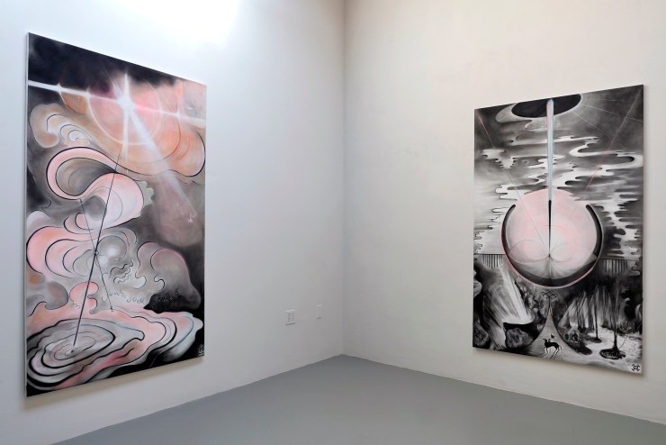
I first encounter Yulia Pinkusevich’s Sakha Aesthesis from this position. Crafted in the slow, solitary beginning months of the COVID-19 lockdown, Pinkusevich’s installation reflects a singular and deeply personal perspective — one best approached with opacity in mind. Her visual lexicon approaches the surrealists; unnaturally pastel skies frame dreamlike, fluid forms. I immediately imagine Hilma Af Klint’s mystic abstractions lining the walls of the Guggenheim and attempt to follow what visions this artist might be summoning. But Pinkusevich’s work shudders past this relation, disrupting my index of her work into the art historical amalgam in which artists like Af Klint now firmly reside. 

Sakha Aesthesis by Yulia Pinkusevich. Installation view 6, MPAC. Photo courtesy of the artist.

I am humbled by scale. Six-foot-tall viewers are dwarfed by the saturated blacks of her imagery, pulled close into mysterious elliptical orbits. A challenging opacity permeates the odd figural and narrative glimmers scattered throughout. In one piece entitled Tree of Life, 2021, a disembodied mouth suspended in scream bursts with a radiance delineated by pale pink sunbeams forming a saintlike corona around it. In another piece, Mother Spirit (ije-kut), 2020, a triumphant, flag wielding figure on horseback confronts a walkway that bends unnaturally skyward. The eye dances across these vibrant, organic, and finely detailed shapes only to be stopped short by crisp, geometric lines that divide the compositions and sever their narrative potential. 

Sakha Aesthesis by Yulia Pinkusevich. Installation view, MPAC. Photo courtesy of the artist.

The exhibition text questions: “Can the ancient enunciate the present?”. I read Pinkusevich’s conversation with MinEastry of Postcollapse Art and Culture (MPAC) curators Ilknur Demirkoparan and Vuslat D. Katsanis, in which she cites her research into Gaia theory, a scientific theory adopted into the Western canon in the 1970s. The hypothesis posits that Earth operates as one large, complex organism sustained by interactions between both organic and inorganic material. Regularly woven into the multicultural amalgam through buzzword-ridden “everyone must do their part” incentives (see: Starbucks banning plastic straws), Gaia theory finds roots in Indigenous knowledge. This knowledge re-emerges with frightening urgency in the weeks since the Intergovernmental Panel on Climate Change declared a “code red” on impending environmental collapse. Pinkusevich heeds this warning and insists on space for ancestral knowledge, offering glimmers of personal history and Indigenous Siberian Sakha tradition to re-center a decolonial framework. 

The influence of these combined practices is immediately evident in Pinkusevich’s use of omniscient perspective representing the three central Sakha spirits—Mother, Earth, Air—that are carried with the individual throughout life. In this context, I feel the ova and womb filling the oxygen of Mother Spirit (ije-kut), 2020 and Tree of Life. I see Earth Spirit’s light graze the pinks of a baby’s blush, ribboning across the composed surface as tendrils of a tree’s roots carve a vascular pattern. Struggling to shake my post-Enlightenment vernacular, I see light above and beyond a horizon — composing a horizon, slipping beneath a horizon — as the promise of futurity or absolute truth. But any sense of grounded linear temporality in these paintings is unstable, trembling with an almost extraterrestrial levity.

Sakha Aesthesis by Yulia Pinkusevich. Installation view, MPAC. Photo courtesy of the artist.

Undulations of the Earthy Spiny Serpentina Making the World, 2021 call again to a sense of fecundity, to the garden, to the feminine. While its title speaks to a literal, reality-building enormity, the serpent itself is surprisingly mundane. Sculpted from biodegradable materials sourced from Pinkusevich’s own garden, its Jim Henson-esque face hovers mid-air, a casual, bemused expression revealing neither the historically-indexed predator nor temptress, but a figure approaching a companion—a co-inhabitant of the room. Glissant’s opacity finds harmony with the serpent. In contrast to the density of the images, the serpent’s gentle curvature around a too-silver air duct again guides the eye to yet another horizon beyond the pictorial plane, shattering the carefully composed gravity of Pinkusevich’s paintings.

Previously noted affinities between Pinkusevich’s work and other artist-mystics are only glancing, nestled on aesthetic similarities. Pinkusevich’s work finds home with MPAC for this very reason. MPAC provides Pinkusevich the space to insist on opacity, to celebrate the unique positionality of her work which, bolstered by the curators’ careful interpretation, reaches beyond the essentialist realm of aesthetics and into the experience of aesthesis. Wrenching discussion away from surface-level visuals, aesthesis denotes a sensuous and experiential relationship to art—one that resists formal classification or definition by adhering to a wider range of subjectivities. This range opposes a colonial amalgam and is essential to MPAC’s mission to explore contemporary art from the perspective of East Europe and Central and Western Asia post-1989.

Sakha Aesthesis by Yulia Pinkusevich. Installation view, MPAC. Photo courtesy of the artist.

Pinkusevich’s overlaying sense of humor within Sakha Aesthesis is one such opposition. While confronting an alarming present and a violent past, Pinkusevich admits her work is also, “about love and life; there’s hope in it. It’s also silly and there’s something a little funny about it”. I’m reminded of Bakhtin’s carnival—that which is immersive, joyous, and communal. That which confronts Order from societal margins, declares itself in a moment of “relational becoming.” That which sends a tremor through linear temporality. If Bakhtin floats in these well-lit walls, he bounces off the earth-colored serpent vertebrae and unassuming face. He lifts from the moments of pale pink fluidity in the paintings, from the silhouetted shoulders of the horse-drawn hero.

Activist and author adrienne maree brown asks in her 2017 text Emergent Strategy: Shaping Change, Changing Worlds, “How do we cultivate the muscle of radical imagination needed to dream together beyond fear?”[2] Following brown’s query, the hope that necessarily radical imagination can build a new dream, Pinkusevich proposes an elevation of heritage, humor, and humility as a multi-sensory site of imagining. She constructs a space of exploring how hidden knowledge may unveil healing possibilities between ourselves and the opaque, ancient, and re-emerging earthly systems at play.

Sakha Aesthesis is on view until September 29, 2021, at the MinEastry of Postcollapse Art and Culture at 2505 SE 11th Ave Suite 233 Portland, OR 97202.

Mia Morettini is a Chicago-based interdisciplinary artist and writer. She is recent graduate of the Master of Arts in Visual and Critical Studies at the School of the Art Institute of Chicago. Her curatorial and written work has been shared with Holly and the Neighbors, a grassroots arts  collective based in Chicago, and most recently at the Smart Museum’s 2021 Health Humanities  in Times of Crisis symposium.


[1] Édouard Glissant, The Poetics of Relation, trans. Betsy Wing (Ann Arbor: The University of Michigan Press, 1997), 192.

[2] adrienne maree brown, Emergent Strategy: Shaping Change, Changing Worlds (AK Press,  2017), 59.