Folklore and Fashion: In Discussion with Reilly Knowles

Reilly Knowles. “Taking, Giving Root.” Embroidered fabric collage (cotton, linen, wool, beeswax, sumac, yellow onion, black-eyed Susan, goldenrod, avocado, wood and nails). 16¼”x9”. 2019.

Interview by Adi Berardini

Using the language of feminism, folklore and religious icons, interdisciplinary artist Reilly Knowles visualizes the liberation of monsters living somewhere between life and death, male and female, human and nonhuman, and reality and fantasy – exploring the creative, liminal space between dualities. Drawing particularly from ancient Irish art and an eco-centric ethos, he constructs artworks which celebrate living entities that society attempts to tame into exploitable classifications, including the land itself. Knowles addresses how the western obsession with binaries hinders the spectrum of possibilities.

Working in a variety of media including painting, sculpture, textiles, and using natural dyeing techniques, Knowles creates art that explores how women, queer and transgender people are labelled as ‘Other.’ He envisions a radical enfolding of these bodies into an understanding of nature, with care towards women, queer people, and the environment as crucial components of working towards a healthier ecosystem. Recently, he also started a project called Swingout Sewing to document his process of hand-sewing a 1920’s wardrobe while conducting historical research, adapting the designs to meet his needs as a trans man.

Splitting his time between London and Milton, ON, Knowles is a recent graduate of Western University’s Honours Bachelor of Fine Arts program, with a Specialization in Studio Arts. He has exhibited work since 2015, showing in such venues as Artlab Gallery (London, ON), Good Sport (London, ON) and Holcim Gallery (Milton, ON). He is a recipient of the Gray Creative Arts Award in Visual Arts, the Mackie Cryderman Award for Excellence in Visual Arts, and the Kate and Robert Taylor Scholarship in Visual Arts, among others.

Reilly Knowles. “Nativity.” Wood, acrylic paint, coloured pencil, straw, sand and found figurines. 18 ¾”x16¾”x11¾”. 2019.

Your piece Nativity (2019) is a sculpture depicting a nativity scene, constructed from wood and painted, featuring straw and figurines. Can you speak more about how you use religious iconography, symbolism, and folklore in your work?

I’m really drawn to working with myths and legends. I love stories that use the fantastical to describe earthly experiences, like the cycles of life and death. I accumulate these stories over time, and they cross-pollinate in my imagination, sometimes reinforcing one another and retaining their recognizable points, while other times reassembling into personal mythologies that aren’t as easily picked out.

Stories are constantly changing, even though we might be able to trace their lineages into the far past. Biblical stories are interpreted in a wide variety of ways according to the disposition of whichever Christian culture, sect, or individual is telling them. Since these stories are meant to describe reality, the storyteller holds the immense power of ostensibly interpreting truth. For myself, even though I wasn’t raised as an active Christian, I absorbed Christian stories and their messaging around gender and bodies on a deep level. Nativity marked the beginning of an artistic exploration into stories surrounding the Virgin Mary. I wanted to see what would happen to the Nativity if Mary’s presence was centralized and liberated from a focus on her reproductive capacity. I think the result is a different kind of nativity – a birth into an exultant and independent female power.

How does your art explore the liminal gap between binaries, such as man and woman, life and death, and human and non-human? How do you find navigating this in-between space encourages you creatively?

Western society is very dualistic, but things aren’t nearly as black-and-white as we’d like to believe. For example, the male/female binary, which overwhelming favours males, collapses under a recognition of intersex individuals. The human/non-human binary, which favours humans above all other lifeforms and finds its logical conclusion in environmental destruction, becomes a mostly arbitrary distinction when we grasp the depth of our relationship with other living beings, like the trillions of bacteria that make up our bodies. These liminal gaps between binaries have immense creative potential because they’re so expansive. Embracing liminality is like getting to paint with infinite shades of grey as opposed to just that black and white.

One way I try to work with liminality is by combining supposedly opposing imagery. I like to create characters that are both male and female, plant and animal, or dead and alive. One of my favourite subjects is the mandrake plant. In legend, its root resembles a human body, and when torn from the earth, it kills its attacker with its piercing cry. The mandrake is at the fascinating intersection of fact and myth, growing and destroying, human and inhuman, and above and below. I like how it’s neither here nor there, and that’s precisely what makes it potent.

Reilly Knowles.”The Mandrake Field.” Oil on wooden panel. 36″x48″. 2019.

Your work touches on environmental themes, addressing how people attempt to classify and restrict living things including the land itself. In what ways do you address the environment and ecologies through your art?

I think my relationship with the environment is always going to be evolving, along with the ways I express that relationship in my work. I’m hesitant to make any definitive statements about what the environment signifies to me as an artist, because I know I have a long way to go in terms of fully unpacking what it means to be a white settler relating to the land in Southern Ontario. But in terms of what I’ve produced up to this point, much of my work has been about using religious imagery to frame my immediate environs as spiritual. I think that if white people put the same energy into venerating and glorifying the rivers and woodlands in our backyards as has been expended on cathedrals and illuminated gospels, then maybe we wouldn’t be experiencing environmental catastrophe.

By the land being classified and restricted, I mean that Western society teaches that humans are separate from the environment, when in reality we exist on a continuum in which we rely on and blend into one another. I’m trying to make art that collapses my body back into everything around it. One of the ways I’ve been doing this is by dyeing textiles with plants available within walking distance of my home. To be a responsible natural dyer, I have to learn what plants to use, and where and how they grow. I have to think about the seasons, the weather conditions, and the sensitivity of London’s ecosystems. It’s a slow process. It means I have to pay attention to and care about the land. It forces me to see first-hand that all art does have an environmental impact, one way or another.

Who are some artists that are influential to you and your practice?

Definitely Kiki Smith and Shary Boyle. Seeing [that] there were artists engaging with fairy tales, and that they were being taken seriously, really encouraged me early on to explore folklore without feeling apologetic. Also, Allyson Mitchell. A lot of her work operates at this intersection of crafting and queer culture, which is where I like to be.

I noticed that you have started a new project called Swingout Sewing. Can you explain more about the project and what your process has been like? In what ways do you think constructing vintage clothing can help navigate gender and queerness?

Swingout Sewing is a project where I’m documenting my process of hand-sewing a 1920’s wardrobe using historical research, while also adapting designs to meet my needs as a trans man. Right now, I’m working on the undergarment layer, which has involved reading period sewing manuals to figure out historically appropriate sewing techniques, as well as adapting original patterns. After each stage of construction, I post an article about it to the project’s website, swingoutsewing.ca.

I never knew I could be a man when I was a kid because I didn’t know trans people existed. I didn’t see them in the media, and I certainly didn’t see them in history class. When you don’t exist in the cultural imaginary of the past, it’s hard to imagine yourself in the present or the future. So, for me, making historical garments specifically designed for my trans body is about imagining those invisibilized folks of the past we might today consider transmasculine, and connecting to them in a very real, material way through the act of getting dressed. It’s also about honouring my trans body and attending to its needs, about adornment over camouflage. So much advice given to trans men beginning their transitions is about disappearing into mainstream masculine tastes. I want to follow my passion for vintage despite the threat of a conspicuous masculinity, while also rejecting the problematic attitudes (namely racism, misogyny, ableism and queerphobia) associated with the past.

In addition, there’s something delightfully queer about transitioning to live in the world as a man but poring over antique seamstress manuals and perfecting my buttonholes. This act of learning vintage menswear construction actually involves learning a lot about historical femmes and feminized labour.

Reilly Knowles. “Swingout Sewing, documentation.”2020.

Do you have any advice for someone who is first learning how to sew or work with textiles?

My first piece of advice is that just about every community is going to be chock full of elders who’d love to pass down their skills. Online tutorials can be very helpful, but they can’t compare to one-on-one teaching from an experienced textile artist. If you’re in a larger city, then you may even have some textile guilds at your disposal. Granted, your mileage in these spaces may vary if you’re visibly queer, but it’s worth considering.

Secondly, you shouldn’t listen to the people who are definitely going to tell you textile art isn’t art. Textiles are devalued because they’ve tended to be made by women. If people look down on your practice, it’s not a reflection of your practice’s worth, but rather of their unexamined sexism.

You can find more of Reilly Knowles’ work on his website, Instagram, and at Swingout Sewing.

Male Fear: Encounters with Roxanne Jackson’s Ceramic Monsters

bark at the moon (1)
Bark At The Moon. (View 1). Ceramic, glaze, underglaze decals, luster, hoop earrings; 19 x 16 x 10 inches. 2016.

By Chloe Hyman

A monster is a personified manifestation of societal fears. Some anxieties are primal, like a fear of death, while others are social, directed towards those whose distinctive appearance or behavior renders them dangerous. Sexual difference has long necessitated the creation of maternal monsters to legitimize a fear of the feminine. This anxiety motivates the policing of women’s bodies, in an effort to enforce a heterosexual gender binary. By transforming women and femmes into demons, patriarchy equates femininity with evil and masculinity with good; monstrous women keep men in power.

That is, until they don’t. Banshees and harpies that subvert monstrosity’s patriarchal parameters dispute the validity of gendered social divisions, threatening male dominance.

Such creatures abound in the oeuvre of Roxanne Jackson, a ceramicist who dissects the politics of monstrosity. In works like Bark at the Moon (2016) and Third Eye Fuck (2019), she oscillates between wish fulfillment and stereotype subversion, crafting figures that embody and disrupt tropes of feminine monstrousness.

The latter’s sexual title accentuates the comingling of fear and desire in monster tales. Film scholars Barbara Creed, Jeffrey Cohen, and Barry Keith Grant discuss how cinematic monsters attract and repulse men, fulfilling their submissive fantasies with the threat of the monstrous woman, and their dreams of domination when said threat is vanquished.[1]

This essay considers how the relationship between straight men and female monsters informs the same audience’s interpretation of Jackson’s work. Analyzing the interaction between an artwork and a particular viewer necessitates an understanding of art as a cultural product; although the artist’s intentions contribute to its significance, its many meanings are also a product of symbolic codes, dominant social ideology, and the viewer’s perspective.[2] By modeling the straight male’s encounter with subversive female monsters, this essay explores what Jackson’s work signifies to a powerful group—the descendants of the architects who constructed the myth of female monstrosity.

bark at the moon 2 (1)
Bark At The Moon. (View 2). Ceramic, glaze, underglaze decals, luster, hoop earrings; 19 x 16 x 10 inches. 2016.

The Archaic Mother

In The Monstrous-Feminine: Film, Feminism, Psychoanalysis, psychoanalyst Barbara Creed describes a number of monstrous cinematic archetypes. Her analysis provides a blueprint for an examination of fear, desire, and monstrosity in the bodies of monsters coded female. Creed’s description of the archetypal archaic mother elucidates how two of Jackson’s ceramic sculptures are implicitly gendered. Furthermore, it suggests that male viewers will respond to Bark at the Moon and Third Eye Fuck with repulsion, arousal, and fear.

The myth of the archaic mother centers parthenogenetic procreation—that is, female reproduction without a phallus. Mythological figures like Gaia (Greek), Coatlicue (Aztec), and the Spider Woman (Navajo) illustrate the historical lineage of self-reproducing mothers.[3] They appear today in cinema in the guise of monsters, like the titular figure in Alien whose eggs require neither phallus nor fertilization, but a human host. According to Creed, the archaic mother presents as “the voracious maw, the mysterious black hole that signifies female genitalia which threatens… to incorporate everything in its path.”[4]

At the center of Bark at the Moon sits such a mouth, its gaping lips emptying into nothingness. Ridged white tubes, caked in muck, wriggle around it like maggots. With their rounded ends, these tubes could be fallopian or phallic, an ambiguity that, paired with the mother’s vaginal maw, points to her self-reproduction. She also threatens to consume the viewer, who cannot escape her slimy hole. If the archaic mother faces him, he risks obliteration, but if she turns towards the gallery wall, then he must be inside her—an embryo-corpse.

The divine symbols ornamenting Third Eye Fuck invoke the archaic mother in a different context. Unblinking eyes adorn the deity’s cheekbones while cobalt spiders traverse her neck—a powerful allusion to her ancestor, the Spider Woman. Furthermore, the creature’s pearly-white face is bifurcated, revealing a fleshy, womb-like cave. The womb’s proximity to the creature’s mouth literalizes the narrative of the devouring mother. As Creed explains, “The archaic mother threatens to cannibalize, to take back, the life forms to which she once gave birth.”[5] Third Eye Fuck embodies this threat, collapsing the metaphor of the vaginal mouth into a single fleshy cavern, capable of consumption and ejection.

Due to their self-reproduction, Jackson’s creatures render the phallus superfluous. And because they layer vaginal and oral imagery, they threaten to consume man whole. According to Creed, this evisceration of man’s social status and bodily integrity appeals to “a masochistic desire for death, pleasure, and oblivion” that is common amongst men.[6] And yet, it is also repulsive and terrifying, which Creed attributes to abjection.


Abjection

The theory of abjection was introduced by the psychoanalyst and semiotician Julia Kristeva, who defined it as “that which evades borders and rules which define identity and maintain order.”[7] When matter passes the skin as it does during birth, people are reminded of their mortality and animal nature. Subsequently, the transgressive matter—in this case, blood and placenta—becomes abject, along with the tools that facilitated the transgression: the reproductive system. Men are more disturbed by abjection because they are less accustomed to the sight of blood than those with ovaries. Thus bleeding, birthing bodies become beacons of man’s inescapable death and epicenters of abjection.[8]

Historically, men in power have expressed their fear of abjection by demonizing the female body. Christian art abounds with womb-like depictions of hell and uteruses adorned with devil horns. Leviticus, for example, associates birthing bodies with decaying corpses, linking femaleness and death.[9] As Creed notes in her analysis of Alien, this trend continues in horror cinema. She describes crewmen entering a spaceship through a vaginal doorway and walking down narrow corridors (echoing fallopian tubes) to an egg-filled, womb-chamber.[10] This intra-uterine imagery roots the alien’s monstrosity in the abject female body.

A mass of tubes, holes, and flesh, Bark at the Moon and Third Eye Fuck exude abjection. Furthermore, each contains a passage through which organic matter can be imbibed or ejected. These vaginal/oral mouths repulse and terrify because they are abject reminders of human mortality.

3
Roxanne Jackson. Third Eye Fuck (View 3) Media: Ceramic, glaze, luster; 18 x 15 x 10 inches. 2019.

Subversion

While Bark at the Moon and Third Eye Fuck embody the archaic mother, they also subvert stereotypes of female monstrousness. Both are decadently glazed, their uterine linings shimmering like dew or diamonds rather than blood. Bark at the Moon is awash in lime, turquoise, and salmon pink, which almost obscures a floral motif that emerges from its crevices. This blue pattern, an allusion to Delft porcelain, features prominently on the pale skin of the deity that is Third Eye Fuck.

The ornamentation of monstrous bodies with bright, shimmering colors and courtly motifs subverts the binary between beauty and monstrosity.

The ornamentation of monstrous bodies with bright, shimmering colors and courtly motifs subverts the binary between beauty and monstrosity. Jackson’s sculptures occupy a liminal space between the two, where gender and morality also blur; Bark at the Moon is ambiguously gendered and Third Eye Fuck depicts a monster with an eye for Dutch design. The more viewers peer at each, the less frightening, and more intriguing, they become. To understand why this subversion elicits discomfort for male viewers, the theory of abjection proves useful.

Aesthetic codes, which are tied to gender and moral binaries, function like skin. Just as the epidermal layer protects man from blood and, therefore, the recognition of his mortality, social divisions protect members of the dominant group—men—from the knowledge that their superiority is unearned.

Media maintains these divisions by reinforcing the myth of female immorality. It also demonizes the defiance of heterosexual gender roles by giving female monsters traditionally masculine traits, like promiscuity or voracious appetite. Cinema is ripe with archaic mothers and other monsters who elicit fear in a controlled environment, for the sexual satisfaction of men whose dominance is never really at stake. It is expected that the banshee will be vanquished before the screen darkens, reasserting heterosexual gender roles.

But the fate of Jackson’s sculptures is not predestined. By deconstructing the notion that beauty equates goodness and gender clarity, while ugliness signifies immorality and gender ambiguity, the artist produces creatures of ambiguous moral character. Luminescent and bright, Bark at the Moon and Third Eye Fuck engage in an active dialogue with the male viewer. They threaten him, they tantalize him, and ultimately, they will dethrone him.

Editor’s Note: The beginning paragraph has been edited to use more inclusive language,  recognizing and clarifying that these cinematic tropes affect both cis and trans women and femmes.

This feature is an excerpt from our first print issue. If you’d like to grab a copy you can visit our online shop.

Notes

[1] Jeffrey Jerome Cohen, Monster Theory: Reading Culture (Minneapolis and London: University of Minnesota Press, 1996), pp. 7-17; Barbara Creed, ‘Horror and the Monstrous-Feminine: An Imaginary Abjection,’ in The Dread of Difference: Gender and the Horror Film, ed. Barry Keith Grant (Austin: University of Texas Press, 2015), pp. 42.

[2] Janet Wolff, The Social Production of Art (New York: New York University Press, 1984)

[3] Barbara Creed, The Monstrous-Feminine: Film, Feminism, Psychoanalysis, 1993 (London and New York: Routledge, repr. 2007), pp. 104-112; Shohini Chaudhuri, Feminist Film Theorists: Laura Mulvey, Kaja Silverman, Teresa de Lauretis, Barbara Creed (London and New York: Routledge, 2006), p. 95; American Museum of Natural History, ‘The Spider Woman,’ AMNH

< https://www.amnh.org/exhibitions/totems-to-turquoise/native-american-cosmology/the-spider-woman > [accessed 20 November 2019];

[4] Creed (1993), p. 116.

[5] Ibid. p. 83.

[6] Creed (1993), p. 170; 470-471.

[7] Julia Kristeva, Powers of Horror: An Essay on Abjection (Seuil: Paris, 1980) quoted in Creed (1993), p. 51.

[8] Creed (1993), pp. 190-193.

[9] Kristeva quoted in Creed (1993), p. 184; Margaret R. Miles, Carnal Knowing: Female Nakedness and Religious meaning in the Christian West (Beacon Press: Boston, 1989), quoted in Creed, p. 170; Creed, p. 170.

[10] Creed (1993), pp. 83-85.

LOVE MY DYSFUNCTIONS by Rea Sweets

LMD_DOCUMENTATION-5586
Rea Sweets. LOVE MY DYSFUNCTIONS installation shot, Charles Street Video. 2020. Photo by Roya Delsol. Images courtesy of the artist.

LOVE MY DYSFUNCTIONS

Charles Street Video

Organized by Margin of Eras Gallery 

February 14th – March 14th, 2020

By Adele Lukusa

LOVE MY DYSFUNCTIONS is both a figurative and literal invitation to Rea Sweets’ bedroom. Tucked into Margin of Eras Gallery’s Charles Street Video space, on the second floor of Toronto Media Arts Centre (TMAC), the immersive installation explores being a neurodivergent, mad, and disabled individual pursuing higher education. Swept in red lighting and underscored by soft indie tunes, the disheveled and realistic bedroom evokes the artist’s presence: a desk with stacks of discarded clothes, notebooks, and food; a bed and screen-printed pillow to rest your head on; and two towers of stacked empty prescription bottles, with an LED sign with the word “take your time” sitting between them. Slide the headset over your ears, and get transported to an all-nighter with Sweets typing rapidly with coughs. A short film documents her executive dysfunction. And if you’re lucky, you could converse with Sweets herself (or scribble messages in her guestbook if you miss her).

LMD_PORTRAITS-8277
Rea Sweets. LOVE MY DYSFUNCTIONS installation shot, Charles Street Video. 2020. Photo by Roya Delsol. Images courtesy of the artist.

If madness is messy, then Sweets embraces it passionately and unabashedly. At its heart, LOVE MY DYSFUNCTIONS is an ode to Sweets’ relationship — or rather, her break-up with post-secondary education. Through the interactive nature of the work and the accompanying public programming, LOVE MY DYSFUNCTIONS also demonstrates how vulnerable art can foster community dialogue.

Incorporating disability and madness into her art had not come to full fruition until Sweets signed up for Ryerson’s Cripping the Arts in Canada and A History of Madness.

Both classes are rooted in disability justice and encourage students to think critically about the ways in which society has created and enforced “normality” in relation to disability and madness, while examining the overlap between those two communities.

According to Eliza Chandler, former artistic director at Tangled Arts + Disability and disability studies professor at Ryerson, the term “mad” refers to individuals with a history of mental health diagnoses or experience with the psychiatric system, which may include institutional stays, prescribed medication use, therapy, and other medical intervention. Members of the mad community may identify as consumers, survivors, and current or ex-patients of the psychiatric system. Historically considered a slur, “mad” is currently being reclaimed by those classed as mentally ill or neurodivergent. It can encapsulate all who experience oppression due to sanism.

“[Mad] a small, monosyllabic three-letter word, but it really did afford me the kind of freedom to stop pretending,” said K Zimmer, a poet and English Literature student at the University of Toronto. 

LMD_PORTRAITS-8426
Rea Sweets. LOVE MY DYSFUNCTIONS installation shot, Charles Street Video. 2020. Photo by Roya Delsol. Image courtesy of the artist.

“Language is power,” said Sweets. By learning about terms like neurodivergent and mad, as well as hearing students speak about madness and disability, Sweets could better articulate her own experiences, specifically her executive dysfunction that had only been exacerbated in university.

“It’s like your capacity is always on cooldown mode,” said Sweets of executive dysfunction. “You’re smashing buttons, trying to get yourself to do things but your body-mind says ‘We can’t do that yet. We’re still recharging’.”

Within a university setting, Sweets routinely had to pull all-nighters to finish essays when professors refused accommodation.

“No matter how much you accommodate me, or think you’re leveling the playing fields, it will never be as if I am on the same level as of a neurotypical student,” Sweets says, “I’m still going to have to sacrifice my health or in some way, shape, or form.”

Art was a way to motivate herself to create beyond the academy. “At least if a situation is incredibly shitty, I can make and mold something out of this, she said. “Creating artwork for myself as a form of agency is really important for me.”

For folks like Sweets, stepping into mad-positive spaces is essential. Classes in disability studies were the first time she felt “welcomed and encouraged.” Instead of handing in an essay for her final Cripping the Arts assignment, Sweets asked if she could submit a proposal for a showcase idea. Chandler gave her the okay, and so LOVE MY DYSFUNCTIONS came to be.

At the front of the room, Sweets is on the mic asking about the ways madness manifests itself in art. By Sweets side are fellow mad student-poets Zimmer and Twoey Gray, as well as Max Ferguson, her mentor. Though set up as a panel discussion for the public, the conversation shared by these four artists is filled with uncommon honesty and vulnerability.

There’s no sugarcoating their experiences of sanism, of the ways pursuing post-secondary studies has impacted their desire to succeed academically at the expense of themselves. Their stories are being told, not as a heartfelt tale to make others feel better about themselves, but to embrace the good with the bad that comes with being mad.

Gray described the panel as a very “affirming” space, a sentiment echoed by Zimmer.

“There were times [when I thought], ‘Oh, I’m royally fucking up’,” they said, “[But] I could trust that I was going to be accepted in that space.”

LMD_PORTRAITS-8310
Rea Sweets. LOVE MY DYSFUNCTIONS installation shot, Charles Street Video. 2020. Photo by Roya Delsol. Images courtesy of the artist.

The comfort, acceptance, and vulnerability present within that discussion is an extension of Sweets and the artwork itself. Take, for example, the wall of actual diary entries, email exchanges, and therapy notes speaking to her madness, a kind of vulnerability described by Gray as “hypersharing.” 

“In some ways, the more naked and exposed and vulnerable I am, the more I’m giving [to the audience] and the more affirming my artwork happens to be,” said Sweets.

It’s what makes Sweets’ artistry so brave, according to Ferguson. “She’s incredibly good at balancing being approachable and being brave,” he said, “And she inspires others to be brave.”

When doing outreach for this show, both in-person and online, Sweets ensures she can be at the gallery. In order to accommodate for COVID-19 measures, she also narrated an online virtual tour of the exhibit through Facebook Live.

“Listening to and seeing the comments is inspiring,” Ferguson said, “It’s inspiring to see [Sweets’ art] inspire other people.”

That inherent reciprocity is what distinguishes LOVE MY DYSFUNCTIONS and all of Sweets’ work.

“That has helped me feel like [sharing] my vulnerabilities are worth it and I feel less like an open scar,” she said. “It doesn’t burn. It’s good.”

The figure does not win every time: In Discussion with Celeste Rapone

By Elaine Tam

March in London gifted a few spring pleasures; memorably that telltale smell of oil paint, one takeaway impression among many from Celeste Rapone’s exhibition Retreat at Josh Lilley gallery. Dressed by electrifying palettes and deftly rendered textures, her eccentric characters go about their daily dealings in paintings oscillating between figuration and abstraction. Swelling to their borders, they occupy “impossible positions” and defy gravity in multiplanar views. Yet it seems that — for all their brazen flair and over-zealous accessorizing — a maelstrom of incidental activity surrounds the figures, swallowing them.

Rapone never does preliminary studies, which means that any self-doubt, struggle, or transformation becomes part of a complex unfolding on the canvas as the painting is realised. The result of this highly personal process is not overtly autobiographical. Nonetheless, the paintings impart an intimate insight into the painter’s psyche, and the ways in which the discomforts and discontents of painting parallel universal human experiences. With remarkable reflexivity, Rapone explores the many personalities of failure and the possibilities for invention, humour and discovery that lie therein.

Elaine Tam: How do you begin the process of creating new work?

Celeste Rapone: I’ll start a painting by mixing colour, usually with some sort of narrative prompt in mind. One of my favourite challenges is assigning a palette to a narrative that has no colour associations. I start my paintings like an abstract, rather than figurative, painter — with colour, shape, composition, form. The figure and environment are secondary elements that come after. There’s a lot of wiping down; I really like figuring it out on the canvas and having the problem exist there.

Elaine Tam: How does this tension register on the canvas or in its contents — with the presence of more control or less gestural swathes of paint?

CR: I’m constantly skeptical of my decisions as a painter. That’s one of the prerequisites of being a painter, right? Doubt about everything. The paintings I struggle through I have trouble seeing after they’re finished; it’s like seeing your significant other for the first time after a really big fight. There are ones that go a bit more effortlessly, but I’m also skeptical of those. Maybe I’ll second guess the speed of something being resolved.

Yawn
Celeste Rapone. Yawn, 2020. Oil on Canvas. Image courtesy of Corbett vs. Dempsey and the artist.

ET: Slightly earlier works like Flirt (2018) or Artist Wife (2017) centre on Guston- or Eisenman-esque caricatures, whilst a recent work like Yawn (2020) is more scenic and features lots of minutiae. How do you relate to your earlier work and the way your practice has developed?

CR: There’s something about the idea of the women contained, occupying these impossible positions anatomically, but also in terms of expectations, ambition, defeat and self-awareness. It is a lot of what embodies painting as a process and practice. In the past couple of years, I started having the figures fill out the entire composition, taking away flattering cropping. When the whole body is exposed, there is a discomfort [and] vulnerability.

ET: The objects slip and slide through the viewing corridors created by the entangled bodies. On your flattened planes, there is no hierarchy — the body never seems to fully possess or grasp the objects. You have described your paintings as anxious. Is anxiety an intended effect?

CR: I don’t set out to make anxious paintings. I see the paintings as an intersection of my personal history — growing up Italian Catholic in North Jersey — art history, and whatever the current circumstances are, both in my studio and in the world. Your comment about hierarchy is something I think about a lot. I’m interested in the figure sort of drowning in their environment and being totally overwhelmed by their context. When I was in grad school, an advisor once asked me: “How do you make figurative painting and not let the figure win every time?”

Screen Shot 2020-07-30 at 1.17.58 PM
Celeste Rapone. Practice for the Real Thing. 2017. Oil on Canvas. Image courtesy of Corbett vs. Dempsey and the artist.

ET: Yes, and in many of your paintings, certain objects are very prominent. Some are even named or branded.

CR: There is a specificity to the imagery. But because of my illustration major at Rhode Island School of Design during undergrad, I’m aware of not being too specific — that the narrative is not overly linear or only hits one note. RISD is a pretty technical school, [so] my whole background is in observational figure and portrait painting. I realized quickly I was not an illustrator. That’s why I went back to grad school for painting.

ET: So as to not be only illustrative or purely representational?

CR: It was about trusting and translating the skillset [so] that I had enough to make totally intuitive work, invent light scenarios or palettes for convincing flesh tones… For years, I was painting with a hyperrealist approach. Sometimes, I have to re-train my hand to paint in a way that’s looser, more gestural, guttural [and to] not paint this thing the way I know, but paint it for what the painting needs. One of my favourite essays is Mitchell’s What do pictures want? I’m interested in that dialogue.

ET: Your background as an illustrator explains so much, as your work certainly exhibits moments of stunning technical prowess. Yet the faces of the characters are mysteriously smudged and less defined…

CR: That’s been happening more lately; the portraits are getting more generic or partially concealed because they are less overtly autobiographical. I don’t know the identity of the person I’m painting, so it seems like a lie to give them a specific face. The more autobiographical elements have been popping up as objects and accessories, [such as the] sneakers I always wanted in junior high that my parents wouldn’t let me buy. I’m making a painting of a woman fishing right now. It’s a night-time painting, and just yesterday, I added those glow light necklaces.

ET: Of course! The ones that crack —

CR: And then they light up and they don’t last long. That was a very popular thing [to wear] when I was growing up, [if you wanted] to look really cool.

ET: Very raver chic.

CR: Totally! Except back in Jersey we weren’t ravers or chic. It was a thing you would wear to a party to have the aesthetic of raver chic. Some of these little nods in the paintings are [to] my own history and life, where I come from: a cough drop wrapper, tooth flosser, or a can of something on the floor of my studio that just makes it into the painting. But these are not things viewers need to know — I don’t want the paintings to turn into an archaeological dig — it’s about how they all collide in a composition.

27941_Rapone_Four Eyes
Celeste Rapone. Four Eyes, 2019. Oil on Canvas. Image courtesy of Corbett vs. Dempsey and the artist.

ET: For someone unfamiliar with “Jersey” as a cultural phenomenon, how would you describe it?

CR: I was growing up in Jersey, amongst all these opulent, maximalist visual stimuli, adopting bad taste tactics. And now I’m working through some of that when making the paintings. I’ll make a painting and look at an area and go, “That’s a real Jersey move”.

ET: That’s so telling!

CR: You know, I heard a recording of Charline von Heyl for her show at the Hirshhorn, and she talked about finding this level of “upgraded cringe”. What a wonderful phrase, right?

ET: It’s a fine line though. How do you distinguish between cringe and upgraded cringe?

CR: That’s a question I ask myself all the time in my studio. What’s one step too far? What’s about bad taste versus just bad taste? I’ve always been interested in this gentle idea of shame and embarrassment in the paintings, and that has become heightened in some of the moves I’ll make in recent ones.

ET: Could we consider these kinds of questions the “narrative prompts” that help you to start a work?

CR: What gets me into a painting can come from anywhere, which is one of the reasons I reference Dutch Golden Age painting. I love the idea of a simple start. There’s something in simplicity that allows me to have total freedom to take it wherever I want, like the women playing dominoes in Yawn. “What a dumb idea for a painting!” I’ll say in my head, but I love that because it’s something to push back against. What’s more interesting to me is the absurdity in how a painting is constructed. A woman stretching canvas, who would want to look at a painting of that?

Swan
Celeste Rapone. Swan, 2019. Oil on Canvas. Image courtesy of Corbett vs. Dempsey and the artist.

ET: It’s funny you say that, because I find this work of yours delightfully witty; the painting becoming the back of its own canvas, revealing its sub-structure. Why did you title it Swan (2019)?

CR: There’s something awkward about your body stretching a canvas. I wanted to play with that in the title; the lack of grace and this idea of transformation. But even if there are sub-narratives occurring in the paintings, inherently they are all about trying. That notion of effort or expectation that goes into trying, which tries to counter failure. But failure is always one aspect of a larger cycle, in life and in painting.

ET: That reminds me of the famed Beckett phrase: “Ever tried. Ever failed. No matter. Try again. Fail again. Fail better.”

CR: Absolutely. I see it as this overarching thing, and I like to think that failure enters the work in different ways: humour as a coping mechanism or trying really hard as the concealment of failure. It shows up in the painting as, perhaps, one too many accessories. She’s trying just a little too hard. Am I trying too hard to paint this necklace perfectly?

Viewfinding
Celeste Rapone. Viewfinding, 2019. Oil on Canvas. Image courtesy of Corbett vs. Dempsey and the artist.

ET: It’s like that fine line regarding “upgraded cringe.”

CR: Right, like I’m gonna paint this rainbow and it’s going to be très embarrassing, but is it going to be more embarrassing if it’s a perfect rainbow, or if it’s a crappily painted rainbow? These are conversations I have with myself ten hours a day, so it’s an all-encompassing practice: thinking about trying too hard, failing, starting over again. I always have to be really honest with myself about the painting. There has to be an evocative undercurrent. Then, there’s the laughter, which lets me know I’m hitting on something. There are times I tell my husband, “I haven’t laughed yet, so I don’t know how it’s going.”

Parameters and Play: A Conversation with Neah Kelly

neah kelly_1 (1)
Neah Kelly. Fodder for Fun series (SRRTt no. 2), recycled screenprint, paper sculpture, thread, plexiglass, 5″ x 6″ x 4″, 2020. Courtesy of the artist.

Interview by Harper Wellman

Neah Kelly is a visual artist currently based in Hamilton, Ontario. After earning her undergraduate degree from Concordia University, Kelly continued her formal education at Indiana University, finishing her MFA in 2018. Today, Kelly’s practice involves working within a self-imposed set of limitations, creating both 2D and 3D pieces. Using imagined shapes, Neah configures the shapes into various forms, again and again, in new and exciting ways. The completed works inspire new shapes, and the process is repeated. Within these parameters, Neah has found a sense of play in her practice leading to a portfolio of closely related but ever-evolving work, reflecting the chaos, beauty, and joy that can co-exist within a creative invention.

Could you please tell us a little bit about your personal history and your history in regards to art exposure, education, and career. Who or what led you down the path to being a visual artist? Who were some of your early artistic influences? 

I’m originally from Vancouver Island, growing up in a very small town (with just one intersection) called Shawnigan Lake. I am and was raised a Baha’i, attending a Baha’i boarding school for all of my high school years. These experiences, I think, set the tone for how I view the world and why I became an artist. Both of my parents are in the arts (my dad is a painter, and my mom is a musician), so it was natural to make art. We were raised looking and talking about my dad’s paintings and playing music with my mom. I really think it was the most natural thing for me to end up doing.

I can’t really remember a time when I wasn’t exposed to art, or when that first exposure was. My dad used to make these very large-scale hard-edge abstract paintings with only two colours. I remember one that was huge, it took up almost the entire length of our living room wall, and it was comprised of a shape that as a child reminded me of a whale. It was blue and black, flat with no depth, just very crisp, clean edges between the shapes. I remember constantly looking at that painting, even when I was really little, it had an impact on me. Besides that, I used to love looking at my dad’s art books, two books that I looked at a lot were by Rodin (his bronze sculptures), and Rothko. Artists that I think were early inspirations for me were people like Kandinsky, Rothko, and Frankenthaler (their use of colour and colour as an expression of the spiritual really interested me), and Eva Hesse. Hesse is wonderfully strange. She has such an engrossing talent with materiality and just seems to be truly creative. I loved that. I love that her work is so full of creative energy, experimentation, and a visceral reaction that you can almost feel through photographs. I’ve only seen a couple of her pieces in real life, and it was worth the anticipation!

Eventually, I went to art school, and started with the visual arts program at Camosun College in Victoria, then attended Concordia University in Montreal, earning a BFA in Studio Art, with a minor in Print Media. While at Concordia, I was able to learn a lot about printmaking and bookbinding, and I think that’s where my art practice started to develop into what it is now. I started doing a lot of lithography and bookbinding, primarily playing with less conventional forms of bookbinding. After undergrad, I attended Indiana University in the US and earned an MFA in Printmaking. I graduated in 2018 and since then have been exhibiting across the US and Canada, participating in residencies, etc. This year I have shows coming up in Hamilton, ON, at Centre[3] and a two-person show at Martha Street Studio in Winnipeg, MB.

neah kelly_2 (1)
Neah Kelly. fodder for fun: step 1a & accompanying form MIAAS no. 1, lithograph. Courtesy of the artist.

neah kelly_3 (1)
Neah Kelly. fodder for fun: step 1a & accompanying form MIAAS no. 1, lithograph / recycled lithograph, paper sculpture, thread, 38cm x 27.9cm / 6″ x 4″ x 5″, 2019. Courtesy of the artist.

Your practice today is centered around ideas of play, as you continually play with a series of imagined shapes again and again. Play is something many people can connect with from their childhood. When did you rediscover this sense of play within your practice, or was it always there?

When I began this current body of work, making use of rules was there from the very beginning. And I don’t think I connected rules to play and play to creativity until a while later. For me, rules have played a huge part in my personal life. I’ve lived with type 1 diabetes for almost 24 years. Although it was an unconscious translation into my art practice, I think learning to function within strict parameters is something that has been a huge component of my daily life for almost as long as I can remember. So, initially creating a premise like this for a project didn’t seem unique in any way or that it would potentially lead to anything in the future. It was more that this type of thinking was just a way of existing in the world that I am familiar with.

But, the play aspect, or realizing that play was an important aspect in my work, I think, began to evolve as my process did. I see the idea of play as a way to generate ideas, and the rules establish a criteria and set of parameters guiding that play and what I’m doing/producing. When I was completing my MFA I read a lot about play and games, and game theory, and at first I saw rules as being really important, but the more I read and learned and thought about what I was doing and how I was thinking about things, I realized that really everything I was doing fit very neatly into game theory, and how children often play. The play of children is so cool. It’s imaginative, the rules are flexible, they change and develop as the game goes on. The rules are most often used to establish an objective, but they also serve the purpose of maintaining the play and allowing the play to continue for as long as possible. I realized that this was very similar to how I was using rules as a way to continue the action of creative invention. Through this research, I learned that play has huge impacts on our ability later in life to form friendships, establish intimacy or not, ethics of fairness and justice and establishing relationships. And all of these attributes are developed through rules and play, ultimately you can’t have play without rules. And rules very often (if you’re open to it) can lead to play.

In line with that thinking, the first project that really used this idea was a book project that I completed in my first year of grad school. It was an absurdly shaped small book (4” x 4” x 9”) that used three repeating shaped copper plates as its imagery. They have unique qualities that I intentionally gave them so that there was room to come up with a variety of compositions, but it was still a huge challenge! The book has about three hundred prints, and one of my rules was that all the prints that I printed had to be included in the book — successful or not. Without the safety of an editing process, the pressure for creative invention was high, it was another prompt! The objective was that with these constraints, I would be forced to invent original compositions within this framework again and again. The theory being that I would never run out of new compositions if I actually succeeded in stimulating and prompting creativity. In the end, these restraints acted as a stimulus for creative solutions, and the activity that I was engaged in during this process was play, and that’s how I got to the idea of play. From there, the broader realization of my practice is about the creative impulse, stimulating and generating it through activities, devices, projects, so that we can all engage in playful activities, seemed to come about naturally. It felt like an explosion of possibility, with my results becoming more absurd, abstract, and silly, with every iteration and subsequent generation.   

neah kelly_4 (1)
Neah Kelly. FFF series: Peekaboo no. 1 (BBB …V), recycled drawing, hand-cut/hand-sewn paper sculpture, paper cut-outs, thread, coloured acrylic, 6” x 4” x 6”, 2020. Courtesy of the artist.

Are you able to elaborate on what initially informed the imagined shapes, and what they have come to mean or symbolize for you since working with them?

The first time I used these shapes was for the book project that kicked off this entire body of work, and when I started that project, I created those shapes with the explicit purpose of them being abstract. When I started I had goals in mind: I wanted the shapes to be different scales, and I wanted them to be truly abstract (or as much as possible) so that they would be hard to anthropomorphize, additionally I wanted them to have interesting and differing parts like angles, lines with dips, sharp edges, rounded corners, curves, notches, and uneven planes so that when these shapes interacted over and over again in the book, I would be able to create a unique and interesting composition with each print. I invented them through a process of formal consideration, and I settled on the shapes I ended up with when I thought they had the features that I was looking for, I thought they’d work well together, and I liked how they looked aesthetically.

I don’t really think of them as symbolizing anything. For me, the shapes were initially a tool to accomplish an idea –  the idea of perpetuating creativity from a restricted set of source material. Now that they have gone through so many translations and have been used in a multitude of consecutive projects, I think of them more as idea generators. That’s their function, that’s what they do but they’ve also come to mean just that for me: they are the prompters for my own imagination.

Where do you see your practice going in the future? Will your series continue, or is there something different in the works?

It is continuing, but it’s always changing. I’m currently working on an artist book that will be pretty interactive. I’m trying to create it in a way that people can handle it gently and participate more fully. The way things are progressing right now, I have pieces in the same vein that I am still creating, but I also have a couple projects that take these ideas but are more outward-looking and more active in soliciting viewer engagement. I really love the idea of working together at bolstering up our imagination skills, and I think that’s where my future projects are headed.

And in the same vein of more participatory projects, I have a collaboration in the works where we plan to use rules to dictate exactly what we make. And those rules will have a much more direct relationship with our personal lives and lived experience. This will be a project that begins with just two of us, and hopefully — through the use of social media — it will grow into a much more expansive, participatory practice.

neah kelly_7 (1)
Neah Kelly. Fodder for Fun: Belled Butt Becomes …Visage no. 5, recycled screenprint, hand-cut/hand-sewn paper sculpture, thread, coloured acrylic, 10” x 10” x 6”, 2020. Courtesy of the artist.

Regarding the broader art scene, what do you see on the horizon, and what are some issues you feel the art community needs to address? Can you think of any artists or organizations that are helping the arts community move forward?

Diversity, and equal representation throughout power structures within the broader arts community. Recently, I’ve been thinking about who the gatekeepers in the art world are, who decides whose art, where it’s shown, and what type of content is presented and highlighted. It’s not enough to diversify the artists making art, we need to have boards, curators, directors, and leadership that are reflective of our communities. Shifting these power dynamics, and not simply having white boards showing POC artists, but POC communities determining the content and the conversations that we’re ultimately having within the art world is where I think the art world needs to move and is going. A few institutions that I’ve seen actively changing and diversifying their organizing bodies are Open Space in Victoria, BC; Martha Street Studio in Winnipeg, MB; and Trestle artist-run center in New York.

Finally, how can we all incorporate a little more play into our lives?

I don’t know exactly. I think for adults, play is more an attitude than a set thing. If there’s one thing I learned when researching play amongst animals and children, it’s really that anything anywhere can be considered play. One thing that I’ve observed about myself is that rules, deadlines, constraints, bribing, etc. turn really anything into a game. Set a time limit, something that you need to accomplish in a certain way, and it really does turn into a game instead of a chore. I think that combined with a more relaxed attitude, a healthy and robust sense of humour would definitely succeed in incorporating a little more play into our daily lives. The same goes for art, hobbies, anything really. That’s just what I think. Play is incredibly diverse and unique to the individual —there’s no right or wrong way to do it.

Check out more of Neah Kelly’s work on her website and Instagram.

Lena Chen in Conversation with Chun Hua Catherine Dong

IMG_2903
Chun Hua Catherine Dong. I Have Been There. 2015 – ongoing. Photo credit: Oliver Santana & Elizabeth Ross. Photo Courtesy of the Artist.

By Lena Chen

The expansive practice of Chun Hua Catherine Dong utilizes the artist’s own body as a bridge between immigrant and nation, mother and daughter, and the personal and the public.

First and foremost a performance artist, her work has taken the form of photography, video, installation, and more recently, animation and augmented reality. Born in China, Dong immigrated to Canada, where she received a BFA from Emily Carr University Art & Design and an MFA from Concordia University. Her experiences occupying a racialized body and adapting traditions from her homeland have played heavily in her practice, which has explored marriage, death, and maternity.

Having performed and exhibited internationally, she was also a 2014 recipient of the Franklin Furnace Award for contemporary avant-garde art and a finalist for Contemporary Art Award at Le Musée national des beaux-arts du Québec ( Prix en art actuel du MNBAQ) in 2020.

Dong spoke with us about her experience of creating intimate body-based works that engage the participation of public audiences and spaces.

Lena Chen: I noticed that your most recent work, Skin Deep, and your long-running series I Have Been There, share a similar aesthetic through the use of traditional Chinese embroidered fabric. Can you talk about how they evolved?

Chun Hua Catherine Dong: These two works actually do not have many connections except using the same fabric. In 2014, I bought some fabric in Chinatown in Montreal, where the supply is very limited. The fabric was wrapped on my face very randomly and looked terrible, so I didn’t develop it further. But in 2017 and 2018, I went back to China and collected all kinds of new fabric that I began to work with. More recently, I expanded Skin Deep to animation and augmented reality to make this work more alive and architectural.

IMG_2909
Chun Hua Catherine Dong. Skin Deep. Photographs with Augmented Reality. 2014-2020.

 You have performed in performance art festivals around the world from The Great American Performance Art in New York to Infr’Action in Venice to Dublin Live Art Festival in Dublin to Miami Performance International Festival. Can you talk about how the site-specific performative work I Have Been There came out of your lifestyle as a traveling artist?

I started I Have Been There in 2015. I love traveling and really miss it right now [because of COVID-19]. One of the good things about being a performance artist is the chance to travel because the body is your material and your body is your work. If you travel to a new city, you need to see the tourist attractions. But I’m also a bit of a workaholic, and I considered it a waste of my time to just go see attractions without doing anything. I thought what if I could visit these sites while making work?

IMG_2904
Chun Hua Catherine Dong. I Have Been There. 2015 – ongoing. Photo credit: Oliver Santana & Elizabeth Ross. Photo Courtesy of the Artist.

Chen: I’m interested in how the work deals with your relationship to your own mortality and Chinese traditions around burial, especially because of the material you’ve chosen to use.

Dong: In my hometown, there’s a tradition that when the parents die, each daughter of the family makes a shroud and they cover the body with it.  When my father passed away, he had six daughters. So, his body was covered with these six layers that he was buried with.

According to Chinese tradition, it’s your children who bury you. And if you don’t have children, it’s your family. But I live here in Canada and everyone else in my family is in China. I decided not to have children, so I thought nobody’s going to bury me. But I’m still very young. I have these fantastic [opportunities] to travel around the world, so why don’t I just bury myself in the most beautiful desirable spaces wherever I want?

I have been doing this project for five years right now. Every time I travel to a new space, I would do another part of the series there. So far, I have traveled to 33 cities and 15 countries in the world. My plan is that I’m going to do it until I die or until I can’t travel anymore. This is my commitment.

Chen: Death seems to be a common theme in your work. I was also very moved by how you made peace with your mother’s passing through your art.

Dong: I was supposed to visit my mother in the summer of 2016, but I went to London because a curator invited me to do something. Then in October, she passed away very suddenly, so I have a lot of regrets about that. In the tradition of my hometown, they only keep the body for three days, and after three days that they have to bury her. But my passport was expired at the time and I couldn’t get my visa in three days, travel to Beijing, and then travel to the village. It would have taken me at least five or six days.

I wanted to do something dedicated to her because I feel I should have been there for her death, but I wasn’t. So in 2017, I went back to China, and originally, I wanted to find her personal belongings – her shoes, her clothes, her bed – so  I could do something right. But after her death, my family burned everything because of tradition. They believe when a person is dead, they need access to their belongings right away in the afterlife.

I was very disappointed there was nothing left of her belongings. It was very sad. There were no smells. There were no visible things. When I was in China, I realized I was looking for my mother everywhere. If I walked around and heard a voice that sounded like my mother, I would turn around and see this old lady and I would notice that the way she walked or wore her hair would be like my mother. Her smile would look like my mother, so I was looking for my mother through other people’s mothers.

IMG_2908
Chun Hua Catherine Dong. Mother. Photograph & Video: 14 pieces of photographs, inkjet prints, size varies, 2017.

Chen: Can you talk about how you decided to honor her memory by engaging with the women who were close to her?

Dong: I decided that I was going to looking for my mother’s childhood friends and relatives because since I came to Canada, I barely had contact with them. I visited them and I asked them because I don’t have any clothes to wear from my own mother if each of them could offer her clothes [for] me to wear. 

My mother also always loved these traditional beautiful cotton flower shoes. So, I brought a pair of shoes to each mother in my project. I thought about this kind of Cinderella story of whoever fits this crystal shoe is the bride. I started [to] imagine, whoever fits these shoes is my mother. I would take a photograph of us together, with me wearing their clothes and them wearing the shoes. At that time, I didn’t even think about what I was doing as work. I was doing it for myself, as a memorial to my mother.

Next year, I will return and live with each mother for a day as her daughter. I will document this day with the 14 mothers. This film is called Mothers with No Names.

Chen: Even though the work is very much tied to your own relationship with your mother, grappling with the death of a parent is such a universally understood experience. How has the public received this piece?

Dong: The mother is universal. Every time I show this work, people become very emotional,  People connect themselves to the mother in the photograph. When I showed it in Istanbul, this woman came to me and she was crying. She showed me that the jewelry she was wearing belonged to her mother.

The first time I showed this work was in South Korea and the curator said it made her think of her mother as well, who was getting older. When I had my artist talk,  she left and later apologized, saying that she knew I’d be talking about the piece and it was too emotional for her to be there thinking about her own mother.

IMG_2906
Chun Hua Catherine Dong. Husbands and I. Photography and performance. 2009-2011. Series photo credit: Ruth Skinner and Chad Darnford. Photo courtesy of the artist.

Chen: Even though they’re very different works, I see connections in the methods you used for your series Husbands and I, in which you documented entire days you would spend with strangers who you “married.” How did you go about getting participants for that work?

Dong: That was 11 years ago when I was still in art school. I used Craigslist and dating websites, hung flyers on the street, passed them out to people, and left them in coffee shops. At that time, I was very passionate about a performance. But now if you asked me to do it, if I could spend a day with a stranger, no, no, no, I wouldn’t. I never thought about the fact that there could be danger there because I was meeting this person I didn’t know and I went to this person’s home to spend a whole day with them. I could’ve been killed.

Chen: And did participants know this was supposed to be an artwork or was there also an expectation of intimacy?

Dong: Of course, they knew it, because I asked them to sign the contract. But also, there were many men who wanted to spend a day with me, until I said, “Okay, I’m going to film it. It will be an art piece and exhibited.” And then, 90% dropped out. They said, “Oh, I would love to spend a day with you without the camera” and I refused. 

I remember two participants. One still calls me his wife, but of course, he knows I’m not.  We had a ceremony, because he had a party, and I was at his house and he announced me as his wife, that we were getting married. He put a ring on my finger, and he felt that he really married me.

There was also another guy, and he was begging me to spend a day longer with him. He wanted me to be in his real life, but I couldn’t. Before this, I believed in the idea that art is life, but then I realized, if your art is really your life, you are going to mess with your life. I could not bring those men into my real life. I didn’t want to have any more connection with them, but of course, after that, [they] kept calling me, and I had to say no.

Chen: How did the project affect the way you thought of power and identity, as an Asian woman living in a Western society?

Dong: A reason I stopped doing the project is [that] after I spent the day with some of the men, I actually felt a little bit like I was taking advantage of them. The reason I was able to stay a day with them is because they don’t have partners. They are lonely people. Otherwise, they were not going to allow me to be in their life. Even though they know, it’s going to be filmed and it’s going to be an art piece, they still wanted to take this chance, because they needed this company and this kind of excitement. [In] the beginning, this work was a political piece because I always felt like I was an outsider despite living in Canada for a long time. But when you close the door and spend a day with this so-called privileged white person, I realized we were just two normal people, staying together and chatting. Before I was working on a lot of identity issues, but my work started to change after that.

Chen: What guidance do you have for other artists working in performance?

Dong: If you don’t doubt yourself, then other people won’t doubt you. When you do the performance, you have to 120% believe in what you’re doing at the moment.

Profiles on Practice: Tazeen Qayyum

tazeen.qayyum-painter_Installation (1)
Portrait of Tazeen Qayyum, courtesy of the artist.

By Nadia Kurd

Trained as a miniature painter from the National College of Art (NCA) in Lahore, Pakistan, artist Tazeen Qayyum points to her mother’s encouragement as the source of her success. “She constantly encouraged me, drove across town every evening after her tiring job to take me to after-school art lessons” reflects Qayyum.[1] Such foundational encouragement prompted Qayyum to have confidence in her own voice and to pursue her art in Pakistan.

This encouragement soon paid off and Qayyum’s time at NCA during the 1990s solidified her practice. Much of her work critically draws on the long illustrative tradition of Central Asia, South Asia, and Iran. The practice of miniature painting — the brilliantly coloured miniaturized folio images—emerged in the Islamic lands during the 8th century with the introduction of paper from China. Commonly referred to as karkhana or ‘the painting workshop’, numerous medical manuscripts, legal treaties as well as the histories of rulers and most importantly, the holy Quran, were part of the elevated art practices amongst Ottoman, Persian and Mughal empires.[2]

The practice of miniature painting is an arduous one. Students training in the karkhana will sit on the floor for hours, focused on mark-making on handmade paper. The paper is often mounted on a takhti or ‘tablet’, which the student keeps propped up on their lap. The brush and paints are also skillfully handmade during the student training. The technique consists of “minute, repetitive brushstrokes render delicate figures in a painstaking technique called pardakht, a kind of linear pointillisme.”[3] While this finite yet vibrant practice serves the basis of Qayyum’s past and present work, she has continuously pushed the genre both conceptually and formally.

Thee only do I love (1)
Tazeen Qayyum. Thee Only Do I Love. Flexible acrylics, canvas, and plastic, 2010. Courtesy of the artist.

For example, in the work “Thee Only Do I Love” (2010) the floral designs commonly found in traditional miniature works are transformed by the ice bags canvases upon which they are painted on. Moreover, the phallic nature of “Thee Only Do I Love” pushes the boundaries of accepted norms regarding sexuality and modesty within Muslim and South Asian cultures. The flowers depicted on the ice bags also represent fidelity and loyalty in Western culture.

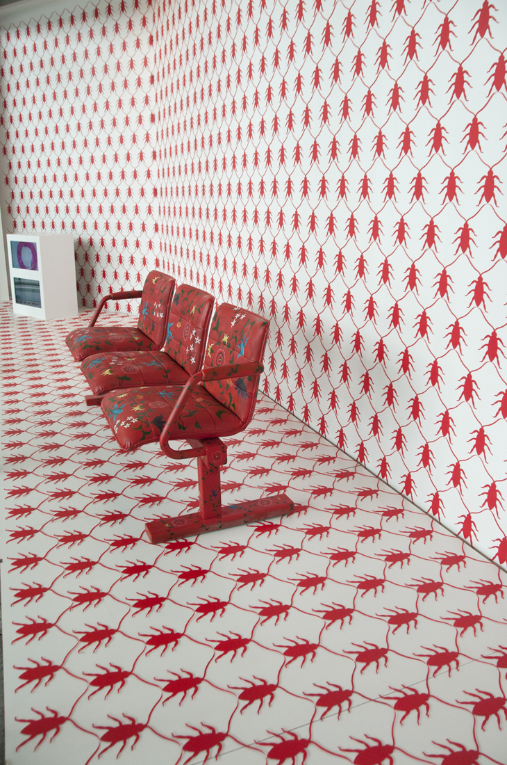
Since 2002, one of the most enduring themes in Qayyum’s work has been the cockroach motif. The symbolism of the cockroach – a hardy insect that has long adapted to human life – is one that Qayyum uses because it elicits fear and has often been used as a metaphor for immigrants and those considered as outsiders.[4] In her 2011 work “Incubate” depicts a series of small paintings of cockroaches encased in Lucite (acrylic). In the 2013 work “A Holding Pattern”, installed at Toronto’s Pearson International Airport, the cockroach pattern features prominently throughout the backdrop and furniture of the work and is made of painted pieces of acrylic. These pieces are meticulously arranged in a grid pattern that mimics the wood lattice room dividers commonly found in Islamic architecture. The installation references the airport transit terminology for continuous routing loops when planes are unable to land, which serves as an apt metaphor for the various socio-political (often life or death) conundrums faced by refugees today.[5]


01-A Holding Pattern detail (1)
Tazeen Qayyum. A Holding Pattern. Site-specific, mixed media installation
at the Toronto Pearson Airport, 2013. Courtesy of the artist.

This repetitive patterning common in her cockroach themed work has evolved and informed her performance work. For example, in her recent performances such as “We Do not Know Who We Are Where We Go” (2012 and 2014-15), Qayyum centers herself on the drawing surface and begins to write in her native Urdu language using Perso-Arabic script in concentric circles. The repetitive, trance-like process of creating these works can span several hours. For Qayyum, the process to create these works allows the audiences of the performance to see how her body fully becomes the instrument, melded with the paintbrush, to create the cursive lines of script.[6]

MIXER-Yuula B (1)
Tazeen Qayyum. We Do not Know Who We Are Where We Go-II, drawing performance, MIXER. 2014-15. Photo by Yuula Benivolski. Courtesy of the artist.

“I am confident to say that I have always prioritized my home and being a mother over my professional life,” reflects Qayyum. This has often meant passing on opportunities that may have propelled her into the limelight, however, this has not lessened the potency of Qayyum’s artistic output. Instead, her work continues to be driven by “what my narrative is, what is it that I want to investigate or say, what has moved me enough that I need to express my feelings, and then comes the ‘how.’”[7]

Qayyum’s work continues to push the limits of modern miniature painting. Her latest project, a series of multidisciplinary works called “Cover The Same Ground” (2020—), has been “created as worksheets of learning to draw a dead cockroach, breaking it down as fictional letters and language.”[8] Here, Qayyum continues to evaluate and piece together visual imagery to challenge the conceptions long shaped by colonialism and white supremacy in the imagining of the ‘Other’. Indeed, the ability to address the misuse of knowledge and its translation “into acts of bigotry and brutality through misrepresentations of socio-political and religious ideologies” features prominently in Qayyum’s art.”[9] In her work, Tazeen Qayyum brings these issues to the forefront using and expanding the established vocabulary of traditional miniature painting.  “Fear is no longer a mute condition” Qayyum points out, “I believe we are infinitely connected through thoughts, words, and actions, and I want my work to convey that as well.”[10]

To see more of Tazeen Qayyum’s artwork and future projects, visit www.tazeenqayyum.com or her Instagram @tazeenqayyum.

Nadia Kurd (she/her) is an art historian and curator based in Amiskwacîwâskahikan  (Edmonton, Alberta). Her work can be found on http://www.nadiakurd.com


[1] Tazeen Qayyum, interview by author, Edmonton, AB, May 16, 2020.

[2] Jonathan Bloom and Shelia Blair, Islamic Arts (New York: Phaidon Press Inc. 2006), 220.

[3] Louis Werner, “Reinventing the Miniature Painting”, (accessed May 20,2020).

https://archive.aramcoworld.com/issue/200904/reinventing.the.miniature.painting.htm

[4] Leah Sandals, “Into the Deep”, Canadian Art, https://canadianart.ca/features/into-the-deep/ (accessed May 20,2020).

[5] Ibid.

[6] CBC Arts, “Why Tazeen Qayyum is Willing to Suffer Joint Pain for Her Art” https://www.youtube.com/watch?v=cPUeQ4XSBMU, (accessed May 20,2020).

[7] Artist interview with Author.

[8] Ibid.

[9] Ibid.

[10] Ibid.

Complicated Signs: Marianne Nicolson in Transits and Returns

Transits_Returns_10_Nicholson copy
Installation view of Marianne Nicolson, Oh, How I Long for Home, 2016, neon, SFU Art Collection, Gift of the Artist, 2017, in Transits and Returns, exhibition at the Vancouver Art Gallery, 2019–20, Photo: Maegan Hill-Carroll, Vancouver Art Gallery.

Transits and Returns

Vancouver Art Gallery

September 26, 2019-February 23, 2020

By Ada Dragomir

As I sit down to write these words, I feel a kind of sadness that is hard to articulate. I miss my grandmother’s steady teasing, her unending superstitious habits, her proverbs and expressions which—when translated into this jagged, dagger-for-smiles language—shrivel on my tongue, making sense to no-one. I missed the instructions for how to be a Romani woman, forfeited ancestral knowledge on right relationship, my embodied cultural teachings traded in for a citizenship card. As I ride the Vancouver Art Gallery escalator up to ​Transits And Returns,​ I can’t help but bring the other places I have been with me: the port blockades in support of Wet’suwet’en sovereignty, the overnight at Broadway and Cambie, the Grandview rail barricade, and the Bucharest University square where they shot into the crowd while I jingled keys on my father’s shoulders; a four-year-old in pigtails in the middle of the Christmas revolution. Sometimes, all of these places are really the same place, and my settlerness—my dislocation—is bound up within the greater Gordian knot of global capitalism and the colonial state, connected to the dislocation of the Wet’suwet’en, the ​Kwakw​a​k​a​’wakw​, and the Kanyen’kehà:ka. As I come into the whiteness of the gallery, I am tired, oscillating between brazen hope and exhausted collapse, but, under it all, ​Oh, How I Long for Home​.

Transits and Returns presents the polyphonic work of 21 Indigenous artists thematically contextualized by movement, territory, kinship, and representation. Curated by 5 distinct voices—Tarah Hogue, Sarah Biscarra Dilley, Freja Carmichael, Léuli Eshraghi, and Lana Lopesi—the exhibition deftly bridges distinct Indigenous contexts with global experiences. If Transits and Returns aims to represent the complexity and multiplicity of Indigenous experience within the framework of rootedness and mobility, then Marianne Nicolson’s neon work, ​Oh, How I Long For Home,​ functions as a visceral and cerebral reminder that language, land, and home are the quiet and persistent spaces of resistance. The work speaks to generative refusal and the intricate negotiations—and frequent collapses—between past and present, here and not here, self and not-self. If ​Transits and Returns​ is about the discursive formation of Indigeneity in the ‘entre’ space of the Pacific, then Nicolson’s sculptural and linguistic sign is a hand that points in many directions simultaneously, making it easier and more difficult for us to find our way home.

For, if we truly desire justice beyond decolonial optics and performative solidarity, we must accept that the street signs and google maps, compasses and sextants, atlases, and star charts—though seemingly solid and incontrovertible—only function to set us further adrift.

For, if we truly desire justice beyond decolonial optics and performative solidarity, we must accept that the street signs and google maps, compasses and sextants, atlases, and star charts—though seemingly solid and incontrovertible—only function to set us further adrift. Nicolson’s neon reminds me of a conversation between UBC History Professor Coll Thrush, and Metis-Cree community planner and filmmaker Kamala Todd, in which they discuss our responsibility to place. Place has its own ancient laws, protocols, and cosmologies. They invite us—the uninvited guests—to sit in our disorientedness and to accept being off-balance and unsure. They talk about making space for paradox in order that we may find our way home.

Under the hot glow of a red neon sign, tucked away inside a grey offset room, I can feel the uncomfortable swelling in my chest that tells me I may cry. I breathe deeply, stare at the glowing words that are both familiar and unrecognizable, and ground myself again. Marianne Nicolson’s work makes me hot under the collar, forces my face towards the sun, and makes me think—confronted by my own lack of understanding. It brings to mind the teeming connections between the many frontlines at stake in the struggle for Indigenous sovereignty, territory, and representation both within and beyond the walls of the Vancouver Art Gallery. Working formally with text, electrons, and light, and in the long history of neon works from Kosuth, to Flavin, to Nauman and Emin, Nicolson’s ​Oh, How I Long for Home​ immediately invokes the complex experiences of urban Indigenous people. Neon, once ubiquitous in the urban post-war consumerist boom—think Fred Herzog’s 1959 ​Granville/Robson​—now has a double meaning, standing in symbolically for the “seedy underbelly” of the metropolitan core, the inner-city slums, the Downtown Eastside, a dead man in a shopping cart. A week and a half ago, I saw the last remnants of that neon explosion near Main and Hastings, walking with hundreds of people for the 29th annual Memorial March for Murdered and Missing Indigenous Girls, Women and 2-Spirit folks. ​Oh, How I Long for Home​ makes unsettling formal connections between the urban realities that displacement causes, and like the Memorial March itself, speaks to the forced movements to and from territory, towards and away from kinship ties, in the complex web of people endeavouring to survive colonial legacies, greeting the ordinary daily sunrise as best they can.

Nicolson’s work participates in what Indigenous scholar Audra Simpson and writer, scholar, and artist Leanne Betasamosake Simpson have termed generative refusal—refusal of the terms and conditions imposed on Indigenous subjects by the settler state, refusal of the neoliberal and colonial politic of recognition, refusal of the voyeuristic, fetishistic ethnographic gaze, and in many cases, refusal to centre settlerness at all[1]

According to the exhibition essay, the neon work “presents a phrase in ​Kwak’wala​, ‘​Wa’lasan xwalsa kan ne’kakwe,​’ which translates to the work’s English title,” while also sharing linguistic roots with ​Kwak’wala​ notions of returning home, and the dawn, or sunrise.

Transits_Returns_07-1
Installation view of Marianne Nicolson, Oh, How I Long for Home, 2016, neon, SFU Art Collection, Gift of the Artist, 2017, in Transits and Returns, exhibition at the Vancouver Art Gallery, 2019–20, Photo: Maegan Hill-Carroll, Vancouver Art Gallery.

Despite the act of translation, ​Oh, How I Long for Home​ intervenes as the sign of generative refusal for many gallery-goers as it denies us anything but an approximation of meaning, a jagged translation which misses entire worlds of embodied understanding, a symbol for an uncertain kind of belonging. Language—which contains entire universes of interrelationship, mental schemas, and cultural concepts, is an active site of resistance—another front-line for Indigenous resurgence. Alongside the linguistic implications of Nicolson’s work exist deeply political ones. The ​Kwak’wala​ language on the walls of the Vancouver Art Gallery, which until 1983 was the Vancouver Law Court, is a deeply meaningful act of ​Kwakw​a​k​a​’wakw​ visual sovereignty. But as I become more engaged in direct action and more politicized about Indigenous laws and titles, I would contend that visual sovereignty is not enough. Reserves are not enough, status is not enough, representation is not enough, reconciliation is not enough.

Neon words are only the beginning.

Home is invoked by Marianne Nicolson’s work in conceptual and embodied ways. From the fierce false heat of neon light, viewers must walk back and forth across the expanse of the grey room in order to access the work’s translated meaning. Placed opposite Bracken Hanuse Corlett’s Qvùtix, an animated creation myth displayed on a button blanket, ​Oh, How I Long for Home​ makes aggregate, non-stationary claims about what home actually is, and what it means to return home as an Indigenous person. Within the confines of the gallery space, home is an ideological and conceptual invocation, but to anyone who doesn’t currently live under a rock, Indigenous homeland in BC is a highly contested and deeply physical space, subject to colonial encroachment, capitalist greed, settler laws, and convenient “justice.” Returning home to live in one’s territories is a site of intricate personal, familial, and political negotiation for many Indigenous peoples living on the largely unceded lands of this province. It is no coincidence then, as Nicolson pines after home in ​Oh, How I Long for Home​, Indigenous youth across unceded British Columbia are demanding nation-to-nation dialogue, and above all, Indigenous reoccupation of traditional territories, that is, land back.

As I stare up into the face of this neon sun, I am reminded of another nuance; “​Transits​” can be read as movement—the journey of people, goods, ideas, and cultures—but also implies the passage of celestial bodies across each other’s planetary faces; the shadow of Europa traversing the face of Saturn, the glow of our overcast sunrise crossing Sydney’s round face as we pack up the last of the cold coffee, watched closely by VPD officers. ​Oh, How I Long for Home​ addresses the complexity of Indigenous pasts, presents, and futures in subtle and visceral ways, simultaneously invoking the contested spaces of land, language, and home but managing to dislodge us and disorient us from our familiar and flawed understandings.

Oh, How I Long for Home ​is a complicated sign, pointing simultaneously to our head, our heart, and our gut, asking us to sit in the strangeness of each other’s glow just a little while longer.

[1] Audra Simpson, Mohawk Mohawk Interruptus: Political Life Across the Borders of Settler States, 2014, Duke University Press

Leanne Betasamosake-Simpson, As We Have Always Done: Indigenous Freedom through Radical Resistance, 2017, University of Minnesota Press.


Gio Swaby: She Used to be Scared of Hair Comb

fullsizeoutput_305
She Used to Be Scared of Hair Comb 1. 51cm x 71cm each. Fabric and Thread on Canvas. 2017.

By Gio Swaby

At the core of my practice is the desire to reimagine; taking something that once was and giving it new life. This is true for both physical objects and concepts. My work revolves around an exploration of identity, more specifically, the intersections of Blackness and womanhood. I am interested in the ways in which this physical identity can serve as a positive force of connection and closeness, while also examining its imposed relationship to otherness. Generally, my work begins with the development of a concept and from this point, I choose media most suitable to represent my ideas. In this way, I’ve constructed a practice that is interdisciplinary by nature. 

fullsizeoutput_304
Going Out Clothes 1. 79cm x 109cm each. Fabric and Thread on Canvas, Lace. 2018

While studying at the College of The Bahamas, I established a strong background in traditional forms of art-making. In my time at Emily Carr University, I explored forms of digital media primarily by way of video installations, performance, and filmmaking. Since my time after my BFA, I have intensely developed my textile practice, focusing primarily on portraiture as an exploration of the intersections of Blackness and womanhood and how they relate to identity.  I have experimented across several disciplines to form a current practice that encompasses fibre art, performance, and mixed media installation. 

fullsizeoutput_308
She Used to Be Scared of Hair Comb 3. 51cm x 71cm. Fabric and Thread on Canvas. 2017.

She Used to Be Scared of Hair Comb (1-3 of 10) is an example of my fibre-based practice and explores my primary themes of interest. This series demonstrates a process of detaching long-standing stigmas associated with Black hair and hosting a celebration of beauty in its place. This series is a nod of appreciation to Black women everywhere that have resisted the consistently reinforced narrative that Blackness has no relationship to beauty. As a whole, my fibre-based works recontextualize textiles outside of the negative connotations often connected to domesticity and instead bow in admiration of the awesomeness of womanhood. 

fullsizeoutput_30e
Study of Self 3. 28cm x 36cm. Fabric and Thread on Canvas. 2020.

Artists such as Ebony Patterson and Kehinde Wiley influence my visual practice in their unapologetic and dynamic representation of Blackness and Black culture. I take inspiration from bell hooks’ “Talking Back: Thinking Feminist, Thinking Black” and the ways in which she dissects the relationship between oppressed and oppressor. My ambition is that my work can reflect the strength of a Patterson or Wiley while remaining accessible to its intended audience in the same way that hooks has achieved. I hope to further the visibility of Blackness in art and academia and to continue to build upon the important works of influential thinkers and creators.

Each piece I create continues to build upon an integral aspect of my practice: to contribute to the visibility of Blackness in the art world. At many points in our lives, Black women can live within a paradox of hypervisibility and yet still not feeling truly seen. I want my work to function as a love letter of sorts to Black women, to create space for us not only to be represented but to be celebrated.

Socially Distant but Still United: Art in the time of COVID-19

By Adi Berardini

When I first posted a call for submissions for immunosuppressed artists and artists affected by COVID-19 cancellations I had no idea that we would have such a strong response—we had a large number of submissions and it was shared over 150 times. I spent hours getting back to artists who are affected by the pandemic; hearing many stories from both immunocompromised artists, artists who had faced closures, and students who had their final grad exhibitions cancelled. Although COVID-19 has brought upon a sense of collective trauma, artists with pre-existing conditions that put them at risk should be centered in the discussion. Through the call for submissions, I was able to connect with some of the artists who are also working as disability activists, fighting for their rights and accommodations that should have long been addressed by art institutions and the broader society long before this pandemic hit.

Launching this call for submissions re-affirmed what I already knew— that the community behind this small publication is in fact very large and interconnected. The following are some artist highlights from our social media call. The posts were curated around certain themes such as invisibility and chronic illness, memory and dreaming, land and the environment, the domestic and interiority, and biology and its relationship to art. You can view all of the features on the Femme Art Review Instagram under the stories highlight “Social Solidarity” and by following the hashtag #caringisnotcancelled and #sociallydistantbutstillunited.

CATlamora
Cat Lamora. Mok yok tang, We Bathe Here installation shot. The Margin of Eras gallery. 2019. Image Courtesy of the artist.

Cat Lamora

Cat Lamora @catlamora is a Toronto-based artist who creates large-scale installations with paper. “We Bathe Here” is an immersive paper installation by the artist that explores themes of connection within a shared and very vulnerable space—the Korean bath house, or mok yok tang, which translates to “bathing pools.” Traditionally, towns became named after the bodies of water flowing through them and to know the names of the bathhouses would be to get a glimpse of the town itself. The installation aims to interpret the transition where a long-used space becomes a physical, emotional, and cultural reflection of its people and how these spaces also influence the internal strata of experiences.

quarantine
Kimberly Edgar, Quarantine. 2020. Courtesy of the Artist.

Kimberly Edgar

Kimberly Edgar @deadbirdparty is an artist, cartoonist, illustrator, and designer living in the subarctic town of Dawson City, Yukon. Kim is chronically ill and uses comics to reflect on their experiences of both the medical system and the ennui that comes with being sick with no end. Edgar’s work transports the viewer to enchanted forests with mushrooms and flora and fauna. They explore the experience of bodily illness in comparison to the experience of climate change and how it impacts the land (which is also a body). Their works have been nominated multiple times for Best Comic with the Broken Pencil Zine Award, and in 2019 they won the award for their comic The Purpose.

9_Zdanovic_Nina_Turkish Coffee Divination
Nina Zdanovic, The Kitchen. Oil on Paper. Image courtesy of the artist.

Nina Zdanovic 

Nina Zdanovic @allaboutninka is a painter from Vilinus Lithuania living in Tokyo. As if referencing distant memories, in her paintings she refers to situations that have happened to her, places that she has visited, or people that she has met. Real stories often merge with similar memories and the emotions she associates with them. Most of her paintings are like a snapshot of a lucid dream: some things are real, some things are not, and it’s not possible anymore to tell them apart.

KatCope_4
Kat Cope. Onward March.

Kat Cope

Kat Cope’s @kat_cope_artist project titled, “Onward March,” is a sculptural installation comprised of a series of suits and fragmented pieces of armor made from paper.  They remain feminine in nature to contrast with armor, which is commonly perceived as masculine, despite historical women warriors. It is a documentation of how we build our own armor in the face of challenges through perseverance. Describing her process, Cope says, “Paper, like skin, is vulnerable to the materials and elements that assault it; yet, paper is an astonishingly resilient material. Sheets of paper can be made incredibly strong[…]While in most cases we as humans do not develop a thicker skin, both time and experience shapes us and we learn when, and where, to protect ourselves from harm both emotional and physical.” Starting this fall, she will be pursuing her PhD at Burren College of Art in Ballyvaughn, Ireland.

Bedrock (1)
Em Somoskey. Bedrock’ (84”x96”). Mixed Media on Canvas. 2020.

Emily Somoskey

Emily Somoskey @emsomoskey gives form to the complexity, instability, and enigmatic nature of our lived experiences. Through these large-scale, mixed media paintings, she explores the simultaneity between the actual and the psychological, the material and the immaterial, the visible and that which lies beyond sight. Domestic spaces are largely the carrier for this ambition, which offers multi-sensory and ever-changing material that the paintings build upon. Digital collage fragments and painted shards might reference a tiled floor, a stove-top burner, or the edge of a piece of furniture, but they also point to readings that move beyond the domestic. The complex tension of their visual density calls for contemplation; asking the viewer to slow down in order to navigate, discover and dwell within them.

femmeartreview--1587611774330
Isadora Vincent. Installation shot, Michigan State University. 2020.

Isadora Vincent

As part of her BFA exhibit at Michigan State University, Isadora Vincent @isadoravincent addresses the altered way she views the relationship between her body and her mind after she had to face her irrational fear of needles, foreign objects, and substances invading her strange cellular interior. The processes she uses to generate painting and sculpture initiates a rediscovery and connection. She investigates the complexity of the human body, specifically with feelings of pain, discomfort, and anxiety around the unknown.

Dana_Kearley_Relief_2019
Dana Kearley. Relief, 2019. Image Courtesy of the artist.

Dana Kearley

Dana Kearley  @danakearley is a multidisciplinary artist, illustrator, and jewellery designer on the unceded territory belonging to the Musqueam, Squamish and Tsleil-Waututh First Nations. Kearley depicts powerful figures among other-worldly landscapes with a digital airbrushed aesthetic. Her work is inherently autobiographical, dealing predominantly with themes of chronic invisible illnesses, disability, mental health, and tenderness. On COVID-19, Dana states, “I kindly ask abled folks to please remember that you still have an able body while in quarantine, and that a quarantined lifestyle is normal for many of us. It is VERY different being chronically ill and disabled during this time. Many of us are merely surviving…It makes me sad that abled folks who have recently been laid off due to covid are getting much more compensation for their lob loss than myself and other disabled folks ever will. Itʼs not that they donʼt deserve it, but why are people with disabilities still being paid less? Ableism! It is very, very hard to sit with. It hurts. I donʼt share my experiences for fun. I share them as part of my activism, to raise awareness around endometriosis and for disability visibility.”

image2 (1)
Madeline Walker, studio shot. 2020. Courtesy of the artist.

Madeline Walker

Living with an invisible illness has informed the majority of @madelinewalkerart‘s work, which is a combination of painting, sculpture, and digital fabrication. Using a range of mold-making and casting techniques, her sculptures and installations are commonly assembled out of cell-like parts that emerge as a visualization of various mental states, encouraging closer examination of what we thought we knew to be true.  Often coloured white, faint candy pink and blue, the molds resemble that of honeycomb or even bubble wrap packaging, merging natural structures with the artificial. Playful yet architectural landscapes of thought patterns and mind maps emerge in her recent series, Sensory Landscapes /Mind Maps 1. Forms, colors, textures, and everyday objects are re-contextualized as a form of re-writing and storytelling about unseen disability.

ProductsOfNatureInBloom (1)
Em Minyard Oppman. Products of Nature in Bloom. Supreme Court ruling Association for Molecular Pathology v. Myriad Genetics, Inc. screen printed on bacterial culture growth medium cast in a petri dish for hosting bacterial colonies, creating a living document. 2019.

Em Minyard Oppman

Em Minyard Oppman @emminyard_ is an interdisciplinary artist and scientist from New Orleans working in sculpture and genetic research.  They were recently part of the 0.1% exhibition at NAVEL Gallery in Los Angeles in collaboration with UCLA’s Institute for Society and Genetics, and EXPO Chicago. Oppman earned their BFA from The School of the Art Institute of Chicago with an emphasis in Art & Technology and Sculpture.

On their practice they state, “mixing lab protocol with sculpture and performance, I enjoy subverting systems of power and control by working within them to expose their depravity. My lab work focuses on the intersection of biotechnology and oppression.” Drawing upon their experiences with the medical industrial complex, they break down the alienation of the white coat by performing within it. Currently,  they are patenting mutations of their own genome, challenging SCOTUS’ 2013 decision in the landmark case that ruled for-profit corporations can no longer identify and patent isolated human genes. Having identified a loophole in the ruling, they are patenting mutations of their own genome to educate the public on issues of bioethics and prove that if they can do it, large corporations undoubtedly still can.  Following lab protocols including molecular cloning while collaborating with patent attorneys, this project is a conceptual exploration of the American patent system, as the artist navigates legal labyrinths and distributes NDAs. Minyard Oppman explains that “this work is about ending the monopolization of human genes and the further exploitation of sick people.”

Alvarez_Tania_Anywhere But Here
Tania Alvarez. Image Capture. Oil, Acrylic and Graphite on Canvas. 2019.

Tania Alvarez

Artist Tania Alvarez @taniaalvarezart paints in the same way that she recalls events in real time: Objects, lines, and figures may appear and disappear as she remembers them, but the process is left behind like a roadmap for the viewer. Regarding her practice, Alvarez says “Being diagnosed with a chronic illness, I have become increasingly concerned with how my own story will be remembered. While every day it becomes easier and faster to record our story in the digital world, it can just as easily become diluted and two-dimensional. The human experience is layered and full of nuance and mistakes.  My paintings aim to preserve the raw experience and tell a more complicated story.”

emilysara12345-1584544097943
Emily Sara. Image courtesy of the artist.

Emily Sara 

 Emily Sara @emilysara12345 is a disabled, interdisciplinary artist, designer, and disability rights advocate working within the language of advertising and animation to discuss the American healthcare system, pain, and the extent of social control over the disabled body. Her work mixes feminine signifiers with food, commenting on the infantilization of women with disabilities, and also how sickness affects one’s relationship to food. Emily received her undergraduate degree from Boston University in Advertising and Art History and her MFA from Cranbrook Academy of Art. She has exhibited nationally and is the recipient of grants from the Women’s Center for Creative Work in Los Angeles, and the Foundation for Inclusion Fellowship at Virginia Commonwealth University in Richmond, VA where she currently teaches in the Graphic Design Department. Emily has authored articles such as Fighting the Art World’s Ableism, first published by Hyperallergic in 2019, and is a current resident for the art criticism website The White Pube (London, England) where she utilizes the platform to highlight international disabled artists.

IMG_20200317_113207_897
Katrina Jurjans. Our Sanctuary underground (at times withdrawn). Acrylic on Canvas. Image courtesy of artist. 2019.

Katrina Jurjans

Katrina Jurjans @katrinajurjans is a visual artist creating poetic narrative heavy with symbolism— flowers embody feelings of absence and growth and rain clouds communicate intense emotion. She is interested in the power of analogies to tap into the feelings we all experience. Shifting into the surreal, the depicted scenes – intimate, often nostalgic and heavy – are anchored to this world while simultaneously departing away from it. Sometimes flesh and blood, other times ghostly outlines, the figures she paints exist between somewhere real and imagined.

IMG_7471
Mimi Butlin. Image Courtesy of artist. 2020.

Mimi Butlin

Mimi Butlin is the artist and creator of @cantgoout_imsick. Often using pop culture references, Butlin makes art to amplify the experiences of many sick and disabled womxn, making those who are chronically ill and disabled feel seen. She also aims to highlight medical trauma, and inaccessibility, and to break down disability stereotypes, provoking conversation around the many issues faced in a world not built for sick and disabled people.

Untitled Frosting
Amira Brown. Untitled (frosting). Image Courtesy of the artist. 2020.

Amira Brown 

Amira Brown @amirahb_art is an interdisciplinary artist based in New Haven, Connecticut. Currently experimenting with the limits and variations of subjects in paintings, she often uses random chance as the starting point for her series of work. Her work at the moment focuses on personal meaning and the obscuring of such through red herrings, whimsical aesthetics and deconstructing the picture plane.

These are just some highlights! To view the rest of the social media features, check out the Femme Art Review Instagram under the stories highlight “Social Solidarity” and by following the hashtags #caringisnotcancelled and #sociallydistantbutstillunited. Thank you again to all the artists who submitted their work.