Impenetrable intimacies: the body as a fever dream

the body as a fever dream, 2020. Installation view. Work by Eija Loponen-Stephenson, Sheri Osden Nault, and B Wijshijer in view. Photo credit: Roya DelSol. Courtesy of Xpace Cultural Centre.

the body as a fever dream

Xpace Cultural Centre

October 9 – November 7, 2020

Séamus Gallagher, Eija Loponen-Stephenson, Sheri Osden Nault, Camille Rojas, Lauren Runions, and B Wijshijer

Curated by Dallas Fellini

By Dana Snow

The back of my head rests at a right angle on shutters made of composite wood pulp, craning at my laptop screen—I have forgotten about good posture. Trapezius muscles in my neck hold the tension of overdue bills and the strain of a heavy grocery load. The sharpness in my tailbone presses into my partner’s firm mattress. My hamstrings are taut after a morning run in old sneakers. In the privacy of the bedroom, my body belongs to me, supporting and warming the person asleep next to me. I am fully present, existing on my own terms. I am safe from consumption.

The body as a fever dream teeters between thresholds of the corporal, constricting and constructing form. Spectral absences refuse the optical cannibalism lurking around every sightline in the gallery space. I have seen many exhibitions on the Body — in its academicized capital B — it has become synonymous with an essential identity, co-opted most frequently by a cis-white feminist framework.¹ The body as a fever dream works outside of this history, centring the body as an opaque form; one that honours trans experience. Using elements of absence, refusal and opacity, the exhibition refigures the body as something that exists in the slash between either/or, granting self-governance to a form that has historically been framed under the cisgender gaze.

Séamus Gallagher, THINKING OF YOU THINKING OF ME. Video. 2019. Photo credit: Roya DelSol. Courtesy of Xpace Cultural Centre.

Scarlet LCD screen emissions beckon me into the gallery—I think of Sara Cwynar’s Red Film first. An examination of ideal cosmetic femininity under late-stage capitalism, Red Film’s didactic lines have stuck with me the most: “Remember that dull scanners and digital cameras have problems with highly saturated reds.” Artist Séamus Gallagher plays with these “problems” in THINKING OF YOU, THINKING OF ME. After an opening close up of artificial flowers printed on foam core, the camera cuts to ersatz velvet red shower curtains in the middle ground. Gallagher emerges as their drag persona, Sara Tonin, dripping in ruby sequins. Her Oz-worthy strapless dress blows out the focus on the torso of her performer, focusing the viewer’s attention on her paper maquillage. Under her mask, she— or perhaps Gallagher—speaks to biological “cheap imitations” in animal behaviour. Sara Tonin is a construction of mimetic lust. She moves just beyond reach, a technicality away from tangibility. “I am thinking of you, thinking of me. Watching myself the way you watch me.” In the wash of reds, I can’t tear my eyes away from her face, her décolletage. Gallagher’s use of red is a formal refusal to be completely captured as an object of desire. It’s a performed understanding of the freedom afforded by elusiveness — a refusal that grants breathing room. I think about my own red slip, a silky garment that lays in a whisper against my skin. A reminder of sensuality against exposed flesh that stretches over my bones and often feels like it does not belong to me, especially when it is on view. Wearing the garment becomes a literal exposure therapy. I think it is my form of a cheap imitation, that I am playing a vision of a woman that I will never be. But it also means that I do not have to truly reveal myself, I remain unwounded through performance. I re-watch THINKING OF YOU, THINKING OF ME hoping that I will catch a glimpse of Gallagher revealing an aspect of themself, something that will point me to the person behind the performance. I am unable to find anything.

Eija Loponen-Stephenson, Net Interface. Forest-green privacy netting, button thread, brass grommets. 2019. Photo Credit: Roya DelSol. Courtesy of Xpace Cultural Centre.

Eija Loponen-Stephenson’s Net Interface leaks into my space before I can tear myself away from Sara Tonin. A wheat-pasted image of a construction shroud veils while Sara bares her collarbones. As I wander over to the installation, I think that it might be out of place, until I see the four drooping gloves protruding like weeds from the netting. I feel like I am intruding on this work, like a voyeur unable to access their subject. Within the folds that reach the floor, I find a knuckly plaster mass. Sheri Osden Nault’s Mimic, Lake Ontario offers relief, an assurance that my own body is not implicated to fill the vacant gaps in the work.

The two installation pieces lap at each other’s edges in the gallery space. They contain complimentary absences— while the site-specific images of Net Interface sever a body into limbs, Mimic, Lake Ontario materializes the body as a larger contextual whole in the space. As I walk around gently heaped piles of sand, I imagine the animate plaster peeking through to have spindly roots, a nearly neural network of connection between the islands in the gallery. The piles lead me to Hold, a sculptural work from Osden Nault using the same technique of cast plaster fingers inside a burrowed-in log. Corroded by insect trails, the work centers the embedded remnants of bodies reliant on one another. I am looking at the intersection between the human artist and the movements of insects as artists in their own right, one tracing another’s presence. I am reminded that I am not the sole being in the gallery space. Underneath my feet and poured concrete flooring there is soil, microbes, water. I am reminded of the mask I am wearing in the gallery to keep out virulence, and the open wound in my hand the sanitizer sears into upon entry—we are all embroiled together. In the unease, I recognize the intimacies of interconnection.

Sheri Osden Nault, Hold. Log, plaster, acrylic medium, epoxy resin. 2017. Photo credit: Roya DelSol
Sheri Osden Nault, Sovereign Bodies 01. Found wood, human hair, epoxy, nylon rope.
2018. Photo Credit: Roya DelSol. Courtesy of Xpace Cultural Centre.

Sovereign Bodies 01 hangs within the sightline of Hold, the boughed found wood and human hair evoke a closed eye with lashes looking over their fleshy parts. Osden Nault’s works contain what feminist scholar Donna Haraway would call a “becoming-with…  the cat’s cradle games in which those who are to be in the world are constituted in intra- and interaction.”² The independent works become an involved landscape. If Net Interface asks you to fill its voids, Hold, Mimic, Lake Ontario and Sovereign Body 01 interpellate the viewer’s body into their becoming. In their use of abstraction and union with the non-human, Hold and Mimic, Lake Ontario deny a singular corpus, allowing a horizontal relationship to the other bodies of the landscape (including the viewer’s) to emerge. I cannot distance myself from the objects as a singular viewer to gaze at the landscape the works create. I can only become a subject with an impact in their world.

B Wijshijer, How to Edit Your Selfies. Video. 2019. Photo credit: Roya DelSol. Courtesy of Xpace Cultural Centre.

B Wijshijer’s How to Edit Your Selfies flashes west of Hold, jarring the world it has built for me. The artist sifts through filters on FaceApp, a popular application used to swap genders and ages, predominantly for social media posts. After each filter a screenshot is taken, moving Wijshijer further and further away from their origin point. Over time, the face of the artist becomes exponentially more bizarre, unrecognizable by mid-film and at the end, reminiscent of Francis Bacon’s suffering figures. Wijshijer’s face is not absorbed by the algorithm, but defiant to the cis, neoliberal “beautiful” versions of the self the app was created to produce. In their exhibition essay, curator Dallas Fellini describes Wijshijer’s transformations as “monstrous.” As I embrace my own femme identity, monstrousity is somewhere I feel most comfortable. Tracing the scholarship of Judith Butler, the monstrous is “a way of writing ourselves out of the ‘bind’ of gender binaries, heteronormative desires and traditional forms of kinship.”³ Wijshijer has written themself out of the teleological nature of cis beauty the app promises to deliver, and into a cyborgian realm of possibility. How to Edit Your Selfies feels like a finale to Gallagher’s THINKING OF ME, THINKING OF YOU, a performance of data mined mimicry stretched beyond recognition.  A mutated, distorted face is one that has agency over its aesthetic co-optation, one that cannot be easily digested — it is what I would call a “power move.”

Quartet with “Net Interface” and “Mimic, Lake Ontario”, Performed by Camille Rojas and Lauren Runions. Work by Sheri Osden Nault and Eija Lopponen-Stephenson. Photo credit: Philip Leonard Ocampo. Courtesy of Xpace Cultural Centre.

             Quartet with “Net Interface” and “Mimic, Lake Ontario” punctuates the exhibition in its notable absence of action. The only ephemera left from the performance between Camille Rojas and Lauren Runions are fingers scraped through the sands of Mimic, Lake Ontario. The atemporal aspect of the performance is a spectre in the gallery, stretching from far before I arrived when the act took place, and realized in a video work I pulled up from the comfort of my own home. I could describe the curious movements made by Rojas and Runions, inhabitants of the work and the space before I, or any other viewer for that matter, saw the work. I could speak to their loving cradling of Mimic, Lake Ontario or I could tell you about the playful insights bodies in movement bring to Net Interface. But I think the work is at its strongest in its frustrating inaccessibility. What the viewer can know in the space is that an activation took place, but until they seek it out for themselves, they cannot see through anything but its remnants. In its frustrating opacity, Quartet is whole—a completely inconsumable body of work, a haunting refusal to be present. It reminds me that as you read my words, I am not the voice that exists in your head. Or, that I am becoming another as you digest me. And I can exist as both, unburdened.

¹Louis Fermor, “The Feminine, The Grotesque and the Reclaimed,” Canadian Art, November 24, 2020. 

²Donna Haraway, When Species Meet (Minneapolis: University of Minnesota Press, 2008), 4-5

³Judith Butler, “Afterword.” In Animating Autobiography: Barbara Johnson and Mary Shelley’s Monster. (Palo Alto, California: Stanford University Press, 2014) 40.
The Shrugging Lady Emoji and Russna Kaur’s Abstractions

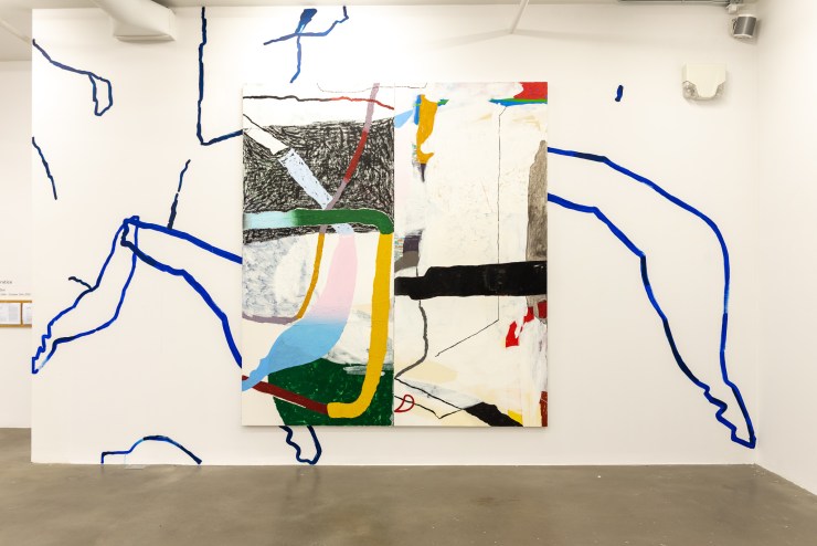
Russna Kaur, Suddenly her lips sharpened—it was splendid installation shot, the sky seems to be the only one to Notice, 2020. Burrard Arts Foundation. Photograph by Ada Dragomir.

Suddenly her lips sharpened—it was splendid

Burrard Arts Foundation

August 29, 2020 — October 10, 2020

By Ada Dragomir

The first time I saw one of Russna Kaur’s monumental paintings, Ironing, Bored, I couldn’t stop staring. Sized at 12 feet x 9 feet, occupying a quiet corner on the top floor painting gallery at Emily Carr University, it was hard to leave, difficult to walk away. It wasn’t until much later that I understood why I felt that way.

When I first saw Kaur’s work, I was an exhausted third year BFA student, equal parts overwhelmed and in awe, walking through offerings at The Show—Emily Carr University’s graduating exhibition. Her work was a welcome reprieve from an onslaught of poorly executed new media works and frenetic installations filled with broken things, clumsily glued back together. Kaur’s work moved me, held me, and invited me in because it walked a tightrope across the complex political and visual histories of abstraction and representation. Though her work is situated in the realm of the abstract, she manages the concomitant baggage with intention and grace. While the art world reckons with representation, Kaur keeps on going—making work with the practiced pragmatism of the shrugging lady emoji.

Russna Kaur, Suddenly her lips sharpened—it was splendid installation shot. They are midway between the sun and the moon, 2020. Burrard Arts Foundation. Photograph by Ada Dragomir.

That initial encounter was with a painting constructed from multiple abutting surfaces, strips of canvas, sawdust, and saturated acrylic paint. It was mimesis of absolutely nothing and an image of absolutely everything. It made sense to me and yet alluded to so many unanswerable things. My girlfriend thought it was a very ‘pretty’ painting—and her passing attraction speaks to the seduction of Kaur’s style, but all good work deserves a closer encounter, a longer breath, a deeper look. Ironing, Bored made me think of my grandmother ironing bibi’s fotă, the velvety red embroidery flattening under the weight and steam, a mostly-ash cigarette hanging from her mouth—dangerously drooping over the entire operation. I didn’t know Russna then, hadn’t heard the stories she tells about and around her paintings, hadn’t yet understood how someone manages the burden of representation, juggling what to reveal and what to conceal, forging a possible path forward for the rest of us racialized diasporic femmes, sharp as fucking tacks—especially, those of us who think carefully, skeptically, and often, about identity-based politics in art.

You see, much of 21st-century art history is filled with White men making abstract paintings. From de Kooning to Pollock, from Malevich to Yves Klein, an entire century’s worth of artists with class, gender, and most notably race privilege, have escaped the burdens of representation, marshaling abstraction into a purportedly universal language. How many White guys in modern, post-modern, or contemporary art paint consciously and representationally about the specific circumstances of Whiteness and masculinity? How readily can you name 10 White men working in abstraction historically or contemporaneously, and how readily can you name 10 racialized women doing the same? Go ahead, count them on your fingers.

If abstraction is coded as both White and male—and we can trace this back to Whiteness and masculinity situating themselves as central, normal, default, everything and everywhere—then inadvertently, the assumption falls that racialized and women artists’ purview is—or ought to be—representational.

Representation can be articulated as making mimetic work. That is, paintings and sculptures which aim to communicate likeness to life, but representation can also be inflected in order to increase political visibility, literally to see more racialized artists exhibited and collected. Abstraction, on the other hand, presupposes a stifling universality—a ‘pure’ and singular visual language, more connected to platonic ideals or some eternal spiritual principle than to the muddy meatspace we all live in. It’s messy since the politics of representation are just as dangerous as white-washed and colour blind universalisms, both in art and in life. Our political forms—and our artistic ones—need subtler inflections. In other words, why use a hatchet when a scalpel is needed? In other words, is justice for BIPOC better served by a cop with a dastār or an RCMP commissioner who thinks that systemic racism doesn’t exist?

In other words, are the politics of representation the road to liberation?

While I have serious doubts about the potency of identity politics and the real political power of representation in our current world, the fact that I’ve had exactly two instructors of colour in my six year stint in art schools (none of them women), and that a recent survey of Canadian art institutions breaks down a dismal percentage of BIPOC in executive leadership[1] all tell me that Whiteness is still very much the norm, the neutral, the abstract and amorphous center of the universe art world. Buricul Pământului.

What makes Kaur’s paintings worth the second look is that they imbricate this tension, navigating both the possibilities of the utopic and the political burdens of representation.

Russna Kaur, Suddenly her lips sharpened—it was splendid installation shot, 2020. Burrard Arts Foundation. Photograph by Ada Dragomir.

When I sit with Suddenly her lips sharpened… it was splendid, Kaur’s recent show at Burrard Art Foundation, it feels like a breath of fresh air. For an exhibition which demands so much space—a monumental almost endless picture plane crawling across 13+ canvases and occasionally the walls—Kaur offers a surprisingly subtle political inflection. Sometimes reminiscent of maps, sometimes of rich velvets or shalwar kameez, and sometimes of a secret story held in too long, Kaur’s paintings invoke her “Punjabi-ness” without essentializing it and convey her stories without performing them. There’s a lot going on within those adjacent canvases, packed with colour and line, a feast of texture and material, but there’s also a lot of space for me, and in all likelihood, space for you as well.

On display at Burrard Art Foundation from August 29th to October 10, 2020, the exhibition consists of 10 works. Ranging from the humble 4 x 6 inch blinking your eye—an energetic painterly swath of milky acrylic and thread over burgundy pastel—all the way to the enormous 192 x 108 inch They are midway between the sun and the moon, the show towers over the viewer with discordant gradations of purples and greens, pinks and lime-yellows.

Kaur’s use of colour—that jarring, clashy, raucousness—recalls walls covered with the covoare and ştergari of my childhood in Romani homes. Abstracted tree of life motifs or screaming regional floral symbols reaching across and beyond the linen they were embroidered or woven onto, jumping from one surface to the next in a cacophony of colour and texture. The world never finished, the arrangement always growing. Kaur’s paintings work similarly, modular and mutable, puzzle-like in composition and title, enormous and ever expanding. Her use of multiple surfaces—in size as well as material presence—include the traditional canvas and cradleboard panel, but also extend well into the diversity of cloth that one would find in any self-respecting fabric store or bridal boutique in South Main. Ranging from silk, muslin, and twill, to paper and found wood, the substrates are rendered with thread, cold wax, acrylic, crayon, pastel, sand, and spray paint. In parts it’s sprawling and enormous, in parts tiny and spacious; all of it is full to the brim. Suddenly her lips sharpened…is a lot.

Russna Kaur, Suddenly her lips sharpened—it was splendid installation shot, 2020. Burrard Arts Foundation. Photograph by Ada Dragomir.

It’s as if there’s just too much to pack in: too much life, too many imperfect abutting pieces in tension, too much emotion, too much colour, too much ornament. That too-much-ness exists in sharp differentiation from the not-enough-ness of Kaur’s titles. Constructed, like the work itself, from pieces—Kaur uses redacted poetry to generate titles like when the mirror, It asked for more—there is barely enough information to achieve anything but a short nod towards a hidden world of meaning.

It is this same dynamic, this too-much-ness wedged in beside a not-enough-ness, that compels me to sit with Kaur’s paintings. I do so because they make me think. I am reminded that it is a similar and simultaneous too-much-ness and not-enough-ness of which young racialized women are constantly accused. Too loud, too bright, too unprofessional, too rude, too angry, too emotional, too smart. Not subtle enough, not perfect enough, not rich enough, not enthusiastic enough, not bright enough, not White enough.

Remarkably amongst all that, Kaur’s paintings seem to be a kind of artistic manifestation of the shrugging lady emoji—and just to be clear, not the “default” yellow one. While the world wants racialized artists to wage political battles and carry around the baggage of representation, Russna Kaur choses to just do what she wants—what she has to do.

Certain elements cross the expanse of the broken-up picture plane gesturing the continuity and integrity of the whole, but there are just as many instances of imperfection, of line or shape or colour which don’t add up, popping up inverted, truncated, or somewhere where they aren’t “supposed to be,” but are so desperately needed. Imperfection is inevitable, and in Kaur’s work, it’s accepted—recognized as a necessary facet of existence—and as they say, so in art as in life. I imagine the shrugging lady emoji, too, when I think about the assumptions and associations made with such bright and profuse colour. While some of us live in a world where simplistic and essentialist cultural mores direct us to believe that vivid and loud colour equals exotic and signals happiness, others live by the adage “laugh so you don’t cry.”

Russna Kaur, Suddenly her lips sharpened—it was splendid installation shot, 2020. Burrard Arts Foundation. Photograph by Ada Dragomir.

The shrugging lady emoji is of that latter persuasion. Having exhausted her finite store of shits left to give somewhat early in life, she spends her time wedged in the fissures between culture, race, gender, and labour. The shrugging lady emoji is not so much about resignation as it is about the recognition of a cruel irony, a prosaic pragmatism—facing the way things are, accepting that shit is profoundly fucked, and figuring out a way to move on, move in, and move through.

The shrugging lady emoji is intergenerational trauma wrapped in eggplant purple embroidered with gold silk thread. She is sexualized abuse and the wounds of diaspora shimmying into teal silk with lime green and hot pink trim. She is my grandmother ironing bibi’s fotă, tired and hunched over. She is a human pyramid of tiny stooped women with kind eyes, or squat fat women with gnarled hands, or once graceful but now stiff women with tongues like freshly sharpened knives upon whose shoulders the rest of us stand. She is the person who pretends to not speak English to get a discount, who expects you to work till you drop dead and then rise from the beyond to put in just two hours more. She is far from perfect, but….

¯\_(ツ)_/¯

_________________________

Sometimes, I like to think about artworks making arguments. Not every artwork makes an overt contention, but there are almost always ideological underpinnings to the aesthetic choices we make, even if they are buried deep, instrumentalized later, completely unconscious, or intentionally concealed. Think about Alfred Loos’ essay against decorative adornment titled Ornament and Crime[2] in which he takes a moral (and extraordinarily racist) approach to the “degeneracy” and “wasted labour” of embellishment. Or Hans Holbein’s The Ambassadors filled with hidden symbols and double entendres which reflect the politically and religiously treacherous waters in which it was painted.

A particularly apposite example, in our case, is Abstract Expressionism’s collaboration with the CIA during the Cold War. Soviet Era Socialist Realism, with its idyllic, heroic and pastoral inflections, ideologically presents an image of a united proletariat or sometimes their magnanimous yet salt-of-the-earth leaders living harmoniously, sucking from the fertile bosom of Mother Russia. As someone who grew up in Eastern Europe in the long shadow of the setting Soviet sun, I assure you that’s not quite how it went. Ideologically, Abstract Expressionism was America’s answer—a modern movement dominated by individualism, capitalism, expressive creativity, freedom of emotion and mark-making, monumentality, and masculine vigor. In Rockefeller’s words, it was “free enterprise painting,” and so it remains, a movement whose works are scattered across billion-dollar bank lobbies, executive offices, and prestigious galleries throughout America.[3]

What is Kaur’s work then saying if it speaks with the embouchure of abstraction, the scale of the monumental, the colours and rhythms of Punjab? What does it say when spoken in the halted staccato of redaction? What is concealed and what is revealed? What does it say about gender, and race and representation, about how much space there is, where, when, and for whom?

Her work says you can look but you won’t be able to see, you can consume but you’ll never be sated, there is a story but told only in fragments, it’s not perfect and was never meant to be. There is space for you, but not in the center.

¯\_(ツ)_/¯

You can view the virtual exhibition tour of Suddenly her lips sharpened — it was splendid at Burrard Arts Foundation here.


[1] https://canadianart.ca/features/a-crisis-of-whiteness/

[2] Loos, Adolf, and Adolf Opel. 1998. Ornament and crime: selected essays.

[3] https://www.independent.co.uk/news/world/modern-art-was-cia-weapon-1578808.html

Celebrating the Work: Marlene Yuen at grunt gallery

Cheap! Diligent! Faithful!

Marlene Yuen

grunt gallery

September 25 — December 12th, 2020

Marlene Yuen. Cheap! Diligent! Faithful! installation shot. Image by Dennis Ha courtesy of grunt gallery.

By EA Douglas

Entering grunt gallery, I am initially struck by the kelly green and turquoise mural which occupies the entirety of the back wall. The mural is easily distinguishable as the facade of a building from Vancouver’s Chinatown, a neighbourhood a short walk from where I stand now. Simply illustrated in white and red, green and blue, the pretend storefront is a memorial to Ho Sun Hing Printers, Canada’s first Chinese-English print shop that was shuttered in 2014 after over a hundred years of business.

On the wall, a pretend awning stretches out over a faux garage door. A sign with red Chinese characters and green English font reads, “Quality Printing at Reasonable Prices.” There are painted plants in the painted window, beside a bold little placard that shouts “Colour Copies.” A nod to Marlene Yuen’s time spent in the letterpress studio creating her latest work, Ho Sun Hing Printers, is an artist book inspired by and made with blocks gleaned from the business the book takes its name from. When the established Chinatown print shop closed, there was a swoop of community interest in preserving the printing equipment that had been in use for over a century. Yuen added several woodblocks to her personal collection, on display in a glass case in the corner, and the WePress Collective, a community art space in the Downtown Eastside acquired over eight thousand characters of Chinese type which Yuen was able to borrow in her completion of Ho Sun Hing Printers.

Marlene Yuen, Ho Sun Hing Printers. Printed in collaboration with Moniker Press riso studio. Cheap! Diligent! Faithful! installation shot.Image by Dennis Ha courtesy of grunt gallery.

Yuen is a printmaker and comic artist, mediums that can be difficult to translate into physical spaces. grunt pulls it off by highlighting Yuen’s cheeky storytelling through a series of largescale comic posters, each one narrating the life and labour of a Chinese-Canadian. There’s Stewart Wong the begrudging restaurant owner, who ran Public Lunch Cafe in Olds, Alberta for nearly 30 years, Jean Lumb, the celebrated entrepreneur and activist working in Toronto’s Chinatown and John Woo, the dedicated launderer in Hamilton, Ontario. With storytelling that exists within the pictures as much as words, the linework is thick and distinct. Backgrounds of black juxtapose the simple outlines of the people featured. The overall impact is heavy, burdensome like the hours these Chinese-Canadians laboured to run their businesses. Still, emotion is conveyed easily throughout the poster boards. A frowny faced plate of bacon and eggs echoes Wong’s misery of having to wake early to run a restaurant he didn’t want. Lumb’s armfuls of children outlined in a rigid, jagged edge depict her dedication to a large, and perhaps chaotic, family. A clothesline of various outfits, including judicial robes and football jerseys, communicates the impact that Woo’s laundry company had on his community.

Marlene Yuen. Cheap! Diligent! Faithful! installation shot. Image by Dennis Ha courtesy of grunt gallery.

Accompanying these black and white pieces on opposing walls are two cheerfully screenprinted accordion books stretched out in a display case. Here, we find the colourful biographies of Mary Ko Bong, a military mechanic and watchmaker, and Cheng Foo, a railroad worker. Leafing through the display copy of Ho Sun Hing Printers the beauty of letterpress radiates. Yuen’s artistry occurs in the composition and patterning of the images as they dance their way across the pages. Weaving between a quick history of Ho Sung Hing Co. and an interview with the last owner of the print shop, Norman Lam, the effect is ethereal while grounding. The book emits a sense of timelessness with its spellbinding pull that causes me to lose myself as I become aware of the history these pages preserve. Through the prints, the importance of these woodblocks and their specific purpose within the Chinatown community is highlighted. Slanted rows of Lanxiang Snow Chrysanthemum tea parade across a lavender page. On soft seafoam, waves of a pictorial guide to using chopsticks flow in three straight columns. Prior to the interview with Lam, we are treated to a photograph of a heavy-looking chase prepped for printing. The English text reads, “SECOND BEAUTY SALON” in reverse.

Utility is the backbone of this work. Ho Sun Hing Printers uplifts tools formerly of the everyday into art. Within the art book, the prints from these blocks are displayed as graceful facsimiles but through the translation, their importance as tools rings clear—these blocks, although beautiful, were acquired to serve and support the Chinese-Canadian community in Vancouver. When Ho Sun Hing Printers closed, due to the combined impacts of the digital age and gentrification, Chinatown lost a part of its charm.

Yuen’s work is a consistent endeavour to document the history of Chinese-Canadians, specifically their labour and dedication. Through the profiling of these business owners, she manages to capture both the sweet and the sweaty moments of a fading history. Yuen celebrates this value of industriousness, a trait that is clearly evident in her own practice. The hard work pays off—Cheap! Diligent! Faithful! is as captivating as it is informative, a true celebration.

Adrien Crossman: Fake Childhood, No Future

Adrien Crossman. Lavender Culture. digital render, 2018. Courtesy of the Artist.

By Adi Berardini

CW: Brief mention of transphobic/homophobic media tropes; discussion of LGBTQ+ suicide

When my friends had discovered that I had never seen But I’m a Cheerleader, they were appalled and assigned the film to me as queer culture homework. After watching it, I could tell why—I had never seen a feature film that distinctly depicted the experience of being femme before. The protagonist Megan is a stereotypical blonde cheerleader; however, she doesn’t realize that the Melissa Etheridge poster in her room, not being that into her boyfriend, and checking out other women, points to the fact that she is a lesbian. Although with a light-hearted approach, the film, with its campy, John-Waters-like, pink and turquoise aesthetic, depicts her condemnation to a conversion camp where she learns the ‘how-tos’ about heterosexuality and gender roles. Any attempt to brainwash Megan into straightness dramatically fails, and (spoiler alert) she falls for the dreamy rebel, Graham. It’s no surprise that the film has now become a cult classic within the LGBTQ+ community. It’s also no surprise to me that I was late to learn about this film since I didn’t fully come to terms with being queer until early adulthood, and like Megan, I think my friends picked up on my queerness first. Although not to be mixed up with confusion, it’s more like a lack of realization as a result of under-representation and erasure.

Often referencing cult-classic films such as But I’m a Cheerleader, interdisciplinary artist, educator, and curator Adrien Crossman both unpacks and reclaims the ambiguity of queer culture, in a heteronormative society that struggles to acknowledge and accept queerness. They are interested in critically analyzing how media largely depicts queerness as either “abhorrent or invisible,” with reference to what Adrienne Rich calls compulsory heterosexuality, the idea that heterosexuality is assumed and enforced by a patriarchal society.[1] Further, Crossman is interested in how the potential of queerness can provide space for exploration beyond rigid binaries and gender roles. They reference how popular childhood characters, such as SpongeBob or Furby, have queerness built into their creation or storylines but were protested by religious groups due to a sense of “moralism” and “protection” of children. As a result, these pop culture figures are often reclaimed or named by the community as signifiers of queer identity.


Crossman’s work heavily points towards queer iconography itself, whether it’s a virtual projection of a neon sign reading ‘lavender culture’ or felt pennants reading ‘Silence=Death’ reminiscent of the posters of the HIV/AIDS crisis. Just as the edited volume Lavender Culture attempts to explore, the neon sign had me thinking what I am always asking myself while doing a project like Femme Art Review—what exactly is lavender culture? The introduction to the book notes how more mainstream culture is influenced by queer culture, yet there’s a failure to name this influence due to homophobia.[2] However, Crossman is more interested in establishing a queer sensibility, or perhaps a shared frame of reference, than defining queer culture, recognizing that queer experiences are intersectional and widely differ. Although without this sense of shared understanding and reference, it can create a sense of isolation within being queer, especially when aspects of queer history remain in the background yet still influences our lives today. For example, the trauma of the 1980s/90s HIV/AIDS crisis that perpetuated, and still perpetuates, stigma towards queerness due to the homophobic media coverage and lack of government response due to conservatism. The Lavender Culture sign is digitally rendered instead a physical object in space, which speaks to the intangibility of lesbian culture often existing on the fringes of LGBTQ+ narratives.

Adrien Crossman. Queer Still Life, digital render, 2016, courtesy of the artist.

In addition, Crossman is interested in challenging the binary of the real versus artificial, or fiction and reality. They form a 3D rendered stack of queer theory books as a still life, including a Furby and a Tamagotchi, that subversively reads an Audre Lorde quote, “The master’s tools will never dismantle the master’s house.”[3]  They explore their relationship to these objects and texts, and the power structures that Lorde references in the quote, the force of the white, cis-heteronormative patriarchy that leaves little room for queer expression, particularly for racialized queer people. Crossman has a distinctly digital way of working to subvert the binary of digital and real, rendering in 3D, then casting in aluminum, then back to the digital plane, in order to transcend these binaries and fixed categories. They define these objects, such as Tamagotchis and Furbies, as “relational artifacts” that possess a sense of queer affect and intimacy.[4] The Furby symbolizes the potential for queerness since they are objects undefined by gender or race. Crossman also explores how certain technologies, like the beloved 90s toy Tamagotchi, require human care and attention as a way to exist out outside of the binary of real and fake.

There’s also a lack of representation of outwardly queer women and Non-binary/Trans characters in television and media which perpetuates this sense of isolation and erasure. There’s the obvious L-Word, or Orange is the New Black, however the lack of media representation from our own perspective haunts us with the misunderstanding of our own identities (and other people misunderstanding them, too). Tinky Winky from the Teletubbies carried a women’s handbag, potentially signalling his gayness and gender non-conformity, which was made out to be blasphemy. The original L-Word misconstrued Trans men as violent. Orange is the New Black has representation of queer and Trans women, yet in the setting of a women’s prison. How do we come to terms with queer identity when it’s not depicted at all, or if so, so inaccurately; being fetishized and sexualized, or being made out to be monstrous or criminal? The lack of queer media representations often leads to depictions that are able-bodied, cis-gender and white, which are deemed more ‘palatable’ under the male gaze and white supremacy. The erasure of queer experiences in pop culture and media ultimately contributes to the erasure of us.

Adrien Crossman. Exist, video still, 2019, courtesy of the artist.

For this reason, the words I see depicted on Adrien’s ankle tattoo of a flag reading ‘EXIST,’ and their leg tattoo spelling out ‘NO FUTURE’ in their film Exist, hit me hard. In the film, they tattoo their own ankle with a version of their artwork to address that being queer is an act of resistance in a heteronormative society, providing a new queer orientation.[5] The words of their one tattoo are in reference to the queer theory text No Future by Lee Edelman in which he challenges the archetype of the child symbolizing future and innocence, positioning the embodiment of queerness as anti-social and future-negating.[6] The self-inflicted pain of their stick and poke tattoo reflects the pain queer people experience, a pain that is often left undiscussed or brushed over. To ‘exist’ is to live under adverse conditions—it’s exhausting being labelled as resilient or strong in a world that so often deems queer as “abnormal.” The lack of the reflection of our experiences and the way that queer identity is depicted as too taboo to explicitly address in film and television, re-upholds the belief that it’s morally wrong for us to authentically exist as ourselves. This framework of thinking is so often why we internalize homophobia, it contributes to feeling ashamed to be who we are, and why we lose lives in the queer community to suicide. Countering this, the flag that reads ‘EXIST’ reaffirms that existing in a heteronormative regime is an act or resistance in itself for queer and marginalized folx. The flag signals a sense of protest, pride, and celebration, counteracting the sense of shame these harmful ideologies perpetuate. The film is a meditation that affirms that you are enough—you’re more than enough.

Adrien Crossman, Heaven is a Place on Earth install shot, 2019, photo by Polina Teif.

The title of Crossman’s 2019 exhibition Heaven is a Place on Earth at Patel Projects is not only in reference to the Belinda Carlisle song, but the Black Mirror episode, San Junipero. In this modern cult classic, the shy Yorkie, eventually meets the uninhibited Kelly, a soulmate connection that encourages her to let go. With its 1980s bisexual colour scheme, the episode details their relationship, including hookups in a beach house and convertible rides along the shoreline. Although, (another spoiler alert) the episode becomes a utopia within a broader dystopia—the couple is in a simulation that the dead can live in and the elderly can visit as part of immersive nostalgia therapy. In reality, their lives were much more plagued by hurt and pain. Trans and bi activist and scholar Julia Serano theorizes that the “bi” prefix of bisexuality is not between two genders, but of two worlds—navigating one of heterosexuality and one of queerness.[7] Although she was happily married to a man, Kelly, who is bisexual, feels the grasp of compulsory heterosexuality and never acted upon her desire for women during her lifetime. Yorkie was also never able to act on desire since she was brought up in a highly religious family. The episode uses imagined reality to create an alternate space, one that’s not confined by fear or repression, but love and connection that moves beyond gender and racial boundaries. In Heaven is a Place on Earth, Crossman references Toronto queer spots like the Henhouse bar, addressing how spaces that formed a sense of queer community are vastly disappearing at the hands of capitalism and gentrification. Crossman also subverts the rainbow ‘Cocksucker’ matchbox in But I’m a Cheerleader to the ‘Henhouse’ reflecting on how LGBTQ+ spaces often center cisgender gay men, perpetuating lesbian, bisexual and trans erasure. The necessary physical spaces also disappear, leaving little room for queer connection.

Adrien Crossman. Dystopia, neon sign, 2019, photo by Polina Teif.

All too reflective of the current moment, Crossman forms neon signs reading ‘dystopia’ and ‘utopia’ in Heaven is a Place on Earth. This touches upon utopia and queer futurity (the concept that queerness exists in a futuristic potentiality) with such reference to Cruising Utopia by José Esteban-Munoz, and how it’s necessary to form a sense of political imagination, particularly for queer people of colour.[8] The etymology of the word utopia is ou-topos or ‘no place,’ which is a void that queerness knows well—neither here nor there—but a space of infinite in-between. And with this potential ambiguity or space for liminality, endless possibilities beyond binaries emerge.

Additionally, Crossman co-runs an online publication called Off Centre with artist Luke Maddaford, which covers art exhibitions that exist outside of metropolitan city centres. In my own experience in London, Ontario, a mid-size, conservative city, my queer friends and I create small pockets of utopia in order to counter the outsider feeling of living in a city filled with frat bros and toxic masculinity (a personal dystopia). In the midst of a global pandemic and Black Lives Matter protests standing up to the injustices of a white supremacist police state, things seem rather dystopic. However, there’s an importance of having a sense of hope and collaboratively working towards a goal of a better future. An imagined place, a utopia, where everything is perfect may seem overly naïve, but demanding that queer identities are seen as valid and that our humanity is recognized should not be too much to ask.

Adrien Crossman. Utopia, neon sign, 2019, photo by Polina Teif.

But I’m a Cheerleader likely resonated with young queer people since it was written and directed by Jamie Babbit, a queer director—the fact that so many saw their experience reflected back to them is meaningful when LGBTQ+ experiences are often erased and ignored. Crossman references visual imagery, from pop culture and cult-classics, to ground a sense of unity, countering how queer identities become fragmented due to erasure both in the mainstream media and in physical space. They refuse to let queer culture fade into an un-defined background by reclaiming it through the assertion that, try as you might to erase us, we’re here and we’re queer.


[1] Rich, Adrienne (1980). “Compulsory Heterosexuality and Lesbian Existence.” Signs: Journal of Women in Culture and Society. 631–660.

[2] Ed. Jay, Karla. Lavender Culture. NYU Press. 1994.

[3]Lorde, Audre. “The Master’s Tools Will Never Dismantle the Master’s House.” 1984. Sister Outsider: Essays and Speeches. Ed. Berkeley, CA: Crossing Press. 110- 114. 2007. Print.

[4] Relational artifacts, also known as sociable robots, was coined by Sherry Turkle. Crossman speaks more to this in their artist talk as part of Art Intersections Meetup found here: https://www.youtube.com/watch?v=55PlIb5fHlY

[5] From Crossman’s description of Exist for Barbed Mag. https://barbedmagazine.com/Beyond-Measure-A-Performance-Art-Survey-in-Metro-Detroit-and-Windsor Likely in reference to Ahmed, Sara. Queer Phenomenology: Orientations, Objects, Others. Durham: Duke UP, (2006).

[6] Edelman, Lee. No Future. Duke University Press. 2004.

[7] Serano, Julia. “Bisexuality and Binaries Revisited.” 2012. http://juliaserano.blogspot.com/2012/11/bisexuality-and-binaries-revisited.html

[8] Muñoz, José Esteban. Cruising Utopia: The Then and There of Queer Futurity. New York: New York University Press, 2009.

totally ruinous/ totally ruin us: In Discussion with Kim Neudorf

Kim Neudorf. Untitled, 12 x 12 inches, oil on canvas, 2020.

Interview by Adi Berardini

Weaving dream-like, obscured imagery in neutral tones of peach, rust brown, and green, Kim Neudorf’s paintings are dense with textual reference. Although their process starts with collaged images and film stills, the imagery is blurred and abstracted with intricate brushstrokes. With a focus on fluidity and the non-linear, their paintings delve into affectual territory, referencing ‘psychic material’ and how trauma shows up in the body. As mentioned in their artist bio, Neudorf’s writing and paintings “explore themes of resilience, healing, and survival, while seeking to undo easy legibility in order to honor the daily, more complicated modes of visibility and existence.” Recently, they have connected their art with their poetry practice, also referencing poetry fragments through small-scale watercolour paintings. Neudorf speaks more about their process and exhibition totally ruinous/ totally ruin us ,currently on display at Support project space until October 17th.

Neudorf’s work has also appeared at DNA Gallery, London (ON); Paul Petro, Toronto; Franz Kaka, Toronto; Forest City Gallery, London (ON); Modern Fuel Artist-Run Centre, Kingston; Evans Contemporary Gallery, Peterborough; and Susan Hobbs Gallery, Toronto. They live and maintain a writing and studio practice in London (ON).

Kim Neudorf. totally ruinous / totally ruin us, installation, 2020.

You take an abstract approach to painting. Do you work intuitively or from a certain representational subject matter at first? Can you further explain your process?

When I work out ideas for a painting, this can begin in visual research, collage, or writing, such as poetry. I get information that is almost always a feeling or signal first. I have to work backwards; I search out more and more information that matches the signal (a colour, a visual expression of energy) and create folders and sub-folders as themes begin to emerge. Then I write about what I’ve found, and through this writing, I start to understand what the signal is about. The word intuitive does not always mean vague or mysterious. For me, it means making connections that skip a step-by-step process, so reverse engineering is necessary.

There’s a lecture by Jan Verwoert on how bodily and facial communication “has no story,” or transmits via affect; affect as transmission rather than an effect or product to be capitalized on. It makes more sense to me to create writing and artworks which use visual fragments, like body-forms rather than figures, to hold bodily and unconscious information.

In earlier paintings, I didn’t include specific symbols or visual information from my reverse-research in the work itself. When I started to do this, I could see clearer connections to my past and daily experiences. I had to make work for a long time to see what it was telling me. I started to see that the paintings create spaces/contexts for bodily and unconscious information to live, to communicate. The states in which that information is in relates very well to how painting can show shifting material space, physical states, and multiple temporalities existing together. The partially clear, rough, scribbly, half-formed material states in the paintings are deliberate. The way in which I use paint actively tries to resist a certain legibility to avoid grafting a false sense of resolution or story onto the work.

Kim Neudorf. inner sanctum, 5 x 7 inches, watercolour and acrylic on paper, 2020.

Your paintings have a sense of closer looking that’s required, almost leaning into a sense of opacity or refusal. How is your work influenced by these concepts, if at all?

The paintings and poems may seem like they are deliberately withholding information, but they give partial, unstable information the way dreams do. It’s not about deciphering a code. It’s about looking at each painting as its own context. A dream may not be at all about its content, but how it feels and the dynamics between people and things in a non-linear sequence. There are eyes, hands, bones, wings, flowers, various body parts, and also layers of energy or even tendrils or veins that link things together in the paintings. I’m asking viewers to think about how these visual elements are linked. How is something mashed together or sliced through (or slicing through) or emitting energy or interference in the paintings?

In the work there is a refusal to be or perform what it is to be “correctly” visible. Every day, bodies exist amidst public and social rules that are not designed to include them, even within spaces that advertise themselves as supposedly safe or inclusive.  In my own experience, feeling unsafe has been such a daily experience that blending in is a form of survival, which is simultaneously part of my own privilege. The body-forms in my work try to exist in a state where they are both themselves, in pieces and in process, and where they mimic their surroundings. There is no narrative or ultimate state or goal—only in allowing a continual, daily movement and transformation of form.

Kim Neudorf. totally ruinous / totally ruin us, installation, 2020.

Your recent work in the exhibition totally ruinous/ totally ruin us is connected to your writing practice, and more recently your poetry practice. How has poetry influenced your art (or vice versa?)

Recently I attended a workshop on metaphor in poetry, and I was surprised to learn how a lack of linear narrative can provoke some extremely negative reactions. I’m very new to poetry, but I’ve recently found that it is the closest form of writing to allow very personal, unprocessed information to communicate in its natural form, in a way that doesn’t force it into a normative, linear narrative. Finding a way to tell your story can be lifesaving, as every other form of communication can feel designed to violently suppress and reject that story. To not feel safe to communicate is traumatic. Information that needs to be externalized often appears in abstract or exaggerated forms, which can cause knee-jerk reactions. I want to be compassionate to that kind of externalization.

How is this body of work in totally ruinous/ totally ruin us influenced by healing and psychic material?

The inherent violence of being projected into a story that is not one’s own can embed itself within the body and create specific behaviours of self-protection. Trauma becomes embedded in my body in a way that it reconstitutes rather than rejects, like shrapnel that it grows around. The words that I associate with this are always very sharp and painful, appearing as tiny abstract fragments, which feels like the body getting rid of toxins. I started to see this reflected in my work, along with themes like disembodiment, dysphoria, gestures of contact and intimate touch, and the abstractness of emotional energy. The body-forms in the paintings are also genderless or nonbinary, and I think it says a lot when viewers want to project specific, digestible or normative identities onto them.

The term ‘psychic material’ can mean the way unprocessed trauma or energy take certain forms/states that interrupt daily life, or how trauma shows up in the body. Maggie Nelson writes about how psychic material won’t accept being hidden and controlled in private space but emerges in ways that are very public. My body has often reacted in extreme ways when I had no tools or language to process experiences. In somatic- and trauma-informed therapy, there’s a term ‘co-regulation’, meaning that to create a safe space for someone to feel heard/seen means you need to know how to self-regulate, or not be triggered yourself. Part of this can mean knowing how to decipher your own energy and emotional stuff from others. The body just stores all of it until it’s externalized or until it comes out on its own involuntarily. Visual and verbal externalization, including writing, can be accessible, daily strategies of healing.

The title “totally ruinous / totally ruin us”, as well as the small text paintings, are riffs on poems that I started this summer. Only after I read the poems did I realize that they were referring to recent experiences of violence. Part of the process involved revisiting my writing about those experiences, and listening to the information between the words, like a kind of mishearing. This was a way of getting closer to the information stored in my body.

My brain also supplied some cinematic references, which added a lot of comic relief to the process. The exhibition title also refers to astrology, specifically the 8th and 12th houses, which can be about forms of “undoing” from within, but instead of something negative, the tools for healing in this instance are internal and appear only after undoing, or ruining, old, unhealthy patterns.

Kim Neudorf. para dies, watercolour and acrylic on paper, 6 x 4 inches, 2020.

Who are some artists that influence you and your practice?

Joy Hester influenced me when I started art school in my 20s, and I’ve been returning to her work. The eyes of her figures are prominent and inward-looking, and cartoony without losing their emotional edge. Didier William, Lee Lozano, Gertrude Abercrombie, Michaela Eichwald, Amelie von Wulffen, Leonor Fini, and Jutta Koether are also big influences.

I’m also reading a lot of Johanna Hedva, CA Conrad, and Ariana Reines, and the work of poets who flip or subvert language in a way that gets at hidden structures of power within so-called common or everyday exchanges, as well as showing how multiple temporalities exist in the same space – Harryette Mullen and Gertrude Stein especially.

Do you have any future projects or news you’d like to announce?

I have some writing projects in the works that are in process, including collaborative writing I’m doing with Liza Eurich (more information TBA at a later date). During the present state of the pandemic, it makes more sense to me to focus on learning as much as I can online, particularly from contexts and voices that help me think beyond my own perspective and privilege.

totally ruinous/ totally ruin us is on display at Support Gallery, London ON from Sept 5 – October 17, 2020. To view more of Kim Neudorf’s work, you can visit their website or Instagram.

THIS IS GREAT MATERIAL: Rearranging Remnants for Resiliency

Tamara Bond, A Pearl in N’s Hair, 2016. Collage (silkscreen, intaglio fragments, acrylic on paper). 22 in x 22 in. Image courtesy of the artist.

By Ella Adkins

THIS IS GREAT MATERIAL

Gallery Gachet

July 17-August 21, 2020

Unprecedented times call for unprecedented futures. Within the unknown future, there’s the potential to re-imagine our known spaces. There’s a possibility for a new; a never before.

THIS IS GREAT MATERIAL, an online exhibition and poster series exhibited by Gallery Gachet, explores the notion of reimagined spaces and potential realities through the celebration of collage. The exhibition features the work of five artists: Marissa Diamond, Afuwa, Tamara Bond, Mary Phyllis O’Toole, and Krystle Coughlin Silverfox, all of whom are located throughout the region of the unceded Esquimalt, Songhees, Musqueam, Squamish and Tsleil-Waututh territories.

As I meander through the virtual exhibition, I first find pause in the vibrant patterning and diverse textures of artist Marissa Diamond’s work. Throughout her five works, I get lost in the layers of cross lateral landscapes of vibrant pinks and greens, triangles of orange felt, a cheetah print ‘x,’ and a hole punched strip ripped out of a Hilroy notebook. I’m reminded of my own past doodles in the margins of my Hilroy as I panic about my upper lip acne, wishing for high school and hormones to be over.

Marissa Diamond, Broken Limbs, 2020. Collage on paper: paint remnants, acrylic paint markers, fabric, plastic, pen. 8.5 in x 11 in. Image courtesy of the artist.

 The title of her fifth piece ‘Skinny Dip’, prompts me to look for the naked body. I cock my head at the purple and the pink with black dots and focus on a small curved pink shape submerged in a blue mass. There is no resolve as to whether or not this is a ‘human’ body, I’m only reminded of the tingling sensation of my bare skin entering cool water.

Through her titling and abstract shapely reminders of bodily parts and forms, Diamond reworks preconceived ideas about the body:

“Piecing and rearranging the components of each artwork allows me to create this new ‘world’ where bodies are liberated. The shapes I use are bodily, but simultaneously reference things found in landscapes and nature such as the moon, sun, sky, plants, rocks, hills, and animals — I think of the collages as ‘bodyscapes.’”

         Diamond cuts and peels remnants of dried paint, as well as other scrap materials, that no longer exist in their wholeness. She sees this discarded material as a speculative metaphor for bodies and physical traits that do not meet the westernized standards of beauty. ‘Unconventional’ bodies are discarded by the male gaze and no longer have use in being ‘beautiful.’ Diamond recuperates these discarded parts and re-appropriates the ‘useless’ body into a useful, functional, and celebrated state and space.

Mary Phyllis O’Toole, Who Am I? An Old Hag or A Beautiful Young Woman?, 2019. Mixed-media collage. 11 in x 15 in. Image courtesy of the artist.

Throughout the exhibition, there is a repeated theme of collecting ‘scraps’ of reality in order to recreate a more inclusive and celebrated future. In Mary O’Toole’s work, she utilizes collage to present the dichotomy of realities she experiences as an individual with schizophrenia.

O’Toole explains that individuals with schizophrenia “view themselves as the person they are and as an imaginary person.” She uses magazine cutouts of recognizable forms such as images of cars, cartoon and real-world animals, and depictions of female bodies and faces. This keeps the viewer rooted in reality, however, her arrangement of this media creates new shapes and spaces, such as that of a castle, or the silhouette of a face, or a neighbourhood. O’Toole depicts the unseeable—her own experience with schizophrenia living between two realities. She hopes to create landscapes “without discrimination and acceptance” for those with schizophrenia.

The exhibition also presents the possibilities for healing through the process of collage. Artist Tamara Bond utilizes collage to cover up written diary entries she crawled on sheets of paper during a past psychotic episode she experienced. The writing is hardly visible: the viewer is enchanted by fantastical fairy-like figures, horses, faces with large exaggerated mouths and gouache strokes. Bond uses collage as a healing practice, almost like placing a whimsical medicinal cloth over a written wound.

‘THIS IS GREAT MATERIAL’ not only strives to create resilient future worlds of healing and inclusion, but calls upon the interconnection of history, land, and culture that makes up an individual and a life story. Both artists Afuwa and Krystle Coughlin Silverfox loosely use the form of the portrait paralleled with textured materials to recall ideas of belonging and interconnectedness. 

Krystle Coughlin Silverfox, Hats’adän echo (Elders teachings) 2, 2020. Digital collage. 18 in x 12 in. Image courtesy of the artist.

Coughlin Silverfox’s works Hats’adän echo (elder’s teachings) are four digital collages inspired by family photos. Each work contains a silhouette of bodies in different constructed landscapes. In one work, two figures stand on a deck near the ocean, in another, two figures are in an upside-down forest next to a bridge to the moon. The spaces that the silhouettes leave are filled with their own landscapes whether it be blue sky, a mountain view, a fir tree branch, or fluffy clouds.

Regardless of the lack of a human figure, these portraits seem to more viscerally connect people’s narratives and history to place and landscape. The non-human elements construct the personal narrative and connection without the human being present. Each figure is outlined with small coloured beads, which recalls Coughlin Silverfox’s Indigenous heritage and practices. The beads act as a visual and tactile tether, evoking the traditional Indigenous craft and demonstrating how one’s cultural traditions and practices form their identities. Coughlin Silverfox creates the shape of her familial figures with evocative elements from her own heritage, figuratively reminding us of the interconnected cultural elements that construct an individual.  

Afuwa, The Matriarch, 2014/16. 23K gold leaf, handmade paper, and hand-painted paper on wood panel. 12 in x 13 in. Image courtesy of the artist.

Afuwa also employs the human empty portrait silhouette in her collection Familiar Icons in order to explore the precious bonds of blood, land and spirit. Her works have a rich opulence in colour and texture—gold leaf on wooden panels make up the background of each work, and each figure is made up of handmade printed patterned paper of rich blues, reds, greens, purples and oranges. These portraits evoke a stunning and iconic family, saturated in colour and intricate textures.

“I focused on the precious and the portable, using handmade paper and 23 karat gold — not only to underscore the value of these relationships that resisted the destruction wrought by enslavement and indentureship, but to lay claim, as well, to the gold and other resources extracted with neither recompense nor acknowledgement of the poisoned landscape left behind.” The process of assembling for Afuwa is part of the gratitude to the sacred artefacts of her history, as part of the ritual and prayer.

This exhibition externalizes anxieties, intimacies, and connectivity in a tactile and visceral sense. Through the process of collage, we can see the layering, recognize material and forms, and are reminded of our reality. However, we must abandon what these familiar images, textures, and titles signify in order to experience these works. We don’t see the naked woman’s body skinny dipping into the cool water in Diamond’s work. Instead, the feeling of the ‘skinny dip’ is evoked, allowing for all ‘imperfect’ shapes forms, and bodies  to experience the sensation. We aren’t seeing the family posed portrait, rather we are  seeing  the opulence and vibrancy of history and blood love, and the felt natural manifestations of one’s heritage. Collage has a foot rooted in reality, and the other in the imagined, a speculative metaphor utilized by O’Toole to explore the experienced dichotomy of the schizophrenic mind.

Collage collects the discarded, the scrap, the small, the insignificant, the forgotten, and blends, mixes, layers, and weaves known materials into new imagined spaces. These are spaces built on the remnants of our troubled worlds that envision more resilient and respectful potential futures. The five artists show how picking through the troubles and complexities of our current realities can result in portraying progressive and magical future perspectives, creating imperfect possibilities through a hopeful craft.

‘THIS IS GREAT MATERIAL’ was exhibited from July 17-August 21, 2020 at Gallery Gachet . Gallery Gachet is located in the DTES neighbourhood of Vancouver, British Columbia. http://gachet.org/


Self-Love Tribute: In Conversation with Elia Fushi Bekene

Elia Fushi Bekene. What Home Means series. Image Courtesy of the Artist.

Interview by Adi Berardini

Currently based in Berlin, Elia Fushi Bekene is an African/French Queer-Feminist artist. Using a range of visual and audio approaches, their projects— including a podcast and a newsletter— are combined under ‘Self Love Tribute.’ Through their practice, Elia focuses on the strength that lies behind vulnerability and the power of radical self-care to counter the forces designed to oppress individuals based on race, gender, class, and power.

Bekene’s work explores the intersectionality of LGBTQ2IA+ communities, intimacy and vulnerability between women of colour, and how home relates to identity. Bekene is artistically driven by people and the psychological complexities of everyday interactions—reaffirming that emotions are not something to hide away but embrace and work through. Their work ranges from portraiture and video, to audio exploring topics such as decolonization, dating, and spirituality. Currently, in the midst of the intersecting crises of a global pandemic and Black Lives Matter protests, Bekene explains that although everyone has a role in the revolution, it’s time to center the Black women and femmes who have been doing the work for years.

I was wondering if you could speak more about how the Self Love Tribute Project started and the project itself?

It started in a funny way—I believe in signs or at least in my story. I moved to Berlin from France three and a half years ago now. I was working as a business analyst in a company and I hated my job at the time. I was also in a relationship that was not really serving me. Even in terms of relationships, and patterns and emotions, I felt like I was always doing circles. I was worried since I was meeting the same patterns over and over and I thought that it must be me since I am the common denominator in all of this.

When I went home after my job, I would take classes [about] feelings since I realize I don’t come from a family where feelings were explained, we just didn’t sit down at the table and talk about things like that. So, I thought that I would learn what those feelings mean, just on Google and I would Youtube what those feelings mean. Like what is jealousy, what is anger, what is hurt, all of the feelings that I felt at the moment? I would write down what would resonate for me. After a while, I [had] a book of just my thoughts. I would read it to a very close friend of mine, and he told me that I should publish it since it actually really helped [him]. I was telling a friend that I was hating my job, and she asked me, “Well what do you want to do?” And I said, “I don’t really know but I know that I want to help people.” Then she said, “Well what is it that you want to do?” And I said, “I love writing.” My first memory in my whole life was writing. I would ask my mom to write down “Maman” so that I could write, even before I knew what “M” was or “A” was, I just wanted to write.

The next day, my friend told me to publish my feelings, and it was just an email that I would send out every Monday. It would be just a newsletter, basically. I called it a Tribute to Self-Love since I realized I just didn’t love myself enough and I was on a quest to love myself more and understand myself more. I started this email sent from selflovetribute@gmail.com and it’s still the same up until now. I just asked 10 friends [if they could] be in my newsletter and they were like okay, whatever. Then I started to send a Tribute to Self-Love every Monday. It’s still going on now, I think it’s been almost two years—tomorrow I will be sending my 130th tribute to self-love—[that] I was fired on that same day. At that time, when I went out of this building, I knew it was a sign telling me that this is my new career, but more than a career, a path. It’s exactly what I’m meant to do. And of course, I am involved in a lot of things, doing photography, audio work and a podcast and everything. The essence of what I want to do is self-healing and sharing my ideas to the world and hoping it will resonate and help others with their quest to also love themselves more.

This image has an empty alt attribute; its file name is places1-1024x1024.jpg
Elia Fushi Bekene. Home is a place, from the What Home Means series. Image Courtesy of the Artist.

Your work explores the concept of home, and you discuss how colonization fractures home and culture through displacement in your audio piece “Decolonizing Myself from You.” Could you speak more about the significance of home to you and your practice?

I think it’s also a thing that comes back in my practice without me noticing because it’s just so part of my identity. Like so many people, I think that when you’re a Black person living in a white society it’s something that you always come back to since you question whether you belong here—people always make you question your belonging. The whole notion of having a home is a privilege, since so many people are refused a home or have to leave their home since people try to make other people’s home, their home.

It’s always this thing that I think is very personal and very political and very global especially now, with borders and all of that stuff. It’s something that comes up in the collective conscious but also personally being Black and [through] my mixed identity. I think being mixed is feeling like I’m always in the middle. White people tell you that you’re Black, and Black people tell you that you’re white. I think being mixed race, especially being mixed with white, is almost like a weapon against anti-blackness since it’s also light-skinned people who can be centered in Black Lives Matter movements. I think reconstructing the mixed identity is important especially when dismantling anti-Blackness.

It was always something I came back to, even when I went to Ghana. I wanted to document this whole thing around the 400th anniversary of when the first African people were taken off the shores of Africa to be slaves. I went there since I knew there’d be so many things about those topics. Then I found myself having so many feelings and documenting what I feel is home. When you travel geographically, you also travel within. I found myself asking—what does having a home mean? It’s something I think about even if I don’t really want to. I think it’s also in the collective consciousness, it’s on a lot of people’s minds, where is my home, where do I feel most at home and who is my home?

I found your video ‘dating in berlin’ to be hilarious but also heartbreaking when you explain how the queer community loves to hate and divide each other. I was wondering if you could speak more about the video and your process of creating it?

I feel like the more I learn about humans I realize the more we recreate our circles of oppression. I think there’s this sociologist who described it as “close domination.” She gave the example of white women who dominate women of colour in order to have close proximity to white men. [They have] the same hurdles as other women, but at the same time, they still dominate other women because of race.

At first, I just give my tea to everything and everyone in the community around me, but then in the second part of the video, I talk about how everyone wants to recreate their circles of oppression. I think like that’s what hurts me the most, colourism in the Black community. I’m a light-skinned person here in Berlin, I see how people just don’t want to understand their light-skin fragility or their light-skin privilege. For me, it’s so hard to understand that they don’t get it, it’s just so easy for me to get that we may be Black, but we don’t live the same Blackness. We don’t live the same oppressions based on our gender, how we look, if we’re able or not, if we’re older. There are so many things you can think about and I find it so disappointing when a person knows what it’s like to be discriminated against, but they cannot understand their own oppressive ways or that they have certain privileges.

If we don’t protect the ones that we should protect the most, then that’s problematic. If we don’t make sure that Black Trans women are at the center of everything we do, how can we go any further? 

For example, there’s a lot of queerphobia coming from Black people. I just think why would you do that to someone who looks like you? Why are there so many asterisks in your Black liberation? Like “Yeah, I want Black liberation but not for Trans women though.” Why? It just doesn’t make sense. I found it so fascinating but there’s so many “buts” behind liberation. In many ways in Berlin when we get together, there’s so much trauma Olympics, everyone wants to say I’m hurting the most. Of course, not Black Trans women who are actually the most oppressed in our community. It’s not a matter of you not being oppressed, it’s just a deep insecurity of being so rejected outside of this world that we’re just trying to have light when we’re together, so we create this huge amount of pain on top of pain.

Of course, I think the queer community has given me so much, not just here but everywhere. I religiously only listen to Black people or queer people because I find myself so much closer to [them] with politics and spirituality. I just find we can be so destructive when we want to make it personal and not think about the biggest purpose, which is liberation for all. A lot of us personally, we’ve been so rejected, and we didn’t get the space and time to speak. So, when this happens and the ego comes up, on an [intrapersonal], political level it’s interesting to see, but on a personal level, it just feels relentless.

My video was more like, it’s great that we’re all queer and people of colour, but we are still hurting ourselves. If we don’t protect the ones that we should protect the most, then that’s problematic. If we don’t make sure that Black Trans women are at the center of everything we do, how can we go any further? There’s so much racism, there’s so much fatphobia, or femmephobia, or anything, there’s always something. In my videos I give a “Yeah, I’m just done,” since sometimes I really just do feel like that, that humans are just trash since the society is trash. We will never get out of a situation where everyone understands that it’s not about us personally, it’s about the bigger purpose. I’ve also tried to make everything about humour since I know most of the time things are so sad that I try to make people laugh.

This image has an empty alt attribute; its file name is home-ies2-1024x1024.jpg
Elia Fushi Bekene. Home is the Home-ies from the What Home Means series. Image Courtesy of the Artist.

The Black Lives Matter movement is currently at the forefront globally after many years of activism. What role do you think art has in social change and how does this intersect in your practice?

I think art is such a powerful practice and I believe that everyone has a role in the revolution. There are people who cannot go to the protest, physically or mentally for different reasons, but they will do something for Instagram to spread ideas, some people will make food for people who go to the protests, some people will be able to console or hold space for others emotionally, some people will heal. I think it’s so important to know what role you want to have in the revolution.

The Black Lives Matter movement is not new for us at all, so for us it’s a new wave of consciousness for other people to understand, and people in power. I am grateful for—well, it’s terrible to say this—but the horrible consequences. I’m glad that people are listening even though they don’t want to listen. People will hold them accountable for not listening.

Anything with human rights, for women, for Trans people, for Black people for anyone—I’ve learnt that compassion is not something everyone gets under capitalism, so we have to teach them. I’m worried that I get so emotionally drained from explaining things that are so obvious. I do this without me knowing, I know a lot of people tell me, “you opened my eyes to this.” It’s great, but I still try to stay selfish in all of this since I am a Black person in a white supremacist system and a queer person on top of this. Prioritizing this is such a “fuck you” to the system. I’m going to log off of social media, I’m not going to talk to people, I’m going to stop talking to my mother if she doesn’t want to understand. Social change and social justice are part of what we do because when you’re a Black and queer person everything that you do or say is political, even though I don’t even think of it as political. White, straight men have so much of the power outside that everything I do looks super horrendous or something when it’s not.

Now, I think that art has been such a powerful way to show people that actually [connects] the human experience, change is the only constant. There are people who are trying to put change and revolution down, but at the end of the day with social media, things spread so fast. People are willing to change, hopefully, and willing to learn. I think it’s beautiful to see. I think art is definitely such a privilege, I realize that when I talk to white people about racism they might have problems or things in the way to understand it, but if I do it as an art piece, they will feel more receptive to it. But now it’s so white-washed, museums are just full of white men.

I think everyone is an artist, really and truly, everyone is creative in their own way, but they just don’t put it outside in the world to judge it. Art is definitely important in the revolution. I think it’s the most comfortable way for me to participate while still having pleasure and that’s very important to me. If I just talk and have a dumbass conversation about race and I’m not having pleasure, then I’m depleting myself from my energies and not [getting] anything back.

It’s great that people are doing work with grassroots organizations, like designing posters or graphics to spread the word on Instagram. It’s so powerful, but at the same time it’s a little bit sad there’s been so many people in these organizations who have been doing the work for years and years, oftentimes Black women, and people don’t give them enough flowers while they can still smell them. At the same time, if you can help the revolution to go somewhere and to be even brighter, I’m all for it. This may be the best way.

Do you have any news to announce or projects coming up that you are working on that you’d like to discuss?

No—I think it’s great for people to see. It’s hard to be an artist in this world, especially when you’re Black and queer. I want people to see that I have nothing coming up. I was just going to apply for grants or residencies but not anymore that things are so up in the air. You’re not tied to your productivity. Of course, the financial part of it is really hard because you need money to pay your rent. We’re in the middle of a global pandemic with so many things happening so it’s really okay that I don’t have anything going on. The world has so many other things to take care of. It’s also good that we take a little time off to reflect. Let’s use 2020 as a time to stay home and reflect on the things we can do better and decolonize ourselves more.

To check out more of Elia’s work, visit their website and Instagram, @selflove_tribute.

Josiane Vlitos: Illustrating Environmental Awareness

Josiane Vlitos. Feminist Editorial Illustration, 2020. Image Courtesy of the artist.

By Juilee Raje

As we make our way through the last quarter of 2020, most of us are growing accustomed to turning our screens on around midday and intuitively scrolling through informative graphics peppered across social media. Some offer new developments and tips on how to run alongside, rather than into, the mouth of a stealthy virus which has been slithering into our communities overnight. Conversations bounce back and forth between anti-maskers and compassion fatigue. As most of the world is recovering from sheltering in place, the residue of an impulse to collect vast bits of information from various sources and then retreat deep into ourselves remains. 

In survival mode, it can feel familiar and comforting to circle certain questions while avoiding larger, or more difficult ones about our planet and violent interactions with environmental diversity—preventable measures often ignored most by people who have the power to implement them. Journalist and scientist Sonia Shah, who authored the book Pandemic in 2017, explains that rather than a reductionist approach of framing ourselves simply as victims of a foreign invasion, we should reconsider environmental and social policies—such as deforestation and a failure to resolve a persistent housing crisis among vulnerable communities—which are the real culprits behind harmless microbes developing into irreversible outbreaks. Indigenous scholar and environmental activist Melissa K. Nelson refers to the Ojibwe edgewalker and tidewalker trickster figure Nanabozho to explain the urgency of cultivating marginalized ecological biodiversity, and that our relationship to nature should be regenerative and reciprocal. Having truthful understanding of the communities and animals that thrive in our inherited environment, and the complex challenges they face at the hands of other humans, is the first step to influencing policy and strengthening inter-social well-being. 

In these times, mindful image-making is vital in allowing more people to flip to the same page faster. Illustration is an essential artistic practice that has the ability to compartmentalize issues beyond our immediate realm of understanding, especially when it comes to rapidly evolving topics. Around the beginning of summer, I interviewed North-Vancouver based Illustrator Josiane Vlitos to gain more insight on her research-based art practice and her work around intersectional environmental activism. Vlitos studied Communication Design with a focus on Illustration at Emily Carr University, and has since worked on various children’s books and freelance projects. She is an arts and design educator, as well as the author and illustrator of the picture book Bee Friend. Her endearing characters with carrot-shaped noses and their expressive journeys stem from mindful storytelling and her English roots, and her contemporary style certainly shows an experimental approach to representation.

Josiane Vlitos. Togetherness, 2020. Image Courtesy of the artist.

 Sometimes, a message can be driven further when there is a face associated with the words. A distinctive attribute of Vlitos’s work is her ability to conjure characters which feel simultaneously unfamiliar and familiar; especially in her editorial works. Though there is representation of bodies and faces that don’t often receive enough overt visibility, Vlitos finds a way to avoid reducing them to stereotypes by switching up details of attire and palettes of appearances on a spectrum of realistic skin colour shades to blues, greens, and yellows. Curiously, though they rarely show a relationship to each other or hint at an interpersonal dynamic, their individuality is affirmed when they are shown in very specific contexts of coming together as an intersectional community to spread urgent messages, as seen in Feminist Editorial Illustration (2020) or Togetherness (2020).

Seeing yourself represented in a feminist illustration around topical content can inspire more personal accountability and less political apathy. Vlitos says, “As an engaged citizen, I desperately want to contribute to meaningful social dialogue… Illustration empowers me to participate in these important conversations and allows me to engage with people who might otherwise be disengaged from the discussion.First and foremost, when I’m creating an image with a message, I spend a considerable amount of time on research—images can be powerful, so I need to be sure that my message is grounded in truth.” She explains that though her degree in communication design has equipped her with the skill to distill a few key points of research into an image, fine-tuning work is necessary as social dialogue evolves.

Josiane Vlitos. Bee Friend book page spread. 2019. Image Courtesy of the artist.

The artist borrowed from these values when she wrote, illustrated, and self-published the children’s book Bee Friend at the brink of her professional career. The story is spearheaded by a gender-neutral character named Charlie and pulls young readers’ attention to the issue of colony collapse disorder among honeybees. Vlitos shared some insight on why children’s books are a great vehicle to tackle unfamiliar topics by revealing, “As a child, because of my dyslexia, picture books were my only means of reading to myself. Decades later, I’ve never outgrown their charm, both as a reader and an illustrator.” The severity of CCD has fortunately been on the decline; according to the U.S. Environmental Protection Agency, the number of hives lost was halved between 2008 and 2013. Still, as of the last five years, beekeepers see colony loss as a concerning matter that may not be paid attention to due to a skewed stigma of honeybees and lack of public awareness around the role our globalization footprint plays in interfering with pollination.

Josiane Vlitos. Bee Friend book page spread. 2019. Image Courtesy of the artist.

Bee Friend pulls inadequate forage and poor nutrition into focus as a cause of colony collapse disorder. The “cuteness” of the artist’s style takes away the threatening reputation of a honeybee, making it seem more likeable and invoking sympathy, while chipping away at some of the stigma. Though the bee is fleshed out as a mystery and a difficult guest to entertain, its presence in the community is welcomed. The focus leans on Charlie as he engages in trial-and-error in order to learn what is causing the bee to become disempowered and ill. Through tuning into the bee’s reaction to holding a lone flower, the solution is eventually discovered; the book then shifts gears into subtly putting out a call to action to adults and children alike to plant more bee gardens if they are able to do so. While reading aloud Bee Friend to young children, Vlitos engages the bustling class by asking them what flowers and vegetables they are able to identify in a brilliantly illustrated fold-out section. Though it is natural to feel frustration over an initial lack of knowledge or understanding of biodiversity, the character of Charlie illustrates that remaining open, listening to the affected party, and showing reflexivity in his desire to help is the successful approach.

In every form—whether they are erected on the walls in our homes, spread across books and magazines, or present on social media—images undeniably take up space in influencing public perception surrounding an issue. For the visual learners, for disabled individuals, for young learners, and many others, images are more powerful than words alone in creating an emotional and rational impact. During the Black Lives Matter social movement and global pandemic, illustrators are in the position to sketch an accurate portrayal of issues outside of our windows. The good news is, these subjects are not exhaustive and accessible illustration practices make headway for many entry points into engagement. The responsibility of the viewer, however, is to recognize that the images we consume often have short lifespans, and to extend their messages and how they apply to our own practices or routines.

You can view more of Josiane Vlitos’s work on her website or her Instagram.

Profiles on Practice: Khadija Baker

By Nadia Kurd

Khadija Baker. “Birds Crossing Borders.” 2018. Photo Courtesy of Artist.

In 1987, Chicana poet and feminist Gloria Anzaldúa wrote, “a borderland is a vague and undetermined place created by the emotional residue of an unnatural boundary. It is in a constant state of transition.”[1] Born in the Northern Syrian town of Amûdê‎, Montréal-based multidisciplinary artist Khadija Baker fully understands this constant state of transition as her birthplace sits uneasily between Syria and Turkey. “I always saw the border in Northern Syria in the Kurdish region where I was born as a tool to divide and stop the fluency of daily activities,” reflects Baker.[2] 

As an artist, the border, both as a metaphor and the actual division between nation-states has long informed her approach to art making. Baker reflects that she has, “developed various ways to reflect on the re-creation of what we can literally and conceptually call a map in my artwork…[in my work], the border is a developing, changing form that can reflect our connection and comfortable daily lives and can also respond to human needs.”[3]

However, Baker’s work is not only informed by her lived experiences as a Syrian Kurd, but also the current events and Kurdish oral storytelling traditions. For example, in My little voice can’t lie, (2012/2019), Baker sits motionless on a plinth, with small speakers braided into her long hair. Gallery visitors can approach Baker, take hold of a braided plat and raise the speaker to their ears. What they will hear are the recorded stories of displaced women from Kurdish, Palestinian, and Persian backgrounds. Here, Baker’s body becomes the medium for these narratives, collapsing the distance between the women’s stories, the artist and the audience.

Khadija Baker. “My little voice can’t lie.” 2009, 2012. Photo courtesy of the artist.

The multimedia installation Behind Walls (2008/2017) looks at the systematic program of renaming of Kurdish places in Northern Syria since 1962.[4] To visually acknowledge this history, Baker made 80 clay spheres that are connected by a mesh of strings suspended overhead. These strings are spun from clothing and combined with sand to create an altogether web-like formation. An audio soundtrack that accompanies the installation and audio soundtrack of recordings by Kurds living in Montreal. Fading in and out, is a projection onto the clay spheres also reveals the Arabic names—directly onto the names of Kurdish places which have been inscribed in the clay. Viewers can walk through the work and reflect on the impact of a forced map on the daily lives of stateless Kurds—ultimately, to show audiences, as they move through the installation, “the arbitrary nature of maps and history, the fragile nature of memory, and even the interconnectedness of a diaspora scattered across the globe.”[5] 

Khadija Baker. “Behind Walls.” City Hall, Karsh-Masson Gallery, 2008,2011. Photo Courtesy of the artist.

In another installation, Birds Crossing Borders (2018), Baker weaves together a complex assemblage of water-filled and tube-connected Plexiglas boxes, video and live performance. One Plexiglas box is filled with tinted water, and with the connecting tubes, transports its contents to the next box, and so on. The eventual transference of colour serves as a metaphor for both migration and adaptation. Moreover, the videos that document the stories of Syrian refugees surround the linked containers, further emphasizing change and movement. In this project, Baker asks, “How will the host society own the collective memory and generate the sense of understanding? How will it grow more familiar with the newcomer?” In the installation space, the viewer is confronted with these questions, but more importantly, they are asked to examine disconnect in humanistic values that separate the refugee from the citizen.

Khadija Baker. “Coffin/Nest.” 2007, 2017. Photo courtesy of the artist.

Coffin/Nest (2007-2019) take up borders and displacement in a much more personal and material way. Using recycled clothing from friends and acquaintances, Baker weaves a circular nest around herself. Surrounding her woven fabric nest, are long, life-sized bundles of fabric, which mimic a cocoon or womb (or alternatively, body bags). As Baker weaves, she becomes fully immersed in her protective nest, and each time this work is performed, the final outcome manifests in different ways. The work examines on the difficult history of systemic mass murder and burial of people in northern Iraq (mostly ethnic Kurds, but also Shia Muslims), and how the only way to identify human remains was through articles of clothing.[6] The self-made nest also acts like a shelter – Baker enfolds herself within this history in a way to commemorate lives lost and to also recognize survivors.

An intuitive process guides much of Baker’s work, and she often relies on stories and materials to guide each project. “I work against a specific methodology,” notes Baker, “my work reflects things I have witnessed and lived.”[7] In other words, in each of her projects, Baker researches, embodies and pushes the narratives she gathers. Varied and never totally finished, her multidisciplinary performances and installation works are highly emotive and fused with a lived, collective sense of pain and mourning. Baker’s art channels and comes to terms with the current turbulent history of Kurdish displacement through performance and storytelling. By placing herself publicly at the forefront of this lived reality, Baker seeks to present and visualize not only her experiences, but also the humanity of Kurdish people.

Since completing her MFA (Fine Arts) in 2012, Baker has remained a core member of the Centre for Oral History and Digital Storytelling at Concordia University (Montreal). A participant in numerous international exhibitions and residencies, Baker’s work continues to articulate the story of forced displacement and struggles especially women and children who face violence around border issues in all its aspects. Her life and work straddles place, language and belonging – all borne from cruel necessity to preserve Kurdish life. The precariousness of life also echoes the poetic words of Gloria Anzaldúa when she writes:

This is her home

            this thin edge of

                        barbwire.

To see more of Khadija Baker’s artwork and upcoming projects, visit:  http://khadijabaker.com or follow her on Instagram @bakerkhadija

Nadia Kurd (she/her) is an art historian and curator based in Amiskwacîwâskahikan  (Edmonton, Alberta). Her work can be found on www.nadiakurd.com.


[1] Anzaldúa, Gloria. Borderlands/La Frontera: The New Mestiza (aunt lute press: San Francisco, 1978), 25.

[2] Baker, Khadija. “Imagining Borders” Liminalities: A Journal of Performance Studies, Vol. 12, No. 1 (2016), 1.

[3] Ibid.

[4] As Human Rights Watch reports, “In 1962 the government carried out a special census in al-Hasakeh province in northeast Syria on the pretext that many non-Syrian Kurds had crossed illegally from Turkey. Kurds had to prove that they had lived in Syria since at least 1945 or lose their citizenship.” This evolved into land expropriation and a process of “Arabization” of the region. For more on this history, see: “Repression of Kurdish Political and Cultural Rights in Syria,” Human Rights Watch (2009) https://www.hrw.org/report/2009/11/26/group-denial/repression-kurdish-political-and-cultural-rights-syria

[5] “Artist Spotlight: Khadija Baker’” Aesthetica Magazine https://aestheticamagazine.com/profile/khadija-baker/ (accessed 25 August 2020).

[6] Artist website, http://khadijabaker.com/index.html.

[7] Artist interview with the Author, 2020.


Contaminating states: Sophie Cundale’s The Near Room


Sophie Cundale, The Near Room, 2020 (film still). Installation view at the South London Gallery. Photo: Andy Stagg. Courtesy the artist and FVU.

South London Gallery

Aug 15- Sept 13, 2020 (Main Gallery)

By Kit Edwards

Arriving at the South London Gallery to see Sophie Cundale’s ‘The Near Room’ last week, I felt already irritated by the return to IRL art. Obviously not the seeing work in the flesh bit, but all the other stuff that comes along with the experience – the pressure to be enriched in some way, all the standing about, the feeling of being watched whilst watching (am I looking in the right way, for the right amount of time?), now delightfully combined with the fear of spreading/catching COVID. But I had truly forgotten how much I liked being out in the world looking at things, and the quiet closeness of the SLG, the dark blanket of the (well distanced) screening room, felt not dissimilar to the isolated space in which I’d been consuming art for the past five months.

Sophie Cundale’s new film ‘The Near Room’ takes its title from Muhammad Ali’s description of the nightmarish space which came to him in the depths of a fight, as described by George Plimpton in his book Shadow Box (1977):

            …a door swung half open [into a room of] neon, orange and green lights blinking, bats blowing trumpets and alligators playing trombones, snakes screaming. Weird masks and actors’ clothes hung on the wall, and if he stepped across the sill and reached for them, he  knew that he was committing himself to his own destruction.

Inspired by this vivid and strange psychic space, Cundale constructs a similar dichotomy between the life of a boxer and the manifestation of his post-knockout hallucinations. The film begins with a carousel of scenes from a life of constraint, and though we have not yet entered the ring there is something strange on this side of the psyche. The tight choreography of the training boxers gives a sense of the constructed nature of this reality as they pause and begin in perfect unison. Things become increasingly uncanny as the close images that punctuate the boxer’s life swing round again: he wakes, he weighs, he sweats. These repetitions situate the viewer in the disorientation of monotony – have we been here before? How many times has this scene replayed? Groaning audio sways us into a state of anxiety as the boxer’s fears that he may be past his prime are articulated in this impotent cycle of discipline. A sand timer bathed in red light slithers on, and the lip of his opponent begins to curl – almost imperceptibly – into a threat. This first part of the film is tight and affecting in its quickening pace, working to untack the pins of coherence.

Sophie Cundale, The Near Room, 2020 (film still). Installation view at the South London Gallery. Photo: Andy Stagg. Courtesy the artist and FVU.

The bell rings and the boxers take their places beginning their slow dance. Devotional singing starts up and as their bodies wash over each other, the boxer is knocked unconscious and we enter into the ‘near room’. We are introduced to a queen from times past, and her courtiers who are concerned about her deteriorating mental and physical state. The action that ensues takes on the conventions of melodrama and Greek tragedy: a chorus is recognizable in the two courtiers gossiping between song, the sensationalizing of lust and violence is active in nearly every scene, and there is a sense of catharsis achieved through the enactment of a fantasy so concerned with defilement.

As the boxer deprives himself in pursuit of physical greatness, so the queen of the near room disintegrates, the two strangely connected by the psychic threads of the near room. The queen is afflicted with ‘Cottard Dellusion’—a rare neurological condition in which the sufferer believes themselves or part of their body to be decaying or already dead—but she nevertheless remains the far more tangible protagonist. Brilliantly played by artist and poet Penny Goring, the queen maintains a chaotic sense of erotic potency over the other characters. Lipsticked and filthy, she cackles wildly whilst abusing and seducing her courtiers. The notion that she must be diseased and deluded to believe her body is decaying becomes less convincing as she hovers over the lifeless body of her son (once the boxer, now the prince) and a parallel between their mental states becomes apparent. The queen is aware of our fleshy precarity and so lives voraciously, whereas the boxer/prince lives in denial of his vulnerable and changing humanity and so lives in a relative un-world of discipline. She stands above him, symbolic of the threat of all he guards against.

Sophie Cundale, The Near Room, 2020 (film still). Installation view at the South London Gallery. Photo: Andy Stagg. Courtesy the artist and FVU.

This tethering of reality and the near room to the mother/child dynamic between the boxer and the queen enacts elements of Julia Kristeva’s theory of abjection as outlined in her essay “From Filth to Defilement.”[1] Kristeva explains the occurrence of abjection as the process by which our perception of the world first splits in two. The first object we encounter in infancy is the mother (the model for all proceeding ‘others’) which we must ultimately ‘abject’ or cast out in order to realize ourselves as distinct. The abject is the horror that exists in the liminal space of the in-between—between self and object, our internal and external worlds. This process according to Kristeva is the impetus behind the incest taboo which veils the threat of the loss of the self across the ultimate boundary of life and death, and prevents the temptation to enter into the murky waters of liminality where one might ‘find death, along with nirvana.’[2] This process of abjection is enacted in the film through the blurring of boundaries between previously distinct realms (psychic/physical, self/other, reality/fantasy, desire/disgust) which works to expose their closeness and the inescapable reality of being as a state of flux.

Consumption and excretion are recurring features of the near room in contrast with the boxer’s abjection of all indulgence. In one playful scene, the queen’s advisor is seduced by the revelation of her filthy feet and writhes in pleasure on her lap before she pulls out a dagger and slits his throat – blood gushing in place of ejaculation. The drinking of urine features a number of times in the near room referring to uroscopy, a medieval medical practice used to assess health. The queen, cognizant of her internal rot, seems to revel in this realm of the abject.

Sophie Cundale, The Near Room, 2020 (film still). Installation view at the South London Gallery. Photo: Andy Stagg. Courtesy the artist and FVU.

One aspect of the film that I was unsure of was the use of sound. From the moment we enter the near room out-of-sync audio is layered over each scene. Initially the effect made me think of the moment between dreaming and consciousness when real but distant sounds (an alarm, the tv, a loved one’s voice) become enveloped in the dream space, bending in and out of sense. The video/audio can never quite sync and the more you strain to cohere it, the more it is lost. As it continued however, I began to recognize the repetitive nature of this layering, that the audio of the following scene was simply layered over the present one in a way that made the process transparent and wearisome. I think a more playful and varied layering of voice and sound would have worked better to disrupt a chronological narrative, aligning with the film’s concern with flux.

Still though, the visuals are consistently strong, implicating the viewer in the strange delight achieved through the corruption of opposing sensibilities. In the final scene the boxer looks on at his slippery reality, bathed in deep blue light. We can’t unsee the chaos of the near room, can’t shake the sense that this is the unreal space where movements appear nauseatingly rehearsed. The two realms, though separate, touch each other and therefore contaminate. The film constructs a space in which the precarious nature of our fleshy and psychic realities is exposed, and we are invited to slip deep into a playful world of polluted borders where the fear of destruction is not so far from the realization of pleasure.

The Near Room is commissioned and produced by Film and Video Umbrella with support from Arts Council England, South London Gallery, Bonington Gallery, Curator Space and The Gane Trust3 and is available (for free) at the South London Gallery until 13th September 2020.

The film will also be on display at Bonington Gallery, Nottingham
December 2020 – February 2021


[1] Julia Kristeva, “From Filth to Defilement” in Powers of horror: an essay on abjection, (New York: Columbia University Press, 1982)

[2] Kristeva, p.64