Muscle Memory: In Conversation with Michèle Pearson Clarke

Michèle Pearson Clarke, Still from Quantum Choir, 2022. Images courtesy of the artist.

Interview by Adi Berardini and Aysia Tse

Michèle Pearson Clarke is a Trinidad-born artist, writer, and educator working in photography, film, video, and installation. As Clarke describes, using performative gestures, her work “situates grief as a site of possibility for social engagement and political connection.” Currently based in Toronto, Clarke holds a Master’s in Social Work from the University of Toronto and received her MFA in Documentary Media from the Toronto Metropolitan University (formerly Ryerson), where she is currently an Assistant Professor in the School of Photography and Image Arts. Additionally, Clarke was the inaugural 2020-2021 artist-in-residence at the University of Toronto’s Bonham Centre for Sexual Diversity Studies and has recently served a term as the Photo Laureate for the City of Toronto (2019-2022).

In the following interview, Clarke speaks more about her most recent exhibition Muscle Memory at the Art Gallery of Hamilton. The exhibition features the film Quantum Choir, a piece exploring queer female masculinity and vulnerability through the shared experience of four participants learning how to sing. Also featured in Muscle Memory, is the photo series The Animal Seems to be Moving, which explores growing up and grieving her sense of boyhood, going from being read as a young Black boy to being seen as a middle-aged Black man. Clarke uses personally significant emblems of masculinity to reflect on both grief and the more playful aspects of queerness. Read on to learn more about the thoughts and process behind Muscle Memory.

Michèle Pearson Clarke, Still from Quantum Choir, 2022. Images courtesy of the artist.

Adi Berardini: Can you speak more about how Quantum Choir addresses queer kinship through the vulnerability of learning how to sing?

I’m not sure that it addresses queer kinship, but rather, it harnesses it because I knew I didn’t want to do this by myself. It’s always easier to do something difficult if you’re holding somebody’s hand. I knew that I wanted to harness that sense of togetherness and queer kinship, and that sense that it takes a village to do this hard thing that I wanted to do. I found three other people (participants Naisargi N. Davé, Kerry Manders and Kimiko Tobimatsu) who also wanted to do this hard thing, and I think none of us could have done it by ourselves. Maybe I could have hired a coach to get over my shame. It’s possible I eventually would have gotten there and just done it as an individual personal thing. But as an artist, you get to create these experiences and these processes, you can bring a process into being that is just so much more rewarding.

 I think a lot of people can relate to the shame of feeling like you can’t sing, but also lots of people will happily get up at a bar, sing terribly at karaoke, and think nothing of it. I think the four of us deeply understand how difficult this was for each of us. Even though I think some people in our lives, our community, may not understand. We feel bonded because I mean, everybody almost dropped out before each singing lesson. And as I said, I cried. One participant almost wasn’t sure she would be able to come and see it in person because she just wasn’t sure she could bear seeing herself singing publicly, even though she had been through the process. So, it is extremely challenging for all of us to share our voices. This is the first time we’re all singing publicly.

And I understand what it means to not just do it but to make something that you can share with an audience. Laverne Cox introduced the term “possibility model,” how you have to see it to be able to be it. We offer each other a sense of permission and possibility through all our choices and actions. That’s something I try to do with my artwork. Not to say that everybody in the audience needs to go and learn how to sing, but if these four people could do this hard thing, what hard thing in your own life might you want to harness, tackle, or work through?

Michèle Pearson Clarke, Still from Quantum Choir, 2022. Images courtesy of the artist.

Aysia Tse: You use performative gestures and repetition in your work. I’m wondering how intentional those choices that you make are, and if you see them connecting to your discussion of visibility and invisibility?

I would say performance is one of the bedrock strategies for me in my practice because I’m very interested in the relationship between looking and seeing, and thinking and feeling, so affect is something I’m always thinking about. How do I produce an affect in the work that I make? I find performance and repetition are strategies that generate a lot of affect. I’m just completely compelled by what repetition does. We learn, we gain knowledge, and gain experience through repetition.

Half of Quantum Choir is just us doing our vocal, upbeat exercises on our vocal warmups. We say words in the singing, but we never speak. So instead of interviewing those three people to ask them about their experiences of being masculine and the vulnerability associated with that, it’s like we’re expressing it through this metaphorical way of communication. For the first time, I worked with a choreographer having people do the same movements. We spent the day with our movement coach and did a workshop where we talked about our relationship to masculinity, our relationship to our bodies, movement, gesture, and performance. And then, collectively, we listened to the song that we were learning to sing. And we all just decided on these simple gestures, we performed for the camera when I shot.

I knew that with Quantum Choir, I was filming everybody separately, but that [most] of the piece I would have two, three, or four voices together. And I knew that in the scenes where it’s only one person singing, that is the peak vulnerability, right? Because when there are two voices, your inability to sing is a little bit lost by somebody else’s inability to sing. But at that moment where it’s just [one person] singing, I was thinking, how do I communicate and express an enormous amount of solidarity and collectivity? When the three of us are moving and one person is singing, I wanted that choreography and that intentional movement to emphasize that we are in sync, we are together. We got you. We’re not just standing there listening to a person singing. Almost like a boy band, there’s something about movement together that expresses we are all one, we belong, we are a group.

Quantum Choir, 2022. Four-channel 4k video installation (colour, sound, 12:46), soccer balls, and training cones. Photo credit: Natalie Hunter.

AT: I love how you integrate sport into your practice. I see that there are soccer balls in the exhibition, and it seems like you’re thinking through the architecture of the space very thoroughly. Can you explain these creative choices?

It’s exciting for me because when you’re an emerging artist, you’re not always able to realize your ambitions. Institutions don’t give you enough space and resources. Muscle Memory is the first time I could design my dream installation. But one of the things I have been grappling with in the first stage of my career is the power dynamic of consuming moving image work in a gallery space. Most video in the gallery is projected on a wall. You walk in, you sit on a bench, and there’s this kind of passive consumption of the work. I’m always thinking about what it means to share the vulnerability, the griefs, the pains of queer folks, Black folks, of people of colour in a gallery space that, as we know, has colonial power dynamics still embedded in it.

And when I think about that history, particularly of making Black pain a spectacle for public consumption we go right back to the circulation of the lynching postcard. Even though I’m not showing that kind of violent pain, I am still showing pain. This piece is more of an extreme step in beginning to think about how I introduce more opacity and refusal into my work. With this piece, I wanted to think about how I ask the viewer to be an active participant in bearing witness to this vulnerability.

I’m always thinking about what it means to share the vulnerability, the griefs, the pains of queer folks, Black folks, of people of colour in a gallery space that, as we know, has colonial power dynamics still embedded in it.

The soccer balls have two functions. One, for all of us, sports is the only place in our life where masculinity has been supported throughout our life and for three of the four of us, that sport is soccer. Beyond that, the grid on the floor is a small ask from the viewer since you have to pay attention to where you’re walking. It’s a bit of labour and effort on the part of the viewer to come into the installation. Because of this design, even though we’re always on screen, you can never look at all four of us at the same time. This is what I mean about opacity and refusal—how do I hold something back for each of us? As a viewer, you have to make decisions from second to second about where you’re looking and who you’re looking at. It’s not just sitting on a bench and it’s all coming at you.

Glitter Stache, 2021, Archival pigment print on Hahnemühle Hemp, Alupanel mounted, 40” x 50”

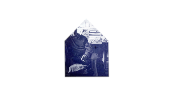
AB: Can you speak more about your photo series, The Animal Seems to be Moving, and how you use humour to address aging and racial stereotypes surrounding Black masculinity?

MPC: This is an ongoing project that I started in 2018, I was 45 when I started it. I decided that I would work on it for five years and finish the project next year when I turn 50. This series is just really rooted in how I’ve always been read as younger than I am. For [most] of my life, I have been read as a young Black boy. Then before I started working on this series, I was brushing my teeth one day and I thought, “Oh, your face is finally beginning to catch up to you.” And then I just found there was a span of particularly hostile encounters with strangers. Obviously, I don’t know what’s in people’s minds, but I started to surmise that I am moving from being read as a young Black boy to being read as a middle-aged Black man.

Even though Black boys do have their innocence robbed and often get read as older than they are, a Black man is to many people more threatening than a Black boy. I was thinking “Now I have to worry about more risks and less safety for myself in the world as I age.” Then I was just struck by how absurd that is. Using humour and leaning into the absurdity of oppression is not a new strategy, right? It’s something that if you’re a woman, if you’re queer, if you’re trans, or come from any minority position, if you face oppression, then humour is in your tool belt for coping with oppression. It might be you read some nonsense in the paper, and you just laugh. If we responded to everything with anger and grief, we wouldn’t get out of bed. There’s grief, right? Every time I walk into a woman’s washroom and a woman shrinks in fear because she thinks I’m a man coming to hurt her, there’s grief. There’s grief that people see me that way, that people respond to me that way, that [my presence] in their world can create that kind of interaction.

It’s absurd also that people see Black men as a threat but that gets transferred to me because of my gender presentation. Oppression, at the root of it, is absurd and I wanted to incorporate that. How can I work these ideas of performance in a photograph? But it also helped me, [that] with both pieces there’s play and there’s humour. Both pieces are about [the] vulnerability and grief of being seen in ways that are not how you feel yourself to be in the world. In both pieces, rather than foregrounding victimhood or a trauma position, they foreground the pleasure that’s part of the experience too. Both are trying to acknowledge that oppression exists, and the pain is real, but it was fun to make Quantum Choir. It is fun to be gay.

The absurdity is both trying to point to the absurdity of the gaze and the assumptions about me, but it’s also a way for me to express the joy, pleasure, and the fun that I’m having aging. And how do I prioritize that for myself? How do I let [myself] define my experience of aging and not that external gaze? I have to live with it, I have to contend with it every time I leave the house, but how do I foreground my pleasure and experimentation and play? And a little bit of that series is also melancholy in terms of feeling like I’m saying goodbye to my boyhood as well.

They’re also intentionally photographs because when I’m out in the world, I don’t want people staring at me trying to figure out my gender or trying to figure out if they should be afraid of me or not. The photograph freezes that moment. In the exhibition design, I put seating in the room with the photographs because it is an invitation to look and stare as long as you want at these photographs.

I wanted to play with tropes and ideas of masculinity, and many of the ideas are rooted in my childhood memories because I wanted to be a boy when I was a kid. And I remember the things that my child’s mind associated with manhood, like in one of them I’m wearing one of those tree-shaped air fresheners. As a kid growing up in Trinidad, I remember it was something that taxi drivers had. I’m wearing it on like a gold chain, which is another kind of Black manhood.

Little Trees (Hold), 2021, Archival pigment print on Hahnemühle Hemp, 24” x 30”

AT: I think that you’ve expressed beautifully how grief is personal for you and your boyhood and kind of moving through different stages of life. Do you also see it as personal and collective in your work?

MPC: Absolutely. As I said before, there’s nothing I feel that only I feel. My work is also ethnographic versus autobiographical because I feel like the things that I feel are not because I’m Michèle—they’re because I’m Black, I’m masculine, I’m queer, and I’m an immigrant. There are these systemic, historical, and cultural factors that mean that people respond to me in certain ways, which make me feel a certain way. Anybody who occupies my identities, those same cultural, historical, and social factors are [imposed upon them]. The feelings I’m exploring are not individual feelings. They’re political feelings, they’re public feelings that are produced by political and social forces.

To me, grief itself is something that in Western culture we are told should be private, not public. By bringing it into the gallery space, I’m bringing it into a public space. I do think that grief is one of those things where everything is politicized. We see it in the world’s response to Ukraine, not that the world shouldn’t have responded to Ukraine the way it has, but the world didn’t respond to Yemen in the same way. The grief of certain people has more value to a degree than other people. We’re not free of systemic forces with anything, even when it comes to grief.

I also feel that one of the ways that Black people have been robbed of our humanity is the ideas that white supremacy brought into being to justify slavery and similar for Indigenous people. We are not seen to have rich interior lives—That’s not a coincidence. It’s white supremacy [proclaiming] “Let’s reduce these people so that we can justify the way that we treat them.” This lingers in contemporary culture.

When I lost my mom, I couldn’t find anything that [spoke to] the experience of a Black queer person losing their mother. I couldn’t find a book; I couldn’t find a tool. I couldn’t find anything. Everything about Black loss is homicide or violence. The only grief that our culture wants to talk about is hurt and anguish, not just the everyday thing like losing your mom. We don’t get to be seen as having [that kind of grief]. It hurts since it’s just the most mundane kind of everyday grief. That’s what I mean about grief as a site of social engagement and political connection. It’s a way to connect to the impacts of these larger forces.

For people who feel like they are different from me in the world and that we have nothing in common to sit and watch Parade of Champions, which is the work I made about grieving my mother—It sounds so ridiculous but I’ve met the little old ladies who don’t understand, nothing in their life has ever prepared them to think that somebody who looks like me could feel what they feel. We are the same in that way and grief is the most universal human experience. And so, by sharing queer grief, by sharing feminist grief, by sharing Black grief, it is a way, hopefully, for people to feel that kinship across differences.

Michèle Pearson Clarke’s Muscle Memory is on view at the Art Gallery of Hamilton until September 5, 2022. This interview will be featured in our second print issue on Queer and Feminist collaboration, launching later this summer.

Lena Chen in Conversation with Chun Hua Catherine Dong

IMG_2903
Chun Hua Catherine Dong. I Have Been There. 2015 – ongoing. Photo credit: Oliver Santana & Elizabeth Ross. Photo Courtesy of the Artist.

By Lena Chen

The expansive practice of Chun Hua Catherine Dong utilizes the artist’s own body as a bridge between immigrant and nation, mother and daughter, and the personal and the public.

First and foremost a performance artist, her work has taken the form of photography, video, installation, and more recently, animation and augmented reality. Born in China, Dong immigrated to Canada, where she received a BFA from Emily Carr University Art & Design and an MFA from Concordia University. Her experiences occupying a racialized body and adapting traditions from her homeland have played heavily in her practice, which has explored marriage, death, and maternity.

Having performed and exhibited internationally, she was also a 2014 recipient of the Franklin Furnace Award for contemporary avant-garde art and a finalist for Contemporary Art Award at Le Musée national des beaux-arts du Québec ( Prix en art actuel du MNBAQ) in 2020.

Dong spoke with us about her experience of creating intimate body-based works that engage the participation of public audiences and spaces.

Lena Chen: I noticed that your most recent work, Skin Deep, and your long-running series I Have Been There, share a similar aesthetic through the use of traditional Chinese embroidered fabric. Can you talk about how they evolved?

Chun Hua Catherine Dong: These two works actually do not have many connections except using the same fabric. In 2014, I bought some fabric in Chinatown in Montreal, where the supply is very limited. The fabric was wrapped on my face very randomly and looked terrible, so I didn’t develop it further. But in 2017 and 2018, I went back to China and collected all kinds of new fabric that I began to work with. More recently, I expanded Skin Deep to animation and augmented reality to make this work more alive and architectural.

IMG_2909
Chun Hua Catherine Dong. Skin Deep. Photographs with Augmented Reality. 2014-2020.

 You have performed in performance art festivals around the world from The Great American Performance Art in New York to Infr’Action in Venice to Dublin Live Art Festival in Dublin to Miami Performance International Festival. Can you talk about how the site-specific performative work I Have Been There came out of your lifestyle as a traveling artist?

I started I Have Been There in 2015. I love traveling and really miss it right now [because of COVID-19]. One of the good things about being a performance artist is the chance to travel because the body is your material and your body is your work. If you travel to a new city, you need to see the tourist attractions. But I’m also a bit of a workaholic, and I considered it a waste of my time to just go see attractions without doing anything. I thought what if I could visit these sites while making work?

IMG_2904
Chun Hua Catherine Dong. I Have Been There. 2015 – ongoing. Photo credit: Oliver Santana & Elizabeth Ross. Photo Courtesy of the Artist.

Chen: I’m interested in how the work deals with your relationship to your own mortality and Chinese traditions around burial, especially because of the material you’ve chosen to use.

Dong: In my hometown, there’s a tradition that when the parents die, each daughter of the family makes a shroud and they cover the body with it.  When my father passed away, he had six daughters. So, his body was covered with these six layers that he was buried with.

According to Chinese tradition, it’s your children who bury you. And if you don’t have children, it’s your family. But I live here in Canada and everyone else in my family is in China. I decided not to have children, so I thought nobody’s going to bury me. But I’m still very young. I have these fantastic [opportunities] to travel around the world, so why don’t I just bury myself in the most beautiful desirable spaces wherever I want?

I have been doing this project for five years right now. Every time I travel to a new space, I would do another part of the series there. So far, I have traveled to 33 cities and 15 countries in the world. My plan is that I’m going to do it until I die or until I can’t travel anymore. This is my commitment.

Chen: Death seems to be a common theme in your work. I was also very moved by how you made peace with your mother’s passing through your art.

Dong: I was supposed to visit my mother in the summer of 2016, but I went to London because a curator invited me to do something. Then in October, she passed away very suddenly, so I have a lot of regrets about that. In the tradition of my hometown, they only keep the body for three days, and after three days that they have to bury her. But my passport was expired at the time and I couldn’t get my visa in three days, travel to Beijing, and then travel to the village. It would have taken me at least five or six days.

I wanted to do something dedicated to her because I feel I should have been there for her death, but I wasn’t. So in 2017, I went back to China, and originally, I wanted to find her personal belongings – her shoes, her clothes, her bed – so  I could do something right. But after her death, my family burned everything because of tradition. They believe when a person is dead, they need access to their belongings right away in the afterlife.

I was very disappointed there was nothing left of her belongings. It was very sad. There were no smells. There were no visible things. When I was in China, I realized I was looking for my mother everywhere. If I walked around and heard a voice that sounded like my mother, I would turn around and see this old lady and I would notice that the way she walked or wore her hair would be like my mother. Her smile would look like my mother, so I was looking for my mother through other people’s mothers.

IMG_2908
Chun Hua Catherine Dong. Mother. Photograph & Video: 14 pieces of photographs, inkjet prints, size varies, 2017.

Chen: Can you talk about how you decided to honor her memory by engaging with the women who were close to her?

Dong: I decided that I was going to looking for my mother’s childhood friends and relatives because since I came to Canada, I barely had contact with them. I visited them and I asked them because I don’t have any clothes to wear from my own mother if each of them could offer her clothes [for] me to wear. 

My mother also always loved these traditional beautiful cotton flower shoes. So, I brought a pair of shoes to each mother in my project. I thought about this kind of Cinderella story of whoever fits this crystal shoe is the bride. I started [to] imagine, whoever fits these shoes is my mother. I would take a photograph of us together, with me wearing their clothes and them wearing the shoes. At that time, I didn’t even think about what I was doing as work. I was doing it for myself, as a memorial to my mother.

Next year, I will return and live with each mother for a day as her daughter. I will document this day with the 14 mothers. This film is called Mothers with No Names.

Chen: Even though the work is very much tied to your own relationship with your mother, grappling with the death of a parent is such a universally understood experience. How has the public received this piece?

Dong: The mother is universal. Every time I show this work, people become very emotional,  People connect themselves to the mother in the photograph. When I showed it in Istanbul, this woman came to me and she was crying. She showed me that the jewelry she was wearing belonged to her mother.

The first time I showed this work was in South Korea and the curator said it made her think of her mother as well, who was getting older. When I had my artist talk,  she left and later apologized, saying that she knew I’d be talking about the piece and it was too emotional for her to be there thinking about her own mother.

IMG_2906
Chun Hua Catherine Dong. Husbands and I. Photography and performance. 2009-2011. Series photo credit: Ruth Skinner and Chad Darnford. Photo courtesy of the artist.

Chen: Even though they’re very different works, I see connections in the methods you used for your series Husbands and I, in which you documented entire days you would spend with strangers who you “married.” How did you go about getting participants for that work?

Dong: That was 11 years ago when I was still in art school. I used Craigslist and dating websites, hung flyers on the street, passed them out to people, and left them in coffee shops. At that time, I was very passionate about a performance. But now if you asked me to do it, if I could spend a day with a stranger, no, no, no, I wouldn’t. I never thought about the fact that there could be danger there because I was meeting this person I didn’t know and I went to this person’s home to spend a whole day with them. I could’ve been killed.

Chen: And did participants know this was supposed to be an artwork or was there also an expectation of intimacy?

Dong: Of course, they knew it, because I asked them to sign the contract. But also, there were many men who wanted to spend a day with me, until I said, “Okay, I’m going to film it. It will be an art piece and exhibited.” And then, 90% dropped out. They said, “Oh, I would love to spend a day with you without the camera” and I refused. 

I remember two participants. One still calls me his wife, but of course, he knows I’m not.  We had a ceremony, because he had a party, and I was at his house and he announced me as his wife, that we were getting married. He put a ring on my finger, and he felt that he really married me.

There was also another guy, and he was begging me to spend a day longer with him. He wanted me to be in his real life, but I couldn’t. Before this, I believed in the idea that art is life, but then I realized, if your art is really your life, you are going to mess with your life. I could not bring those men into my real life. I didn’t want to have any more connection with them, but of course, after that, [they] kept calling me, and I had to say no.

Chen: How did the project affect the way you thought of power and identity, as an Asian woman living in a Western society?

Dong: A reason I stopped doing the project is [that] after I spent the day with some of the men, I actually felt a little bit like I was taking advantage of them. The reason I was able to stay a day with them is because they don’t have partners. They are lonely people. Otherwise, they were not going to allow me to be in their life. Even though they know, it’s going to be filmed and it’s going to be an art piece, they still wanted to take this chance, because they needed this company and this kind of excitement. [In] the beginning, this work was a political piece because I always felt like I was an outsider despite living in Canada for a long time. But when you close the door and spend a day with this so-called privileged white person, I realized we were just two normal people, staying together and chatting. Before I was working on a lot of identity issues, but my work started to change after that.

Chen: What guidance do you have for other artists working in performance?

Dong: If you don’t doubt yourself, then other people won’t doubt you. When you do the performance, you have to 120% believe in what you’re doing at the moment.

Take the Sacred Pause: Talking Tarot with Laura Dawe

978D39DD-98FB-4C48-A8C1-48315263ADA5
Laura Dawe, Pack of Dogs tarot deck 2019. Courtesy of the artist.

By EA Douglas

In early 2018, a blocky mauve building with green eaves appeared on my Explore feed and brought Laura Dawe and her work into my life. A painter, a filmmaker, an occasional tattooist, the host of BUMP TV’s Valentine’s MATCHtacular, Dawe released her Pack of Dogs Tarot Cards in 2019. We got on the phone to discuss her process of making the deck and the rituals surrounding her readings and creative practice.

EA Douglas: Let’s start with your own history with the Tarot. When did you first start engaging with Tarot? When did you decide to make your own deck?

Laura Dawe: I decided to make my own deck and I started engaging with Tarot at the exact same time, which was when I was a 14-year-old goth and I knew nothing about it. I didn’t own a deck, I didn’t know anyone who did, I had never had my cards read or anything. But obviously the mystical depictions, I was just like “this is the coolest thing ever” and I started to make a deck.

Then I went to Newfoundland for my grandfather’s funeral, and my Uncle was there, and he’s actually an artist as well. He’s pretty deeply religious. We went for a walk to the Ocean and I was telling him excitedly about this thing I was making, thinking that he would think it was cool, and he basically had an intervention. He was like, “These are tools of the Devil, if you open the door for the Devil to come into your life you may never be able to close it.” I abandoned the project and then didn’t really start doing the Tarot thing until my ex-boyfriend bought me a deck close to 10 years ago. I used that deck to make some very major decisions in my life, that still resonate until this day, and slowly I started learning the cards.

While I was doing my Master’s, it occurred to me that I might make a deck. I was making a lot of art about archetypes and studying Carl Jung who made his own Tarot deck. Then I’m writing this movie and in the movie, the girl has a Tarot deck, they live in a very resource scare apocalyptic world. I knew the aesthetics of the movie; I knew how she would make a deck and so that’s how I ended up making mine. Basically, pretending I was her.

6F661823-0D7D-47FC-863D-EC4F9DE1DD90
Laura Dawe, Pack of Dogs, tarot deck 2019. Courtesy of the artist.

EAD:  I have a quote here, that each Tarot deck “tends to have its own voice and story written in the images.”[1] I know it’s called Pack of Dogs, and the large black dog almost prances from one card to another. What’s the source behind the dog?

LD: The dog has been in my paintings for a long time, kind of representing our shadow selves. I have a painting that I made when I was having a very serious shame-over called Bad Dog Wants to Be Good. It’s a black dog smoking a cigarette with a white dog in its mind, surrounded by empty wine bottles and there’s a full moon outside.

It’s sort of that idea, it’s different for all of us, as an extrovert (like) me, sometimes I will leave a social situation and feel this incredible shame that I dominated the conversation or neglected people. I would think about that and (know) I can’t control it. I think we all have these things, some people have anger issues, some people binge eat, some people have all three or seven.

We all have these little black dogs running around inside of us and I feel sometimes they’re definitely deeply tied to our unconscious; sometimes we’re aware of them, sometimes we’re not, sometimes we’re aware of them and we still can’t control them.

For example, the Lovers card we think about like “Oh! It’s definitely a good omen for romance!” While that is true, there’s also a lot of guilt linked to the Lovers card for a lot of readers. RuPaul said it best “If you can’t love yourself, how the hell you gonna love somebody else?” So, in my version, it’s a woman embracing a black dog and they’re embracing equally. I see that as a kind of a self-union.

6 lovers
Laura Dawe, Pack of Dogs, Lovers card. 2019. Courtesy of the artist.

EAD: Loving yourself first?

LD: Loving and accepting your shittiness. Which isn’t to say we shouldn’t all be trying to make sure our shittiness doesn’t spill into the world, but we also need to not punish ourselves for being human. Accepting because there’s no other way to make sure it’s accepted.

EAD: That’s super cool. The black dog stood out to me.

LD: They kind of represent our anxiety, (when) I say shadow self I mean that in the Jungian sense.

EAD: The things we don’t want to admit about ourselves.

LD: Even when we’re looking for it in analysis we sometimes can’t find (it) because of how much of our personality is a fortress that we build to protect ourselves from our humanity.

Someone offered me the tip of like if you want to get in touch with your shadow self, think about someone who sets your teeth on edge. Someone who stresses you out so much you find them so offensive and guaranteed the qualities you find so appalling in them are your shadow characteristics.

EAD: Oof, yes. The Tarot deck consists of 78 cards, each one containing an image or archetype. Did you approach each card with an idea in mind?

LD: The way that I did it was imagining I was this woman and she would have been travelling, so she would’ve been making one card at a time. I made most of the deck where I would be doing a reading for myself or someone else and then whatever cards I would pull I would then make those cards for my deck. It made it easier to remember the meanings because it was tied to a reading.

Also, it helped me try and communicate the meanings because I was applying it to a situation; I would find a way to express it to myself to make sense.

Like most Tarot decks it is based in many ways off of the Rider-Waite. There’s some of the cards that are pretty closely Rider-Waite and those are the earlier ones. I started to understand how to use my own voice the more that I made, some of them I would go back later and remake them so they’re much more my own thing.

LAURA DAWE bad dog wants to be good
Laura Dawe. Bad Dog Wants to be Good. Courtesy of the artist.

EAD: Were there any that were super hard to make?

LD: The Three of Wands, I do not know what that card means. Every single time I pull it I’m like “I’m going to look this up” which means I should really know. I really struggled to draw it because I don’t know. It’s a picture (of) a dog climbing some candles and there’s a chicken wing in front and it’s smiling. I feel like it’s a bit of meditation on the grass is greener mentality. When I say the grass is greener I kind of mean projections, the suit of Wands (is) a suit of manifestations, and so projection/manifestation (are) synonymous in some ways.

EAD: When you’re performing the Tarot readings does interacting with them bring them into your studio? You were making the cards after you read for someone, but now that the deck is completed and that’s what you’re using?

LD:  Oh, I never read in the way that I read now until this deck was made. I would (read) in the way that anyone would read with their friends at a party. It was never the way that it is now where I am off book. I didn’t do that until I went to Foire Papier in Montreal; that acted like my deadline to get the deck finished. I read for people there and I was really scared. Of course, people loved it because it’s all about them.

EAD: It’s also such a unique experience in the art world, I think that being the artist and then sitting there and providing an intimate moment…

LD: A service?

EAD: A service but also a chance for intimacy because Tarot readings are so intimate.

LD: They’re extremely intimate. You pass small talk and you zoom past medium talk right into, “My Dad is dying.” And then you’re like, “What was your name again?” You hold intense eye contact with people, you don’t know what the card is going to say, you don’t know what is going on with them. It’s a profound privilege to get to communicate so deeply, so quickly and to feel so trusted. 

12 hanged man
Laura Dawe, Pack of Dogs The Sacred Pause 2019. Courtesy of the artist.

EAD: Have any of the conversations you’ve had over the Tarot come back into your work?

LD: I guess everything does affect, who even knows what ways (things) manifest. I haven’t been painting really at all for a couple of months and I’m circling the studio, I need to make a bunch of paintings for the new year. I’ve been thinking about them, all the time, and prepping the studio. I’ll go in there, stare at the wall, build a canvas and then get freaked out and run away.

It’ll be interesting to see when these paintings start coming out, whether this kind of archetypal language (will appear). Those are the conversations you have with people, it’s the Major Arcana moments in their life. No one is rushing for Tarot reading if they don’t have big questions. The people who are first in line are heartbroken, they’re grieving, they’re moving, they’re falling in love, they’re stagnant in a way that feels unbearable, you know? I (am) curious to see.

19 sun
Pack of Dogs, Sun Card. 2019. Courtesy of the artist.

EAD: I look forward to seeing it too! I have another friend who reads Tarot and between readings, they put their deck on a milky hunk of selenite, to clear the energy. Do you have any rituals around your readings?

LD: I have a cloth I use, a piece of canvas, that I read on. Each of the elements in the deck represents an element in nature. So, I’ll light a candle for fire, anything works for earth, a flower, a grapefruit, whatever. I have a baby goblet that I’ll put some water or wine in, and then for wind, if we’re near an open window it’s okay. Otherwise, I might light an incense (to) activate the air a bit. I feel like it’s grounding, it grounds the reading a bit. It sets the tone and invites things to enter in equal amounts. Although the cards really typically just reflect what is exactly going on and what the person already knows.

EAD: Sometimes you need someone else to spell it out. What sort of rituals are built into your creative practice? What rituals do you have in the studio?

LD: I wish I knew! I want to become a structured person because I am wildly not. I clean the studio usually. If I haven’t been in there in a while the big ritual is to go in and re-organize and clean, see what’s there.

If I am really struggling to get into a painting, I’ll put on This American Life. It really brings me back to my studio so many times over the years. Ideally, I’ll be zoned into the work by halfway through the episode, and if I can’t get into some kind of flow by the end of the episode then I may have to give up.

15 devil
Laura Dawe, Pack of Dogs, Devil Card. 2019. Courtesy of the artist.

EAD: Okay, last question. Do you have a favourite card in the Tarot?

LD: Jeez, I mean if it’s something you want to pull, obviously, The Sun. Which is also the 19th card, which I am born on the 19th and 19 is lucky my number. I don’t know. I wouldn’t call it my favourite.

My first response was the Devil – it’s the card I pull the most. It has seen me through many different experiences [and] it has changed meaning for me many times. I think it has to do with addictive thinking and not being in control of our mental domain so it can be a reminder to me about checking in. If I pull the Devil then I need to personally pull a Hanged Man and take a bit of a spiritual step back and chill.
EAD: Put your head upside down and figure it out.

LD: Put my goddamn head upside down and take the Sacred Pause.

Pack Of Dogs Tarot Cards are available to purchase through the Likely General website.

[1] Jaymi Elford, Tarot Inspired Life (Woodbury: Llewellyn Worldwide, 2019), 9.

The Poetic Everyday: In Conversation with Natalie Hunter

02_NatalieHunter_RodmanHall_2019
Natalie Hunter. Staring Into The Sun. Solo exhibition at Rodman Hall Arts Centre. Hansen Gallery. 2019. Documentation image by Jimmy Limit.

Questions by Adi Berardini

Natalie Hunter’s work brings the everyday experience into a wondrous technicolour world, where the present moment meets that of memory. Bridging photography, sculpture, and installation, photos of interior domestic spaces are re-imagined through a kaleidoscope of colours, cyan meeting magenta, yellow and violet. She often produces experiential installations using photographs on transparent film, light, and other fragile materials that engage with the poetics of time, memory, perception, and the senses.

Natalie holds an MFA from the University of Waterloo, and a Bachelor of Art in Visual Art with a Concentration in Curatorial Studies from Brock University. She has shown her work in Canada and the United States in numerous exhibitions, including Rodman Hall Arts Centre, Centre 3 for Print and Media Arts, Art Gallery of Windsor, Hopkins Centre For the Arts at Dartmouth College, Museum London, University of Waterloo Art Gallery, and the Hamilton Supercrawl. She is the recipient of several awards including an Ontario Arts Council Creation Project Grant, and a Canada Council for the Arts Research and Creation Grant.

08_NatalieHunter_RodmanHall_2019
Natalie Hunter. The sky seemed to fold in ribbons of palest sunlight. 2017. Giclee prints on transparent film, poplar, light. installation dimensions variable. 12” x 72” each print. Documentation image by Jimmy Limit.

It seems like your work facilitates a looking closer” since it often uses colour and layering of translucent images until they are nearly rendered abstract. Can you speak more about the conceptual ideas in your work and your process? How does it relate to perception and memory?

Natalie Hunter: My practice is multidisciplinary and concerned with the transformation of materials, objects, and images in ways that evoke an emotive or psychological response in the viewer. I often make images and installations and think of myself as a sculptor who fell in love with images. I’m interested in process and materials just as much as concepts. The starting point for most of my work boils down to light and time, both of which can be experienced differently through image and sculpture. I’m interested in really ephemeral things like light, air, memory, the senses, motion, stillness, and time. Things we can feel the effects of, how they shape experience, and how these concepts can be articulated in material ways. I very much look at photographs as material fluid things that are tangible objects vulnerable to the elements. I find sculpture and photography related in some way. There is an element of stillness in sculpture and photography that speaks to the present moment, but also the past. The negative and positive aspects of photography mirror that of sculpture and casting—both are traces just in different ways.

I’m really interested in the exploratory, transformative power of materials to translate these experiences of the everyday.

For the past seven or eight years, I’ve been working with layering images both physically (layering transparent photographs to make new images and spaces), and inside of the camera (multiple exposures). I find this act of layering both inside and outside of the camera transcends logical ideas of time. For me, the act of layering images subverts expected notions of a perfect photographic image and notions of linear time. I use layering in an attempt to connect with the processes of human memory. Layering both accumulates and loses information, and this is what happens as we accumulate memories, sensory information, and thoughts over time. Detail is lost, while sensation is accentuated.

When making images, I use colour filters to bring attention to these layers. They help me slow down and separate different moments of time while leaving clues as to how the images were made. I choose combinations of colour filters emotively; choosing colours that naturally occur in the spaces I occupy to further accentuate them. Colour is sensorial in the visual sense. I believe that the addition of colour heightens awareness. When I think about the strongest earliest memory that I have, I can’t identify details, but I can describe the sensations, and for me adding colour through the use of filters is a way of exploring sensation or sensory information through photography. In this way, I hope to make a predominantly visual medium physical.

06_NatalieHunter_RodmanHall_2019
Natalie Hunter. Helios (interior day view). Hand-applied dichroic film on window, light. variable dimensions. 2019. Documentation image by Jimmy Limit.

  You take photographs of what may seem ordinary or mundane, like the interior blinds and curtain shots in As the Light Touches and create something quite awe-inspiring and vibrant. Can you speak more about the transforming of everyday, familiar spaces?

NH: Artists should make work about their experience and how they perceive and understand the world. The mundane experiences we find ourselves in on a daily basis are often those in-between moments that we don’t really count as experiences. I’m really interested in the exploratory, transformative power of materials to translate these experiences of the everyday. Memory is just as important as breathing in our human experience and I’m interested in exploring how that manifests and transforms through time. I feel like we are all unconsciously shaped by the spaces we inhabit on a daily basis, and I know that my work is often influenced by the spaces I spend the most time in. Space is something psychological just as much as it is physical, and I want to explore both of these aspects of space in my work.

Gaston Bachelard’s The Poetics of Space is a text that I return to a lot. It has been influential in how I understand my work and its relationship to space, time, and memory. We participate daily in the creation of spaces we unconsciously make for ourselves. I don’t wish for my work to merely represent these spaces, but instead, act as experiences in and of themselves that become new spaces and encounters in their own right.

05_NatalieHunter_RodmanHall_2019
Natalie Hunter. Helios (interior day view). Hand-applied dichroic film on window, light. variable dimensions. 2019. Documentation image by Jimmy Limit.

Your work seems to incorporate the surrounding architecture of the space it occupies. For example, your installation Helios at the Rodman Hall Art Centre, a site-responsive piece that addresses the ephemeral qualities of light and how it affects familiar spaces, the body, and our perception. I was wondering what your process is like in terms of creating work that is more site-specific?

NH: I don’t like to ignore the space my work exists in. I try to consider the space it exists in at the time of exhibition as an element of the work itself. Often, my work changes when it’s installed a second or third time, or from my studio to the gallery space. I need to do site visits when thinking about site-specific work, and I usually respond in an emotive way that speaks to a unique characteristic of a space in order to converse with it. Memory plays a big part in this. When responding to a space site-specifically, I hope to produce a kind of encounter between viewer and work that elicits memory or a sensorial response.   

Helios was a site-responsive installation at Rodman Hall Art Centre exhibited in my solo exhibition Staring into the sun. When making Helios, I wanted to consider it a gesture, response, or conversation with Rodman Hall; a connecting work that bridges outside and inside and only exists for a short time in the space. I was really influenced by my memories and experiences of Rodman Hall as a student. I remember ascending the stairs and seeing the stained glass, which is located in various locations in Rodman Hall’s domestic spaces. I wanted to converse with these architectural elements while at the same time make something new. Something that made you more aware of time, your body, and the space you exist in a very present, albeit slow, way. Change and fluidity are important to this work. And the work took on its own life as winter stretched to spring and the light changed.

I think Helios points to the process of how I create images and think with materials. I spent about a little over a month playing with samples of dichroic film, doing material research, finding out what it does in different lighting conditions, bending, folding, layering, and draping it in various situations, and mixing it with different materials. A lot of my inquiries stem from testing materials to see what they will do. Helios is much about slow movement, the slowness of time, and how we perceive it through our human senses. I hope to continue exploring what I learned in making this work.

07_NatalieHunter_SunsRays
Natalie Hunter. The Sun’s Rays Do Not Burn Until Brought To A Focus. Installation at Centre 3 For Print and Media Arts, Hamilton, Ontario, Canada. 2018. Documentation courtesy of the artist. 

Q: Your installation The sun’s rays do not burn until brought to a focus creates a temporal experience for the viewer since as the sun moves across the sky, each work is animated with their own ephemeral rhythm.” I was wondering if you could speak more about this work and the use of natural processes, light and time?

NH: I use light in the making of images, but also physically in how they are exhibited and exist within space. For me, light is quite kinetic or makes the work kinetic through the passage of time. There is both stillness and subtle motion in my installation The sun’s rays do not burn until brought to a focus, achieved through different uses of artificial and natural light. I use light in this installation as a material that activates spaces.

Light is fundamental to photography, and I consider its manipulation as a material process in my work. Light is also fundamental to sculpture because it is how we are able to situate and perceive objects in space. Light is ephemeral, like time and memory. Natural sunlight is always changing, where as artificial light is static. In The sun’s rays do not burn until brought to a focus, natural sunlight is used in a kinetic way, gallery lighting is used in a rather still way, which casts latent imagery on the surfaces of the exhibition space. A viewer’s experience of the work is not static but always changing. Elements move with the subtlety of the air movement in the space, and the installation seems different on a cloudy day, or between dawn and dusk.

It’s hard to discuss photography without discussing time because time is so essential to the medium. Photography is always seen as a frozen moment, but for me, photographs are fluid things. A lot of my transparent film works require active movement in the space that they occupy in order to experience them. The light activates them, but the viewer does through movement too. For example, in The sky seemed to fold in ribbons of pales sunlight, it appears different when standing at different points in the room. When standing directly in front of the piece, the physical images almost disappear, and you only see latent imagery on the walls. When standing at an angle, the images appear layered with themselves and the latent imagery on the walls. You aren’t sure what the true image is; the physical photograph or its latent reflection.

Q: Who are some artists that are influential to you and your practice?

NH: A lot of the artists I admire often explore quiet and overlooked elements of our being and how they shape experience. I look to artists like Tacita Dean, Uta Barth, James Welling, Sabine Hornig, and Sarah VanDerBeek for their consideration of materiality in lens-based image making. I feel a kinship to artists like Ann Hamilton, Roni Horn, Kimsooja, and Alison Wilding for their conceptual and material research, and multidisciplinary approaches to working. In 2012, I spent a summer internship working for sculptor and installation artist Soo Sunny Park. This was a priceless opportunity and an integral part of my artistic development and education in terms of understanding space and place. She encouraged me to think about my images in material ways and take my interest both in sculpture and images into installation territory. She taught me that sculptors have a unique understanding of space. I want to continue to develop and explore that in my work—subverting expectations of what images and installation can be.

09_NatalieHunter_Dappled
Natalie Hunter. Dappled (detail). 2018. Archival inkjet prints on backlight film draped over poplar and aluminum sculptures. Approximately 24″ x 60″ x 36″ each. Documentation courtesy of the artist.

Q: Can you speak more about the upcoming exhibition Shaping Time: Natalie Hunter, Xiaojing Yan and Lois Schklarat at Latcham Art Centre? What work will you be displaying?

NH: Shaping Time: Natalie Hunter, Xiaojing Yan and Lois Schklar at Latcham Art Centre considers ideas of memory and time through a multimedia lens. Elisa Coish curated Shaping Time around the 40th anniversary of Latcham Art Centre. Part of her curatorial strategy involves inviting artists at different stages of their careers to create a larger dialogue surrounding these concepts and the different approaches and discussions that can arise from it. Both Xiaojing Yan and Lois Schklar are well recognized and established artists that have exhibited with Latcham Art Centre in the past. Elisa Coish invited me as the emerging artist to exhibit work in Shaping Time after my solo exhibition Staring into the sun closed at Rodman Hall in May. I will be exhibiting some of the work that was shown at Rodman Hall in Staring into the sun, but also some work that has never been exhibited that I made in 2018 with an Ontario Arts Council grant. The work going in Shaping Time is an overview of the many approaches and materials I use to consider light, time, and memory in both installation and photo-based ways. It will be interesting to see how I respond to the space during installation because Latcham Art Centre is essentially a white cube. Corners are often considered non-spaces, and I am fond of corners for their surreal shape and potential for activating a space. In this way, I’m hoping to converse with some of the architectural elements in the space during installation.

 You can view more of Natalie Hunter’s work from July 10 – August 24th 2019 in Shaping Time: Natalie Hunter, Xiaojing Yan and Lois Schklar at Latcham Art Centre, curated by Elisa Coish and on her website.

Pushing the Limits: In Discussion with Julia Betts

07_2015-2017 (Orange)
Julia Betts, 2015-2017. Personal belongings embedded in plaster. Courtesy of the artist.

Questions by Adi Berardini

Artist Julia Betts channels art as a means of self-destruction—her work Detritus consists of self-portraits that are destroyed by shredding them back to earth, with the dust of the remains left in shades of rose pink, crimson, grey and russet. Betts brings art into the realm of imposing bodily limits through intervention. Veering towards the intersection of sculpture, performance, and installation, her work is defined by intentional unpredictability, the use of unstable materials and orchestration of situations in which her body and constructed space are subjected to forces of disorder.

Betts pushes a range of materials to the limits of their utility while placing herself in precarious circumstances that function as metaphors of emotional and psychic vulnerability and demonstrations of intentional disarray. Interested in the impossible, Betts creates uniquely precarious situations with ambiguous results that often lead to disruption and upheaval. She challenges the limits of representation by reflecting how life and art are hardly static but constantly transforming.

Can you explain more about how your work is influenced by emotional/psychological vulnerability and making a mess, but a highly deliberate mess?

I see messes as related to emotional and psychological vulnerability—they have to do with the need to control, the inability to control, and the subsequent loss of control. You can either lament the failure to control or revel in the messiness as a release from confinement. In this way, messes can embody dread or catharsis, reflecting an inability to keep accidents from happening and a yearning for release. Through viewing a mess, the image of the cultivated performer breaks down, revealing the human imperfection within the artist’s process. The viewer may perceive the spillage as the artist’s mistake and [therefore presume] that they have become privy to the artist’s unintentional expression. A mess becomes a radical expression of an imperfect image of oneself in a society that cultivates perfection. For me, messes also have a certain symbolic resonance relating to notions of femininity. Messes enact all things dirty, grimy, gory, visceral, and sensual in human experience, possibly even extending into the realm of the grotesque and traumatic when the dissolution speaks to bodily breakdowns.

09_Body as Pool
Julia Betts, Body as Pool. Still of performance while pouring paints. Courtesy of the artist.

Your practice seems to involve a mix of performance and traditional fine art (painting/ sculpture/installation), notably in Body as Pool where you create a self-portrait from outlining clay and pour liquidized paint through performance. Can you explain this piece further?

In this piece, I built a self-portrait by making an outline of a body with clay and I poured liquidized paint into the clay outline. The body’s color is made of acrylic paint and water. The area around the body is made of oil paint and vegetable oil, two substances [that] don’t mix. I rip into the clay walls and pour cups of paint into the image. The colors burst, erupt, flow, and penetrate through the body image both by my intentional action and by random circumstance. These intrusions into the body are meant to elicit a pain sensation. I imagine the clay as dams holding waters. I break the dams and let the waters out and the dams also just randomly burst.

Oil and water and their inability to mix relate to my interest in the impossible. The clay dams find the liquids impossible to hold. The oil and water find it impossible to merge. Because of these material properties, separation seems both fragile and unbreakable at the same time. I’m trying to depict unstable and ruptured bodily borders.

For me, there is a connection between material impermanence and the vulnerability of human life.

2015-2017 (white)
Julia Betts, 2015-2017 (white). Personal belongings embedded in plaster. Courtesy of the artist.

Your piece 2015-2017 poetically captures a sense of material impermanence. The work uses your personal belongings mixed with plaster to capture how the materials become altered over time. Can you explain this piece further and how you address transition and unpredictability in your work?

In 2015-2017, belongings accumulated over two years are sorted by color (white, blue, orange, brown, black, red) and frozen in plaster time capsules. As part of the installation, labels situated nearby catalog the ephemera within each brick and describe moments when each object in each block changed colors. For example, a piece of a book with black text fades completely to white from repeated trampling, or a clear piece of hot glue accidentally sits on a window sill for months and when found, has yellowed. Permanence is contrasted with transience, transformation, and entropy. Seemingly insignificant moments and “trash” are elevated into vehicles to hold personal interactions, memories, and the residue of life.

For me, there is a connection between material impermanence and the vulnerability of human life. In my overall practice, I use materials that evoke transience and timelessness. With this piece, I attempt to control what is temporary and fragile, with what is solid and enduring, but, ultimately, the garbage within the plaster erupts with rot. Organic intervention interrupts my attempt to control and stasis.

Betts- Julia-7
Julia Betts. Window Screens, 2016. Ink, steel, window screens. Courtesy of the artist.

In Window Screens, you explain how you created a steel box around yourself in a corner, filled the box with black ink and continuously dipped the sheets in the ink at maximum capacity. It seems to be an impossible task since the screens only hold the ink for a few seconds. Can you explain more about the inspiration behind this piece?

In Window Screens, the clear screen is unable to hold the black ink. Each time the ink drains from the screen, opacity and concealment relent to transparency and exposure. The untenability of the process is furthered when the box springs a leak and begins to empty the contents. The more ink I lost, the more I was unable to perform my process. It became harder and harder to make the screens turn black. I found myself scrubbing the floor with screens attempting to pick up any drop I could find of leftover ink. Eventually, I was completely unable to darken the windows and the performance ended. Even before I began this performance, I knew the possibility that the box might not be able to hold the ink. I intentionally created a precarious situation through lining the box with a tarp that may or may not be up to the task. I’m interested in placing myself in uncontrollable, vulnerable situations where accidents and disasters may happen. In this piece and my overall body of work, I am trying to create helplessness.

Detritus
Julia Betts. Detritus, 2015. Ground self-images. Courtesy of the artist.

It seems as if the self-portrait is a common theme in your work, also appearing in the piece Detritus that shreds multiple self-portraits, displaying them as powdered remains. Can you explain your interest in the anxiety of self-representation (or the representation of self-destruction?)

I’m less interested in the anxiety of self-representation and more interested in the representation of self-destruction. This piece also has to do with my long-term interest in skin. Skin is both boundary and connection between self and other. There is a need for there to be a skin to bear, protect, carry, and represent. In Detritus, I grind images of myself with a household grater, shredded self-images of the body accumulate into layers of dust—with the colors incidental to the photographs used as source material. Photographs are a surrogate for skin. I had been doing work before this that depicted the boundaries of the body being torn, but I fully brought the body to the earth in this piece. Whereas, in Body as Pool, I imagine the body at the edge of the sea.

Your work seems to deal with imposed limitation, and at times, distress. Can you explain more about this interest and what it represents to you?

I’m interested in limits and possibilities. Either can cause distress or comfort.

I use the limitations of my body, time, space, and mark. Confinement can be a metaphor for social or psychological confinement. Within the limits, I am too much or too little. I react with helplessness and determination.

I portray vulnerability in my work in different forms. Materially, I try to create space for material agency to intervene in my authorship. Physically, my work shows the frailty of my body when it is unable to complete its tasks. Emotionally, my work exposes and reveals me in pieces like 2015-2017 where the viewer is allowed to sift through my trash. Situationally, there is vulnerability when I put myself in scenarios that I am unsure of the outcome, and, often, I share this uncertainty publicly through performance.

Check out more of Julia’s work at her upcoming show at Grid Space NYC in December 2019 and on her website and social media.

Making Waves with Melissa McGill and Red Regatta


fullsizeoutput_1651
Preview performance of Melissa McGill’s Red Regatta on May 11, 2019, in front of the Associazone Vela al Terzo on the North Lagoon at Fondamente Nove. Photo by Matteo De Fina.

By Chiara Mannarino

A week after graduating from the Rhode Island School of Design in 1991, artist Melissa McGill travelled to Europe for the very first time. This independent voyage, beginning in Venice, Italy, would unexpectedly lead her to an abundance of friendship, love, and creative inspiration, all of which have coalesced to inform her most recent project, Red Regatta.

Red Regatta is an independent public art project presented in collaboration with Associazione Vela al Terzo and Magazzino Italian Art Foundation. It activates Venice’s lagoon and canals with large-scale regattas of traditional vela al terzo sailboats hoisted with hand-painted red sails. The visual combination of fifty-two carefully crafted and applied red hues swimming and swirling together through Venice’s unmistakably distinct greenish-blue water is an unforgettable sight, leaving its imprint on the “Floating City” forever.

Such ambitious, grand, and site-specific public art projects are central to McGill’s artistic practice, which redefines each landscape it touches through physical interventions seeking to illuminate rich histories and traditions and to foster a greater understanding of our surroundings as well as our relationship to them.

GN7A9252
Melissa McGill with the first sail at Atlas Studios in Newburgh, NY. Courtesy of the artist.

CM: Can you speak a bit about your connection to Venice?

MM: I lived in Venice for two years from 1991-1993. Right after graduating from the Rhode Island School of Design in the sculpture department, I went to Europe for the first time. Venice was the first place that I landed. I went by myself and that helped me learn to speak Italian. I made many friends, who are now like family, and became part of a community of Venetians. I have been going back and forth for 30 years for inspiration, for friendship, and for work.

CM: How did you become so invested in the longstanding Venetian sailing tradition and how did the project come to light?

MM: Two years ago, I did an exhibition based on the Campi in Venice. Through doing this project, I was lucky enough to meet Giorgio Righetti, the president of the Associazione Vela al Terzo Venezia, and Silvio Testa, who wrote a wonderful book about vela al terzo and to spend a day in their boats exploring the small canals in the city. On the plane back to New York, I just completely fell into Silvio’s book and was so inspired by the tradition and these boats. These two became my core collaborators in the Red Regatta project, and it was really from that moment that the project started to unfold.


CM: Can you speak a bit about how the project has developed since then?

MM: Last month, we did sail painting workshops with art students from IUAV (University IUAV di Venezia) and my collaborating sailors from the Associazione Vela al Terzo Venezia in Spazio Thetis in the Arsenale, which was very generously donated for the project. We painted 104 sails in 8 or 9 days, and the reason it was done in such a timely way is that we had such incredible enthusiasm from the students and the sailors. To see and be working with the actual sails in space and to have this community form together between the students and the sailors painting together created this wonderful feeling of collaboration.

CM: It must have been quite a feat to complete all of that work in just 8 or 9 days! What did the actual painting of the sails look like in terms of technique?

MM: While testing a prototype sail in my studio in New York, I realized that I wanted to have the hand evident in the painting rather than it just being a flat color field, so we used brooms and brushes to create these big, beautiful, expressive brushstrokes. Each sail became a painting on its own. The idea to use brooms to paint the sails was something that came to me at 5:00 in the morning on the second day with jetlag. After testing a few types of brooms, we bought all the brooms of this one type from the Ferramenta on Via Garibaldi. The guy was like, “What on earth are you doing with all these brooms?”

IMG_9905
Melissa McGill painting the first sail at Atlas Studios in Newburgh, NY. Courtesy of the artist.

CM: Was he excited when you explained what they were being used for?

MM: Oh yes, he was very excited. He even asked, “Can I come and see? I’m really interested!”

CM: It seems like so many are drawn to this project. The workshop collaboration itself involved people from all different walks of life. Can you speak about the significance of this unification of young and old through painting the sails?

MM: We had sailors of all ages, including those who are in their 70s, participate, and between the university students and these people there was a huge age range. Some even brought their kids to see the sails being painted. It was just this incredible community that formed. They were all getting to know each other, the students were asking the sailors questions about the maritime traditions, and there was this exchange, collaboration, and connection created between all involved.

CM: Why did you choose to involve young Italian art students specifically?

MM: Involving students in a public art project provides a unique opportunity to invite young people to participate and engage with the work in an intimate way. That opportunity, I think, is community-building, which is really important to me and my public art project. The sailors were so moved by the students’ interest and their involvement and passion for the project that they invited the students to be crew members in Red Regatta!

CM: That must be so exciting for them! The students’ enthusiasm alone demonstrates just how significant this tradition remains today, and your project and process really honor it and bring it into our current moment in a new and exciting way. What does the Venetian sailing tradition mean to you and what about it excites you?

MM: This is a tradition is about the lagoon and its history. Many of the boats have been passed down through generations and restored, and they’re so beloved. These boats are very specific to Venice in that they are very low draw, so they have flat bottoms and can go in very shallow water, and the mast can be removed and laid down so that they can go down under bridges or be rowed. It’s a tradition that really involves the rowing or sailing and the wind and the water. It’s important to keep this tradition alive.

GN7A9199
Melissa McGill painting the first sail at Atlas Studios in Newburgh, NY. Courtesy of the artist.

CM: I feel that this project is crucial to have in Venice at this time. How do you see Red Regatta fitting into the unfortunate realities of the city today?

MM: The timing for this project is now. There are issues with rising water, climate change, mass tourism. There are many things that are having a huge impact on Venice. There’s also a shrinking native population and a rising tourist population. This is a public artwork, and this work is not meant to presume to solve the many problems Venice is dealing with. However, it is meant to raise awareness about a lot of these things.

McGill_Red Regatta Preview_5.11.19_5
Preview performance of Melissa McGill’s Red Regatta on May 11, 2019, in front of the Associazone Vela al Terzo on the North Lagoon at Fondamente Nove. Photo by Matteo De Fina.

CM: The project celebrates Venice and the qualities that make it unique in so many ways—one that really stands out is your consideration of Venetian colors. Can you speak a bit about your selection of red as an emblematic color of the city?

MM: Red is a color that I associate with Venice, and reds refer to an enormous range of things in the city. From Rosso Veneziano, Venetian red, to traditions like the Festa del Bòcolo with the roses, the terracotta rooftops, Tiziano and Tintoretto paintings with that rich red, and the pigment trade, there are all types of things that we can talk about in terms of the color’s direct physical associations with the city. But then there’s also the emotional. Red is a color of energy, of life force, passion, alarm, warning, love. It represents a huge range emotionally, so for me, a core decision in the project is that it’s not one thing, it’s many things, and all of those colors and all of those possible references are sailing together in this work.

VENEZIA 11/05/19 - red regatta - performance dell'artista Melissa McGill - barche con vela al terzo in competizione con le vele rosse ©Marco Sabadin/Vision
Preview performance of Melissa McGill’s Red Regatta on May 11, 2019, in front of the Associazone Vela al Terzo on the North Lagoon at Fondamente Nove. Photo by Matteo De Fina.

CM: How have you chosen and procured the shades of red that you use in the project?

MM: I’ve walked around taking photographs of all of the different reds as reference material, I developed about 100 shades of red, and finally chose one for each of the 52 boats we have participating. The range of the reds goes from orangish to brownish to purplish.

CM: What were you most excited about as you sailed closer to the project’s official launch?

MM: The moment we see the sails on the boats reflected in the water, against the city, against the sky, against the lagoon, that is it for me! I’m excited about seeing it in its context because I’ve seen the sails hanging in the Arsenale in Spazio Thetis, I’ve done all these experiments in my studio, but when the sails are actually on the boats and when we’re there with the boats sailing together, that’s when the project will come to life. Doing a project like this is a long and challenging road, but when the sun illuminates these red sails, mixing and blending together in Red Regatta…that makes it all worth it!

Red Regatta officially commenced on May 8 with an artist talk and community open house at Ocean Space and a preview regatta on May 11 on the northern lagoon at Fondamente Nove. Additional regattas will sail at various points throughout the duration of the Venice Biennale until November, including during the annual Regata Storica in the Bacino di San Marco and the Regata di Burano in September.

To follow the Red Regatta project, please visit the artist’s website where you can find an interactive map, additional details, and updates.


Travel, Terminology and The Not Cooking Show: An Interview with Ayo Tsalithaba

_MG_6107
Ayo Tsalithaba, Portrait by Kezia Chapman.

Questions by Adi Berardini

Ayo Tsalithaba’s primary mediums include digital art, film photography and digital filmmaking. Largely influenced by music and travel, transporting the viewer everywhere from a dreamy alpaca farm to the village of Cheshee, their films address identity and the intersections of race, gender, and sexuality. Ayo is also the founder of The Bacon Berry Card Co., a small company specializing in cute greeting cards, stickers, prints and more.

Ayo has been featured in Huffington Post Canada, The Kit, TFO, the University of Toronto magazine and Munch Magazine. Additionally, they have screened their films and appeared on panels at the TIFF Bell Lightbox, University of Toronto, George Brown, the Revue Cinema, Xpace Cultural Centre, among others. Ayo is currently specializing in Women and Gender Studies and minoring in Linguistics at the University of Toronto. They hope to continue learning, taking risks, sparking conversations and above all else, advocating for positive social change.

Screen Shot 2018-11-29 at 4.39.02 PM
A KIKI WITH BOBBY BOWEN –  direction, camera operating, editing, cinematography by Ayo Tsalithaba

  1. One of your films interviews Bobby Bowen and discusses queer terminology specific to the African/Caribbean/Black community. I was wondering if you could further discuss this work?

The film that I made with Bobby was actually a final project for a class I took in my second year. We were supposed to work on a project that “produces knowledge” and to be honest, I didn’t really know what that meant. Instead, I wanted to turn to knowledge that is often overlooked and decided to blend what I was learning about linguistics and women and gender studies with my interest in film and make a short doc about queer terminology. I was also just getting into archiving and documenting Black queer histories, so this project was perfect. It’s stuff like this that keeps me going through school because I know that I can take what I’ve learned, strip it of pretentious (and unnecessary) gate-keeping academic jargon and put it on a screen. I know Bobby through my siblings and from admiring his work as a stylist, so I sent him an Instagram DM and we worked together. I just love this project because it was the first interview that I shot after my feature documentary and I felt like I got to apply what I’d learned to something short, sweet, educational and queer.

gb3
GOODBYES by TiKA, DESIIRE, and CASEY MQ– direction, camera operating, editing, cinematography by Ayo Tsalithaba

  1. I noticed that you often collaborate with musicians. What is your process for creating films for music?

I spend a lot of time listening to music and imagining what I would do with a song if I were given a budget and permission to make a visual for it. I would like to think that I’m constantly practicing music video filmmaking in my head whenever I listen to music, which makes it easier when an opportunity arises to be in the right frame of mind to come up with a concept. I usually start by listening to whatever song I am working with and jotting down ideas. Then I show them to the artist and see what they think and go from there. I like having a plan, but I also like letting go of it to some degree during the shoot. I make sure we have all the shots we need and then I like to play around and try out new things. After the shoot, I like taking a look at the videos and then I have to take some space before I start editing (unless I’m super excited to edit – in which case I could probably finish the video in a few hours).

_MG_5398 (1)
TiKA ft. HLMT All Day All Night – direction, camera operating, editing, cinematography, casting, concept by Ayo Tsalithaba

  1. You mention on your site how travel first influenced your discovery of documentary filmmaking. Can you explain this further? In what other ways does travel inspire you?

I was very lucky to be able to travel a lot as a kid because whenever my dad was going on a trip and I didn’t have school, my mom and I would go with him. However, the first time I remember making a good travel film was when my parents and I went to visit my aunt in Mauritius. I spent the whole trip filming our journey across the island. I think that my [documentary] work was influenced by my travels because I remember just wanting to document everything I saw – whether it was through film or photos – and that would allow me to keep taking it all in long after I had returned home. It’s become a bit of a tradition for me to make a film on every trip that I go on, and if I don’t have the time for a film, I make sure to take as many photos as I can. It’s funny because now I don’t travel nearly as much anymore because of school, because I’m trying to save up and also because I hate flying. I would still love to shoot a documentary that allows me to travel, but for now, I just have a list of places I want to visit.

  1. Do you think that photography and film can be used as a tool for social change? If so, how do you think it contributes to change?

Oh yes, absolutely a hundred times yes! I think my life’s work resides in art for social change – I’m so committed to it. I love making things look, sound, and feel beautiful, and to mix that with an important message is the best harmony there could be. I want to broaden photography and film to art, in general, to answer this question, because art has always been so important in championing change and artists have played an instrumental role in such. I can’t help but think of Nina Simone and how strongly some of her songs pushed for dreaming about Black liberation. I think art contributes to change by allowing people to sink into a struggle and see, hear, or feel something that was made with love and care. I want my art to be something that allows people to experience a shared struggle remotely. In a lot of my films, I try to make space for fear, anger, sadness, outrage, happiness, jubilation, love, hate and more emotions that I have felt while I was alone. In a lot of cases, I wish I had one of my films to watch and cry to or laugh to or just be angry about the current state of affairs to. One of the little ways I try and contribute to social change is making art for it. Eventually, when people trust me enough to give me a bunch of money to make things, it’ll be about bringing people who haven’t had access to funded art together and paying them. And then it’ll be about putting money and opportunities back into communities that need them.

  1. Who are some artists that influence you?

I know I’m going to forget people and this list is in no particular order, but: my whole family, Nina Simone, Kara Walker, Mickalene Thomas, Tika, Miriam Makeba, Lynette Yiadom-Boakye, Noor Khan, Sean Brown, Twysted Miyake Mugler, Syrus Marcus Ware, Solange Knowles, Vivek Shraya, Ruth E. Carter, Morgan Sears-Williams, Sean Leon, Kelly Fyffe-Marshall, Elisha Lim, Barry Jenkins, Sydney Allen-Ash, Tegan and Sara, Ava Duvernay, Nayani Thiyagarajah and so many more that I know I’m forgetting!

Screen Shot 2017-04-07 at 2.09.45 PM
Hallmark of Tolerance film by Ayo Tsalithaba

  1. You are multi-talented—you work as a digital artist/photographer/filmmaker and you have a greeting card business, Bacon Berry Card Co. What are you interested in exploring next?

I am very interested in cooking! I absolutely love cooking and eating. I have a food Instagram account (@notcookingshow) that I’m trying to turn into a cooking show because I know that I’d be a great cooking show host. Other than that, I see myself designing clothing because I struggle to find clothes that fit me and don’t give me dysphoria and I know there are other people who feel the same. Ultimately with all of the things that I’m interested in, I just want to help provide and spread opportunities, experiences and stories that aren’t out there. And also make money and give it to people who need it and help create programming and services that cater to underserved communities.

SPRING/BREAK Art Show: Spiritual Art Advisory

Installation
Spiritual Art Advisory, photo via Samuel Morgan Photography

By Chloe Hyman

On March 5, SPRING/BREAK Art Show descended upon 866 United Nations Plaza, where it will remain in all its tangible, technicolor glory until Monday, March 11. Held annually during Armory Week in New York City, the show challenges the exclusivity of the art fair, providing no-cost exhibition space to emerging and established artists and curators. Its transformation of corporate and government space— this time at the United Nations, the dictionary definition of ‘government space’— is a sharp commentary on the underlying societal institutions that support an exclusionary art world.

IMG_6892 (1)
Sarah Potter and Caroline Larsen, Photo by Christos Katsiaouni

Experimental art and curatorial practices always abound at SPRING/BREAK, but one particular exhibit caught my eye this year— the divinely opulent “Spiritual Art Advisory,” curated by Sarah Potter and Caroline Larsen. The 22 featured artists in this exhibition have all contributed a work inspired by the Tarot’s Major Arcana, and their responses vary in medium and tone. Equally present in the space are the curators, Potter and Larsen, whose roles are not so easy to define. They are both exhibition conceptualizers and spiritual guides, inviting the viewer to engage spiritually with the works and to question Tarot’s magical potential. I spoke to them about their unique curatorial approach. Below are excerpts from our conversation:

Chloe Hyman: Sarah, tell me about your journey into magic(k) and your experience in the art world. What is your background as a curator?

Sarah Potter: Since I was a child, art and magic(k) have always been a part of my life. I have tried to run away from it but it always pulls me back in… I honestly cannot even imagine my life without these two important elements in it every day! I have a background in gallery work and event planning, so as the art world has evolved I have enjoyed evolving my business with it. I love curating experiences for visitors, connecting collectors to artwork that thrills them, and creating ephemeral experiences that last a moment but stay with a visitor forever. 

CH: And Caroline, What is your background in the art world and your connection to Tarot?

Caroline Larsen: I am a painter and I also love to curate exhibitions! I am attracted to Tarot because of the beauty of the decks. Each deck that I looked at [while] doing research for the show was so beautiful that I wanted to make my own card and invite artists whose work I love and admire to make their own as well.

CH: How did you select the artists for this exhibition?

CL: Sarah and I worked on the list together. Some of the exhibiting artists have a tarot practice and others do not, but their work lends itself to the theme. It was really interesting to see how abstract artists interpreted the cards.

CH: How do you see the individual works as existing in dialogue with one another?

CL: Each artist picked a piece of work from the Major Arcana so we hung the exhibition based off of the order of the cards in the deck. All the work in the exhibition is so strong and so different that each work can stand on its own, but they work so lovely as a set too! 

SP: Every artist really brought it, and I am so incredibly proud of how it all came together. Group shows can sometimes be chaotic or challenging, but this feels really harmonious and balanced.

CH: And are the artists all femme-identifying?

SP: There is a diverse mix of artist perspectives here. We didn’t set out to do an all-women show, we just wanted to show the highest quality work for our curation. I do not believe in curating all-women shows, [as] it feels a bit reductive, but I am drawn to a woman’s perspective and it’s important to me to provide a platform for women, now more than ever. I am not going to exclude men from my curatorial conversation in order to heighten the work of women artists. I honestly do not see how that is helping anyone. I just want to show the best quality of work!

CH: I realize my assumption that your exhibition centered femme artists comes from the fact that I only know womxn who practice magic(k). Why do you think womxn are so drawn to magic(k)?

SP: Witchcraft is intuitively guided, and I think women naturally tap into that energy more easily because of our societal constructs.

SP: Lala Abaddon really flipped the script on gender with her portrayal of the emperor, the card that embodies masculine energy. She chose to depict her emperor through a nude self-portrait! It’s a very powerful piece. 

Emperor
The Emperor by Lala Abaddon

CH: I love the way Abbadon’s Emperor is hung between Langdon Grave’s Empress and the wall. What might originally have been a feminine/masculine dichotomy is muddied, the latter taking ‘masculine’ blue as its central hue but centering the female form. What emerges from that new relationship feels really pure, like the essence of each card has been removed from the gendered hands of history. 

The relationship between these two works points to the exhibition’s strong curatorial presence. In many shows, the curation is felt rather than seen. The casual viewer may pass through and focus exclusively on the artwork itself, not considering the impact of space on the exhibition as a whole. But you are using the work of these artists to engage with visitors regarding their own spiritual needs. Your voices as ‘curator-healers’ are very noticeable in this relationship. Would you agree with this interpretation?

SP: I do agree! Thank you, you nailed it. I feel like the curator is almost the narrator of the story, curating the space and directing the flow of energy in the room through the selection and arrangement of the work. Each piece should enhance the overall story and add to the visual dialogue with a strong point of view.

caroline_larsen___-1552178889810
The Empress by Langdon Graves

CH: Is visitor participation often a key element of your curatorial practices?

SP: Being an artist can be very solitary, [with] long days in the studio laboring alone. The work needs other eyes on it—it needs to be displayed and experienced by others. Once viewers can experience the work, the circle is completed and the work and its intentions is fully realized.


CH: Participatory art is definitely a strong theme here. What do you like about SPRING/BREAK? Have you ever exhibited or curated an exhibition here before?

CL: SPRING/BREAK is a pretty dynamic fair! It’s always moving to new locations and you never know what you’re going to get. I have shown work there as an artist twice, once at the post office location and once at Times Square. I have curated twice, once at Times Square and now at the UN Office.

SP: I love SPRING/BREAK! This is my third time curating an exhibition for this fair and it keeps getting better and better each year. I love that the [emphasis] is placed on curatorial concepts and radical vision. You feel it throughout the entire space. Ambre and Andrew have done an incredible job fostering such a creative environment—that authenticity is felt. My clients always tell me it is their favorite fair to collect work from and visit every year. Of course, that makes me happy to hear, too.

CH: What do you hope viewers will take away from the exhibition emotionally, spiritually, and intellectually?

SP: I hope viewers enjoy contemplating the imagery and symbolism of each card’s archetype and the way the artists interpreted each card. Playing with the fair’s curatorial theme of “Fact and Fiction,” I hope that viewers question the role of the Tarot and consider whether it has the divinatory ability to transcend realms and offer a magical peek into their own future. 

* * *

Inspired by my conversation with Potter and Larsen, I decided to embark on my own spiritual journey within the exhibit. I chose four works that really spoke to me as if I’d drawn them from the deck myself. Then I spoke to each artist and allowed their words to inform my…potential destiny.

caroline_larsen___-1552178903306
Justice by Kate Klingbeil

I started with Kate Klingbeil’s interpretation of Justice, which utilizes black sand, acrylic, watercolor, and vinyl to depict a winged Justice presiding over the people. Her body language is contradictory; while her left-hand rests gently on her breast, her right clenches an anthropomorphic sword. Tiny naked human figures dangle from the scales of justice, falling to the murky violet depths below. All the while she looks on peacefully, her eyes downcast, a small smile on her lips. Her serenity is opposed by an ominous eye, the whites of which are tinged a sickly pink, that ensnares the viewer’s gaze.

“I chose the justice card because it offered me a chance to meditate on balance and truth,” Klingbeil says. The artist based her depiction off the imagery in the Serravalle-Sesia Tarot—a late 19th-century Italian deck—but the swarm of tiny people climbing Justice are her own addition. They heighten the significance of the deity’s serene expression. “She remains unphased,” Klingbeil explains. Because she remains calm despite the tumultuous scene below her, “we have to believe that truth will prevail.”

caroline_larsen___-1552178913750
The Star by Margot Bird

 Next I pulled the Star, interpreted by Margot Bird with acrylic paint, epoxy putty, and gold leaf. I was drawn to its kitsch factor, the way aliens, poodles, and pastel hues could someway come together to create something that registers as divine. I fully believed in the existence of these poodle-human hybrid creatures, and I acknowledged that they danced beside the sun, pouring stars to the whirlpool below. Perhaps the sheer abundance of pastel hues created a strange cohesion that rendered itself supernaturally Other.

Or maybe Bird has translated the essence of the truly divine Star into something comprehensible for the human mind. “I feel like [The Star] represents bursts of creativity, inspiration, and optimism,” says Bird. She emphasized anything that passed through her mind that felt new and untouched, like “those feelings of sudden inspiration and positivity.” The inclusion of aliens speaks to her strong desire to share, and so these creatures receive cups of star water, receiving the creativity and happiness she feels inside.

Hibapng
Strength by Hiba Schahbaz

Third I chose Strength, depicted with grace by Hiba Schahbaz. In this mixed-media work, crafted with gouache, watercolor, gold leaf, and tea, a woman sits nose-to-nose with a lion, naked as he. The serenity of both creatures feels a bit ambiguous. Perhaps the woman shows strength to sit so calmly with a predatory carnivore. Or maybe the harmony of the two beings engenders a different kind of strength, a power not measured through action or brute force, but through connection and understanding and taking the time to find peace and resolve differences.

“I love the harmony between the lion and the lady,” says Schahbaz. “It gives me a feeling of being connected to my best self. There is no fear, just perfection.” The artist’s words suggest the lion as a kind of self-portrait, a reflection of the inner self as a powerful lion, strong yet never impulsive. “A sense of protection, perseverance, grace, and love,” she adds.

Jen Dwyer Temperance _5
Temperance by Jen Dwyer

Lastly, I come to Temperance, sculpted by Jen Dwyer, whose ceramic contribution to the deck exhibits similar dichotomies of darkness and lightness. Her ornamented black vases are humanoid, black hands emerging from the clay to tighten around their necks. Or are they resting gently in a soft embrace? The presence of rope winding its way around the bodies of the vases suggests the former, but there is something very meditative about them nonetheless that suggests peace.

“The temperance card is all about balance, which I interpreted as a form of self-care,” Dwyer explains. “I’ve been thinking about the Audre Lorde quote, ‘Caring for myself is not self-indulgence, it is self-preservation, and that is an act of political warfare.’” The artist’s words reinforce the presence of both tension and peace in her work. What strikes me is the agency the hand represents in deciding whether it will be used for self-harm or self-care. “I’m definitely pointing the finger at myself,” she says. “I could get a lot better at taking some space from the studio.”

SPRING/BREAK is open through Monday, March 11th. Stop by E25 to ponder your own future. Sarah Potter and Caroline Larsen will be close by if you need a spiritual guide.

Photography, Collage and Nostalgia: An Interview with Foxtrapped

Collage 2
Foxtrapped, Untitled Collage 01 (That Photo I Stared At Every Time). 2018. Archival Inkjet Prints and Found Photographs on Masonite.

Questions by Adi Berardini

When I first saw two large-scale collages by Brit Moore-Shirley, otherwise known as Foxtrapped, I felt nostalgic for moments I’m not even sure exist. The collages, pieced with pastel colours and childhood photos, made me feel a sense of freedom like driving down a highway with my hair tumbling in all directions. I remembered the time I should have kissed someone in a parking lot with slick streets from recent rain. These nostalgic feelings are too often related to temporary freedom or pangs of sadness and regret.

Foxtrapped is a young emerging artist from London, Ontario, currently undergoing studies at the Nova Scotia College of Art and Design in Halifax, pursuing a BFA in interdisciplinary studies. Brittany’s process has grown quickly into an interdisciplinary (post-medium) practice that relies heavily on elements of photography, collage, and installation, alongside sculpture and ceramics. They came out of the closet when they were 17 and have since utilized their position as a visual artist to encourage a dialogue about narratives and lived experiences that are often overshadowed and overpowered by louder more dominant voices. They hope to provide an opportunity for the audience to allow themselves to empathize with these voices and narratives that are often ignored and are commonly scraped from history.

  1. I find that your work is rooted in nostalgia and some pieces seem tied to childhood memories. Can you further explain the influence of nostalgia on your work?

While I do consider nostalgia to be a part of the conversation surrounding my work, it’s never what I think the conversation is primarily about. Nostalgia, this longing for a return to something, is an exploration mostly through the media; it has a very direct relationship with nostalgia. This is because I’m attempting to document my own history (whether that be personal family history or the history of the various aspects of my identity). The usage of these traditionally nostalgic items is more to analyze than to convey a homesickness or a sentimental yearning for that which was. The items I’m using are done so to displace nostalgia and displace the associations we have with items and memories from our past rather than yearn for them. I want to create a conversation that places those of us with a past we find difficult to navigate, at the forefront. Susan Sontag has this quote from As Consciousness Is Harnessed to Flesh in which she writes: “My loyalty to the past – my most dangerous trait, the one that has cost me most”. To me, nostalgia seems neither good or bad but rather a very delicate and potentially volatile idea. We frequently assume a nostalgia for childhoods or our pasts and I find myself wanting to create from an analytical position that challenges this.

Additional Image 3
Foxtrapped, Still from Home (Searching), 3:03, 2018. Experimental Film, Found Footage.

  1. In your work Queer Ephemerality, you address the fact that home is not a queer concept but one rooted in patriarchy. I found this work incredibly moving, especially since a large percentage of homeless youth are queer. Can you further explain this piece?

Queer people have this very interesting relationship with the idea of home and I started realizing that a lot of queer media centres around that exploration. Of course, the obvious queer relationship to home is one that shifts and may possibly fracture when we start coming to terms with our identities and whether we decide to come out or stay closeted – it’s so much more complex than that. The environment we’ve created wherein queer people have to come out, also means that we’ve created a society where queer people don’t frequently have the privilege of aspiring towards home, both in the classical idea of that term (a nuclear family) and the comforts it brings (security, love, safety, support, etc.). In so many ways, we are exempt from this possibility and we function in this state of homelessness. So, even if our trauma isn’t strictly related to being kicked out of or escaping from a family home, home is still really difficult to navigate as people who exist outside of the patriarchal, heteronormative, and cisnormative ideas of this ‘happy ending’: bury your gays tropes, lack of meaningful representation, the closet, and inadequate legal systems all contribute to this homelessness. Queer people routinely seek alternative homes, places that tend to be temporary. We find these in other people, in community centres, in spaces that are set aside for being queer, or in any possible narrative that presents happiness as a queer option.

My hope is to present queer people (specifically queer youth) with the various possibilities of home – so that while we’re mending the harm caused by the patriarchy and cis/heteronormativity we can still find comfort, safety, security, and love in our own ways.

Childhood Inastalled 1
Foxtrapped, A Childhood in Pixels: The Place On My Mother’s Sweater Where I Rest My Head. Scanned Analog Photographs, Archival Inkjet Prints, Acrylic on Wood. 2018.

  1. In your work A Childhood in Pixels, you use abstracted childhood photos that are reduced to pixels with subtle variations of colour. Can you further explain this work?

This is a good example of my attempts at documenting and deconstructing my own history. Family photo albums are these amazing objects — almost everyone has family photos and so they’re this incredibly accessible object. They often hold so much importance to us as individuals but they mean nothing if they’re not yours. The clarity of the image becomes pointless. At no point in these pixelated photographs does it matter if you can see my father and I’s feet in the sand when I tell you that’s what the photo is of. [Consequently], you are asked to bring your own experiences and relationship to symbolism to the work. Each print is part of a photo from my childhood, I’ve isolated the parts of the photo that sticks out to me – the punctum. I further this by asking the viewers to hold the voxels (a 3D pixel) placed on plinths in front of the photographs in their hands. Each voxel is painted to match a pixel within the print, making the photograph physical and pairing that with the trust of asking my audience to hold something that is so ephemeral and fragile in its relationship to myself.

Just a Photograph
Foxtrapped, Fatigued Nurse. Found Imagery, Photo Collage, 2018.

  1. Your work addresses queer (in)visibility and the lack of empathy towards the queer community. What first inspired your series, Look Who’s Really in Pain, about the lack of empathy and objectification of HIV/AIDS patients?

Three months before I was born my Uncle Steve took his life after a lifetime of abuse from our family – I’ve slowly started uncovering his life and collecting the few remaining pieces of him – the horrendous obituary and the only photo of him I could find. I want to protect him. I feel the same regarding those who were directly and indirectly impacted by the AIDS crisis of the 80s and 90s.

There’s this huge gap in queer history, you can read so much on how we practically lost an entire generation of people and AIDS survivor syndrome has altered the rest. Yet so many of us don’t know this history —and certainly not as well as we ought to. This generational gap is scary because it means we have less ownership of our history and history in our current world comes with a sense of belonging and the right to our identities. Somewhere along the lines older queer people and younger queer people stopped communicating. We, as a community, survived the AIDS crisis of the 80s and 90s because we fought for and with our lives. Their deaths are the reason I have the privileges I have today, yet so much of that history suffers from being rewritten with a hetero/cisnormative bias. Now it frequently serves to give fame to the straight and cisgender people who were empathetic to us. These pieces largely stem from that frustration. I am extremely protective of our history. These people who had so much taken from them: if their stories aren’t being told truthfully, they are being used as pawns to sell this completely false narrative about how painful the AIDS crisis was for straight people – I want to undo this. Disrupting the imagery serves to relieve them of their indebtedness to this false history. In the end, drawing direct attention to a washed over history, protecting them from these lies, and stitching queer narratives back together.

  1. Who are some artists you find influential?

I have had the privilege of being surrounded by artists I truly admire and gain inspiration from so I’d like to mention some of them as well as those I’ve come to know through research, so in no particular order and from no particular time: Felix Gonzalez-Torres, Kiam Marcelo Junio, Robert Mapplethorpe, Roland Barthes, Susan Sontag, Annie Leibovitz, Claude Cahun, Hank Willis Thomas, Lynn Park, Brooke Tomlinson, Brody Weaver, Monica Joy Peeff, Madison Powers, Jeffrey Heene, Julian Miholics.

  1. Where do you see your art practice going in the future?

So much of my work depends on an understanding of contemporary assumptions that we make, I look forward to the day when the work I’m making now becomes contingent on its history and setting. There will be a day when people look back and have to remind themselves of the assumptions we used to make because we’re no longer making them. That will mean things have changed for the better, and I can move on to critiquing some other system in place and helping these changes continue to grow.

Jen Dwyer and Ceramics as Resistance


me sculpting

Jen Dwyer grew up in the Bay Area, California. Dwyer attended the University of Washington in Seattle, WA, and received dual degrees in Ceramics and Environmental Science. She is currently completing her master’s degree program at the University of Notre Dame, where she received a Full Fellowship and will graduate in Spring 2019. Inspired by the Bay Area clay scene at a young age, Dwyer has worked with ceramics for over a decade. She has been awarded numerous grants, scholarships and fellowships, including the Pottery Center in Jingdezhen, China, Salem Art Works, in upstate New York, and Trestle Gallery Residency program in Brooklyn. She has also received numerous interviews and publications features, including Create Magazine, Vogue, Hyperallergic, Vice, and I-D magazine. Dwyer is one of the featured artists in the book The New Age of Ceramics published by Hannah Stouffer. When she is not making art, she is dancing or running.

Percephone's pomegranate Seeds

Persephone’s Pomegranate Seeds

You reference how the male gaze has dominated art throughout history, although you seem to take back that notion in a fearless way. Can you explain this further?

In my current body of work, I examine contemporary socially constructed notions of identity by invoking the female gaze and drawing from the Rococo aesthetic. The term “The Female Gaze” was coined by Jill Soloway in response to Laura Mulvey’s theorization of “The Male Gaze” where cinematic depictions of women are seen as the objects of male pleasure. The female gaze is an alternative way of seeing— a way of looking /representing that seeks to give everyone agency and make everyone a subject. I’m really interested in reclaiming self-representation in a variety of ways—the mirror, selfie culture, and the display of Paleolithic figurines (thought to be self-portraits, arguably the original female gaze).

Jen Dwyer _War Paint copy

War Paint

Your work is influenced by Rococo styles like salons and toilettes and introduces a modern twist. Can you explain why you use this reference?

My inspiration behind my most recent installation, War Paint, was inspired by the morning ritual of dressing and applying makeup called The Toilette, an occasion of great social significance for both men and women in 18th Century France. Visitors and close friends were invited to discuss matters of business, politics, or simply gossip—all while watching their host being prepared for public viewing. This performance could be seen as either an act of submission or an act of rebellion. While society wanted to mold the person into one ideal with each layer [through] powdered wigs, corsets, beauty patches–individuals asserted their own sense of agency by redesigning themselves into who they wanted to be. For this body of work, I aimed to explore the armor we wear and the ways we dress and adorn ourselves every day. I examine contemporary, socially constructed notions of identity by invoking the female gaze and drawing from the Rococo aesthetic.

Rococo art was created in reaction to boredom with the austere baroque style, and instead opted to depict humor, wit, emotion, and whimsy. Characterized by its lightheartedness, the Rococo presents itself at a more intimate scale, often in private spaces. My goal for this work is to create a utopic space that blurs the barriers between the private and public, subject and object, and self and other.

In your work, you contrast soft and gentle and threatening. In your series “Objects of Mass Protection,” you form boxing gloves and brass knuckles and juxtapose them with pale pink and flowers. Can you expand on how you are interested in these juxtapositions? How do they relate to resistance?

I’m really interested in the notion of reclaiming—for example the color pink today is seen as a girly, playful, frivolous, color however in the 18th Century, (the time period that a lot of my research stems from) pink was seen as a lighter form of red, one of power [that was] worn by kings. I also like to create hidden elements in my work, such as subtle threats that can be seen in my flower knuckles. At first glance they seem like decorative objects, however upon further inspection, one sees they are actually porcelain knuckles and ironically could potentially be used as a weapon. But that is one thing I love about ceramics, and specifically porcelain—once vitrified it is a permanent and very strong material. Porcelain is unique because it’s simultaneously very fragile and strong. In all of my practice, I’m attracted to contradictions—the material of ceramics and/ or porcelain certainly exhibits contrasts.

Rose Candlestick

Rose Candlestick

It seems like your work uses apples and hands as motifs often. Do these symbolize anything specific to you?

Yes, I’m really interested in mythology and theology that reference allegories of blame and shame. Recently, I’ve been reading about the first women in both Ancient Greek Mythology and Christianity. I find it fascinating that the first woman in one story, Pandora, was created as punishment for men, and in another, it was a woman’s fault that the first humans had to leave Paradise.

 Who are some artists that inspire you?

There are so many! I definitely love some of the classics: Claes Oldenburg, Salvador Dali, Yayoi Kusama, Georgia O’Keeffe and Adrian Piper. I also went through an obsession with photography in my early twenties and fell in love with Francesca Woodman and Nan Goldin but more recently, I’ve been really inspired by Kehinde Wiley and the Mission School artists. I recently started painting and growing up in the Bay Area, I’ve been thinking about my teenage year aesthetic. I love The Mission School artist’s lowbrow illustrative quality to their work. Also just 90’s nostalgia – I recently turned 30, [and] I’ve really been thinking about childhood, and adulthood and where that line is – feeling nostalgia for that playful although faux Utopia that the nostalgia of one’s childhood can create. Also, I should probably mention some ceramicists I love – shout out to Richard Shaw and Ruth Rippon.

Jen Dwyer _Let's Eat Cake copy

Let’s Eat Cake

 It seems like you’ve had projects such as Let’s Eat Cake that involved an interaction with the public involving food. Can you explain this project? Are you interested in exploring this social element more?

I’m currently in my third year of a three-year program of graduate school at the University of Notre Dame. I’ve definitely taken these past few years to explore video, photography, performance and a bit of social practice art alongside my dominate ceramic-based practice. I really love rituals and the act of gift giving, so the installation Let’s Eat Cake demonstrates the ritual of sharing food. Sharing a meal is a simple yet sacred occasion. It is a universal act that is important to build relationships with people. Intentionally eating together creates time and space to engage and share, [which includes] sharing empathy. My goal for this work was to employ the ritual of sharing food as a conscious effort to create empathy as a political tool and decenter the divide between self and other.

Also, who doesn’t love a sweet treat? It became a really fun, playful and engaging element of the opening. I was surprised at how excited people were at the offering of a small cupcake. Although I suppose when it’s embedded in a work of art it’s unassuming, so perhaps the surprise that people could take the small cupcake and eat it was exciting!

Catch Jen’s upcoming show Not For You, Bunny, Co-curated by Stacie Lucas and Nathalie Levey at Lucas Lucas Gallery, NYC, opening Oct 18th from 6-9pm on view through Nov 11th 2018. Follow her work on Instagram @Jen_Dwyer_