Lena Chen in Conversation with Chun Hua Catherine Dong

IMG_2903
Chun Hua Catherine Dong. I Have Been There. 2015 – ongoing. Photo credit: Oliver Santana & Elizabeth Ross. Photo Courtesy of the Artist.

By Lena Chen

The expansive practice of Chun Hua Catherine Dong utilizes the artist’s own body as a bridge between immigrant and nation, mother and daughter, and the personal and the public.

First and foremost a performance artist, her work has taken the form of photography, video, installation, and more recently, animation and augmented reality. Born in China, Dong immigrated to Canada, where she received a BFA from Emily Carr University Art & Design and an MFA from Concordia University. Her experiences occupying a racialized body and adapting traditions from her homeland have played heavily in her practice, which has explored marriage, death, and maternity.

Having performed and exhibited internationally, she was also a 2014 recipient of the Franklin Furnace Award for contemporary avant-garde art and a finalist for Contemporary Art Award at Le Musée national des beaux-arts du Québec ( Prix en art actuel du MNBAQ) in 2020.

Dong spoke with us about her experience of creating intimate body-based works that engage the participation of public audiences and spaces.

Lena Chen: I noticed that your most recent work, Skin Deep, and your long-running series I Have Been There, share a similar aesthetic through the use of traditional Chinese embroidered fabric. Can you talk about how they evolved?

Chun Hua Catherine Dong: These two works actually do not have many connections except using the same fabric. In 2014, I bought some fabric in Chinatown in Montreal, where the supply is very limited. The fabric was wrapped on my face very randomly and looked terrible, so I didn’t develop it further. But in 2017 and 2018, I went back to China and collected all kinds of new fabric that I began to work with. More recently, I expanded Skin Deep to animation and augmented reality to make this work more alive and architectural.

IMG_2909
Chun Hua Catherine Dong. Skin Deep. Photographs with Augmented Reality. 2014-2020.

 You have performed in performance art festivals around the world from The Great American Performance Art in New York to Infr’Action in Venice to Dublin Live Art Festival in Dublin to Miami Performance International Festival. Can you talk about how the site-specific performative work I Have Been There came out of your lifestyle as a traveling artist?

I started I Have Been There in 2015. I love traveling and really miss it right now [because of COVID-19]. One of the good things about being a performance artist is the chance to travel because the body is your material and your body is your work. If you travel to a new city, you need to see the tourist attractions. But I’m also a bit of a workaholic, and I considered it a waste of my time to just go see attractions without doing anything. I thought what if I could visit these sites while making work?

IMG_2904
Chun Hua Catherine Dong. I Have Been There. 2015 – ongoing. Photo credit: Oliver Santana & Elizabeth Ross. Photo Courtesy of the Artist.

Chen: I’m interested in how the work deals with your relationship to your own mortality and Chinese traditions around burial, especially because of the material you’ve chosen to use.

Dong: In my hometown, there’s a tradition that when the parents die, each daughter of the family makes a shroud and they cover the body with it.  When my father passed away, he had six daughters. So, his body was covered with these six layers that he was buried with.

According to Chinese tradition, it’s your children who bury you. And if you don’t have children, it’s your family. But I live here in Canada and everyone else in my family is in China. I decided not to have children, so I thought nobody’s going to bury me. But I’m still very young. I have these fantastic [opportunities] to travel around the world, so why don’t I just bury myself in the most beautiful desirable spaces wherever I want?

I have been doing this project for five years right now. Every time I travel to a new space, I would do another part of the series there. So far, I have traveled to 33 cities and 15 countries in the world. My plan is that I’m going to do it until I die or until I can’t travel anymore. This is my commitment.

Chen: Death seems to be a common theme in your work. I was also very moved by how you made peace with your mother’s passing through your art.

Dong: I was supposed to visit my mother in the summer of 2016, but I went to London because a curator invited me to do something. Then in October, she passed away very suddenly, so I have a lot of regrets about that. In the tradition of my hometown, they only keep the body for three days, and after three days that they have to bury her. But my passport was expired at the time and I couldn’t get my visa in three days, travel to Beijing, and then travel to the village. It would have taken me at least five or six days.

I wanted to do something dedicated to her because I feel I should have been there for her death, but I wasn’t. So in 2017, I went back to China, and originally, I wanted to find her personal belongings – her shoes, her clothes, her bed – so  I could do something right. But after her death, my family burned everything because of tradition. They believe when a person is dead, they need access to their belongings right away in the afterlife.

I was very disappointed there was nothing left of her belongings. It was very sad. There were no smells. There were no visible things. When I was in China, I realized I was looking for my mother everywhere. If I walked around and heard a voice that sounded like my mother, I would turn around and see this old lady and I would notice that the way she walked or wore her hair would be like my mother. Her smile would look like my mother, so I was looking for my mother through other people’s mothers.

IMG_2908
Chun Hua Catherine Dong. Mother. Photograph & Video: 14 pieces of photographs, inkjet prints, size varies, 2017.

Chen: Can you talk about how you decided to honor her memory by engaging with the women who were close to her?

Dong: I decided that I was going to looking for my mother’s childhood friends and relatives because since I came to Canada, I barely had contact with them. I visited them and I asked them because I don’t have any clothes to wear from my own mother if each of them could offer her clothes [for] me to wear. 

My mother also always loved these traditional beautiful cotton flower shoes. So, I brought a pair of shoes to each mother in my project. I thought about this kind of Cinderella story of whoever fits this crystal shoe is the bride. I started [to] imagine, whoever fits these shoes is my mother. I would take a photograph of us together, with me wearing their clothes and them wearing the shoes. At that time, I didn’t even think about what I was doing as work. I was doing it for myself, as a memorial to my mother.

Next year, I will return and live with each mother for a day as her daughter. I will document this day with the 14 mothers. This film is called Mothers with No Names.

Chen: Even though the work is very much tied to your own relationship with your mother, grappling with the death of a parent is such a universally understood experience. How has the public received this piece?

Dong: The mother is universal. Every time I show this work, people become very emotional,  People connect themselves to the mother in the photograph. When I showed it in Istanbul, this woman came to me and she was crying. She showed me that the jewelry she was wearing belonged to her mother.

The first time I showed this work was in South Korea and the curator said it made her think of her mother as well, who was getting older. When I had my artist talk,  she left and later apologized, saying that she knew I’d be talking about the piece and it was too emotional for her to be there thinking about her own mother.

IMG_2906
Chun Hua Catherine Dong. Husbands and I. Photography and performance. 2009-2011. Series photo credit: Ruth Skinner and Chad Darnford. Photo courtesy of the artist.

Chen: Even though they’re very different works, I see connections in the methods you used for your series Husbands and I, in which you documented entire days you would spend with strangers who you “married.” How did you go about getting participants for that work?

Dong: That was 11 years ago when I was still in art school. I used Craigslist and dating websites, hung flyers on the street, passed them out to people, and left them in coffee shops. At that time, I was very passionate about a performance. But now if you asked me to do it, if I could spend a day with a stranger, no, no, no, I wouldn’t. I never thought about the fact that there could be danger there because I was meeting this person I didn’t know and I went to this person’s home to spend a whole day with them. I could’ve been killed.

Chen: And did participants know this was supposed to be an artwork or was there also an expectation of intimacy?

Dong: Of course, they knew it, because I asked them to sign the contract. But also, there were many men who wanted to spend a day with me, until I said, “Okay, I’m going to film it. It will be an art piece and exhibited.” And then, 90% dropped out. They said, “Oh, I would love to spend a day with you without the camera” and I refused. 

I remember two participants. One still calls me his wife, but of course, he knows I’m not.  We had a ceremony, because he had a party, and I was at his house and he announced me as his wife, that we were getting married. He put a ring on my finger, and he felt that he really married me.

There was also another guy, and he was begging me to spend a day longer with him. He wanted me to be in his real life, but I couldn’t. Before this, I believed in the idea that art is life, but then I realized, if your art is really your life, you are going to mess with your life. I could not bring those men into my real life. I didn’t want to have any more connection with them, but of course, after that, [they] kept calling me, and I had to say no.

Chen: How did the project affect the way you thought of power and identity, as an Asian woman living in a Western society?

Dong: A reason I stopped doing the project is [that] after I spent the day with some of the men, I actually felt a little bit like I was taking advantage of them. The reason I was able to stay a day with them is because they don’t have partners. They are lonely people. Otherwise, they were not going to allow me to be in their life. Even though they know, it’s going to be filmed and it’s going to be an art piece, they still wanted to take this chance, because they needed this company and this kind of excitement. [In] the beginning, this work was a political piece because I always felt like I was an outsider despite living in Canada for a long time. But when you close the door and spend a day with this so-called privileged white person, I realized we were just two normal people, staying together and chatting. Before I was working on a lot of identity issues, but my work started to change after that.

Chen: What guidance do you have for other artists working in performance?

Dong: If you don’t doubt yourself, then other people won’t doubt you. When you do the performance, you have to 120% believe in what you’re doing at the moment.

Profiles on Practice: Tazeen Qayyum

tazeen.qayyum-painter_Installation (1)
Portrait of Tazeen Qayyum, courtesy of the artist.

By Nadia Kurd

Trained as a miniature painter from the National College of Art (NCA) in Lahore, Pakistan, artist Tazeen Qayyum points to her mother’s encouragement as the source of her success. “She constantly encouraged me, drove across town every evening after her tiring job to take me to after-school art lessons” reflects Qayyum.[1] Such foundational encouragement prompted Qayyum to have confidence in her own voice and to pursue her art in Pakistan.

This encouragement soon paid off and Qayyum’s time at NCA during the 1990s solidified her practice. Much of her work critically draws on the long illustrative tradition of Central Asia, South Asia, and Iran. The practice of miniature painting — the brilliantly coloured miniaturized folio images—emerged in the Islamic lands during the 8th century with the introduction of paper from China. Commonly referred to as karkhana or ‘the painting workshop’, numerous medical manuscripts, legal treaties as well as the histories of rulers and most importantly, the holy Quran, were part of the elevated art practices amongst Ottoman, Persian and Mughal empires.[2]

The practice of miniature painting is an arduous one. Students training in the karkhana will sit on the floor for hours, focused on mark-making on handmade paper. The paper is often mounted on a takhti or ‘tablet’, which the student keeps propped up on their lap. The brush and paints are also skillfully handmade during the student training. The technique consists of “minute, repetitive brushstrokes render delicate figures in a painstaking technique called pardakht, a kind of linear pointillisme.”[3] While this finite yet vibrant practice serves the basis of Qayyum’s past and present work, she has continuously pushed the genre both conceptually and formally.

Thee only do I love (1)
Tazeen Qayyum. Thee Only Do I Love. Flexible acrylics, canvas, and plastic, 2010. Courtesy of the artist.

For example, in the work “Thee Only Do I Love” (2010) the floral designs commonly found in traditional miniature works are transformed by the ice bags canvases upon which they are painted on. Moreover, the phallic nature of “Thee Only Do I Love” pushes the boundaries of accepted norms regarding sexuality and modesty within Muslim and South Asian cultures. The flowers depicted on the ice bags also represent fidelity and loyalty in Western culture.

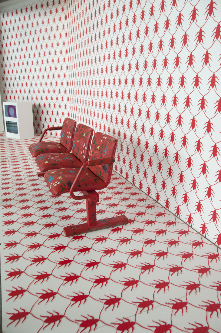
Since 2002, one of the most enduring themes in Qayyum’s work has been the cockroach motif. The symbolism of the cockroach – a hardy insect that has long adapted to human life – is one that Qayyum uses because it elicits fear and has often been used as a metaphor for immigrants and those considered as outsiders.[4] In her 2011 work “Incubate” depicts a series of small paintings of cockroaches encased in Lucite (acrylic). In the 2013 work “A Holding Pattern”, installed at Toronto’s Pearson International Airport, the cockroach pattern features prominently throughout the backdrop and furniture of the work and is made of painted pieces of acrylic. These pieces are meticulously arranged in a grid pattern that mimics the wood lattice room dividers commonly found in Islamic architecture. The installation references the airport transit terminology for continuous routing loops when planes are unable to land, which serves as an apt metaphor for the various socio-political (often life or death) conundrums faced by refugees today.[5]


01-A Holding Pattern detail (1)
Tazeen Qayyum. A Holding Pattern. Site-specific, mixed media installation
at the Toronto Pearson Airport, 2013. Courtesy of the artist.

This repetitive patterning common in her cockroach themed work has evolved and informed her performance work. For example, in her recent performances such as “We Do not Know Who We Are Where We Go” (2012 and 2014-15), Qayyum centers herself on the drawing surface and begins to write in her native Urdu language using Perso-Arabic script in concentric circles. The repetitive, trance-like process of creating these works can span several hours. For Qayyum, the process to create these works allows the audiences of the performance to see how her body fully becomes the instrument, melded with the paintbrush, to create the cursive lines of script.[6]

MIXER-Yuula B (1)
Tazeen Qayyum. We Do not Know Who We Are Where We Go-II, drawing performance, MIXER. 2014-15. Photo by Yuula Benivolski. Courtesy of the artist.

“I am confident to say that I have always prioritized my home and being a mother over my professional life,” reflects Qayyum. This has often meant passing on opportunities that may have propelled her into the limelight, however, this has not lessened the potency of Qayyum’s artistic output. Instead, her work continues to be driven by “what my narrative is, what is it that I want to investigate or say, what has moved me enough that I need to express my feelings, and then comes the ‘how.’”[7]

Qayyum’s work continues to push the limits of modern miniature painting. Her latest project, a series of multidisciplinary works called “Cover The Same Ground” (2020—), has been “created as worksheets of learning to draw a dead cockroach, breaking it down as fictional letters and language.”[8] Here, Qayyum continues to evaluate and piece together visual imagery to challenge the conceptions long shaped by colonialism and white supremacy in the imagining of the ‘Other’. Indeed, the ability to address the misuse of knowledge and its translation “into acts of bigotry and brutality through misrepresentations of socio-political and religious ideologies” features prominently in Qayyum’s art.”[9] In her work, Tazeen Qayyum brings these issues to the forefront using and expanding the established vocabulary of traditional miniature painting.  “Fear is no longer a mute condition” Qayyum points out, “I believe we are infinitely connected through thoughts, words, and actions, and I want my work to convey that as well.”[10]

To see more of Tazeen Qayyum’s artwork and future projects, visit www.tazeenqayyum.com or her Instagram @tazeenqayyum.

Nadia Kurd (she/her) is an art historian and curator based in Amiskwacîwâskahikan  (Edmonton, Alberta). Her work can be found on http://www.nadiakurd.com


[1] Tazeen Qayyum, interview by author, Edmonton, AB, May 16, 2020.

[2] Jonathan Bloom and Shelia Blair, Islamic Arts (New York: Phaidon Press Inc. 2006), 220.

[3] Louis Werner, “Reinventing the Miniature Painting”, (accessed May 20,2020).

https://archive.aramcoworld.com/issue/200904/reinventing.the.miniature.painting.htm

[4] Leah Sandals, “Into the Deep”, Canadian Art, https://canadianart.ca/features/into-the-deep/ (accessed May 20,2020).

[5] Ibid.

[6] CBC Arts, “Why Tazeen Qayyum is Willing to Suffer Joint Pain for Her Art” https://www.youtube.com/watch?v=cPUeQ4XSBMU, (accessed May 20,2020).

[7] Artist interview with Author.

[8] Ibid.

[9] Ibid.

[10] Ibid.

Mira Makai’s Keramik und Grafik at Susan Boutwell Gallery


fullsizeoutput_2aa
Mira Makai. Keramik und Grafik Installation shot. Photo documentation by Ákos Ezer. Courtesy of the artist.

Keramik und Grafik

Susan Boutwell Gallery

Munich, Theresienstrasse 48

Germany

Resembling coral reefs or corporeal body parts, Mira Makai’s abstract ceramics have a sense of organic vitality, pulsing with moulded forms merging together. Makai is a Hungarian artist who intuitively explores the boundaries between life and decay through printmaking, painting, sculpture, and ceramics. She has studied in Germany at the Akademie der Bildenden Künste München and has an MA in Printmaking from the Hungarian University of Fine Arts. Additionally, she has been featured in Forbes Hungary’s Top 30 under 30 and has exhibited throughout Europe, most recently at MODEM Modern and Contemporary Arts Centre, Art + Text Budapest Gallery.

Femme Art Review is pleased to feature a digital experience of Mira Makai’s exhibition Keramik und Grafik at Susan Boutwell Gallery since it has been closed off to the public due to COVID-19. Viewing art online may be a different experience than seeing the show in person, however, we hope to spotlight artists to bring their work to viewers. Although these past few weeks have been uncertain, the power of the arts community coming together to offer their support has been tremendous. In these disheartening circumstances, new avenues of collaborating and experiencing art can occur. Below is an artist’s statement and video of Mira Makai’s exhibition Keramik und Grafik.

Mira Makai. Keramik und Grafik at Susan Boutwell Gallery. Video by Max Draper.

Mira Makai / Artist Statement

While making [these] ceramic objects I was reminded of a childhood scene. When I was young and we went to the River Tisza on holiday, my favourite game was to fool around with the wet sand of the riverbank. I liked to watch the watery silt first losing its sheen in my hand, then go dry, and finally display another quality in it’s cracked and whitened form. This is a basic experience to me, which has determined the roots of my attitude toward painting and sculpture. I like to imagine that in the prehistoric age the process was the same during the birth of the first works of art. This is the feel I am looking for in my work in general.

In my university years, after making a lot of graphic prints and studies, I formulated a need for a kind of creation/possession of objects. This was the main motivation behind my moving to Munich to work on ceramics. I wanted to have something that had value in itself, without being furnished with the amount and locked behind a frame. I immediately warmed up to ceramics, where works are enduring but really mouldable in all respects. First I planned to realize five or six designs, and their building was preceded by a long preparation. After being confronted with the characteristics of the material, getting to know its nature, several options opened up for me. I was liberated from my fear of making errors and at once felt the product to be my own.

_DSC6076
Mira Makai. Keramik und Grafik Installation shot. Photo documentation by Ákos Ezer. Courtesy of the artist.

The forms used in my sculptures are based on a simple observation of nature. Therein reappear the treasures of natural museums, loved and visited by me, such as the structure of minerals and rock, the details of prepared displays under glass and the transparent innards of amphibians in formaldehyde. I strive to create a sort of personal Wunderkammer. What I deem important in these works is the duality manifested on the borderline between inviting, vibrant proliferation and revolting yet natural decomposition. It is in this frontier zone that I imagine these works, and pair up formal elements with colours and surfaces accordingly.

_DSC6090 (1)
Mira Makai. Keramik und Grafik Installation shot. Photo documentation by Ákos Ezer. Courtesy of the artist.

Additionally, I think that the atmosphere and the mood of the works can awake an inviting and repulsive feeling [for the viewer]. This observation is interesting to me. This is the border between the full of life prurience and the deadly rot. I find my works interesting if I can balance in this border with them.  I build up my works for that ambivalent aesthetic, and I search for those values in other artworks.

To see more of Mira Makai’s work visit her website and for inquiries about her work contact Susan Boutwell Gallery.

In Discussion with Nathalie Quagliotto: Safety Yellow, Play, and Pilot Art List

NQuagliotto_new-carts_600
Twisted Reality, fused damaged metal shopping carts colliding, 2014.
Presented in Sudbury for the FAAS4 May residency organized by the Galerie du Nouvel-Ontario.

Questions by Adi Berardini

Nathalie Quagliotto’s sculptures add a sense of playfulness to conceptual art. By using play and the uncanny, Nathalie challenges what a typical gallery experience can look like for viewers. She looks at architecture and questions how the materiality of everyday spaces can form our experiences. Quagliotto is well-known for using “safety yellow” in her work adapted from the industrial yellow found in caution signs or playgrounds, making subversive statements that often linger between innocence and adulthood or caution and action. Additionally, by using the language of consumer culture such as neon signs and shopping carts, she makes us consider our roles within larger societal structures. She has recently started PILOT: Art List featuring paid opportunities for artists.

Quagliotto is a Toronto and Montreal based conceptual and social practice artist. She received an MFA in sculpture from the University of Waterloo in 2009 and a BFA in studio art from Concordia University in 2007.  In 2008, she was Martin Creed’s studio assistant in London, England.  She has shown nationally and internationally, such as the Museum of Design in Atlanta, Georgia, and the Urban Institute for Contemporary Art in Grand Rapids, Michigan, and her work is in private and public collections, such as the Collection Majudia in Montreal, Quebec. She has shown at various artist-run centres and galleries across Canada, namely the Khyber Centre for the Arts, the AGO, Blackwood Gallery, UAS, Neutral Ground, Langage Plus, the Art Gallery of Mississauga, and the Estevan Art Gallery.  Additionally, she has partaken in residencies, such as the Calumet artist residency in Indiana, the Accessibility CMD+R media art residency in Tennessee, USA, and more recently the Vancouver International Sculpture Biennale artist residency.

I was wondering if you could explain your interest in subverting everyday objects? Are you interested in their connection to the uncanny or how they can critique social structures?

I like to take everyday objects in my work, whether it’s a neon sign, a lollipop, playground objects, or tote bags (the list can go on and on) and reconfigure them ever so slightly that your interaction and relationship with them is disrupted. I like that an object can get really unsettling when you change its intended purpose or form.


maturityturn
Nathalie Quagliotto. Maturity Turn, 2011. Courtesy of the artist.

It seems that you use interventions that encourage play, like tic tac toe in your piece ‘Maturity Turn’ Can you explain more about the sense of play, intimacy and social connection you explore in your practice?

Yes, this is particularly evident in the playground installations I’ve created, like in this piece you mention, “Maturity Turn”. Such installations are participatory and play on the notion of how a form or structure can be safe at the same time as it can be a challenge, and how the invitation to play with the work can act this out.

My interest in the playground sculptures and installations lie in play theory and incorporating the history of playgrounds as being objects of social reform. Playgrounds have a long history, from the early 1900s, of making a gradual change to society by improving the lives of the public through play. The more dangerous a structure was, the more challenging it was and thereby made a person more productive in other aspects of their life. These structures, built quite high at the time, have disappeared because of being labeled as dangerous.  Lower playgrounds appeared in the second half of the 1900s, specifically around the time of the playground construction boom of the 1960s.  Many of these metal and concrete playground pieces have also gradually disappeared in our time and are being replaced by safer plastic items: the kind of metal structures that playground architects Paul Friedberg and Richard Dattner would have agreed on in the 1960s and 1970s.  I am attracted to such older objects because they were once solid, acceptable pieces to be placed in public. However, as time progressed, so did ideas surrounding public safety, and this affected social reform through time.

NQuagliotto_galleryarena
Nathalie Quagliotto. Gallery Intervention. 2013. Photo by Toni Hafkenscheid. Courtesy of the artist.

I notice that you use signifiers of capitalist ventures (like neon signs etc.) for public interventions, for example, in Gallery Intervention where you place a neon sign that says “Gallery” in the hockey arena. I was wondering if you could speak more about this piece? In what ways are you interested in these unconventional signifiers?

This was a rather quirky intervention!  I was invited by the Blackwood Gallery of the University of Toronto Mississauga campus to create an installation for “Door to Door 6” back in 2013 and the point of the exhibition series was to place art completely outside of an art context.  I decided to place three yellow neon signs that read the word “GALLERY” in the Streetsville hockey arena in the Vic Johnston Community Centre in Mississauga. By placing commercial gallery signage in a completely different environment where it would normally be found, the project created a type of pop-up art space. The gallery context was transformed into a site-specific intervention that pushed the public who possibly had little experience with art to think about what an artwork, an exhibition, and a gallery could potentially be.

I’ve used neon various times for different installations and interventions. I think neon as an object has an incredible potential to attract attention because it can get kind of strange and unsettling if you take it out of its commercial context of store and restaurant windows in society.

D.D_N.Quagliotto.TH-14_600
Nathalie Quagliotto. Gallery Intervention (2013) Photo by Toni Hafkenscheid courtesy of the artist.

Your work seems to bring a sense of critique to the gallery itself. I was wondering you could speak more to the critique of the gallery space and your approach through your work?

I like to disrupt conventional notions of behavior in the gallery context and allow people to hang out and interact with the work. I like to encourage participation. This I’d say is more evident in my installations and sculptures involving playground equipment or general objects of play in the gallery context where I invite the audience to touch the objects.

Who are some artists that you admire or look to for inspiration?

Lately, I’ve really been into Alicia Eggert’s and Alejandro Diaz’s neon work.

Do you find that there are challenges working as a conceptual artist in a male-dominated art world? If so, what are some challenges?

I’d like to see more women land museum shows. Also, I definitely think there are challenges that women artists face on a commercial level in terms of selling artwork.

Can you speak more about Pilot: Art List? What was the inspiration behind starting this new project?

The project started in November 2018 as a way to encourage a multitude of professional artists out there to only apply to opportunities from institutions and galleries that pay them.  I look at calls all the time and I have for years, and I have to say that in the 10 years I’ve been out of my MFA degree, I’ve never found a list on any platform on only funded calls, so I finally decided to make one.  This is probably the most beneficial list that an artist can sign up to and it comes out every two weeks.  I got the word out through social media over the past year and there are currently hundreds of artists signed up to the list across Canada and in the USA. The calls on each list are researched and hand-picked for funded exhibitions, residencies, fellowships, and public art primarily from Canada and the USA. Right now, artists can sign up at https://nathaliequagliotto.com/PILOT-ART-LIST . I honestly think this is one of the best social projects I’ve created because of the number of artists it’s actively helping.

You can view more of Nathalie’s work at https://nathaliequagliotto.com/.

In Conversation with Rae Spoon: Mental Health

Rae Spoon1
Rae Spoon portrait by Dave Todon. Courtesy of the artist.

Questions by Adi Berardini

Rae Spoon is an award-winning, non-binary musician and author whose music bridges indie pop, rock, folk-punk and electronic. Spoon owns and runs an indie record label called Coax Records that has released fifteen albums by Canadian and international artists. They have also been nominated for two Polaris Prizes, a Lambda Literary Award and a Western Canadian Music Award. A strong songwriter and performer who has toured for over 20 years, Spoon’s music is often connected to social activism/change, especially within the LGBTQ2+ community.

Rae Spoon’s latest album Mental Health addresses their own experience with mental health and the issues that arise in LGBTQ2+ communities while navigating the stigma around both mental health and queerness. Spoon describes that “I often think of albums in themes and that will often guide my writing. I try to tie in the songs in terms of that so there’s some continuity between them.” Spoon is well known for their insightful and introspective lyrics, and their new album is initiating the conversation that we need to be having about mental health.

I noticed that water is a particular theme in your music. I was wondering if you could talk about this inspiration and what water symbolizes to you?

I moved to Lekwungen speaking people’s territories in Songhees, Esquimalt and W̱SÁNEĆ territory, otherwise known as Victoria, BC. I have lived on the west coast before, but it has been a while since I lived in Victoria. I live where the pipeline would be, intersecting with the ocean. We all know it’s a big deal in terms of politics right now. There’s a great deal of activism with Indigenous people not wanting the pipeline to be built and the government pushing back, the federal government especially. I feel even more tied to this issue especially being from Alberta originally. [As a result,] I feel especially connected to the water around. That’s how the water theme started and why there’s often landscapes and waterscapes in my songs.

Your book Gender Failure is a collection of autobiographical essays, lyrics, and images documenting co-author Ivan E. Coyote’s and your personal journey from “gender failure to gender enlightenment,” based on your live tour. I was wondering if you could talk more about this tour and the inspiration behind the book?

We started the stage show for Gender failure in about 2013, and it premiered in an off-Broadway theatre in New York. It was the first multi-media narrative show I was doing so I was very nervous.

It was interesting since we were connecting with local audiences in New York about all of these Canadian stories of growing up. It was pretty cool, we could see it was something that was really connecting people despite that since we were talking about the strict gender binary and the rules of the patriarchy or sexism. You would always end up at some point in your life when you’re like “I don’t wanna do that.” Even the people who are benefitting from it [are affected by] how toxic the masculinity is.

We were going to make a show about being transgender and/or non-binary and we realized we made the show about how the gender binary is failing everybody, connecting a lot of people when I look back. We made it into a big show, we did two sets and toured with it for a couple years and we did some in London I think and across North America and Canada. In that process, we figured out some of the book and we added more pieces to create it. Our friend Clyde Petersen who is in Seattle did the live visuals for the show and made the illustrations and visuals for the book.

I saw you in London at the brewery on top of the Root Cellar. I remember that it was really creative and intimate, it was really special. I was wondering what your favourite part of touring smaller communities and maybe difficulties with that as well?

It’s really nice to go to small communities often since the LGBTQ2+ scene is really supportive. Although I’ve also had the same things happen to me in downtown Toronto as I’ve had in small communities. I’ve had issues getting yelled at—it can happen anywhere that the people can be oppressive or violent. However, I don’t usually stick to large cities, I like how supportive it is being there in small communities.

Before I learned to drive it was a challenge to tour on the Greyhound and tour in Western Canada, but now that I can drive it’s a lot easier. It’s great, I can also make my own hours. Often a lot of different people have to hang out since it’s not big enough to separate people into groups. The [different] scenes and the sort of queer scenes will often be connected which I like, with different ages and different backgrounds.

I see that you have started an indie label, Coax, which supports LGBTQ2+ and under-represented artists through community building. Do you have any advice for gender non-conforming/non-binary musicians who are just starting out in the music industry?

I am really all about community building. I think one of the best ways to meet other musicians is to support the music community, so when you’re starting out going to other shows and you then meet the musicians who are playing or supporting college radio, volunteering at festivals, you can meet a lot of people there who like music. The easiest way to try and build a following is to meet a lot of people who like music.

To be able to tour as a new act helps that, you can meet people from other towns, and you trade having people at the shows so that they know who you are. The best way to start out, in the beginning, is to help out other people and it can help you as well. It’s great to build more live scenes and music opportunities.

Print
Rae Spoon, Mental Health. The album will be out on August 16, 2019.

You have an album coming out in August called Mental Health. I was wondering if you could talk about the inspiration behind the album?

The beginning of the inspiration behind [the album] is the communities I am in, and also my own mental health stuff that I face. I think music can sometimes make space for that. I wrote songs about my own journey with mental health and the different perspectives [I’ve had] during my life.

I think there’s still a lot of stigma about mental health and stigma around queerness and [being] LGBTQ+. It’s important to make space for marginalized communities. Often, we lack services, or you can’t go to the hospital since they’re not going to get your pronoun right. Trauma issues aren’t going to go away but there are ways to find different tools. I was thinking a lot about that and also that it’s not something that needs to be cured. Like getting out of ‘caring’ culture [which doesn’t address mental health as an ongoing struggle], and instead, talking about the everyday journeys of survival.

Check out Rae Spoon’s latest album Mental Health which comes out on August 16th, 2019.

The album launch for Rae Spoon’s Mental Health and celebration of the long-list Polaris nominations for Kimmortal’s X Marks the Swirl and LAL’s Dark Beings is happening on August 14 at Fox Cabaret in Vancouver, BC.

Profiles on Practice: Meera Sethi

Meera Sethi Headshot 2 website (1)
Meera Sethi headshot. Courtesy of the artist.

By Nadia Kurd

“I came to making art through a circuitous route,” says Canadian artist Meera Sethi. As a self-taught graphic designer, Sethi felt that her transition to a full-time visual artist was a gradual one. Despite earning a BFA (1998) and MA in Interdisciplinary Studies at York University (2001), it was only after graduation that Sethi began experimenting with acrylic paints and became more confident working directly with various materials in her studio. As Sethi reflects, “I sometimes wonder if it was because there were no clearly defined role models for me to follow as an emerging visual artist.”[1]

Her experimentations with paint eventually led to figurative paintings that explored her interests in South Asian identities and place. Painting series such as Firangi Rang Barangi (Colourful Stranger, 2009-2012), Foreign Returned (2013) and Upping the Aunty (2016) combine her graphic design and painterly sensibilities. These vivid and highly graphic paintings and drawings examine the hybridity and evolution of South Asian clothing, gendered norms and societal expectations. Most often portraits, these works emphasize the individuality of her subjects and provide insights [into] the diversity of South Asian culture.

Pinky Aunty - Med Res (1)
Meera Sethi. Pinky Aunty (Upping the Aunty series),  2016, acrylic, fabric and crystal on canvas, 36 in. x 60 in. Private Collection. Courtesy of the artist.

For example, in her three-part series Upping the Aunty, Sethi presents portraits of middle-aged South Asian women who are informally referred to as ‘aunties’. Though not always a biological relation, these women are part of the larger South Asian community, who Sethi points out, are “neither our mothers nor part of our peer group, aunties may be trusted confidantes or gatekeepers of social decorum.”[2] Along with these painted portraits, Sethi includes street-style photography and a colouring book. The playfulness and broad appeal of these illustrative works humorously highlight at the misconceptions about the personal lives of South Asian women.[3]

Moreover, the work of established artists such as Mona Hatoum, Doris Salcedo, and Louise Bourgeois have been important to Sethi for understanding how to foreground the feminist body and the ways in which these artists have linked personal histories to larger social and political events. However, it is ultimately the stories and histories of communities that she is connected to such as queer people of colour and her family relations that she is most invested in. For Sethi, it is the stories from these communities, particularly histories of migration, the global flow of capital and colonization that exposes the current, complex lived experiences of people today.

IMG_1858 (1)
Meera Sethi. Outerwhere Series, detail. Courtesy of the artist.

Sethi develops her work organically as her process involves preliminary drawings, reading, and written reflection. More recently, Sethi has shifted from working in a stationary, graphic design manner to one that is much more mindful and body-focused in nature. “When I work in a studio environment, I spend a lot of time sourcing material and understanding its visual and material language” observes Sethi, “I sit with objects and give them time to speak to me, trying not to force an outcome, if during the process I feel stuck, I get up and move.”[4]

In her current textile-based works, Outerwhere (2019), Sethi stitches together second-hand winter coats and various embellishments such as food wrappers, plastic flowers, fabric ribbons, and mirrors. As it develops, this project seeks to study “the binaries of inside/outside, personal/public, past/present as they relate to material culture and the migratory experiences of South Asian-Canadians.”[5] More importantly, the work reveals the intersections of textile, lived experiences, and objects through an everyday, protective garment.

IMG_3477 (1)
Meera Sethi. Outerwhere Series, mixed media textile, 2019-ongoing. Courtesy of the artist.

As she continues to evolve her work, Sethi has moved away from her past design practice to a more experimental, and time-sensitive approach—one that utilizes her history and memories in a more personal way. On this change in her artwork, she notes that “I find myself curious about new mediums such as durational sculpture, textile, and performance and I am also interested in exploring moments of transition and being in-between places, identities, and locations in a way that opens up questions rather than provide answers.”[6]

In 2018, the Melissa Levin Emerging Artist Award through the Textile Museum of Canada recognized Sethi’s work (alongside Indigenous artist Catherine Blackburn). For her, the move from her graphic design to a more visual arts practice has allowed her to move towards a deeper reflection on the world around her. “My work is about the undoing of myself,” says Sethi, “through working with the materials I know best and my own life, I am able to draw connections that make world-making possible.”[7]

To see more of Meera Sethi’s artwork, visit her website, meerasethi.com or follow her on Instagram @meerasethi

Nadia Kurd (she/her) is an art historian and curator based in Amiskwacîwâskahikan (Edmonton, Alberta). She tweets @nadia_kurd and more of her work can be found on nadiakurd.com.


[1] Meera Sethi, interview by author, Edmonton, AB, June 12, 2019.

[2] Meera Sethi, http://www.meerasethi.com, (accessed July 4, 2019).

[3] For more information on Sethi’s Upping the Aunty project, click here.

[4] Meera Sethi, interview by author.

[5] Artist website.

[6] Meera Sethi, interview by author.

[7] Ibid.

The Poetic Everyday: In Conversation with Natalie Hunter

02_NatalieHunter_RodmanHall_2019
Natalie Hunter. Staring Into The Sun. Solo exhibition at Rodman Hall Arts Centre. Hansen Gallery. 2019. Documentation image by Jimmy Limit.

Questions by Adi Berardini

Natalie Hunter’s work brings the everyday experience into a wondrous technicolour world, where the present moment meets that of memory. Bridging photography, sculpture, and installation, photos of interior domestic spaces are re-imagined through a kaleidoscope of colours, cyan meeting magenta, yellow and violet. She often produces experiential installations using photographs on transparent film, light, and other fragile materials that engage with the poetics of time, memory, perception, and the senses.

Natalie holds an MFA from the University of Waterloo, and a Bachelor of Art in Visual Art with a Concentration in Curatorial Studies from Brock University. She has shown her work in Canada and the United States in numerous exhibitions, including Rodman Hall Arts Centre, Centre 3 for Print and Media Arts, Art Gallery of Windsor, Hopkins Centre For the Arts at Dartmouth College, Museum London, University of Waterloo Art Gallery, and the Hamilton Supercrawl. She is the recipient of several awards including an Ontario Arts Council Creation Project Grant, and a Canada Council for the Arts Research and Creation Grant.

08_NatalieHunter_RodmanHall_2019
Natalie Hunter. The sky seemed to fold in ribbons of palest sunlight. 2017. Giclee prints on transparent film, poplar, light. installation dimensions variable. 12” x 72” each print. Documentation image by Jimmy Limit.

It seems like your work facilitates a “looking closer” since it often uses colour and layering of translucent images until they are nearly rendered abstract. Can you speak more about the conceptual ideas in your work and your process? How does it relate to perception and memory?

Natalie Hunter: My practice is multidisciplinary and concerned with the transformation of materials, objects, and images in ways that evoke an emotive or psychological response in the viewer. I often make images and installations and think of myself as a sculptor who fell in love with images. I’m interested in process and materials just as much as concepts. The starting point for most of my work boils down to light and time, both of which can be experienced differently through image and sculpture. I’m interested in really ephemeral things like light, air, memory, the senses, motion, stillness, and time. Things we can feel the effects of, how they shape experience, and how these concepts can be articulated in material ways. I very much look at photographs as material fluid things that are tangible objects vulnerable to the elements. I find sculpture and photography related in some way. There is an element of stillness in sculpture and photography that speaks to the present moment, but also the past. The negative and positive aspects of photography mirror that of sculpture and casting—both are traces just in different ways.

I’m really interested in the exploratory, transformative power of materials to translate these experiences of the everyday.

For the past seven or eight years, I’ve been working with layering images both physically (layering transparent photographs to make new images and spaces), and inside of the camera (multiple exposures). I find this act of layering both inside and outside of the camera transcends logical ideas of time. For me, the act of layering images subverts expected notions of a perfect photographic image and notions of linear time. I use layering in an attempt to connect with the processes of human memory. Layering both accumulates and loses information, and this is what happens as we accumulate memories, sensory information, and thoughts over time. Detail is lost, while sensation is accentuated.

When making images, I use colour filters to bring attention to these layers. They help me slow down and separate different moments of time while leaving clues as to how the images were made. I choose combinations of colour filters emotively; choosing colours that naturally occur in the spaces I occupy to further accentuate them. Colour is sensorial in the visual sense. I believe that the addition of colour heightens awareness. When I think about the strongest earliest memory that I have, I can’t identify details, but I can describe the sensations, and for me adding colour through the use of filters is a way of exploring sensation or sensory information through photography. In this way, I hope to make a predominantly visual medium physical.

06_NatalieHunter_RodmanHall_2019
Natalie Hunter. Helios (interior day view). Hand-applied dichroic film on window, light. variable dimensions. 2019. Documentation image by Jimmy Limit.

  You take photographs of what may seem ordinary or mundane, like the interior blinds and curtain shots in As the Light Touches and create something quite awe-inspiring and vibrant. Can you speak more about the transforming of everyday, familiar spaces?

NH: Artists should make work about their experience and how they perceive and understand the world. The mundane experiences we find ourselves in on a daily basis are often those in-between moments that we don’t really count as experiences. I’m really interested in the exploratory, transformative power of materials to translate these experiences of the everyday. Memory is just as important as breathing in our human experience and I’m interested in exploring how that manifests and transforms through time. I feel like we are all unconsciously shaped by the spaces we inhabit on a daily basis, and I know that my work is often influenced by the spaces I spend the most time in. Space is something psychological just as much as it is physical, and I want to explore both of these aspects of space in my work.

Gaston Bachelard’s The Poetics of Space is a text that I return to a lot. It has been influential in how I understand my work and its relationship to space, time, and memory. We participate daily in the creation of spaces we unconsciously make for ourselves. I don’t wish for my work to merely represent these spaces, but instead, act as experiences in and of themselves that become new spaces and encounters in their own right.

05_NatalieHunter_RodmanHall_2019
Natalie Hunter. Helios (interior day view). Hand-applied dichroic film on window, light. variable dimensions. 2019. Documentation image by Jimmy Limit.

Your work seems to incorporate the surrounding architecture of the space it occupies. For example, your installation Helios at the Rodman Hall Art Centre, a site-responsive piece that addresses the ephemeral qualities of light and how it affects familiar spaces, the body, and our perception. I was wondering what your process is like in terms of creating work that is more site-specific?

NH: I don’t like to ignore the space my work exists in. I try to consider the space it exists in at the time of exhibition as an element of the work itself. Often, my work changes when it’s installed a second or third time, or from my studio to the gallery space. I need to do site visits when thinking about site-specific work, and I usually respond in an emotive way that speaks to a unique characteristic of a space in order to converse with it. Memory plays a big part in this. When responding to a space site-specifically, I hope to produce a kind of encounter between viewer and work that elicits memory or a sensorial response.   

Helios was a site-responsive installation at Rodman Hall Art Centre exhibited in my solo exhibition Staring into the sun. When making Helios, I wanted to consider it a gesture, response, or conversation with Rodman Hall; a connecting work that bridges outside and inside and only exists for a short time in the space. I was really influenced by my memories and experiences of Rodman Hall as a student. I remember ascending the stairs and seeing the stained glass, which is located in various locations in Rodman Hall’s domestic spaces. I wanted to converse with these architectural elements while at the same time make something new. Something that made you more aware of time, your body, and the space you exist in a very present, albeit slow, way. Change and fluidity are important to this work. And the work took on its own life as winter stretched to spring and the light changed.

I think Helios points to the process of how I create images and think with materials. I spent about a little over a month playing with samples of dichroic film, doing material research, finding out what it does in different lighting conditions, bending, folding, layering, and draping it in various situations, and mixing it with different materials. A lot of my inquiries stem from testing materials to see what they will do. Helios is much about slow movement, the slowness of time, and how we perceive it through our human senses. I hope to continue exploring what I learned in making this work.

07_NatalieHunter_SunsRays
Natalie Hunter. The Sun’s Rays Do Not Burn Until Brought To A Focus. Installation at Centre 3 For Print and Media Arts, Hamilton, Ontario, Canada. 2018. Documentation courtesy of the artist. 

Q: Your installation The sun’s rays do not burn until brought to a focus creates a “temporal experience for the viewer since as the sun moves across the sky, each work is animated with their own ephemeral rhythm.” I was wondering if you could speak more about this work and the use of natural processes, light and time?

NH: I use light in the making of images, but also physically in how they are exhibited and exist within space. For me, light is quite kinetic or makes the work kinetic through the passage of time. There is both stillness and subtle motion in my installation The sun’s rays do not burn until brought to a focus, achieved through different uses of artificial and natural light. I use light in this installation as a material that activates spaces.

Light is fundamental to photography, and I consider its manipulation as a material process in my work. Light is also fundamental to sculpture because it is how we are able to situate and perceive objects in space. Light is ephemeral, like time and memory. Natural sunlight is always changing, where as artificial light is static. In The sun’s rays do not burn until brought to a focus, natural sunlight is used in a kinetic way, gallery lighting is used in a rather still way, which casts latent imagery on the surfaces of the exhibition space. A viewer’s experience of the work is not static but always changing. Elements move with the subtlety of the air movement in the space, and the installation seems different on a cloudy day, or between dawn and dusk.

It’s hard to discuss photography without discussing time because time is so essential to the medium. Photography is always seen as a frozen moment, but for me, photographs are fluid things. A lot of my transparent film works require active movement in the space that they occupy in order to experience them. The light activates them, but the viewer does through movement too. For example, in The sky seemed to fold in ribbons of pales sunlight, it appears different when standing at different points in the room. When standing directly in front of the piece, the physical images almost disappear, and you only see latent imagery on the walls. When standing at an angle, the images appear layered with themselves and the latent imagery on the walls. You aren’t sure what the true image is; the physical photograph or its latent reflection.

Q: Who are some artists that are influential to you and your practice?

NH: A lot of the artists I admire often explore quiet and overlooked elements of our being and how they shape experience. I look to artists like Tacita Dean, Uta Barth, James Welling, Sabine Hornig, and Sarah VanDerBeek for their consideration of materiality in lens-based image making. I feel a kinship to artists like Ann Hamilton, Roni Horn, Kimsooja, and Alison Wilding for their conceptual and material research, and multidisciplinary approaches to working. In 2012, I spent a summer internship working for sculptor and installation artist Soo Sunny Park. This was a priceless opportunity and an integral part of my artistic development and education in terms of understanding space and place. She encouraged me to think about my images in material ways and take my interest both in sculpture and images into installation territory. She taught me that sculptors have a unique understanding of space. I want to continue to develop and explore that in my work—subverting expectations of what images and installation can be.

09_NatalieHunter_Dappled
Natalie Hunter. Dappled (detail). 2018. Archival inkjet prints on backlight film draped over poplar and aluminum sculptures. Approximately 24″ x 60″ x 36″ each. Documentation courtesy of the artist.

Q: Can you speak more about the upcoming exhibition Shaping Time: Natalie Hunter, Xiaojing Yan and Lois Schklarat at Latcham Art Centre? What work will you be displaying?

NH: Shaping Time: Natalie Hunter, Xiaojing Yan and Lois Schklar at Latcham Art Centre considers ideas of memory and time through a multimedia lens. Elisa Coish curated Shaping Time around the 40th anniversary of Latcham Art Centre. Part of her curatorial strategy involves inviting artists at different stages of their careers to create a larger dialogue surrounding these concepts and the different approaches and discussions that can arise from it. Both Xiaojing Yan and Lois Schklar are well recognized and established artists that have exhibited with Latcham Art Centre in the past. Elisa Coish invited me as the emerging artist to exhibit work in Shaping Time after my solo exhibition Staring into the sun closed at Rodman Hall in May. I will be exhibiting some of the work that was shown at Rodman Hall in Staring into the sun, but also some work that has never been exhibited that I made in 2018 with an Ontario Arts Council grant. The work going in Shaping Time is an overview of the many approaches and materials I use to consider light, time, and memory in both installation and photo-based ways. It will be interesting to see how I respond to the space during installation because Latcham Art Centre is essentially a white cube. Corners are often considered non-spaces, and I am fond of corners for their surreal shape and potential for activating a space. In this way, I’m hoping to converse with some of the architectural elements in the space during installation.

 You can view more of Natalie Hunter’s work from July 10 – August 24th 2019 in Shaping Time: Natalie Hunter, Xiaojing Yan and Lois Schklar at Latcham Art Centre, curated by Elisa Coish and on her website.

Miss Meatface: Kat Toronto at The Untitled Space

July 2-13, 2019

The Untitled Space

By Chloe Hyman

Starting Tuesday, July 2nd, The Untitled Space in New York City will present a solo exhibition of interdisciplinary work by the artist Kat Toronto, a.k.a. Miss Meatface. The exhibition, curated by Indira Cesarine and named for the artist’s pseudonym, highlights the performance-based photography that Toronto is known for, as well as video and ceramic work and a limited edition of zines. On opening night, the artist signed zines and gave a talk about her practice.

Kat-Toronto-Miss-Meatface-Working_From_Bed-The-Untitled-Space copy 2
Kat Toronto. Working From Bed. Courtesy of The Untitled Space.

Toronto chose her pseudonym as a way to process her hysterectomy, a traumatic procedure that alienated the artist from her body. The persona of Miss Meatface provided Toronto an outlet to explore her sexuality beyond what is typically expected of those who have ovaries. “I found myself stopping to think… about what the heck gender really was,” the artist recalls, “and why society historically placed so much emphasis on sculpting gender stereotypes.”

In her self-portraiture, Toronto stages erotic scenes that play with dominance and submission—games of power that mirror heterosexual power hierarchies—but her sexually ambiguous figures subvert societal standards of beauty, gender, and power. Their skin is replaced by latex which also serves to obscure their genitalia. Dressing in fetish-wear is a joyous process for Toronto, as it frees her from the restraints set on her physical body by a society obsessed with defining and policing gender.

Kat-Toronto-Miss-Meatface-ForniphiliaThe-Untitled-Space copy
Kat Toronto. Forniphilia. 2016. digital photograph. Courtesy of The Untitled Space.

Historically there has been a tension between liberation and objectification when it comes to fetish in art and cinema. Forniphilia bears semblance to the work of Allen Jones, who was also involved with the artistic design of ‘A Clockwork Orange.’ However, Toronto’s identity as a female artist, and her emotional relationship with the persona Miss Meatface, lend her work both agency and depth. There is a raw truthfulness to her photographs that Jones’s Barbie-proportioned fem-bots lack. It radiates from her pink flesh inked with tattoos, and from the realism of her tableaus. Though Toronto visualizes herself in Forniphilia as a submissive sexual object, she remains deeply human, and therefore claims pleasure for herself.

“I found myself stopping to think… about what the heck gender really was,” the artist recalls, “and why society historically placed so much emphasis on sculpting gender stereotypes.”

Central to the realism of the artist’s work is the accoutrement of each domestic space. In Forniphilia, a wall yellowed by an invisible light source, a hard-wood floor, and vintage furniture, paint a simple, albeit dated, interior. A beige lampshade transforms Toronto into a standing lamp, and she assumes the connotations of the room she is in, reading as a willing participant in a sexual game of dominance and submission.

In other photographs, Toronto constructs more overtly retro tableaus, but her utilization of natural lighting maintains their authenticity. These shots, with their unbalanced streams of light, recall old family photographs rather than slick Hollywood sets. In No Time for Tears, a bedside lamp shines so brightly its own form is nearly abstracted—a beacon of blindingly white light. In Parlour, the source of light comes from a window that is almost overexposed by the angle of the sun.

Kat-Toronto-Miss-Meatface-No_Time-_For_Tears-The-Untitled-Space copy
Kat Toronto. No Time for Tears. 2016. Digital photograph. Courtesy of The Untitled Space.

The settings of these works also have a lived-in quality that renders them deeply intimate. Toronto has decorated each space in a manner that recalls a specific time period, but never attempts to achieve Hollywood set design levels of polish. In No Time for Tears, a floral sheet peeks out from the corner of the frame, gently clashing with Miss Meatface’s cheetah-print dressing grown and the burnt-orange walls of her bedroom. Several tissues dot a green doily on her bedside table—an ironic detail given that her nose is obscured by a centimeter of latex. And finally, the strange landscape hanging above her bed follows the room’s color scheme almost too closely, adhering to a 1970s decorative trend that today would be considered tacky.

These elements minimize the work’s artificiality, and as a result, No Time For Tears never registers as a staged scene. Instead, Miss Meatface looks right at home smoking her cigarette on the bed. She is a person engaged in a sexual game rather than an artist’s model posed to elicit shock or titillation. Her agency and comfort enforce the work’s eroticism without subjecting Miss Meatface to voyeurism. Instead, the viewer is privy to a private moment in which Toronto is entirely in charge of her own pleasure.

Kat-Toronto-Miss-Meatface-Parlour-The-Untitled-Space copy
Kat Toronto. Parlour. 2016. Digital photograph. Courtesy of the Untitled Space.

The quality of tackiness that is present in Miss Meatface’s room décor and choice of dress is emblematic of a recurring theme in Toronto’s work—kitsch. The term ‘kitsch’ has historically been employed by the cultural elite as a foil for good taste. Twentieth-century avant-garde artists believed nostalgia and materialism were the greatest obstacles to their utopian goals, and designated any object they deemed sentimental or excessive, ‘kitsch.’ Politically motivated by the perceived need to eliminate kitsch mentality from society, male cultural critics adopted femaleness as a rhetorical device to demonize kitsch objects and champion avant-garde art. This practice led to the debasement of female artists/craftspeople and the women who collected their work.

Despite—and perhaps because of—the history of kitsch, Toronto loves the term. “I don’t happen to think of kitsch as being a dirty word,” she said. “I think it should be celebrated and revered.” She goes on to exalt the kitschy objects she admires, from “doilies, granny squares, and novelty teapots” to “vinyl furniture covers and crochet toilet roll covers.” There is an abundance of such objects in Parlour, which features an array of lace doilies draped over a crimson sofa and a number of whimsical figurines perched on a round table. The inclusion of such kitsch details lends Toronto’s photographs a sense of intimacy that communicates the artist’s comfort in these scenes.

In embracing kitsch, Toronto is part of a generation of artists—often women and/or LGBTQ+ —who are reclaiming a style once used to debase their identities. It’s hard to ignore the gendered history of the term when consuming the artist’s sexually-charged images. After all, she situates submissive figures within historical domestic spaces, which naturally suggests a link between sexual submission and gender hierarchies in the twentieth century. Considering this history is an element of experiencing Toronto’s work, but the artist’s assertion of her agency—communicated through her intimate tableaus—takes center stage.

Kat Toronto aka
Kat Toronto. Meatmaid. Courtesy of The Untitled Space.

The history of kitsch is also the history of porcelain, a material that has been connoted with both masculinity and femininity throughout history. Because it signaled wealth, power, and intellect, porcelain was gendered masculine in the late-seventeenth and early-eighteenth centuries in Western Europe. Sensing the material’s political significance, French court women amassed their own collections, thus refashioning themselves as connoisseurs of court taste and key players in the trade. However, following the French Revolution, the material came to be associated with the materialistic whims of Marie Antoinette and thus fell out of fashion. It’s not surprising that nineteenth-century critics castigated porcelain as feminine, excessive and materialistic, as this rhetoric drew upon existing cultural norms that tied immorality and femininity.

This pattern repeated itself at the turn-of-the-century when many female artists crafted whimsical figurines and charming tableware from porcelain and other cheap substitutes. The masculine cultural elite regarded such goods with disdain, as their predecessors had in the courts of Britain and France.

Given the gendered history of porcelain, it is notable that Toronto has superimposed her photographs onto a number of ceramic plates. Meatmaid Plate is decorated with dainty pink flowers that encircle a photograph of Miss Meatface and her leashed latex pet. The work toys with dominance/submission and masculinity/femininity— themes that are common in Toronto’s practice—but it gains deeper significance by representing such themes on the surface of one of the most gendered materials in history. Sexuality, like porcelain, is marked by a history of power hierarchies that depend on a binary understanding of gender. By fusing the two, Toronto references the past in order to shed light on the present.

Kat Toronto aka
Kat Toronto. Tip Toe: Prurient Apparitions. Courtesy of The Untitled Space.

In addition to photographic and ceramic work, Miss Meatface will feature a limited-edition zine produced and signed by Toronto. The zine, entitled Prurient Apparitions, is printed on silk 170 paper and is sold within a hand-sewn slipcover. Asked about her motivation for incorporating zines into her practice, the artist cites her childhood exposure to the format. “As a child of the 90s zines were a huge part of my high school experience,” Toronto explains. “They were an amazingly cheap and effective way of getting the word out about subjects and interests that were important to us and helped to share information in a pre-internet world.” Although the internet has simplified methods of communication, fine art remains an elusive realm to many and collecting is not financially viable to all. Zines enable more people to collect Toronto’s work, and the portable format of the zine allows the artist’s work to travel with her new collectors and be seen by infinitely more curious viewers.

Prurient Apparitions is emblematic of Toronto’s other work, as it fuses vintage and fetish iconography on a single plane. But what makes this zine particularly intriguing is the seamless blend of contemporary fetish and Victorian iconography within its twenty-four pages. While anachronistic juxtaposition is at the heart of Toronto’s ceramic work, Prurient Apparitions succeeds in its unexpected harmony.

The page Tip Toe situates a polaroid shot of black latex bondage heels within an oval frame. The old-fashioned layout resembles an old scrapbook, with its burgeoning white flowers and the delicately-rendered garden scene peeking out from the top-left corner of the photograph. And yet, the contrast between the shiny black shoes and the frilly femininity of the flowers does not register as dichotomous. Perhaps this is because the artist senses the eroticism lurking beneath the flora in Victorian visual culture.

Toronto describes the Victorian Period as the epitome of sexual repression and rigid gender roles—and the plethora of Victorian pornography confirms this point. “It only seemed appropriate to place my images within Victorian album pages,” the artist says. “When you are flipping through the pages of the zine it feels like you are taking a naughty peek back into a secret Victorian photo album.”

She explains how the repressive atmosphere of the period can be felt in certain Victorian motifs, notably, the orchid. Toronto quotes John Ruskin, the lauded Victorian art critic, to elucidate the significance of the white flower. Ruskin, she says, frequently voiced his disdain for orchids due to their cultural eroticization. The presence of the white flower, therefore, imbues the pages of Prurient Apparitions with a strong sexual charge. Toronto goes on to say that the orchid is a metaphor for her own sexuality, which she feels is instinctive and deeply erotic but often fetishized and objectified by society. The artist and the orchid are similarly stigmatized due to their eroticism, which explains why Toronto’s fetishistic imagery blends so easily into the pages of a Victorian book.

Miss Meatface opens Tuesday, July 2 at The Untitled Space. Please note that the gallery will be closed for the holidays July 3-7, and will re-open on July 8. Miss Meatface will then be on view through the 13th.

Travel, Terminology and The Not Cooking Show: An Interview with Ayo Tsalithaba

_MG_6107
Ayo Tsalithaba, Portrait by Kezia Chapman.

Questions by Adi Berardini

Ayo Tsalithaba’s primary mediums include digital art, film photography and digital filmmaking. Largely influenced by music and travel, transporting the viewer everywhere from a dreamy alpaca farm to the village of Cheshee, their films address identity and the intersections of race, gender, and sexuality. Ayo is also the founder of The Bacon Berry Card Co., a small company specializing in cute greeting cards, stickers, prints and more.

Ayo has been featured in Huffington Post Canada, The Kit, TFO, the University of Toronto magazine and Munch Magazine. Additionally, they have screened their films and appeared on panels at the TIFF Bell Lightbox, University of Toronto, George Brown, the Revue Cinema, Xpace Cultural Centre, among others. Ayo is currently specializing in Women and Gender Studies and minoring in Linguistics at the University of Toronto. They hope to continue learning, taking risks, sparking conversations and above all else, advocating for positive social change.

Screen Shot 2018-11-29 at 4.39.02 PM
A KIKI WITH BOBBY BOWEN –  direction, camera operating, editing, cinematography by Ayo Tsalithaba
  1. One of your films interviews Bobby Bowen and discusses queer terminology specific to the African/Caribbean/Black community. I was wondering if you could further discuss this work?

The film that I made with Bobby was actually a final project for a class I took in my second year. We were supposed to work on a project that “produces knowledge” and to be honest, I didn’t really know what that meant. Instead, I wanted to turn to knowledge that is often overlooked and decided to blend what I was learning about linguistics and women and gender studies with my interest in film and make a short doc about queer terminology. I was also just getting into archiving and documenting Black queer histories, so this project was perfect. It’s stuff like this that keeps me going through school because I know that I can take what I’ve learned, strip it of pretentious (and unnecessary) gate-keeping academic jargon and put it on a screen. I know Bobby through my siblings and from admiring his work as a stylist, so I sent him an Instagram DM and we worked together. I just love this project because it was the first interview that I shot after my feature documentary and I felt like I got to apply what I’d learned to something short, sweet, educational and queer.

gb3
GOODBYES by TiKA, DESIIRE, and CASEY MQ– direction, camera operating, editing, cinematography by Ayo Tsalithaba
  1. I noticed that you often collaborate with musicians. What is your process for creating films for music?

I spend a lot of time listening to music and imagining what I would do with a song if I were given a budget and permission to make a visual for it. I would like to think that I’m constantly practicing music video filmmaking in my head whenever I listen to music, which makes it easier when an opportunity arises to be in the right frame of mind to come up with a concept. I usually start by listening to whatever song I am working with and jotting down ideas. Then I show them to the artist and see what they think and go from there. I like having a plan, but I also like letting go of it to some degree during the shoot. I make sure we have all the shots we need and then I like to play around and try out new things. After the shoot, I like taking a look at the videos and then I have to take some space before I start editing (unless I’m super excited to edit – in which case I could probably finish the video in a few hours).

_MG_5398 (1)
TiKA ft. HLMT All Day All Night – direction, camera operating, editing, cinematography, casting, concept by Ayo Tsalithaba
  1. You mention on your site how travel first influenced your discovery of documentary filmmaking. Can you explain this further? In what other ways does travel inspire you?

I was very lucky to be able to travel a lot as a kid because whenever my dad was going on a trip and I didn’t have school, my mom and I would go with him. However, the first time I remember making a good travel film was when my parents and I went to visit my aunt in Mauritius. I spent the whole trip filming our journey across the island. I think that my [documentary] work was influenced by my travels because I remember just wanting to document everything I saw – whether it was through film or photos – and that would allow me to keep taking it all in long after I had returned home. It’s become a bit of a tradition for me to make a film on every trip that I go on, and if I don’t have the time for a film, I make sure to take as many photos as I can. It’s funny because now I don’t travel nearly as much anymore because of school, because I’m trying to save up and also because I hate flying. I would still love to shoot a documentary that allows me to travel, but for now, I just have a list of places I want to visit.

  1. Do you think that photography and film can be used as a tool for social change? If so, how do you think it contributes to change?

Oh yes, absolutely a hundred times yes! I think my life’s work resides in art for social change – I’m so committed to it. I love making things look, sound, and feel beautiful, and to mix that with an important message is the best harmony there could be. I want to broaden photography and film to art, in general, to answer this question, because art has always been so important in championing change and artists have played an instrumental role in such. I can’t help but think of Nina Simone and how strongly some of her songs pushed for dreaming about Black liberation. I think art contributes to change by allowing people to sink into a struggle and see, hear, or feel something that was made with love and care. I want my art to be something that allows people to experience a shared struggle remotely. In a lot of my films, I try to make space for fear, anger, sadness, outrage, happiness, jubilation, love, hate and more emotions that I have felt while I was alone. In a lot of cases, I wish I had one of my films to watch and cry to or laugh to or just be angry about the current state of affairs to. One of the little ways I try and contribute to social change is making art for it. Eventually, when people trust me enough to give me a bunch of money to make things, it’ll be about bringing people who haven’t had access to funded art together and paying them. And then it’ll be about putting money and opportunities back into communities that need them.

  1. Who are some artists that influence you?

I know I’m going to forget people and this list is in no particular order, but: my whole family, Nina Simone, Kara Walker, Mickalene Thomas, Tika, Miriam Makeba, Lynette Yiadom-Boakye, Noor Khan, Sean Brown, Twysted Miyake Mugler, Syrus Marcus Ware, Solange Knowles, Vivek Shraya, Ruth E. Carter, Morgan Sears-Williams, Sean Leon, Kelly Fyffe-Marshall, Elisha Lim, Barry Jenkins, Sydney Allen-Ash, Tegan and Sara, Ava Duvernay, Nayani Thiyagarajah and so many more that I know I’m forgetting!

Screen Shot 2017-04-07 at 2.09.45 PM
Hallmark of Tolerance film by Ayo Tsalithaba
  1. You are multi-talented—you work as a digital artist/photographer/filmmaker and you have a greeting card business, Bacon Berry Card Co. What are you interested in exploring next?

I am very interested in cooking! I absolutely love cooking and eating. I have a food Instagram account (@notcookingshow) that I’m trying to turn into a cooking show because I know that I’d be a great cooking show host. Other than that, I see myself designing clothing because I struggle to find clothes that fit me and don’t give me dysphoria and I know there are other people who feel the same. Ultimately with all of the things that I’m interested in, I just want to help provide and spread opportunities, experiences and stories that aren’t out there. And also make money and give it to people who need it and help create programming and services that cater to underserved communities.