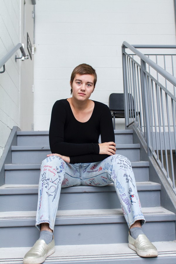
Dark Angels and Amazons: Natasha Wright at SFA Projects

Sista Chapel by Natasha Wright

SFA Projects, 131 Chrystie St, New York, NY 10002

November 13, 2019, to December 15, 2019
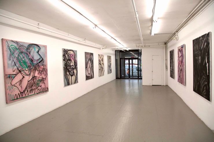
fullsizeoutput_2d
Sista Chapel by Natasha Wright, installation shot. 2019. Courtesy of SFA Projects.

By Nancy Elsamanoudi

The paintings on view in Natasha Wright’s show, Sista Chapel at SFA Projects, convey power with an erotic directness. These bold, exquisitely layered large-scale paintings lure the viewer to muse over the grumbling vibrations of murky, subterranean elements. These works call to mind myth, the underworld, sorcery, dark magic, ancient rituals, primordial energies, and impulses; a violent, dangerous world constantly on the brink of chaos.

Wright’s paintings are peopled with larger than life goddesses, coquettes, amazons and mythological and magical creatures. Her work taps into an imaginary space that collapses the difference between the ancient and the present. These threads that exist simultaneously are seamlessly brought together in the same painting: Cardi B and the Venus of Willendorf, Pac-Man and a sleeping pink nymph, an enormous unicorn smashed against the picture plane against a seafoam green background that at least partly mimics digital space or crouched monsters lurking in an open field at night.

The Unicorn, 60 x 48_, Oil on canvas
Natasha Wright, Unicorn, 2019 oil on canvas 60 x 48. Courtesy of SFA Projects.

The ambiguity at play in Wright’s paintings is compelling. Wright freely incorporates both abstract and figurative elements in a way that heightens the tension and the sensation of suspense in her work.  Her work has a playful openness, a searching quality to it. She seems to allow forms to emerge intuitively.

The thick black lines she uses brings her figures into sharp focus, but then she also sharply crops her figures in a way that frustrates an easy read of them. Various body parts, such as the head, wings, legs, arms are cut off and often lie outside of the picture plane. The figures in Wright’s paintings are cropped as a means of intensifying a feeling—a sense of discomfort. Wright’s work fixates on sensation and the role of the body is central to her work. But the body in her work is not particularly idealized or sexualized. Instead, the body takes on a totemic function—it is more an archetype, a cultural coding of the vitality inherent in a human being.

At times, Wright’s work seems to also touch on death, the macabre and violence. Bodies and parts of bodies are distorted past the point of recognition; the figures writhe in pain. Wright seems to be exploring the precarious and fragile vulnerability often ascribed to the female experience. In Street Ophelia, for instance, a violently contorted female figure appears to be splayed on the ground.

ItsComplicated
Natasha Wright, It’s Complicated, 2019 charcoal and oil on dyed canvas 60 x 60. Courtesy of SFA Projects.

Wright is clearly not interested in making pretty paintings—her paintings aren’t precious. The bodies in her paintings are frequently awkwardly contorted. Grey is often the predominant color and her limited palette of greys, pinks, black and green lend her paintings a gravitas, a weight as does the texture in her work.

Wright builds up the surfaces of her paintings by using a range of materials such as sand, glitter, glass beads, charcoal and black magnum with hand-made oil paint. There is a haptic, textural quality to her work.  The resulting images tend to be suggestive; they seem to hint at a story involving an unfolding drama or possibly a moment of impending danger. She gives the viewer a fleeting glimpse into her world and imagination.

Wright’s work speaks to a fascination with darkness and Wright is tied to her feminist temperament. Wright repositions the female figure at the center by re-envisioning the feminine gaze and rethinking the importance of female agency. The adventuress, the seductress, the muse, the fallen or scorned women all become protagonists that motivate her studio practice. The painting When Black Swallows Red, for instance, looks like large swaths of leather mixed with latex, it is suggestive of the way black leather and latex might feel strapped tight against the skin and in doing so calls to mind straps, whips, and pain folded into pleasure.

Willendorf (Cardi B) 60 x 48_, oil on canvas_
Natasha Wright, Willendorf (Cardi B), 2019 oil on canvas 60 x 48. Courtesy of SFA Projects.

Wright is drawn to the dark, mysterious and dangerous aspects of feminine power and the female experience. By focusing on the body as a vehicle of power and agency, Wright’s work seems to rebuff the so-called feminine virtues of purity, chastity, and modesty.  This can be seen in Already a Saint, a painting of cropped thrusting forward, half-naked torso clothed in animal skins. Or The Swan, a painting that seems to be referencing, “Leda and the Swan.” In this painting, a bent and twisted sullied swan appears like a dark angel covered in volcanic ash flying into a lake.

These paintings speak to feminist concerns, but not in the way that is didactic. Wright seems to be most interested in what may be construed as threatening, destabilizing or emasculating about feminine power.  This feminine power has traditionally sparked fear or has been seen as evil, unnatural and suspect, resulting in images of conniving hags and witches.  Wright’s paintings attempt to reclaim and prize this “darkness” of female power by treating it like black gold—tapping into it as an energy source and an intuitively life-affirming way of knowing.

Sarah Mihara Creagen: The Sisters’ Fart Corner

_GLH9814_Photo Guy LHeureux
Sarah Mihara Creagen, The Sisters’ Fart Corner installation shot. Photo documentation by Guy L’Heureux, courtesy of Articule. 2019.

Articule

262 Fairmount O. Montreal, Quebec

November 9 — December 8, 2019

By Penelope Smart

The walls at Articule in Montreal are piss-yellow — the perfect backdrop for The Sisters’ Fart Corner, a new series of ink drawings and animation by Brooklyn-based Canadian artist Sarah Mihara Creagen. Fart Corner is a playful body of work that is rated R. For those who do not wish to talk about piss and shit, kindly close your browser.

It would be a shame to shy away Creagen’s subject matter, though, because what she lays bare in black ink and bright backsplashes of watercolour is fascinating: figures playing out imaginative personal narratives of surgery, recovery, sex and IBS-related business. Yes, there are exposed labia everywhere, especially in Grafting: union must be kept moist until the wound has healed, but what is truly explicit here are bodies, consent, and ownership. Creagen’s figures — most of whom have female anatomy — expose truths about bodies that we are happy to accept and own, such as self-love practices in the form of masturbation or reading a favourite book on the toilet, as shown in Washroom Stall Chit Chat w/Chastity belts. Leaking into each frame, however, are a host of corporeal realities that we are quick to reject and shame: sex, BDSM, farts, pee, and other solids and fluids — especially where vaginas are concerned.

_GLH9882_Photo Guy LHeureux
Sarah Mihara Creagen, The Sisters’ Fart Corner installation shot. Photo documentation by Guy L’Heureux, courtesy of Articule. 2019.

Queerness makes its presence known and felt within Creagen’s blurring of bodies, boundaries, and the raucous interplay of the sacred and profane (pure and impure, clean and soiled). Creagen succeeds in translating the mess of gender not only through her representations of genitalia, submission and girly accessories (heart sunglasses, thongs) but in her exacting and elegant script-style coupled with natural untidiness. Sex is a tricky noun and verb in these works: an opening, an incision. An act of self-mastery, a site of violence. As a reprieve, on a separate wall, Creagen offers the viewer an overly innocent animation called Gardening lessons: grafting, examining, splitting. The seven-minute video’s shadow play is pretty, but the value of botany as a motif in Fart Corner is the grounding effect of seeds, earth, soil. Her animation works as a simple affirmation of sexual health.

Hot air is something special here.

Creagen shows passing wind in two distinct ways: In the title piece, The Sister’s Fart Corner — a large diptych that’s properly installed in the corner of the gallery — fart gas takes on a Sci-fi laser-quality or Care Bear count-down rays (out your butt). In Weather Butt, fart gas produces auric colour-fields that expand like smoke-stack plumes. While Creagen’s subject matter is art historically connected to Edo-period scrolls in which a male figure’s farting was competitive and political, the act of belching and flatus here can be read as a personal metaphor for subversion and superpower. Wielded for good or bad, it’s inside your insides — or what’s churning inside your intestines — that count.

_GLH9898_Photo Guy LHeureux
Sarah Mihara Creagen, The Sisters’ Fart Corner installation shot. Photo documentation by Guy L’Heureux, courtesy of Articule. 2019.

To the outside world, Creagen describes herself as “White-passing Japanese,” which is more than a hint that themes of identity and representation are being served up with sides of awkwardness, derision (hissing, even) and self-doubt. Creagen connects her experiences of being mixed-race with the vulnerabilities of the examining table and bondage. Swirling around Fart Corner is a freaky, sneaky message: you cannot cut your feelings out of your flesh, and you cannot flush your feelings down.

The pottery humour gets literal with TP scroll, an installation made of pieces of toilet paper sewn together with blue thread. It’s two-ply, draped, and tattooed delicately with Sumi ink drawings. At first glance, it hangs like a detention-worthy highschool prank. Then, oddly, it softens into a recovered memory of the iconic sky-blue book cover for Robert Munsch best-selling Love You Forever (1989). The story tells of a parent’s unconditional love for their child, and on the cover is a turd-cute toddler having a field day with toilet paper. Creagen’s tiny toilet paper narratives, filled with bare butts and roses, speak to reverie, privacy and personal moments.

Fart Corner is an airy, safe space for tits and ass. The stakes are highest, however—in the faces of these figures. Creagen’s careful, caring hand can articulate micro sensations. It is as though her finely tipped brush understands an essential biological sequence: synapses fire, and then muscle, tissue, and cells become the curl of a lip; the twitch of a nose. The bugging of an eye. Squint, look up close, the facial expressions are the most uncomfortable moments — and the most pleasurable. The title piece The Sisters’ Fart Corner, a bodacious woman, with a fart-sister by her side, throws her head back in full cackle. She is fully alive. She gives no fucks and is one hundred percent liberating to look at. She is farting her heart out; she is free.

Colour, Perception, and Affect: Christina Mackie

September 21-November 2, 2019

Catriona Jeffries, Vancouver, BC

by Helena Wadsley

Mackie_2TRACKS_2019_CJ_2019_install_01
Christina Mackie, 2TRACKS, 2019, audio, 9 minutes, 54 seconds. Installation view, Catriona Jeffries, Vancouver, 2019. Photo: Rachel Topham Photography. Courtesy Catriona Jeffries, Vancouver

The new location of Catriona Jeffries in an industrial area of East Vancouver has high black fencing hems in the courtyard, with a stretch of busy train track just metres away. Installed in the far corner across a stretch of beige gravel is Christina Mackie’s audio piece, her first work in this medium. She recorded the grinding, squealing and clanking sounds of the trains that trundle past frequently. The only difference between the real and the recorded is that the audio piece plays at regularly timed intervals. The mimetic sounds pull at memory in an affective way; the recognition of the sound as it becomes more audible conjures up images of station platforms on dark nights in the mode of a romantic film set. It is haunting and surprisingly delicate, which also sums up the large installation waiting inside.

fullsizeoutput_a
Christina Mackie, Colour Drop, 2014. Installation view, Catriona Jeffries, Vancouver, 2019. Photo: Rachel Topham Photography. Courtesy Catriona Jeffries, Vancouver

When I walk into the gallery, my gaze is drawn upwards, my neck bending back to see the towering cones of Colour Drop. The fabric is membrane-like, so delicate it is almost not there, visible only for the colour each is dyed—red, blue and yellow.  The windsock-like forms hover over circular, parched puddles of textile dye. At the beginning of the exhibition, the shallow pools were half full of the liquid dye, the colours matching the silk and nylon fabrics of the cones. On the final day, the blue and yellow have dried up completely, giving the tray of blue dye the appearance of ice on a puddle—sharp shards cracking the surface, a visual record of time passing. The pools have the feel of topographical images of mining residue, evoking the sense that nature has been altered. The red pool never fully dried, and one half of it is like viscous blood. The cones were inspired by Mackie’s childhood when she accompanied her marine biologist father on expeditions and observed similar forms in the nets he used to collect plankton.

fullsizeoutput_7
Christina Mackie, installation view, Catriona Jeffries, Vancouver, 2019. Photo: Rachel Topham Photography. Courtesy Catriona Jeffries, Vancouver

Perception changes over time, hence we often remember visceral images as if they were larger than life. The way we experience art, as with everything, is mitigated by memory, intuition and reason combined, while Mackie’s interest is in the perception of colour. She presents colour that is created by the light that filters through it, whereas we are more accustomed to seeing colour when light is reflecting off a surface. That the viewer can be expected to experience only visual perception feels limiting conceptually because perception is tied with personal experience and memory. The cones also refer to the processes of making colour, especially as Mackie has deliberately chosen to use dyes rather than pigment or paint, and more specifically, dyes that are no longer used, evoking the past as historic as well as nostalgic. As with the audio of the train rolling through, my perception of these large-scale works is scrambling memory with pure visual experience.

fullsizeoutput_3
Christina Mackie, Token no. 14, 2019, stoneware, silk, cup hook, 19 x 9 in. (48 x 23 cm). Installation view, Catriona Jeffries, Vancouver, 2019. Photo: Rachel Topham Photography. Courtesy Catriona Jeffries, Vancouver

In the Token series, Mackie pays homage to clay, approaching it with what seems like a child-like naivete. Some of the pieces appear crudely formed. This and the Chalk series are wall sculptures constructed in layers. In Chalk, the layers of chalk gesso invoke the surface of white lard. The dyes sink into the porous gesso, but the colours remain brilliant. The stoneware works have an imperfection which is balanced by the allure of the glazes, taking me back to the desiccating pools of dye, crystallizing on the narrow points of the silk as well as the pigment poured onto the layered chalk panels. The glazes, the dye pours on chalk, and the dye in the trays illustrate the different processes of applying colour. Both ceramic glaze and dye can be completely transformed by heat, oxygen, or time. Mackie re-creates dyes that are no longer used, referring to a different type of time passage, an extinction of materials through the evolution of new ones.

Minimalist sculptures are self-referential, with strong attention to materials and form and how these interact with the space they occupy. They tend to be geometric, pristine and repetitive forms. Mackie has three cones, dipping into circles. The primary colours reflect on how we see colour when light is filtered through it rather reflected. On the other hand, post-minimalist art, which included feminist art that celebrated textile-based techniques and organic forms are alluded to in the fabric cones and in the torn strips of cloth that wrap around some of the ceramic pieces. Mackie’s work contains these contradictory elements, subverting a patriarchal history of modern art by giving equal attention to the materials and processes, and allowing imperfections of the hand to remain visible. The Token series conveys the potential of clay as a formalist medium, but its vigour is in how Mackie has pushed the potential of glaze as a medium, like a glue. The shapes impersonate the spills of dye over chalk, which in turn refer to the pools of dye and the nuggets of glass. As I leave the gallery, a train is chugging past, its clanking and wheezing referring me back to Mackie’s audio piece and the obfuscation between reality, simulacrum, and memory-affected perception.


Orienta 7: Mapping the City in Unexpected Ways


Students in a guided tour at Moulay Alhassan Gallery
Students touring Orienta 7, courtesy of Chourouq Nasri.

By Chourouq Nasri

Oujda, Morocco

October 10 – November 30, 2019

The way art can transform the city is the theme that knits together the key moments of Orienta 7, an art event organized in Oujda, Morocco from October 10 to November 30, 2019. Orienta’s curator, Azzeddine Abdelouahabi is an artist and art critic who lives between Amiens (France) and Oujda (Morocco). To show art’s potential for social and spatial subversion, he invited local and international artists to remap the city in a new way. Their artworks coalesce into narratives that unlock the parallel between the intimate and the global.

A vast range of media (from painting and sculpture to installation and art-video, digital art, photography and political activism presented as art) are used by artists as a way to expand the limits of representational art and to bring art to life in new spaces in the city. The curator conceived each of the locations of the event as one of the seven provinces imagined by medieval geographer and traveler Charif Al-Idrissi in his map of the world. He distributed the artists among seven venues between the medina (the old city) and la ville nouvelle (the new city).

Mohamed Rachdi
Mohamed Rachdi. Frontiers, aluminum sheet, Orienta 7, Oujda 2019.

The first exhibition in this event is set in Charif Al-Idrissi Library in the narrow, tortuous streets of the old city. Palpable in this first province is a sense that both the city and the event are living systems, mutually shaping one another. Mohamed Rachdi’s art installation occupies a large area of the old library courtyard. The artist created a big round silver basin and filled it with water and objects in the form of alphabet letters. As we get closer to the basin, we have an urge to plunge our hands in the water and play with the letters. On the wall in front of the basin, letters made with scraps of maps read: the world belongs to us. The work is powerful in its simplicity. The artist attempts to understand the philosophies of nomadism; he centers the experience of belonging on the need people feel to move across borders. Boundaries, according to Rachdi, have a different significance depending on who you are. They are constantly shifting and evolving in response to political, social and climate changes.

On the other side of the library courtyard, two sculptures representing Charif Al-Idrissi are set next to each other. One is made with bronze and the other with sponge, an unusual and unpredictable material. The first artwork will last for a long time while the second, paying tribute to the legacy of a fragile and ultimately temporal medium, is doomed to perish shortly. The sponge grey sculpture also symbolizes the transience of life and the intense emotions of living on the edge that Chariff Al-Idrissi, who was an adventurous traveler, must have experienced. Jawad Embarki is searching for a way to make art fulfill a recuperative function, to not only memorialize a loss but to create something out of it.

Imad Mansour
Imad Mansour. The Death Boat, plaster molding and ink on paper, Orienta 7, Oujda 2019.

A sculpture in the form of a sailing boat with three men’s busts in it confronts visitors as they enter the library’s main gallery. The white flower-shaped boat is a funeral tribute to the migrants who die at sea—causing both discomfort and fascination for those who look at it. Like much of the media images we are overwhelmed with, it makes us feel compelled to witness although we would rather look away. Imad Mansour, an Iraqi artist living in Morocco created his sculpture with regular white plaster, the same material he used for another art installation in a different venue. In the middle of one of the rooms of Omar Ibn Abdelazize high school, a building known for its architectural charm and historical significance, a pile of white tied knots lie on a table, as if to point to the interwoven strands of the different exhibitions. The work is also an attempt to draw together the threads of displacement and alienation which have become a condition of contemporary culture within art.

Bachir Amal
Bachir Amal. Stories, mixed technique on paper bags, 660 cm x 450 cm, Orienta 7, Oujda 2019.

The artworks displayed on the walls of the gallery seem to say that life goes on while migrant death tolls continue to rise. Bachir Amal’s unsettling combinations render the complexity of modern life. The artist has used paper shopping bags as canvases for his paintings, drawings, and calligraphies and assembled them into surreal configurations. What makes the work so arresting is its simultaneous evocation of seemingly contradictory states: colonialism, consumerism, and aesthetics. While the collage directly evokes Magritte’s Key to Dreams, it also brings to mind the pop art works of Andy Warhol.

To explore the relation between people and their environment, Hafid Badri uses the language of maps in a very original way. He fashioned scraps of maps combined with Bachar Alassad and other dictators’ pictures into complex forms, reducing countries and even continents into wooden shoe molds hung on a wall and presenting an uncanny tableau. The small sculptures look elegant from a distance, but on closer inspection, we realize that the artist uses the language of surrealism to confront political violence.

Hafid Badri
Hafid Badri. Heartless, collage and wood assembly, Orienta 7, Oujda 2019.

Lala Mariyam Park, a beautiful garden in the heart of the old city explores personal and collective experiences of marginalization and oppression in a different way. Artists Esseddiq Fadhil and Fatima-Zahra Zahraoui have produced a constellation of unusually large Gharnati musical instruments in unabashedly bold colors. The diasporic shift of Andalusi populations is further explored through a retrospective textual view of the history of Gharnati music set at the entrance of the garden.

In the new part of the city, a huge dinosaur sculpture is set in front of the archeology museum that is in preparation. The dinosaur is stylishly provocative, but the provocation seems oddly detached from its subject. This surprisingly huge statue is intended to put the passersby out of their comfort zone—to remind them that Oujda has a rich pre-historical heritage.

One of the most-notable exhibitions of Orienta 7 is organized at Moulay Alhassan Gallery. The exhibition proves a moving tribute to Brahim Bachiri, a Moroccan artist living in France who died earlier this year. Mohamed Rachdi who designed the exhibition scenography took full advantage of the space offered by the gallery and transformed it into a philosophical and aesthetic territory where the art of Bachiri is celebrated. Upon entering the gallery, we are met with a video of the artist shaving his head. The work was made a few years ago as a homage to Driss Berkani, a French man of Moroccan descent who was the victim of a racially motivated murder. But the feeling we get watching the video is that the work is a rumination on death, namely the death of the artist, and on the immortality afforded through art. As if to reinforce this feeling, a white mausoleum-like structure enshrining a photograph of the artist’s naked torso is set in front of the video. The artworks across the gallery walls and floors reflect the multidimensional artistic trajectory of Bachiri and show the artist grappling with his own experience living in France and being of Moroccan heritage in a context marked by Islamophobia and racial discrimination.

Brahim Bachiri
Brahim Bachiri. Artiste Halal (a lawful artist), neon stamp in French flag colors (blue, white, red), 200 cm x 200 cm, Orienta 7, Oujda 2019.

“A halal (lawful) artist” and “Slaughtered according to Islamic dietary law”, the formulas Bachiri sculpted using neon found their way onto the gallery walls. The words bring to mind brutal images posted online by Daesh jihadists and remind viewers that in the aftermath of 9/11, it is difficult to disentangle Islamism from terrorism. The formulas which are used to ensure the Islamic origin of meat have been voluntarily politicized by Bachiri and transformed into a way of denouncing state-sanctioned violence and brutality. The words have become a sort of stamp that provides an overview of the artist’s varied satirical art practices which highlight his layered, idiosyncratic visual identity, one that places a particular emphasis on calligraphy. The viewing experience could almost be meditative; it eschews the easy possibilities of false catharsis. The exhibition narrates a story of activism.

Orienta 7 visitors walking through the streets of the old city to explore the different venues of the event.
Students touring Orienta 7, courtesy of Chourouq Nasri.

The photos of Khalid Alachari appear alongside Hakim Boulouiz’s in one of the most visually compelling shows of Orienta 7. The works of both artists are an exploration of how identity takes place. The two artists have created artworks that are not merely representational but are worlds in themselves. Alachari focuses on tiny unnoticeable details in such a way as to transform ordinary landscapes into extraordinary abstract-like paintings. Boulouiz, on the other hand, makes fine, carefully composed photographs incorporating flashes of color, unexpected juxtapositions and paving the way for many layers of meaning. His fine art photos attempt to understand what and how people convey, contest, or otherwise negotiate aspects of contemporary urban life. They also offer a rare perspective on the artist’s relationship with the city or what he calls “mise en ville”. Boulouiz’s photos make the viewer feel puzzled, unsettled and mesmerized.

Many of the works displayed in Orienta 7 can be fully appreciated only by prolonged, up-close viewing. They are not isolated in time and space and must be put in context. The ultimate purpose of this important art event is to encourage the viewer to think differently, to stop and take the time to confront their own preconceived notions and to participate in the remapping of the city.

Natalia Goncharova in Florence: A Woman of the Avant-Garde

3.17
Natalia Goncharova. Angels Throwing Stones on the City(Harvest polyptych), oil on canvas, 100 x 129 cm. Moscow, State Tretyakov Gallery, ZH-1439. Bequeathed by A.K. Larionova Tomilina, Paris 1989© Natalia Goncharova, by SIAE 2019

Natalia Goncharova: A Woman of the Avant-Garde with Gauguin, Matisse and Picasso

Palazzo Strozzi

September 28, 2019 – January 12, 2020

By Jennifer Griffiths

It has been an exciting year for advocates of women artists—Phaidon published a volume on Great Women Artists and there have been important group shows about women mounted including She Persists in New York, Hearts of Our People in Minneapolis, By Their Creative Force in Baltimore, and Fighting for Visibility in Berlin. Despite the Chinese government’s disappointing decision to cancel We Woman: One is not born a woman, but rather becomes one, an exhibition of feminist artists slated to open in September in Shanghai, other museums across Europe and America have hosted major retrospectives of Lee Krasner, Käthe Kollwitz, Dora Maar, and Dorthea Tanning. The first UK retrospective of Russian avant-garde émigré artist Natalia Goncharova (1881-1962) opened at the Tate Modern in June of this year.

When she left London, Goncharova made her way to Florence and will move on to Helsinki at the start of next year. I had the opportunity to see her at Palazzo Strozzi, which in recent years has become an important center for major modern and contemporary shows. Located on the piano nobile, the exhibition offers stimulating visuals with paintings, illustrations, and costumes across ten rooms. Curators set intensely colorful canvases against similarly bright and patterned walls evoking the artist’s reputation as “the artist richest in colors.”[1] They were also careful to offer much-needed pedagogical assistance to viewers who are likely being introduced to her for the first time.

Video2 (1)
Ballet Le Coq d’or, music by Nicolai Rimsky-Korsakov, scenes and costumes by Natalia Goncharova, Ballets Russes du Colonel de Bazil. London, Covent-Garden,1937 Moscow, Tretyakov State Gallery, Department of Manuscript.

Several high-mounted video installations compliment displays with black-and-white film reel of Russian peasant life, Ballet Russes performances, and cultural context. In typical fashion, curators sought to attract public attention by including the star power of more canonical artists like Paul Gauguin, Henri Matisse, and Pablo Picasso, yet these figures don’t overshadow the presentation of her own remarkable and versatile career. Alas, they have also resorted to clichés and reiterated erroneous refrains, evidencing simultaneously the progress we have made and the obligations we still have to generate a more complex discussion about modernist women.

The exhibition opens with a wall installation that gives a biographical timeline alongside personal photographs. Before we see much of Goncharova’s work, we see Cézanne, Matisse, Derain, Gauguin, and Picasso. This is clearly done in aid of demonstrating the early influences of Post-Impressionism and Fauvism yet separating them out in this way obstructs the process of creating a dialogue between the French and Russian avant-gardes. Larionov was expelled from one of his classes for experimenting with these contemporary trends and together with several of their peers, he and Goncharova founded a radical painting collective in Moscow known as the Jack of Diamonds, but as subsequent rooms demonstrate it was the bridging of eastern and western influences that gave new life to their art.

IMG_9762
Natalia Goncharova with Gauguin, Matisse and Picasso. Palazzo Strozzi. Installation shot. Jennifer Griffiths.

It feels clichéd when in the next room we are greeted as if by a happily wedded bourgeois couple via two self-portraits of Goncharova and Larionov. It is certainly true that their stories are intimately tied together; it is likewise true that she is quoted as having said, “I laugh at people who preach individuality and find value in one’s ‘self’.”[2] Yet they were radical and non-conformist in their lifestyle choices and attitudes, choosing to marry only for practical purposes near the end of their lives and keeping their union sexually open. Presenting Self-Portrait with Yellow Lillies (1907-8), the exhibit’s advertising headliner, alongside Larionov’s Self-Portrait with Turban (1907), the curators have appealed to the prevalent public taste for a conventional fairytale romance. There is perhaps nothing inherently wrong with this narrative except that it is rarely a point of interest in major exhibitions about men artists.

The couple’s attempts to channel the history and culture of their homeland appear on orange walls and here we see how Goncharova’s Neo-primitivism drew inspiration from Russian history and folklore via kamennye baby (ancient Scythian stone sculptures) and lubki (hand-colored popular prints). Picking Apples (c. 1909) is one of the most remarkable works here, depicting a group of women who seem to be members of a rural aristocracy. It is pointed out that the painting illustrates the equal influences of French Cubism and Russian kamennye baby, yet it also feels very much like a riposte to the entire history of women’s representation in art, specifically Manet’s Luncheon on the Grass (1863) or Cézanne’s Large Bathers (1898-1905) in which nude females allegorize nature, art, and beauty. Instead, Goncharova’s women actively enjoy the delights of the countryside in sisterly camaraderie, fully clothed and without men. This painting and the explosive room that follow make clear the full force of the artist’s unique contributions to the avant-garde.

3.6
Natalia Goncharova. A Model (against a Blue Background) 1909–10, oil on canvas, 111 x 87 cm. Moscow, StateTretyakov Gallery, ZH-1633. Bequeathed by A.K.Larionova Tomilina, Paris 1989© Natalia Goncharova, by SIAE 201.

The thematic focus shifts from influences and partnership toward a celebration of a highpoint of Goncharova’s career: her 1913 solo show in Moscow of 800 pieces showcasing thirteen years of work. An unusual accomplishment for a woman artist of that time, it established her success as the first solo show for a woman of the Russian avant-garde. Making clear the sweep of her wide production from paintings, watercolors, and sculptures to pastels, theatre designs, fabrics, fashion plates, embroidery, and wallpapers the show also reintroduced her controversial female nudes, several stunning examples of which are included. As a consequence of these, she would be brought to court three times to (successfully) defend herself against charges of pornography.

Rooms that follow are arranged into “Religion,” “Theatre,” “Modernism,” “Goncharova and Italy,” and “After Russia.” For those of us who cannot travel to Russian museums, this is an exciting opportunity to see about 170 loans, many from Moscow’s Tretyakov Gallery, which has the world’s largest collection of the artist’s works. In addition to paintings, sketches and costume designs for Sergei Diaghilev’s Ballet Russes are included. Sadly, we are given too cursory a treatment of her part in this phenomenon. A significant development of the avant-garde was the attempt to blur the lines between elite and popular arts. Diaghilev’s dance company had a tremendous cultural impact on new ideas about music, theatre, fashion, and design between 1909-1929, attracting collaborators that included Giacomo Balla, Wassily Kandinsky, Jean Cocteau, Coco Chanel, Leon Bakst, Matisse, and Picasso.

7.9
Natalia Goncharova. Cyclist1913, oil on canvas, 79 x 105cm. St Petersburg, Petersburg, State Russian Museum, ZHB-1600© Natalia Goncharova, by SIAE 2019.

It was also very disappointing to read a common yet deeply erroneous refrain in the “Modernism” wall text: “In 1912 Natalia began for a short while to show an interest in urban and modern themes – machinery, factories, speed – in response to Futurism, yet she disputed the group’s celebration of war and its male chauvinism, for it admitted no women.” As a scholar who specializes in Futurist women, I stood aghast. It seems like willful ignorance on the part of the organizers that such a claim could be made yet again in 2019. Despite thirty years of recuperative work by Italian scholars,[3] major Anglo-American scholarship continues to assert the “absence of women in futurism.”[4]

When in 2009 the Pompidou, the Tate, and the Quirinale put on a traveling anniversary exhibition of Futurism, curated by Didier Ottinger, Matthew Gale, and Ester Coen, they made no mention of the Italian women writers and artists who had been direct early contributors: writers like Irma Valeria and Maria Ginanni or artists like Adriana Bisi Fabbri and Rougena Zatkova. They didn’t note that women constituted the first international members of Futurism. Mina Loy (British), Frances Simpson Stevens (American), Alexandra Exter and Olga Rozanova (Russian), were the first non-Italians to exhibit with the Futurists at the First Free International Futurist Exhibition in Rome (1914). It is frustrating to see the same error reiterated ten years later by the same curator. Stars of Italian Futurism, Giacomo Balla, Fortunato Depero, and Umberto Boccioni, feature in the show, but like the Post-Impressionists, they have been separated out in an independent space. This choice reifies their reputation as a misogynist band of brothers while truncating possibilities for more engaged, progressive, or comparative dialogues with Goncharova.

In spite of these problems, I came away from the exhibition with a profound respect for her intellectual curiosity and virtuosity. British critic Waldemar Januszczak had a decidedly different opinion of the Tate show, describing her talent as “unstable,” her understanding of Cubism “charming but slight,” and her stylistic borrowings as “gadfly skipping.” His ultimate takeaway was of an artist of “uncertainty and shallowness.”[5] I was sad to hear a voice whose opinion I have often shared recycle the tired, centuries-old, chauvinist criticisms that a woman artist produces charming but facile work that does not “penetrate below the surface.”[6] What failed to penetrate below the surface here was perhaps the curation, but certainly not the content.

[1] Elena Basner, “The Artist Richest in Colors,” Natalia Goncharova: The Russian Years (Saint Petersburg: State Russian Museum, 2002)

[2] Quote from the preface to 1913 catalogue qtd. in Olga Furman, “Natalia Goncharova: Artistic Innovator and Inspiring Muse,” Marianne Werefkin and the Women Artists in her Circle, Tanja Malycheva and Isabel Wunsche, eds. (Brill, 2016), 195-96.

[3] Claudia Salaris, Le Futuriste: donne e letteratura d’avanguardia in Italia, 1909-1944 (Milan: Edizioni delle donne, 1982); Mirella Bentivoglio and Franca Zoccoli, Women Artists of Italian Futurism: Almost Lost to History (New York: Midmarch Press, 1998); Giancarlo Carpi, Futuriste. Letteratura. Arte. Vita (Roma: Castelvecchi, 2009)

[4] Hal Foster, Prosthetic Gods (Boston: MIT Press, 2004)

[5] The Sunday Times (June 9, 2019) https://www.thetimes.co.uk/article/natalia-goncharova-at-tate-modern-review-not-a-convincing-case-for-her-talent-r68fnjpxj

[6] See Cindy Nemser, “Art Criticism and Women Artists,” The Journal of Aesthetic Education 7:3 (July 1973): 73-83.

The Resistance Tour: Saffron A’s Priceless Advice

304939F9-6FA2-4C7F-A5EB-93AE55EF9C51 (1)
Saffron A, portrait. Photo by Kadee McFarlane. 2019.

By Adi Berardini

CW: Sexual assault

In the sadly saturated rape culture that we live in and the rise of the #MeToo movement, Saffron A’s music is more than timely. In their song “Priceless Advice,” victim-blaming statements are combined in a high energy pop-folk song. Through the strumming of strong chords, the song comments on the absurdity of shaming sexual assault survivors instead of holding rapists responsible.  Saffron A sings them with an ironic joy, and through that, asks their audience to join them on a journey exploring and challenging toxic masculinity and rape culture. In this song, they reclaim their power over the narrative that the behaviour of those affected by sexual assault is the root cause of their trauma.

Their lyrics mention a cop that blames what the victim is wearing for an assault, insisting that the perpetrator is simply “over-friendly.” It’s a narrative that many of us know all too well—not being taken seriously in our experience of pain and sexual assault. These words are difficult to write as I know it well myself. Too often, the responsibility is burdened on the survivor for what was ultimately a violation of trust and abuse of power. It takes a lot of healing after being sexually assaulted, and it can feel like the wound is still open at times. Saffron A uses their own experience to heal and also bring these problematic narratives to light.

FF3EF252-C135-425F-BF43-51DB9BED054C
Saffron A, portrait. Photo by Kadee McFarlane.

Additionally, the lyrics of “Priceless Advice” state, “wear boots so you can run away” and “don’t hang out on that side of town, maybe you should just stay inside.” The haunting statements of “don’t be so enticing, don’t be so inviting,” ring through the speaker. It’s the censorship of women’s behaviour instead of accountability that grinds away at me in hearing these statements. The culture of victim-blaming is the fuel that perpetuates these narratives and breeds shame that should not exist.

The song also has a more hopeful outlook when Saffron sings in the chorus that they will “wear what they like” and that they’re “not going to hide anymore.” It reclaims the bodily autonomy that feels so lost in the aftermath of a sexual assault. Saffron looks toward the possibility to move past these toxic assumptions and the disbelief of survivors in recounting their own experiences. Saffron contests being objectified in a public space, because, like the rest of us, they are tired of it.

98876FF4-3BB6-4E22-9DA9-AC36A12E7EBA
Saffron A, Consent Pants. Photo by Kadee McFarlane. 2019.

On the Resistance tour, Saffron A has brought along with them a pair of “consent pants,” which are jeans they ask the audience to write on them with markers about what consent means to them. “What began as a collaboration with Advocates for a Student Culture of Consent (ASCC), quickly became a community art project,” Saffron A explains. “I co-hosted two concerts at the beginning of my Resilience Tour with ASCC, and they wanted to have an artistic element at the events. I suggested we ask folks to write/draw/express what consent means to them on a pair of jeans.”

0A888215-1B38-4BE2-AE53-F0202F645562
Saffron A, Consent Pants. Photo by Kadee McFarlane. 2019.

The consent pants travelled from Brantford to Montreal, all the way up to Sudbury and beyond. I wrote on the jeans myself at the live show here at the Brown and Dickson Bookstore in London, saying that consent, to me, was “mutual respect.” Writing on these jeans evoked a lot of emotions, mainly since I had to think about what consent personally meant to me. The dictionary defines consent as “permission” or “agreement.” The pants say phrases such as “communication is key,” and “no consent on stolen land,” bringing up what consent looks like when Canadians occupy the land of Indigenous peoples outside of a mutual agreement. Both the consent pants and Saffron A’s music spark an essential conversation—when we don’t discuss consent, it masquerades its meaning, making it easier to become a grey area. The lack of understanding of consent only creates the potential to hurt others. Consent is something rooted in genuine care, and it’s an agreement that is so closely tied to power and trust.

Saffron A taps into their own vulnerability through their music and uses it as a tool for healing—they reclaim their own power and autonomy. Their music echoes so strongly in a society that perpetuates shame for rape survivors. Challenging toxic assumptions and how survivors are not taken seriously, they approach the subject in an open and engaging way. As they sing, “I’d laugh if I wasn’t terrified, I wouldn’t have to sing this song if this behaviour wasn’t going on.” Saffron A initiates the conversation about rape culture and sexual assault and asks us to collectively do better.

You can find Saffron A’s music on Bandcamp. Follow them on Instagram at @saffrockmusic.

Robyn Strickler’s BIRD MILK

BIRD_MILK_still3
Robyn Strickler. Bird Milk still. 2018.

Questions by Adi Berardini

Robyn Strickler is an animator, installation artist, and live visual performer (VJ). They work with abstraction and interaction to create immersive and experimental animations. Their experimental film, BIRD MILK, will be screened on October 19th at 7 pm as part of Antimatter Media Art in Victoria, BC at Deluge Contemporary Art.

Your film is very influenced by electronic music, which was made by Gil Goletski. What was the process of collaboration like for you on your film Bird Milk?

Our collaboration was an interesting one, I think. To start, I gave Gil an energy chart, mapping out the mood of the song. Then, part by part, they made each segment of the song and I would share my feedback. I don’t know how helpful my feedback was because I have no clue how to talk about music, but eventually, we ended with an amazing 7 and a half-minute song. Now, if you have the chance to see my film, you may notice that it is a sweet 4 minutes and 44 seconds. We ended up cutting it down and changing a section because there was no chance I was going to finish 7 minutes of animation in [9 months]. But if you ever want to listen to Gil’s full song, it’s out there, waiting for you.

How did you come about finding the particular textures and effects that you use throughout your experimental animation?

Norman McLaren’s Begone Dull Care was my kick in the pants to make something like BIRD MILK. It was messy, colourful, erratic, [and] chaotic. It spoke to me on a level an art piece had never reached before. McLaren used ink, so I used ink. McLaren scratched, so I scratched. But that was only the start. I dropped ink into water and alcohol to make delicious splashes of colour.

I did some parts of my film in Autodesk Maya, a 3D animation program. To integrate the 3D footage with the rest of my messy, experimental film, I printed out the frames onto transparent sheets at the size of postage stamps. The effect of close-up ink dots and the fact that these sheets would gather dust and scratches imbued what was previously a lifeless 3D animation with a tactile, textured feeling.

I did the same with some rotoscoped footage of birds and different animals I found, except instead of printing the frames, I laser-cut them. I had a grand time creating different method mark-making and then looking at everything under a macro lens, a lens meant for bug and flower photography. The macro lens is what made everything so juicy and crunchy, magnifying minuscule textures into giant pieces of art. Then once everything starts flashing at 24 frames per second (which may not be so fun if you are photosensitive), that’s when the magic starts happening.

BIRD_MILK_still7
Robyn Strickler. Bird Milk still. 2018.
BIRD_MILK_still2
Robyn Strickler. Bird Milk still. 2018.

How did you move from more representational to abstract/experimental animation and film? Do you move back and forth between them?

Back to Norman McLaren, it was his film that I mentioned before that opened my eyes to abstract animation. Up until that point, I was just going through the 2D character animation pathway because I didn’t quite know what I wanted to do. Then in 3rd year, when I saw Begone Dull Care for the first time, it was a revelation moment. I didn’t have to do character animation, it was okay! Since then, I have been doing almost exclusively abstract and non-representation animation. Maybe one day I will delve back into representational work, but today is not that day.

BIRD_MILK_still4
Robyn Strickler. Bird Milk still. 2018.

Who are some artists and animators that inspire your work?

If it wasn’t already obvious, Norman McLaren is a big inspiration of mine. He was a pioneer of experimental filmmaking and is a pillar of film and animation history. I’m not one to idolize anyone, but I idolize McLaren. Not only his work do I adore, but his work ethic is something I aspire to. If he tried something new and it didn’t work out the way he wanted, he would file it away not as a failure, but as something he could use in the future. No effort went to waste, no such thing as a wasted opportunity. I’m also a big fan of Andrew Benson, Ryder Thomas White, Sara Goodman, and Nadya Bokk. These are all people I follow on Instagram or Twitter. Except [for] McLaren, he’s quite dead.

BIRD_MILK_still6
Robyn Strickler. Bird Milk still. 2018.

Do you have any other projects you are working on that are coming up?

I have a music video with queer pop icon Devours that’s on the back burner until we both have the bandwidth to tackle it. Additionally, Flavourcel, the animation collective I’m a part of, has a couple irons in the fire that we are working on. One is a project for the Emily Carr University writing program, and another is a gallery show and workshop with the Surrey Art Gallery. Both of those will happen sometime in the spring. I’m also always up for VJ gigs that come my way. I love doing visuals for the local bands of Vancouver.

Follow Robyn on Instagram at @doktorgrafiks.

Robyn Strickler’s screening of BIRD MILK as part of the Antimatter Media Art Festival is happening on October 19th at 7pm at The Deluge Contemporary Art Gallery in Victoria, BC. 


So, You’re Going to an Art Event

By Sara Peters & Dave Karrel

So, you’re going to an art event. Don’t just stand there, get R E A D Y! Oh, it’s weeks away? Perfect, you’ll need the time to prepare. Maybe you’re thinking, but I already know how to go to art shows. Ha! You couldn’t be more wrong. But worry not, this handy guide to the art of art is 2000% certified by Marina Abramovic™ herself.

Preparing for the Event  

Don’t trust the Facebook event. All the people who say they’re going are not going. Anyone who marks themselves as ‘interested’ never gave it a thought.

FAR images-facebook
Illustration by Sara Peters.

Your friends can’t make it. Sorry to tell you, but it’s best you hear it from me now. One will get sick, one will be tired from a ‘brutal work day’, one will never text you at all.

If you do happen to spot someone you know, they will go missing within minutes. You will think, how is this possible in a 10×10 room? This is the art world, baby. Rules don’t apply.

Ah, the outfit. The cornerstone of any good disguise. Be sure to wear an unintuitive, semi-pre-mostly-post-modern combination of garments. Use this classic example as inspiration: Second-cousin’s work pants with a mesh top. Vintage back-issue of Life Magazine folded into a boat hat. Babybel cheese wax earrings.

To be truly unforgettable, wear a genuine mink shawl and insist it’s actually made of Beyond Meat™.

FAR images-lady
Illustration by Sara Peters.

Entering the Event

The gallery’s entrance may come in the form of a garage door, nondescript archway, parting in the bushes, or subtle parody of an existing fast-food chain, eg: McDonTalds.

Enter the event as though you expected to walk into a restaurant but, upon discovering your mistake, have decided to satisfy your bottomless appetite for contemporary arts and culture.

The Event

 You’ve arrived. Your need for high art is matched only by your growing thirst. In the back, you’ll find two near-identical near-angels selling tall cans from a makeshift booth.

Keep your head down. Approach slowly. Do not bare your teeth. When offered wine, take as many glasses as you can hold (the world record is 51) and consume immediately. Do not hesitate. If you hesitate, they will, in perfect synchronicity, read from their half-finished dissertations and lay a curse that renders you a permanent installation of the gallery.

Establish intellectual dominance from the outset: Take a hurried first lap. This will prove you consume art faster than anyone else in the room.

There will be a dimly lit back patio/parking lot/semi-outdoor area where people squat on tree stumps and take long wistful drags of hand-rolled cigarettes. You can find good conversation here, just don’t bring up the art.

If the artist is your friend, congratulate them before you’ve seen the work. Grasp them by the fingertips, fingerprint to fingerprint, gaze deep into their soul, whisper, Brave. So, so brave with your eyes fully closed.

FAR images - hands
Illustration by Sara Peters.

Talk over the video that is playing on loop. You’re not actually here to see the art, you’re here to be seen with the art.

There WILL be someone whose backpack is twice the size of a Foodora delivery bag. WHAT IS IN THERE????! you will wonder but never ask.

If you run into the gallery owner, say How much? When they ask which piece you’re referring to, laugh and shake your head as you float away.

Learning the Language

Dipping into a new culture requires learning enough of the language to get around. For instance, when someone asks, what do you do? what they’re really asking is, what can you do for me? Look around. Is everyone looking at you? Good. Stand on tiptoe and mention that you know a little Japanese. If you’re looking to make an ally for the night, say you moonlight as a grant writer.

If someone tells you they used to know the artist before they ‘blew up’, it means they once shared a kiln while studying trans-epoch Trotskian pottery at OCAD and have since heavily lurked their social media.

Practice reading didactic panels before you go. The most important part is holding your face perfectly still so as to mask your inevitable confusion as you try to decipher seemingly incomprehensible sentences such as:

FAR images-panel
Illustration by Sara Peters.

If you happen to find an error in a didactic panel, be sure to chuckle to yourself—bounce at the shoulders, shake your head. Make sure someone notices, to unwittingly confirm your superior intelligence.

If there is a Q & A, be prepared for an extended speech that betrays the asker’s prolific art-making history and (eventually) yields into a bumbling reference to one of the work’s materials and a half-hearted request for the artist to explain where they got the idea.

Leaving the Event

In order to leave, you’ll need to plan an escape route. Take into consideration the following likely obstacles:

  • The door is actually part of the exhibit
  • The group of intimidating art teens by the front door (How’d they get in here? How are they so cool? Are they real?)
  • The man by the bar who wishes to tell you about the recent ‘urban farm’ he is building in his “friend Todd’s parents’” backyard
  • Actually, where is the door though? This is frickin’ spooky
  • Spotting the artist, and in so doing, feeling obligated to ask about their process
  • Spotting the curator and having them tack you against the wall for 1-6 hours so they can tell you about their process
  • Uneven flooring
  • Literally no idea what’s happening with this door situation. Will I die here??

An older couple will wander in. The realization that this is not their destination will slowly drain the expectant joy from their faces until the woman grasps her husband gently at the elbow and whispers, “Ted, we need to go.” For an easy out, pretend they’re visiting you from out of town and follow their lead.

There—you made it. You’re now an Art World Veteran. Get yourself home, crawl into bed with your takeout, and post a couple Insta pics so everyone knows what a great night you had.

Profiles on Practice: Yen-Chao Lin


EG_Penny_01jpg
Yen-Chao Lin. The Eroding Garden. Copper, glass enamel, stainless steel. 200cm x 49cm. 2019.

By Nadia Kurd

Dowsing is known as the process of finding water using divination rods. This old technique of sourcing water can be found in various cultures across the globe. For modern-day dowsers, in addition to sourcing water, “they frequently can report its volume, depth, flow direction and potability.”[1]

For Taiwan-born, Montréal-based multidisciplinary artist Yen-Chao Lin, this practice has been a significant inspiration to art. Many of Lin’s works begin organically and can be sparked by the items she collects, hears or senses. The combination of spirituality, folklore, and DIY practices—as found in dowsing— has foregrounded much of Lin’s film, installation, and textile-based works. Moreover, as a child, she was exposed to a variety of religious philosophies, as her mother would take her to places such as Buddhist temples, Sunday mass, and Mormon gatherings.[2]

52605184_2821561034649559_4139083906123038720_n
Yen-Chao Lin, portrait. Photograph by Ashutoshk Gupta. Courtesy of the artist.

EG_Penny_04
Yen-Chao Lin. The Eroding Garden. Copper, glass enamel, stainless steel. 200cm x 49cm. 2019.

Lin’s long-term research into dowsing which included conducting interviews and attending monthly meetings with the Ottawa Dowser’s, led to the creation of her installation Eroding Garden (2019). As a result, Lin created a three-part installation that combines 2000 glass enamelled Canadian pennies, a porcelain bowl with an erected chopstick, and several suspended, casted hands holding dowsing sticks, both in real and imaginary ways. As Lin writes, the work also incorporates her own family history. This history is symbolically reflected, as Lin notes;

The porcelain bowl with the chopstick is drawn from my family oral history, where my grandmother made a chopstick stand in water and communicated with the spirit of a deceased relative who was causing illness to my mother. In many East Asian cultures, chopsticks should not be left vertically stuck into a bowl of rice because it resembles the ritual of incense-burning that symbolizes feeding the dead.[3]

While the work evokes a more intuitive approach to connecting with land and water, dowsing also has an insidious, political history as well. As Lin points out, “dowsing is also used by the petroleum industry to locate oil wells, mining companies for ore, as well as the US army in Korea and Vietnam,  to find tunnels and food caches.”[4]

EG_Bowl_02
Yen-Chao Lin. The Eroding Garden, 2019. Porcelain, hand-forged steel, 22k gold leaf. 12cm x 12cm x 25cm.

In another installation Perchance (2018), 23 booklets, silk tapestries, and several divination sticks are arranged in a way that creates a space where “self-administered divination is offered.”[5] For this project, Lin “visited fortune tellers in Hong Kong and Taiwan, observed different collective and individual divination practices, studied the ancient tradition of I Ching and explored the materiality of silk.”[6] The work melds the sensibilities of traditional East Asian aesthetics and religious practices to forge a contemporary ‘system for divination.’ Here, visitors are permitted to interact with the I-Ching bundle (placed in the centre of the silk banners) and interpret their own numerically based fortune from reading the 23 booklets on the wall. This process ultimately melds chance and instruction and asks visitors to reflect on “socially determined networks of information distribution.”[7]

2018-04-18-SBCDeadLetter-021
Yen-Chao Lin, Perchance, 2018. Photography by Paul Litherland, courtesy of SBC Gallery of Contemporary Art.

Her most recent project, The Spirit Keepers of Makut’ay (2019) also follows a highly intuitive process. This short, experimental film was shot on the rural coast of Taiwan in collaboration with the local Amis Indigenous community. Largely abstract in nature, the film poetically “unravels mixed-faith expressions from Daoist ritual possession to a Presbyterian funeral” to reveal the past Amis healers. For Lin, this work brings together the past and present to show how “nature, colonization and population migration” comes together in Taiwan’s unique spiritual landscape.[8] The Spirit Keepers of Makut’ay will have its Canadian premiere the Vancouver International Film Festival this October.

Makutaay still 10
Yen-Chao Lin. The Spirit Keepers of Makuta’ay Still. 10:57. 2019.

Since migrating to Canada at the age of thirteen to pursue an education, Lin recalls that she had, “this overwhelming strong pulsation darting out from my heart, telling me I must leave in order to pursue what I want out of this life. I wanted to leave since I was 11, it took two years to convince my parents and it was not easy.”[9] This determination led her to pursue an arts education. After earning a Cégep (Studio Arts) diploma and a BFA (Film Production) from Concordia University (Montréal) in 2008, Lin has gone on to participate in numerous residencies, exhibitions, and performances in Canada and abroad.

With an understanding of how she may be perceived as an immigrant woman of colour, a large part of Lin’s work has also involved working with arts organizations to develop equity policies and practices. In 2019, she was the Equity Officer for La Centrale Gallerie Powerhouse, a feminist artist-run centre in Montréal. This experience made her realize “how important and challenging it is to make space for equity-seeking folks within institutions, and how education, leadership development, and solidarity can contribute to change.”[10]

Combined with an intuitive sensibility, Lin’s practice, on the whole, is rooted in examining equity and justice. “I believe in self-empowerment, the accessibility of arts, and the possibility of change through art,” reflects Lin, “I’m a critical person and I will always question the dominant structure of power, either through my work as an artist or as a cultural worker.”[11]

To see more of Yen-Chao Lin’s art and upcoming projects, visit her website: yenchaolin.com

Nadia Kurd (she/her) is an art historian and curator based in Amiskwacîwâskahikan (Edmonton, Alberta). She tweets @nadia_kurd and her work can be found on nadiakurd.com.

[1] Canadian Dowsers Association. https://canadiandowsers.org/introduction-to-dowsing/ (accessed September 10, 2019).

[2] Yen-Chao Lin, interview by author, Edmonton, AB, September 6, 2019.

[3] Ibid.

[4] Yen-Chao Lin, Artist Website: yenchaolin.com, (accessed September 7, 2019).

[5] Ibid.

[6] Ibid. Note: I Ching can be described as “philosophical taxonomy of the universe, a guide to an ethical life, a manual for rulers, and an oracle of one’s personal future.” For more information, see: http://www.chinafile.com/library/nyrb-china-archive/what-i-ching

[7] Ibid.

[8] Ibid.

[9] Interview by author.

[10] Ibid.

[11] Ibid.

Profiles on Practice: Christina Battle

3_BADSTARS
Christina Battle. BAD STARS, Installation documentation, Trinity Square Video, 2018, Photo by Jocelyn Reynolds. Courtesy of the artist.

By Nadia Kurd

“The weather,” writes scholar Christina Sharpe, “necessitates changeability and improvisation; it is the atmospheric condition of time and place; it produces new ecologies.” For Sharpe, ‘the weather’ represents the social and political climate that shapes and produces anti-Blackness. The weather is contextual and ongoing. It is both the condition and the resulting effect on Black life in the aftermath of slavery.[i]

It is within the complexity of ‘the weather’ that Edmonton-based, media artist Christina Battle wants to articulate her interests in disasters and imagine how we cope and respond to change. The concept of disasters —be they social, political, ecological fallouts or otherwise —are the focus of Battle’s art practice. The interconnected nature of past events, history and ideas can manifest in contemporary disasters and as a result, continually create new circumstances and a need to address survival. In her work, Battle also looks at how these ideas and actions are circulated and communicated through social media.

10_Battle
Christina Battle. Portrait courtesy of the artist.

Her process begins broadly by reading and gathering information and images online. As Battle moves through her research, she also quickly makes gifs and other digital images “as a way to reflect on our larger visual sphere.”[ii] Her work brings together digital images and text to animate them in a variety of ways. Sometimes spontaneous, many of these pieces are either reworked or further developed into larger projects. For Battle, “different strategies are taken up depending on the issue at hand. If I’m thinking about satellite mapping and issues related to how we engage with tools that are continually tracking us…the work pulls from aesthetics reminiscent of those technologies.”[iii]

What drives Battle’s practice is her interest in how people use varying modes of communication with one another. “We don’t seem to be doing a very good job,” reflects Battle, “of even recognizing, let alone admitting the problems we face and that drives a certain sense of urgency for me.”[iv]

heavytimes
Christina Battle. Notes to Self, video still (2014-ongoing). Courtesy of the artist.

Her ongoing video-based work Notes to Self (2014-present), addresses this sense of urgency.  In the videos, Battle records the burning of paper, which features short phrases and words. Often lasting a few seconds, the notes mimic the visual and sound bites of social media. However, as Battle writes, this work is also unlike social media as “the fate of these updates is controlled and finite, existing only for a few seconds before being completely destroyed.”[v]

2_BASTARS
Christina Battle. BAD STARS, Installation documentation, Trinity Square Video, 2018, Photo by Jocelyn Reynolds. Courtesy of the artist.

In the multi-video installation work, Bad Stars (2018) Battle examines the theme of disaster from an astronomical perspective. Primarily a multi-screen and image installation, the exhibition of this work also brought together a collaborative group of individuals who “to help forward the discussion, beginning with the invitation to contribute to a wall of photographic imagery included in the exhibition.”[vi]  The parallel multidisciplinary discussions and presentations that occurred at Trinity Square Video in 2018, allowed for,

… room for those from various disciplines to come together for shared conversation and experience, programming invites those actively researching and working to tackle issues of disaster into the space of the gallery.[vii]

The participatory aspect of this installation allows for the images and videos in the installation to be grounded in tangible realities. Though not similarly interactive, the billboard project the view from here (2019) immerses images into the built environment. Mirroring the impact of advertising, the large-scale collage billboard merges satellite images (from where the works are located) and the texts to evoke self-reflection on situational environmental themes such as “How to Sense What You Cannot See” and “Locate Yourself”. In presenting these large-scale digital images, curator Jayne Wilkinson notes that the work, “asks viewers and passers-by to consider how the digital infrastructure and global networks are obscured by the surfaces of the sea.”[viii]

8_viewfromhere
Christina Battle. the view from here, Capture Photography Festival, 2019. Documentation by roaming-the-planet.

A large part of her creative work has included curating exhibitions. In 2020, Battle will be organizing a group exhibition titled Grasping at the Roots at the Mitchell Art Gallery (Grant MacEwan University, Edmonton). While still in development, this upcoming exhibition will feature both regional and national Canadian artists who work closely with communities through critical sustained engagement.

With a background in Environmental Biology, film studies and fine arts, Battle is currently completing a Ph.D. in Art & Visual Culture at the University of Western Ontario. As she researches and explores the changing nature of online communications, her work will no doubt shift in order to respond to the complexity of our world. “I am trying to make images as a way of starting conversations with people I don’t know,” writes Battle, “I consider how others might engage with the images and how through images we might come together and form some kind of collective understanding.”[ix]


To see more of Christina Battle’s art, visit her website or to see her work with seeds and plants visit @c_I_battle on Instagram.

Nadia Kurd (she/her) is an art historian and curator based in Amiskwacîwâskahikan (Edmonton, Alberta). She tweets @nadia_kurd and more of her work can be found on nadiakurd.com.


[i] Christina Sharpe, In the Wake: On Blackness and Being (Durham: Duke University Press, 2016), 104.

[ii] Christina Battle, interview by author, Edmonton, AB, August 4, 2019.

[iii] Ibid.

[iv] Ibid.

[v] Christina Battle, Artist Website: http://cbattle.com/, (accessed August 4, 2019).

[vi] Ibid.

[vii] Ibid.

[viii]  Capture Photofest. “Signals in the Sea”, https://capturephotofest.com/public-installations/signals-in-the-sea/ (accessed August 4, 2019).

[ix] Artist interview with Author.