Colour and Commodity: Marilyn by Sara Cwynar

Sara Cwynar

Marilyn

27th February 2020 – 30th April 2020

The Approach

SaraCwynar_redlips
Sara Cwynar, Marilyn, installation view at The Approach, London. Courtesy the artist and The Approach.

By Adi Berardini

 “Cezanne…it’s Susan,” the voice in Sara Cwynar’s film Marilyn echoes. Cezanne jewellery boxes act as a signifier of high-class wealth, opening multiple times throughout the collaged-footage film. Suddenly, I have flashbacks of every time someone has mispronounced my name—something that many women likely know well. I have to introduce myself saying, “it’s Adi. Eighty like the number.” Then, I think of how it’s depressing that I have to assign a numerical value to my name in order to be remembered. Isn’t remembering someone’s name a sign of fundamental respect?

In Marilyn, featured as an online exhibition at The Approach, Vancouver born, New York-based artist Sara Cwynar addresses how the commodification of women’s desire is not only prevalent but ingrained in a capitalist society. On the inspiration of the title, Cwynar explains how “the X-Rays of Marilyn Monroe’s chest sold for $45,000—even the inside of her body was up for grabs.” Often with a seductive, vintage feel, the film specifically uses soft pinks and siren reds to display the relationship between colour and commodity. The narrator chimes in with, “colour, decided by someone else, handed down, placed upon us.”  Reminiscent of shopping for lipstick and attempting to find the perfect colour, it causes me to dwell on how individuality can be both a myth and a marketing ploy. I think of how it’s ironic that women don’t have full autonomy over our bodies, yet there are hundreds of shades of lipstick to choose from. 

SaraCwynar_image
Sara Cwynar, Marilyn, installation view at The Approach, London. Courtesy the artist and The Approach.

“I’m telling you these reds aren’t real,” the narrator states in a voice reminiscent of Patrick Bateman in American Psycho. 

The lips are referred to as a red wound, a seductive and vivacious symbol, but also one that is tied to violence. A hand strokes a lavender rose; the film repeatedly zooms in on a fashion editorial, a shot of a woman posing with matte red lipstick. Cwynar is interested in the production of photographic tropes and how they are just as manufactured as the makeup that the models wear. She has worked as a graphic designer for the New York Times, and frequently shoots her colleague Tracy Ma, since Ma is also familiar with media construction and its inherent power imbalance, particularly as a woman of colour. Footage of make-up manufacturers reel, showing the creation of buttery foundation and saturated glitter eye-shadows. While the cogs of the machine hypnotizingly churn, the darkness envelops us, consumed by the same cycles—a loop. Cwynar is fixated on the same few poses the models for popular e-commerce sites repeat. The film speaks of the idea of “a New Woman, “a Face,” and how the patterns were invisible to us before.

“I thought of the women of antiquity who were accused of lying for making up their faces.”

SaraCwynar_image2
Sara Cwynar, Marilyn, installation view at The Approach, London. Courtesy the artist and The Approach.

The film is primarily narrated by a man’s deep voice and a woman who chimes in at times, almost like she’s trying to get in a word during a meeting where a male colleague takes up too much space. The artist is pictured trying to lip-sync the narrator, an act that seems like a reclamation of what he’s saying in a tried but failed manner. The inter-spliced narration is in reference to a myriad of philosophers and cultural icons such as Descartes, Barthes, Plato, Sontag and Eileen Myles, and focuses largely on colour, art, capitalism, and gender. The artist says phrases like, “Women create life, men create art but not anymore, suckers,” and “I know I have a body of a weak, feeble woman but I have a stomach and a heart of a king.” Suddenly, the clearance sale is filmed from the vantage point of an escalator— “60% off!” the red tag reads, illuminated by fluorescent mall lighting. There are deliberately too many media snippets to contemplate simultaneously, enacting the oversaturation of advertisements one subconsciously faces during a trip to a shopping mall or scrolling through their phone.

“A new image comes without warning.”

SaraCwynar_men_bust
Sara Cwynar, Marilyn, installation view at The Approach, London. Courtesy the artist and The Approach.

A key aspect of the film is how nostalgia fades in a capitalist ploy. It also evokes how companies re-appropriate trends and nostalgia to sell their products to consumers. I witness not just the plaster nude bust, but the staging and the men behind it, setting it up. Several shots of a blonde woman’s slick red manicured nails are seen stroking a cherry convertible. Sliding by are a plethora of lipsticks, collaged over a shot of Claude Cahun and vintage film photographs of near-nude women. The voice of the narrator evokes the posts of Instagram influencers, inherently narcissistic in nature, but oh so deep. These days, it’s impossible to tell if someone genuinely likes something or they’re trying to sell it to you. The voiceover proclaims that she loves the times, she can buy anything she wants, but it’s hard to believe her when her face is visibly stressed, tears welling up in her eyes. She searches for pleasure where she can get it, but it hardly seems to be authentic—the glamour fades just as feelings do.

“To choose when to look and when to be looked at, that is the essence of true freedom.”

Cwynar addresses how in art women are thought of as objects and not subjects. With an array of commodified colours in her palette, the films address the painful reality of a society that uses the idea of “freedom” as a marketing method to sell back a sense of feminist empowerment. I can’t help but think we’re trapped in a system that’s difficult to escape.

The end of the road: Julia Frank’s Fine Corsa

1FC_Eye_Entrance1_JuliaFrank
Julia Frank. FC / Eye, Color print on semitransparent textile. Galleria Doris Ghetta. 2020.

By Victoria Dejaco

Preface: Julia Frank’s solo exhibition FINE CORSA at Galleria Doris Ghetta opens with a large curtain of fabric, an all-seeing singular eye. Through FINE CORSA, Frank addresses the environmental concerns of the warming planet we live on through cosmogony. The exhibition contains an artificial crystal—a large, melting block of contaminated ice filled with microplastics. The crystal causes the viewers to dwell on the power of our actions that taint its very nature. Frank asks us how long our human-made illusion can last if the earth’s ecological imbalances are ignored.

The exhibition is situated in the current Northern Italian Covid-19 hotspot. Regardless of its physical inaccessibility, the following text and visual material provide stimulus and relevance during this difficult time that we all face. The new work is accompanied with a text by Victoria Dejaco, a curator, art historian and her lifetime partner, in the form of a love letter. They are both from the same Northern Italian region but have left the area years ago because of its conservative and homophobic ideology.

Upstairs, the upper floor of the gallery is a curated exhibition by Siggi Hofer which has opened simultaneously. Altogether, even under sad circumstances, it seems historical because for the very first time two gay artists, born in the same area but who moved abroad, decided with united forces to provoke what they have been escaping and fearing for years.

Vienna/Ortisei/Vienna, February/March 2020

Dear Julia,

Your exhibition opens with an eye printed on a semi-transparent textile installed like a curtain separating us from the exhibition space. Not two eyes. One. Like we use it to look through a looking glass or a microscope. An invitation to look closer? One left and one right eye, a pair of eyes would be a familiar sight. It’s the one, isolated right eye that is unfamiliar. Seeing something unfamiliar influences our perception. Not long ago we had a conversation about how—in order to save energy—our brain constantly categorizes patterns and acts/reacts accordingly. It also means that we as humans are less susceptible to the details and irregularities of the everyday because automated categorizing blanks them out. To look at a pair of eyes is not irregular, and our brain would recognize the pattern as known. However, the single eye is alien enough for us to switch from a process-orientated everyday into a different rhythm—one that prepares us mentally and physically for the exhibition and focuses our attention.

Because our blind spot is approximately 30 cm in front of our noses, metaphorically this begs the question of how many other things we ignore that we have right before our eyes? The simple apology that puts an end to the fight? The heartfelt salutation that would turn the stranger into a friendly neighbor? Even solutions to the big challenges of our times might be similarly simple. A thorough global redistribution that also produces less CO2? Maybe we just cannot see it clearly yet. We don’t have much time left for good solutions and their implementation. In the race against climate change, we are already “in fine corsa,” if not behind schedule.[1]

Possibly, this is the most important outcome of any artistic practice: the invitation to look closer, to dwell on a topic, to decipher a riddle, to engage with an object longer that we are used to from the scrolling on platforms in our everyday hustle under constant and simultaneous impulses. Who will preserve this skill in the future to ponder on a question as long as it takes for the solution to arise? Or to lose oneself in a painting like the one at the beginning of your exhibition?

The time and skills for contemplation are getting scarce. We find “Contemplor” from “contemplare” in the Stohwasser, the Latin dictionary that always quotes the first person singular of every verb: “1. inspect, regard: contemplator (imp.) cum to observe, when V. 2 metaphor. contemplate, consider. E: templum: observation room.” The last remark is relevant for your exhibition. Temples (or cathedral) are rooms of observation. A room, in which we have time for contemplation, for observation. Not too long ago I read in the Swiss newspaper NZZ:
“In the 1980s […] society’s need for clearly defined spaces of art increased. Their closedness was experienced as reassurance, their institutional character is seen as a confirmation of certain values that seemed to disintegrate in a pluralistic, multicultural media society. […] Enhanced by a previously inexistent public interest the museum became the new community building: Incidentally, those new museums were called the new cathedrals.”[2]
With precise mise-en-scène of the lighting, you turn your exhibition into a cathedral, a temple (for observation). Already in medieval Gothic age, the dramaturgy of light was orchestrated for maximum enhancement of contemplation and worship. Cathedrals were built in order to have dim light in the entrance so that the eyes would need to adjust to the somberness and then be blinded by the rising sun through the colored windows of the apsis in the East during morning congregation.

3FineCorsa2020_ExpoView1_JuliaFrank
Julia Frank. Fine Corsa, Installation shot, Galleria Doris Ghetta. 2020.

The two light sculptures are oriented towards the poles. One towards the North, the other towards the South. Shining bright, albeit their ephemeral presence. Besides the wall text, they are the only source of light.

Light is also the guidance for the viewer through the exhibition: leading from the first sculpture in the South, along with the text work and the second sculpture in the North to the last installation, that closes the apocalyptic atmosphere of the exhibition with a symbol of hope.

The first wall work on the blue membrane on the left wall after passing the eye-“curtain” is part of a series of works in a technique you developed a few years back. The surface of the insulating material with layers of microplastics has as many familiar associations as unfamiliar ones. The newest work is the smallest one yet with a diameter of 150 cm. The works can’t be much smaller by nature because you are 170 cm tall and the synthetic layers applied under gas pressure are pressed together in the folds of the material under the weight of your agile and muscular body, pressed into one another and partly detached from the surface again. The viewer is looking at the backside of the layer of “paint” because the frontside was collapsed to become the middle or bottom layer.

To question things and to think outside the box is second nature to you. In general, sculptures are three-dimensional and have more than one obverse. Pictures, on the other hand, even abstract ones, from an art-historical point of view, traditionally don’t show the viewer their backside. However, we experience the layers of color in your works mainly through their backsides. A very sculptural approach to “painting.” Fittingly, their making is rather a performance than a work process. I am hardly surprised, that you succeeded in transferring the vehemence of stone carving (which you already mastered prize-winningly as a teenager) to the practice of painting. Who else? 80% of your artistic output was done without a studio to work in. Artistic production is like breathing to you; intrinsically interwoven in your actions and thoughts.

The rectangular versions of the membrane work have a cartographic character. Now you have turned the form into a circle and immediately it resembles a distant planet.

Or the iris of an eye? The single “components” of the surface are multi-faceted in their form, individual like configurations of clouds and as co-incidental. The clods seem as fragile as eggshells. Or moss lichen. Or corals. A piece of untouched nature. Or, on the contrary, like the garbage patches of plastic trash floating in our oceans trapping sea animals.

After all, the surface is made of microplastic particles undulating on the blue insulating membrane, like the residues of plastic that regularly get retrieved from the insides of dead sea animals. Every year a million birds and 100,000 ocean mammals die around the planet from ingesting plastic or being caught in it. Also, we humans apparently consume the weight of a credit card in plastic every week.[3] Plastic sediments in the bodies of mammals similarly as on the whole of our planet: in clods and layers. Future civilizations will be able to tell the period between 1970 and 2030 AD from the sedimentation of plastic in our geological strata.

Also, the layers of your wall work function like strata of sediment of colored plastic particles. Residues of this sediment can be found in the ice blocks that form the main body of the sculptures, that melt in front of our eyes, while we decipher your signs in the dimmed light.

18FC_Icewhite2020_detail2_JuliaFrank
Julia Frank. Fine Corsa, Installation shot. Galleria Doris Ghetta. 2020.

Your exhibition is plunged into darkness. Another contribution to sharpening our senses. Light only plays a role as part of three artworks and one wall installation. Implicitly you are showing us that light>enlightenment> (in-)sight comes from the works of art. Both sculptures are composed of a grid on which the ice blocks are resting, a frame, and a rotation motor, that moves a tube light up and down. It looks like a scanning process. In intervals of a few minutes, the wet lights are moving down and up the ice blocks, then switch off again. The first sculpture has a red light. Despite the light source being a cold light, the red color brings a feeling of warmth, a fire that melts the ice. We might think of spring, the sun that melts the ice and awakens nature since the exhibition takes place only a couple of weeks before the official start of spring. But the ice is melting with the room temperature that changes depending on the visitors in the exhibition space. The more visitors in the room, the warmer it gets and the faster the ice will melt. The more people there are on the planet, the more our planet is “sweating…”

Coincidentally, this exhibition takes place under a frightening global state of emergency. Nothing like humanity has ever experienced before. Due to the global pandemic spread of Covid-19 whose European epicenter became Lombardy towards the end of February, the Italian government banned meetings of more than 100 people in the week before Saturday 7 March, the date of the exhibition opening. Initial partial and local restrictions in Lombardy soon applied to the whole of Northern Italy. 48 hours after your unofficial opening, the whole country goes in lockdown. All cultural institutions have to close. 72 hours later, we are both back in our apartment in Vienna when all boarders to Austria shut down and everyone passing the boarders on Brennero, Sillian, and Passo di Resia by train, highway, or state road gets fever checked. In the following weeks, governments [from] all across Europe and most Western countries take up similar measures to curb the spread and “flatten the curve” of exponentially growing infections. International flights are reduced to a minimum. No international conferences are held. The Olympics are postponed for the first time in history. No festivals. No concerts. The CO2 values drop world-wide in the following days. After four weeks under lockdown, in Wuhan, where the virus first broke out emissions are reduced to the point of a blue sky showing behind the lifted smog.[4]Natural light reaches the citizens again.


6FC_IceRed&Cartography2020_JuliaFrank
Julia Frank, FC / Ice (rot). Ice, metal, rotation motor, electrical parts, wet- lamp, LED, translucent red film. Galleria Doris Ghetta. 2020.

The unnatural red light of your first sculpture reminds us of infrared light rather than sunlight. Infrared light is also associated with layers in art history since infrared reflectography is used to reveal underlying layers of a painting or sketches in a non-destructive manner because different pigments of color absorb the light differently. It hence references the synthetic layers of your membrane work too. But it is associated with a second function that relates to your work: The infrared spectroscopy is used in waste management to detect and filter plastic in waste separation processes.

The light bar installed prominently at the far end of the room combines two different practices of yours for the first time to my knowledge. The installation unites the text works that until now have appeared on paper, as photographs, on mirrors, or in shop windows with your sculptural practice. The text, in this case, is applied to a light bar. It connects the wall installation with the freestanding sculptures. It is mounted on the same height as one of the objects too and the residues are frozen into the ice block connect the sculpture with the wall work on the blue membrane. You give the viewer clear signals that for you nothing exists independently, that everything is connected. If this concept of interconnectivity would be clear to humanity, we might stand a chance…

The wall text reads: “You are my last breath. Tell me you care for me. You are the first and the last thing on my mind. We probably risk too much. Is this part of our destiny? You give us all we have, but it’s not enough and your patience has run out, we let it happen. The time is now. All eyes are on the clock (but) the time takes too much… Do we end our waiting? The atmosphere is charged. In you I trust. And I feel no fear as I do as I must. Seduced by the fear… I will not hesitate. The time is now, and I can’t wait. I am empty already too long. Tempted by fate. And I won’t hesitate. The time is now, the time has come.”

14FC_TTIN2020_Zeit_JuliaFrank
Julia Frank. Fine Corsa, Installation shot. Galleria Doris Ghetta. 2020.

Each sentence opens doors to multiple interpretations. The text could be read as a prayer. The worship of planet Earth. Seeing it as an equal partner, to not take the planet and its resources for granted as the basis of our livelihood. No fear of the grand gestures that are necessary for course correction. To shift the metaphor of the Earth as “Mother” to the Earth as “Lover” creates a more emphatic, equal relationship between humanity and the natural world.[5] “You give us all we have, but it’s not enough and your patience has run out.”

The second sculpture is illuminated repeatedly by clear cold-white light shining through the melting, impure ice. This ice block contains the residues of the layers of plastic from the performative membrane works. The lettering on the wall that picked us up in the South at the first ice block, lead the viewer in the North, where a second block is melting away before our eyes. You found a poetic expression, but your message is clear: the poles are melting.

21FC_IceWhite2020_JuliaFrank
Julia Frank. Fine Corsa, Installation shot. Galleria Doris Ghetta. 2020.

Also, outside around your exhibition during these first warm days of March, huge ice sculptures are melting. In the winter in Ortisei, Val Gardena, the valley where your exhibition takes place, up to 30-meter high ice sculptures are traditionally created along the river and in prominent places. They are created by a sprinkler system with a huge tree-shaped scaffolding underneath. It sprinkles the structure with water during the cold winter days that freezes into a big white-blue weeping-willow-resembling frozen waterfall. At night they are illuminated from inside. A bright glow comes from inside the frozen sculpture. They give the landscape the semblance of a magical world. The light behind your second block of ice has a rather disenchanting effect. It shines a clear light on the impurities of plastic scatterings inside the ice.

The South Tyrolean landscape, UNESCO World Heritage Site of the Dolomites, is a multifaceted and fascinating region in the Italian Alps. Mediterranean and alpine.[6] International and vernacular. Bilingual. A transit country and yet largely untouched and undiluted, for example in terms of language development (so many dialects!). Harald Pechlaner talks about a prominent facet of South Tyrol, tourism, in an audio piece that is set on a porphyry “seat.” You asked Harald, with whom you have already travelled half across Europe exploring the non-places along the most frequented routes, to take on the roles of tourist, resident, and critic around the topic of tourism and to alternate between those perspectives. You present this audio piece with headphones on a rock. The stone has a sprawling shape adapting to ones, hips, and thighs, inviting to linger. To observe, to rest, to contemplate. Listening on headphones, we know, creates an intimate space where one loses awareness of the noise level of the outside world. You give the listener the opportunity to dive into the globally omnipresent problem of the familiar abroad and the foreign at home.

27FC_detail_Amethist:Geoide_JuliaFrank
Julia Frank, Fine Corsa installation shot. Rock, Local porphyry rubble, MP3 Player, headphones Audiorecording by Harald Pechlaner. Galleria Doris Ghetta. 2020.

The surface of the stone is replicated on the wall of your last installation. A cave wall with cracks in it makes the viewer approach in curiosity to discover what is hidden behind. In Plato’s allegory of the cave, the true forms are behind the viewers, who are satisfied with shadows on the wall. In your narrative truth, purity, hope all hide behind the wall. As it happens, when you intensively engage with space over a longer period of time, you have intervened in the architecture of the gallery and used the space between the exhibition architecture and the building itself. In a custom-made display, different spotlighted gems nestle behind openings that look as if they were cracks in our dimension and the entrance to another. Hidden behind the wall are four rock crystals which are gems of pure quartz and amethyst, a variant of quartz. The rock crystal is generally assigned to the month of April, the month you were born in.

The Earth is made of 65% of silicon a mineral that derives from the rock crystal. In the Classical world, it was thought to be petrified ice. “Crystal” comes from the Greek “krystallos” which means “ice.”[7] We come full circle: At the end of your Parcours the crystals represent symbolically the rock strata of the planet, the sediments. Layers of history and the history of our planet before it was ours before the Anthropocene began to erode it. Before we added plastic to its historic geological strata.

Around the world, various cultures attribute healing powers to the quartz and in particular to the rock crystal, who can be found almost everywhere on the planet. Among the ancient Egyptians and the Romans, the Aztecs, Mayans, Celts, Tibetan Buddhists, Aborigines, Native American and African tribes, it is a supporting tool in diagnosing diseases. Hildegard von Bingen described its effect on the eyes, against ulcers, heart problems, and stomach troubles.

The rock crystal is a symbol of hope and renewal.[8] We encounter here the hope for healing. Originally you probably related the metaphor of healing to the climate disaster. Now, in an awful coincidence, simultaneously we are hoping for the healing of the over 500.000 infected[9] followed by the healing of the economy. The hope, that this disaster won’t be forgotten and give us a chance to find better methods of developing as a collective species. The last message of your exhibition is hence one of hope. A glimmer of light, the only thing we need, to see, to realize. We turn to leave the exhibition towards the entrance and look at the single left eye staring at us—the mirror image of our first impression when entering the exhibition.

Love, Victoria


[1] Buckminster Fuller, Operating Manual for Spaceship Earth, first edition 1969, new edition 2008/2017, Lars Müller Publishers, Zurich.

[2]  Vittorio Magnago Lampugnani, 23.09.2016, https://www.nzz.ch/feuilleton/kunst_architektur/museen-sind-die-kathedralen-von-heute-unterhaltung-und-erkenntnis-ld.118166 (Last accessed: 17.03.2020) (translated by the author)

[3] CNN Health. “You could be swallowing a credit card’s weight in microplastics each week.” June 17, 2019. (Last accessed 17.03. 2020) https://edition.cnn.com/2019/06/11/health/microplastics-ingestion-wwf-study-scn-intl/index.html

[4] https://www.tagesschau.de/ausland/coronavirus-china-luftverschmutzung-101.html (last accessed 17.03.2020)

[5] “We treat the Earth with kindness, respect, and affection. […] We will stop the rape, abuse and poisoning of the Earth” from the Ecosex Manifesto, (http://sexecology.org/research-writing/ecosex-manifesto/) (last accessed: 17.03.2020)

[6] South Tyrol accommodates many industry leaders of international relevance: Microgate (https://www.stol.it/artikel/wirtschaft/suedtiroler-teleskop-spiegel-fuer-die-nasa-und-co), Durst, Leitner (last accessed 17.03.2020)

[7] https://www.edelsteine.net/bergkristall/ (last accessed 17.03.2020)

[8] Ibid.

[9] The Number of infections globally still rising. 476.000 on the morning of March 26th, 2020. 523.000 on the evening of March 26th, 2020 when I finished translating the text from German. 9 Yuval Noah Harari, The world after Coronavirus. (https://www.ft.com/content/19d90308-6858-11ea-a3c9-1fe6fedcca75) (last accessed: 25.03.2020)

Mama Cash Feminist Art Festival

Mama Cash logo
Mama Cash logo.

By Chloe Hyman

International Women’s Day is an increasingly intersectional affair in The Netherlands, where the Mama Cash Feminist Festival kicked off in three Dutch cities on the weekend of March 8th. Programming at art spaces in Amsterdam, Rotterdam, and Utrecht provided platforms for queer people, POC, and sex workers to discuss issues pertinent to their identities, through panel discussions and interactive tours. Live performances were plentiful too, and their participatory nature embodied the spirit of International Women’s Day; emboldened by the atmosphere of self-love, visitors were free to jump up and dance, tell a story, or strut down the runway.

Mama Cash Ad
Mama Cash Feminist Festival Advertisement by Marilyn Sonneveld.

Intersectionality and participation are central to the mission of Mama Cash, the first international womxn’s fund. Founded in 1983 by a group of feminists in Amsterdam, the Mama Cash fund has grown to support thousands of womxn, trans, and intersex people each year. The fund provides financial and networking aid to 150 self-led feminist human rights organizations annually, and the proceeds from the yearly Feminist Festival help finance these grants. Further, some recipients participate in the festival, which is a wonderful platform to raise awareness for their human rights initiatives. This year, the Mama Cash Feminist Festival sold out completely, aiding future grant recipients and ensuring full audiences for every panel and performance.

The Infinite Kiki Function

My weekend began Saturday evening at the Mama Cash Feminist Festival X Infinite Kiki Function, a ballroom competition held at WORM, an experimental art space in Rotterdam. Co-hosted by the Kiki House of Angels and the Kiki House of Major, this competition—known as a ‘kiki’ in the ballroom community—invited individuals of all identities to compete in a variety of creative categories.

Some of these, like Old Way to Vogue Femme Beats, paid homage to 1970s queer Black ballroom culture, which originated in New York City. Performers in this category embodied the ‘Old Way’ of voguing, at regular intervals sliding from one sustained angular pose to the next. They were accompanied by vogue femme beats, a more contemporary musical subgenre characterized by high-energy beats and frequent crashing—the ideal instrumentation for a perfectly-executed dip. In other categories, like Dyke Realness, Trans Activist Realness, and Transfemme Aesthetic Resistance, the MCs Ms. Maybelline Angels and Karmella Angels welcomed intersectional identities to the runway.

These added categories illustrate the inclusive nature of ballroom culture today, but their incorporation is not always seamless. Questions arose when artist Mavi Veloso took to the stage for Trans Activist Realness and shimmied her silk dress up to her navel in a tantalizing body reveal. The judges questioned whether the entrant adequately fulfilled the category’s activist requirement, and Veloso was quick to defend her performance as activist art. The judges faced a dilemma: what are the parameters of trans activism? After a few tense minutes, Ms. Maybelline Angels announced that the discussion would continue after the kiki, and the judges awarded the grand prize to the performer Alex 007, who walked the category carrying a sign reading, “My existence is resistance.”

Kiki 2
Performer Alex 007, Winner of the Trans Activist Realness event, with MC Karmella Angels, Infinite Kiki Function. Photo by Naomi van Heck.

Later, Rae Parnell—House Mother of the House of Major—would elaborate on the judges’ decision. He explained that ‘realness’ has historically referred to an individual’s ability to pass as a cis woman or a cis straight man. Thus, trans people who can’t or don’t want to pass are not able to walk categories that place a premium on a participant’s ‘realness.’ Of course, such categories were not invented to be exclusionary, but to exalt the qualities that might save a person from anti-trans violence. In recent years, the ballroom community has broadened the meaning of ‘realness’ to make space for non-passing trans people. Newer categories like Trans Activist Realness de-center passing and unclockability; the only quality judged for realness in this event is the entrant’s performance of their activism. According to Parnell, this was the aspect the judges found lacking in Veloso’s otherwise stunning performance.

Though this conflict charged the air in the room with feeling, it was not uncomfortable to witness. Moments of discord should be embraced in spaces of activism, as they enable us to better support and elevate marginalized voices. The ballroom community acted in kind, using the conflict to communicate the community need for a category judged a particular way. Furthermore, Trans Activist Realness is a relatively new category, so it’s understandable that the culture must shift to make space for its presence. Parnell calls ballroom “a living organism,” and we are watching it evolve in real-time.

In addition to intersectionality, the Infinite Kiki Function exhibited a commitment to fostering audience participation. Though most performers signed-up prior to the evening for their chosen events, the MCs frequently invited the crowd to join in. When they first announced Dyke Realness, not a single person hit the runway, but after some encouragement, people leaped off their chairs to show the judges what “lesbian energy” really looks like. By my count, the category boasted the largest number of contestants out of any event that evening.

The Fearless Collective

Fearless Collective 3, Photo by ClaireBontje
Ishq Inquilab (my love is the revolution). The Fearless Collective. Photo by Claire Bontje.

The line-up on Sunday across all three participating cities demonstrated a similar commitment to participation and intersectionality. I was most intrigued by the program offerings at the Stedelijk Museum in Amsterdam, which promised an art-filled International Women’s Day experience. Geographically speaking, the festival began outside the glass walls of the Stedelijk. Early attendees arrived to see members of The Fearless Collective—a public arts organization—busily painting the museum façade. They watched as artist Shilo Shiv Suleman traversed her glass canvas on a moving scaffold, carefully bringing her portrait to life. Visitors were also invited to participate in the work by adding their own protest slogans in the bottom right-hand corner of the mural. Later arrivals, including those who slept in after attending a late-night Kiki, were greeted by a complete rendering of the artist’s subject and her penetrating gaze.


Fearless Collective 2, Photo by ClaireBontje
Ishq Inquilab (my love is the revolution). The Fearless Collective. Photo by Claire Bontje.

English-speakers had the opportunity to learn about the mural during the English-language panel, which included Suleman—the founder of The Fearless Collective—and a number of different arts organizations. Following a spirited opening address delivered by the Dutch Human Rights Ambassador Bahia Tahzib-Lie, Suleman shared the story of the Fearless Collective.

Since 2012, The Fearless Collective has travelled from the artist’s home in Bangalore to underrepresented communities in over ten countries, where it works with locals to transform public spaces through art-making and storytelling. Each public art project draws on community values, practices, and histories to foster collective healing. Murals are painted to reclaim public space, flooding sites of fear and trauma with affirmative messages chosen by the community—proclamations of strength, sacredness, and beauty. Suleman spoke of recent murals, like that erected in the Indigenous village of Olivencia in Brazil, which celebrates the contributions of women to their society. She also recalled the construction of the first known public tribute to queer masculinities in Beirut, which her organization made possible.

Fearless Collective, Photo by Claire Bontje
Ishq Inquilab (my love is the revolution). The Fearless Collective. Photo by Claire Bontje.

The artist also discussed the significance of her mural on the Stedelijk façade, which echoes a mural recently painted by the collective in Delhi, India. Both public artworks call attention to the peaceful protests led by women in the Shaheen Bagh neighborhood of Delhi, in response to the 2019 passing of the Citizenship Amendment Act targeting Muslim Indians and other minorities. That both are public multiplies their strength; the thousands of tourists who flood Museumplein each day—to see the Rijksmuseum, The Van Gogh Museum, and the Stedelijk—will encounter Ish Inquilab (my love is the revolution). These international visitors will learn the story of the Shaheen Bagh protestors, and will no doubt be affected by its message of resilience and beauty. Perhaps they will find strength in this message and gain the courage to stand up for themselves and others in their own communities.

Las Reinas Chulas

Suleman was joined onstage by a number of other speakers involved with Mama Cash. I was particularly excited to hear from Ana Laura Ramírez Ramos, a project coordinator for Las Reinas Chulas, a human rights group that works with women, youth, LGBTQ+ communities, and indigenous people to workshop cabaret performances, and educate through the medium of cabaret.

Ramos explained how cabaret, a heterogeneous mix of song, comedy, and storytelling, lends itself well to personal expression and community building. She also emphasized the comedic aspect of the medium, which promotes self-reflection, enabling performers and audiences alike to think critically about their identities. Throughout the creative process, participants often find themselves wondering, “How did I swallow so much rubbish?”

Ramos explained how cabaret, a heterogeneous mix of song, comedy, and storytelling, lends itself well to personal expression and community building.

Armed with their frustrations and an acerbic sense of humor, the participants of a Las Reinas Chulas cabaret workshop create characters rarely seen in Mexican telenovelas—autonomous women who enact positive change in their societies. In recent years, many of the participants have been lesbian and bisexual women, and their onstage personas reflect the experiences of queer women in Mexico. By virtue of their visibility, these personas are a threat to patriarchal systems, but Las Reinas Chulas are not content to merely disrupt the status quo; every story seeks to engage male audiences in a societal restructuring. Ramos and her collaborators look to the men in their lives for inspiration—men who feel comfortable living in a male-dominated society. They have found humor to be a successful rhetorical tool in various communities for infiltrating cultural barriers and communicating feminist messages to men in the audience.

Las Reinas Chulas also offers a number of educational cabarets for school and university groups, including the diverse series ‘The New Monographs.’ In these thought-provoking musical skits, professional performers provide information on safe sex practices, dating violence, abortion rights, and a number of other issues. Another intriguing program is ‘The Observatory Publivíboras,’ an awards show parody, in which ad campaigns are recognized for their outstanding contributions to sexism, racism, and classicism.


The Sex Worker’s Opera

Another notable presence on the English-language panel was the Sex Workers Opera, a theatre company that promotes narratives written by sex workers, represented onstage by Movement Director Siobhan Knox, and Music Director Alex Etchart. The company’s titular work is a devised theatre piece assembled from one hundred stories submitted by sex workers from 18 countries, incorporating song, dance, poetry, and visual projections. A film adaptation is also in the works, and the performers regularly conduct workshops for sex workers and allies.

Speaking at the Stedelijk, Knox and Etchart discussed the inclusion of sex workers at International Women’s Day celebrations, emphasizing the intersectional relationship between sex workers’ rights and feminism. They explained that most sex worker advocacy groups push for decriminalization rather than legalization because the latter requires sex workers to obtain legal paperwork and pay expensive licensing fees—hurdles for migrant workers and other marginalized groups.

When asked, “Is the feminist future near?” Knox responded thoughtfully. She acknowledged the global trend toward oppressive policies, which are endangering marginalized communities around the world. But she also spoke admiringly of young activists, who she trusts will bring us closer to a feminist future. “We [are] constantly inspired by the next generation,” Knox said. “By young people who are more aware and active than ever before through social media and necessity.” Echoing Ramos’s comments about humor, she added that art and laughter have the power to “disarm hatred or ignorance.”

Feminist Tour of the Stedelijk with Sekai Makoni

Sekai Makoni, Photo by ClaireBontje
Sekai Makoni giving a tour at the Stedelijk Museum. Photo by Claire Bontje.

The next English-language event of the day was a guided tour of the Stedelijk Museum led by English artist, speaker, and activist Sekai Makoni. Makoni’s artistic and academic work is characterized by an intersectional interest in Black Feminism, spirituality, and activism. She is a graduate of the Critical Studies program at the Sandberg Institut in Amsterdam and currently produces a podcast, Between Ourselves, in which she explores the experiences of Black women in Europe. In keeping with the artist’s integrated approach to contemporary art, this tour explored four different works through the shared themes of play, activism, Blackness, and togetherness.

We began at Barbara’s Kruger’s 2017 installation Untitled (Past, Present, Future), an immersive text-based work situated in a transitionary space between the museum lobby and exhibition halls. Visitors moving through this space are bombarded with English and Dutch sentences, printed in all capitals and plastered on the gallery walls and floors. A George Orwell quote takes center stage, informing us: “If you want a picture of the future, imagine a boot stomping on a human face, forever.” Other statements come from Kruger herself, like the simple request, “PLEASE LAUGH,” or the Dutch sentence fragment, “GEZOND VERSTAND” which translates to ‘common sense.’

Barbara Kruger, photo by Gert Jan van Rooij
Barbara Kruger, Untitled (Past, Present, Future), digital print on vinyl, acquired in 2012, the installation of the work in 2017 is made possible by ProWinko ProArt. Photo: Gert Jan van Rooij.

Makoni guided our group through a basic visual analysis, beginning with observations about the work’s use of color, space, and light. Next, she asked us to consider Kruger’s intentions—what the artist hoped to communicate to viewers—and how the work’s formal aspects enabled that message to be delivered. Only after this collaborative process did Makoni supplement our ideas with a brief overview of Kruger’s feminist oeuvre, and the qualities that characterize 20th-century American activist art. By waiting to contextualize the work, Makoni created space for free-thinking and participation. That viewers interpreted Untitled correctly without a didactic lecture is a testament to the work’s clarity, as well as Makoni’s skill as an educator.

Esiri Erheriene-Essi, photo by Daniel Nicolas
A Lineage of Grace (for Toni and Cindy), Esiri Erheriene-Essi (2019). Photo by Daniel Nicolas courtesy of the artist.

In contrast, Esiri Erheriene-Essi’s A Lineage of Grace (for Toni and Cindy) (2019) contained a number of visual references unknown to our (mostly European) group. Makoni adapted nimbly, identifying the American Civil Rights slogans pinned to the figures’ clothes, and the patchwork of figures from Black pop culture hanging behind their heads. She discussed the significance of political activist Angela Davis, whose likeness on a button is pinned to the baby’s onesie, and wondered aloud if the eponymous Toni might be a reference to Toni Morrison—the famous Black American author who died last year.

Inspired by Makoni’s lecture, an observant Hungarian woman in our group wondered whether the family might represent the progression of activism from generation to generation. Another attendee inquired about the significance of Black American activist symbols in a British context, given that Erheriene-Essi is Black British. In response, Makoni described the experience of a global Blackness—a recognition of shared histories that enables Black figures from different countries to feel significant to communities around the world.

Of the four works discussed on this tour, only Kruger’s came from the permanent collection, while the remaining three hang in the museum’s temporary exhibitions. A Lineage of Grace (for Toni and Cindy) is shown in an exhibition dedicated to last year’s Prix de Rome, for which Erheriene-Essi was a nominee. At the beginning of the tour, Makoni acknowledged the lack of female artists represented in the permanent collection—a common feature among modern art museums that Stedelijk director Rein Wolfs seeks to change. “We still have far fewer women than men in our collection,” Wolfs said on International Women’s Day. “It’s important to send a clear message in a strong and also an activist way. And for us, Mama Cash is a really good partner for that.”

Events like the Mama Cash Feminist Festival certainly raise awareness about feminist issues as they pertain to art, but the permanent collection can only be diversified bureaucratically through new acquisitions. I hope that Wolfs intends to expand the museum collection accordingly, but for now, I am impressed by the inclusivity of the temporary exhibit program, which enabled Makoni to create an enthralling tour.

I am in awe of all the artists and organizations that participated in the Mama Cash Feminist Festival. Their work demonstrates how art can be used as a tool for both empowerment and education—to uplift underrepresented communities through art-making, and then share their stories with the world. It was also remarkable to see so many groups with seemingly disparate causes converge on one sunny weekend. Organizations dedicated to LGBTQ+ and sex worker rights shared the stage with those advocating for communities of color, illustrating the increasingly intersectional goals of Dutch feminism and International Women’s Day in The Netherlands.

Pleasure Prospects: Counter-Prospective Feminist Futures

TBA_NewMineralCollective_259LakeShore_02
New Mineral Collective, Pleasure Prospects, 2019, single-channel video, 4k. Commissioned by the Toronto Biennial of Art. On view at 259 Lake Shore Blvd E as part of the Toronto Biennial of Art (2019). Courtesy of the artists.

295 Lake Shore Blvd, 2019 Toronto Biennial

September 21-December 1, 2019

By Courtney Miller

The calm, soothing voice of a narrator asks the viewer, “…how to extract meaning, not material?” Pleasure Prospects, a video installation by the New Mineral Collective (NMC), analyzes the current state of resource extraction industries, countering realities of environmental destruction with imagined reparative futures. Responding to the Toronto Biennial’s overarching question what does it mean to be in relation? artist duo Tanya Busse and Emilija Škarnulytė present a dreamy, placid recourse through contemporary dance and alternative medicines, refusing a capitalist trajectory of progress. In an era of panicked attempts to combat the climate crisis, what function does feminist utopian dreaming serve? Positioning environmental ruin as a continuous invasion against a shared life body, NMC knows that this crisis is already well underway, in which Pleasure Prospects demonstrates the impetus for healing.

What happens when artists create space for dreaming and respite?

Beginning with what appears to be footage from a mining trade show, suited bodies strike-through booths and across polished floors, while screens depict the earth’s surface in networks of grids and topographical markers. The counter-narrative to surveying from an overhead view presents the viewer with gentle caressing gestures, touching both human and earth bodies. Whether skin or sand, hands move slowly across surfaces with the intention to console rather than siphon. Shifting from cold, hard edges and detached socialization, machinery is replaced by moving bodies, and what the NMC calls ‘geo-trauma healing theory’; dance, acupuncture, and hydrotherapy. Pleasure Prospects introduces what ‘the least productive mining company in the world’ offers as an approach to repairing and softening, in resisting extractive industry through radical care and rest. The setting of this presentation is Toronto’s Cinesphere, recycling the 1971 geodome theatre to a site of future projections. In the literal slowing of time, dancers glide in undulating and rotating motions, as synchronized swimmers float in star configurations through purple plumes of smoke— possibly a nod to Judy Chicago’s Biennial iteration of her Atmosphere series.

TBA_NewMineralCollective_02
New Mineral Collective, Pleasure Prospects, 2019, columns, casts of prospecting bore holes, rammed earth, hand-pulverized black copper slag, copper, zinc, steel, aluminum, fine gold and silver shavings, concrete. Commissioned by the Toronto Biennial of Art. On view at Small Arms Inspection Building as part of the Toronto Biennial of Art (2019). Photo: Vlad Lunin. Courtesy the artists. 

The Pleasure Prospects narrative begins with an overview of the extractive mining industry’s penetrative effects stemming from a decidedly neoliberal drive for supply and demand. Thinking through what it means to be in relation, the NMC recognizes human impact on land by acknowledging the “apocalypse all around us, and how to alter it.” Current conversations of the climate crisis from a Western perspective tend to position environmental threat as a future concern, rather than a process already begun. Recently, Métis scholar Zoe Todd and settler scholar Heather Davis have argued that the beginning of the Anthropocene on Turtle Island coincides with colonial contact, marking the beginning of apocalyptic changes for Indigenous nations[1]. The Biennial’s curatorial vision of The Shoreline Dilemma calls attention to the shifting and evolving Toronto shoreline, the history of this area as a meeting place for Indigenous societies for over 12,000 years. While the Pleasure Prospects video installation does not touch on Indigenous realities or colonial systems of the Toronto area, the focus remains on extractive industry as the culprit for one of the most aggressively scarring enterprises. Furthermore, NMC offers a contribution to WalkingLab’s and RiVAL’s programming The Bank, The Mine, The Colony, The Crime, in the form of an audio therapy guided tour of the headquarters of a mining company in Toronto’s Financial District. Although the Cinesphere and brief aerial views of Ontario are recognizable locations in the film, the Toronto shoreline is not specified, suggesting that the NMC operates through a global lens. The Biennial’s overarching question, what does it mean to be in relation? can be interpreted within this work as everyone in relation to each other, or extractive industry versus everyone else.

TBA_NewMineralCollective_259LakeShore_13 (1)
New Mineral Collective, Pleasure Prospects, 2019, single-channel video, 4k. Commissioned by the Toronto Biennial of Art. On view at 259 Lake Shore Blvd E as part of the Toronto Biennial of Art (2019). Courtesy of the artists.

In directly challenging the monetary driven power of the extractive industry, what happens when artists create space for dreaming and respite? Rest becomes a radical concept when the NMC touts itself as the least productive mining company in the world. Delivering a persuasive and soothing pitch for their services, the collective seeks to engage in counter-prospecting, the opposite of production, yet not the antithesis of work. The idea of counter-prospecting involves resting, dancing, repairing, and calming, as methods of extracting meaning fueled by desire, poetry, love, and resistance. A minimal amount of technology is present in the film, functioning more as props than tools: two women relax on the beach with a filing cabinet and laptop, and an indeterminate measuring/recording device fashioned out of aggregate materials, is carried in one hand and placed on the ground while dancers whisk by. The reparative approach towards resisting extractive industry, represented through dreaming of a feminist utopia may not outline a definitive plan of action, but rather an alternative to incessant production. This method calls to mind strategies within Afrofuturism and Indigenous futurities to invest power in imaginary prospects. In being ‘unproductive’, the NMC gently calls to halt further destruction of the environment in recognition of the damage already done.

The title, Pleasure Prospects, speaks to the pursuit of pleasure as an industry as well as to the connotation of the equine hobby. Whether this link is intentional or not is uncertain; a pleasure prospect is an equestrian term denoting a horse representing an aesthetic standard of balance, grace, and willingness. Given that these standards place human expectations on the output of intelligent animals, this can be paralleled with a Western view of the earth as an endless resource, taking without giving back. Within the spoken narrative is a clearly defined intention for resisting female characterization of the earth – a protective move in avoiding the essentialization of the earth’s body. Resisting extraction through gestures of care, the New Mineral Collective illustrates a compassionate alternative future.

[1] Heather Davis and Zoe Todd, “On the Importance of a Date, or, Decolonizing the Anthropocene,” ACME: A Journal for Critical Geographies, 16(4) (2017): 761.

This article is an excerpt from our first print issue. To purchase a copy visit our online shop.

Emotional Objects: Contemporary Textiles and Queered Femininity

Emotional Objects curated by Emily Gove

Ana Morningstar, Yasmeen Nematt Alla, Yahn Nemirovsky, Danny Welsh, Hannah Zbitnew, and Lisette Markiewicz

Xpace Cultural Centre

January 17th-February 15th, 2020

xpace_image_install
Left: Hannah Zbitnew, The Absence of the Witch Doesn’t Negate the Spell, 2018. Right: Ana Morningstar, I Am Buying My Land Back One Bag At A Time & I am Getting A Receipt This Time, 2019. Photo credit: Polina Teif

By Rebecca Casalino

The intersection of textile work and femininity becomes increasingly complex as more women and non-binary folks introduce their narratives into the public discourse. This active queering of textiles lends itself to the undervalued history of artworks created in the margins and the ‘low’ aesthetics associated with craft. Emotional Objects exhibits work that explores textiles through lenses of Indigeneity, affect and witchcraft. Artists Ana Morningstar, Yasmeen Nematt Alla, Yahn Nemirovsky, Danny Welsh, Hannah Zbitnew, and Lisette Markiewicz present their works in tandem; queerness and femininity act as threads weaving through the exhibition.

Dealing with topics of beauty, land, and magic, curator Emily Gove presents a range of artworks, each employs unique understandings of materiality. Artists Welsh, Morningstar, and Zbitnew use feminist, queer and Indigenous frameworks to create art objects that challenge formal material norms and that inject their narratives into the exhibition space. In choosing these artists, Gove presents works that employ “construction, de-construction, and re-forming to re-imagine garments, samplers, and practical everyday items” [1] to interrogate emotions often dismissed in the public sphere. Exploring the emotional possibilities in textile-based materials and techniques, each artist untangles the medium using feminist sensibilities.

Danny Welsh, Behind Closed Doors, 2019. Photo Credit_ Polina Teif
Danny Welsh, Behind Closed Doors, 2019. Photo Credit: Polina Teif

The inclusion of non-binary artists in feminist conversations allows for slipperier definitions of womanhood and a more nuanced understandings of gender expression. Welsh’s Behind Closed Doors (2019) presents a quilted tunic displayed on a soft fabric backdrop installed with a photo of the artist wearing the piece as well as an incantation. The photo features Welsh modeling the garment against peach velvet backdrop with a serious look, sporting slicked-back hair and contoured cheekbones. This dramatic presentation creates an aura of beauty and glamour around the work. Used makeup wipes create a patchwork of the artist’s daily routine, holding their pigment in a tie-dyed fashion. The rotating blocks of beige, black, blue and pink reveal a palette that exists in a domestic oasis, hence the title of Welsh’s work. The collection and use of materials that are usually waste evoke an abject nature within the otherwise beautiful work. Welsh pushes this contrast further with previously golden safety pins adding a broken, now oxidized green, border to the soft material of the garment. The changing and deteriorating nature of the garment elevates the fragility of the piece and, simultaneously, pushes it further into the realm of decay.

The garment is paired with an incantation on the wall. Highlighting a few stanzas themes within the work become evident:

“body-centric eccentricity

metamorphic multiplicity

authenticity

synchronicity

a preformative reoccurring ritual

secretly spiritual

heavily habitual


hybridization

embodied transformation

manifestation

domestic Dalmation

durational display

today’s the day time to play

wipe away” [2]

This magical layer of the incantation adds a witchy femininity which speaks to the ritualistic aspects of makeup and gender presentation. Makeup becomes armour and a mask as people who embody feminine characteristics walk through the world. The celebration of femininity outside of the domestic space, beyond closed doors, allows for conversation around gender’s performative aspects and an exploration of modes for expressing power and agency. The added dynamic of the abject allows for a more complicated embodiment of beauty. Welsh’s presentation of their garment, photo, and poem creates a quilt of dialogues for viewers to interpret.

Ana Morningstar, I Am Buying My Land Back One Bag At A Time & I am Getting A Receipt This Time, 2019. Photo credit_ Polina Teif
Ana Morningstar, I Am Buying My Land Back One Bag At A Time & I am Getting A Receipt This Time, 2019. Photo credit: Polina Teif

Centering on the conceptual, Morningstar’s installation sits as a pile of white tarp bags filled with black soil tucked in the corner of Xpace’s main space. The collected earth is interrupted by small glass trade beads, adding symbolic value. Morningstar captions documentation of the work on Instagram, writing about her use of blue and red glass trade beads, “[t]he blue beads are a direct reference to treaties on ““canadian”” soil, Red are referencing the spirits in the soil-not only of the animate but of the ““inanimate’’”[3]

Stenciled with red paint are phrases like “I Can’t Believe It’s Not Rez Dirt” and “For up to 500+ Years of Resistance!” Morningstar uses satirical humour to engage with land rights. Her piece is titled I Am Buying My Land Back One Bag At A Time & I Am Getting A Receipt This Time (2019), which is a direct reference to a Facebook status meme written by Jay Jay Tallbull.

natives-be-like-8-hrs-today-i-was-at-the-27802975
Facebook status meme via Jay Jay Tallbull.

Meme-slinging in Indigenous communities acts as a humourous, entertaining, and educational way of spreading content about resistance and resilience. Watching Indigenous meme creators drop truth bombs across social media platforms cracks the facade of a happy multicultural Canada presented by mainstream accounts. Morningstar manifesting Tallbull’s meme in sculpture adds a physical presence and weight to the issue of land rights. With the RCMP roadblock on Gidimt’en territory, again, a tense sense of deja vu hangs ominously. Memes about the racist origins of the RCMP, the issues surrounding resource extraction and UNDRIP (The United Nations Declaration on the Rights of Indigenous Peoples) are circulating fast as supporters of the Wet’suwet’en Nation strive to educate and inform Canadians. The issue of land is now at the forefront. Morningstar’s gesture of collecting the land in bags and “Getting A Receipt This Time” emphasizes past and present instances of Indigenous land rights being ignored by white western bureaucracy.

The aging woman is an uncomfortable concept in western culture, which emphasizes youth and beauty as markers of womanhood. Displayed on a custom shelf at eye level with stairs ascending upwards into the gallery wall, Hannah Zbitnew presents three pairs of hand fabricated shoes. Each set uses leather, terracotta-coloured ceramic, and woven fabric producing an earthy tone to the objects. The shoes follow the order of the Triple Goddess presenting Maiden, Mother, and Crone (which represent women’s life cycle) in the design and treatment of the shoe. The Maiden is represented with a sensible chunky heel, made from clay, with an open toe design. These shoes’ uppers are loosely woven with green cotton—they are casual and easy to slip out of. The Mother is represented by a closed-toe open back shoe with a tan leather sole.  Sensible shoe design is stereotypically associated with motherhood, and the aging Maiden losing her beauty but gaining wisdom. A clay rope wraps around the beige woven top of the shoe adding stability and form. The Crone is characterized by simple flat slippers with a pointed toe, leather sole, and a woven beige upper.

Hannah Zbitnew with Lisette Markiewicz, The Absence of the Witch Doesn’t Negate the Spell, 2018. Photo credit_ Polina Teif
Hannah Zbitnew with Lisette Markiewicz, The Absence of the Witch Doesn’t Negate the Spell, 2018. Photo credit: Polina Teif

This movement through the life cycle of a woman characterized by footwear creates a visual dialogue that allows viewers to engage and respond with their own understandings of the correlation of aging and fashion. The silliness and extravagance of high heeled shoes make young women feel sexy, successful, and sore. This sexuality is lost in the more muted tones of Motherhood where practicality and fashion become equally important. Finally, the Crone is comfortable and wise but pale. Zbitnew’s title The Absence of the Witch Doesn’t Negate the Spell (2018) is a quote from an Emily Dickenson poem [4], hinting at feminist undertones to the work, but also functions to lead the viewer into her neopagan understanding of Mother, Maiden, and Crone. Zbitnew allows femme magic into each stage of life. Bending the western perspective on aging and womanhood Zbitnew invests care into each pair of shoes meditating on the value of each phase of life; recognizing that women’s power does not come from the heel of her shoe but from the spell they cast.

The multiple narratives and truths explored in Emotional Objects rejects monolithic and universal biases surrounding textiles and femininity. This multimodal approach to tackling issues important to individual artists highlights the multifaceted nature of queerness and femininity. Gove’s emphasis on textiles privileges affect as a source of knowledge. This epistemological contrast to masculine western modes of understanding elevates witchcraft and queerness as alternative methods for exploring complex emotions. This feminist untangling allows women and gender non-binary people to gather in spaces to discuss new forms of knowledge and art-making without the hinderance of phallocentric narratives or ideals.

Bibliography

[1] Gove, Emily. “Emotional Objects Curated by Emily Gove.” Xpace Cultural Centre.

[2] Welsh, Danny. “Danny Welsh, Behind Closed Doors, 2019. Photo Credit: Polina Teif.” Xpace Cultural Centre.

[3] Morningstar, Ana, ““I’m Buying My Land Back One Bag At A Time & I’m Getting A Receipt This Time”. Instagram.

[4] Gove, Emily. “Emotional Objects Curated by Emily Gove.” Xpace Cultural Centre.

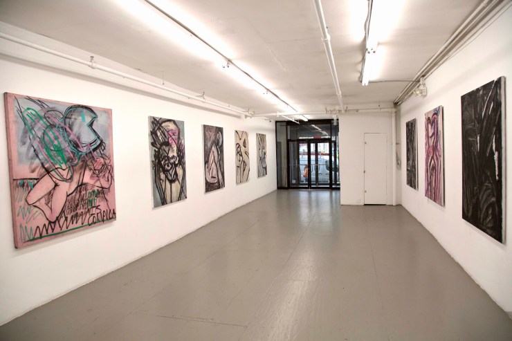
Dark Angels and Amazons: Natasha Wright at SFA Projects

Sista Chapel by Natasha Wright

SFA Projects, 131 Chrystie St, New York, NY 10002

November 13, 2019, to December 15, 2019

fullsizeoutput_2d
Sista Chapel by Natasha Wright, installation shot. 2019. Courtesy of SFA Projects.

By Nancy Elsamanoudi

The paintings on view in Natasha Wright’s show, Sista Chapel at SFA Projects, convey power with an erotic directness. These bold, exquisitely layered large-scale paintings lure the viewer to muse over the grumbling vibrations of murky, subterranean elements. These works call to mind myth, the underworld, sorcery, dark magic, ancient rituals, primordial energies, and impulses; a violent, dangerous world constantly on the brink of chaos.

Wright’s paintings are peopled with larger than life goddesses, coquettes, amazons and mythological and magical creatures. Her work taps into an imaginary space that collapses the difference between the ancient and the present. These threads that exist simultaneously are seamlessly brought together in the same painting: Cardi B and the Venus of Willendorf, Pac-Man and a sleeping pink nymph, an enormous unicorn smashed against the picture plane against a seafoam green background that at least partly mimics digital space or crouched monsters lurking in an open field at night.

The Unicorn, 60 x 48_, Oil on canvas
Natasha Wright, Unicorn, 2019 oil on canvas 60 x 48. Courtesy of SFA Projects.

The ambiguity at play in Wright’s paintings is compelling. Wright freely incorporates both abstract and figurative elements in a way that heightens the tension and the sensation of suspense in her work.  Her work has a playful openness, a searching quality to it. She seems to allow forms to emerge intuitively.

The thick black lines she uses brings her figures into sharp focus, but then she also sharply crops her figures in a way that frustrates an easy read of them. Various body parts, such as the head, wings, legs, arms are cut off and often lie outside of the picture plane. The figures in Wright’s paintings are cropped as a means of intensifying a feeling—a sense of discomfort. Wright’s work fixates on sensation and the role of the body is central to her work. But the body in her work is not particularly idealized or sexualized. Instead, the body takes on a totemic function—it is more an archetype, a cultural coding of the vitality inherent in a human being.

At times, Wright’s work seems to also touch on death, the macabre and violence. Bodies and parts of bodies are distorted past the point of recognition; the figures writhe in pain. Wright seems to be exploring the precarious and fragile vulnerability often ascribed to the female experience. In Street Ophelia, for instance, a violently contorted female figure appears to be splayed on the ground.

ItsComplicated
Natasha Wright, It’s Complicated, 2019 charcoal and oil on dyed canvas 60 x 60. Courtesy of SFA Projects.

Wright is clearly not interested in making pretty paintings—her paintings aren’t precious. The bodies in her paintings are frequently awkwardly contorted. Grey is often the predominant color and her limited palette of greys, pinks, black and green lend her paintings a gravitas, a weight as does the texture in her work.

Wright builds up the surfaces of her paintings by using a range of materials such as sand, glitter, glass beads, charcoal and black magnum with hand-made oil paint. There is a haptic, textural quality to her work.  The resulting images tend to be suggestive; they seem to hint at a story involving an unfolding drama or possibly a moment of impending danger. She gives the viewer a fleeting glimpse into her world and imagination.

Wright’s work speaks to a fascination with darkness and Wright is tied to her feminist temperament. Wright repositions the female figure at the center by re-envisioning the feminine gaze and rethinking the importance of female agency. The adventuress, the seductress, the muse, the fallen or scorned women all become protagonists that motivate her studio practice. The painting When Black Swallows Red, for instance, looks like large swaths of leather mixed with latex, it is suggestive of the way black leather and latex might feel strapped tight against the skin and in doing so calls to mind straps, whips, and pain folded into pleasure.

Willendorf (Cardi B) 60 x 48_, oil on canvas_
Natasha Wright, Willendorf (Cardi B), 2019 oil on canvas 60 x 48. Courtesy of SFA Projects.

Wright is drawn to the dark, mysterious and dangerous aspects of feminine power and the female experience. By focusing on the body as a vehicle of power and agency, Wright’s work seems to rebuff the so-called feminine virtues of purity, chastity, and modesty.  This can be seen in Already a Saint, a painting of cropped thrusting forward, half-naked torso clothed in animal skins. Or The Swan, a painting that seems to be referencing, “Leda and the Swan.” In this painting, a bent and twisted sullied swan appears like a dark angel covered in volcanic ash flying into a lake.

These paintings speak to feminist concerns, but not in the way that is didactic. Wright seems to be most interested in what may be construed as threatening, destabilizing or emasculating about feminine power.  This feminine power has traditionally sparked fear or has been seen as evil, unnatural and suspect, resulting in images of conniving hags and witches.  Wright’s paintings attempt to reclaim and prize this “darkness” of female power by treating it like black gold—tapping into it as an energy source and an intuitively life-affirming way of knowing.

Sarah Mihara Creagen: The Sisters’ Fart Corner

_GLH9814_Photo Guy LHeureux
Sarah Mihara Creagen, The Sisters’ Fart Corner installation shot. Photo documentation by Guy L’Heureux, courtesy of Articule. 2019.

Articule

262 Fairmount O. Montreal, Quebec

November 9 — December 8, 2019

By Penelope Smart

The walls at Articule in Montreal are piss-yellow — the perfect backdrop for The Sisters’ Fart Corner, a new series of ink drawings and animation by Brooklyn-based Canadian artist Sarah Mihara Creagen. Fart Corner is a playful body of work that is rated R. For those who do not wish to talk about piss and shit, kindly close your browser.

It would be a shame to shy away Creagen’s subject matter, though, because what she lays bare in black ink and bright backsplashes of watercolour is fascinating: figures playing out imaginative personal narratives of surgery, recovery, sex and IBS-related business. Yes, there are exposed labia everywhere, especially in Grafting: union must be kept moist until the wound has healed, but what is truly explicit here are bodies, consent, and ownership. Creagen’s figures — most of whom have female anatomy — expose truths about bodies that we are happy to accept and own, such as self-love practices in the form of masturbation or reading a favourite book on the toilet, as shown in Washroom Stall Chit Chat w/Chastity belts. Leaking into each frame, however, are a host of corporeal realities that we are quick to reject and shame: sex, BDSM, farts, pee, and other solids and fluids — especially where vaginas are concerned.

_GLH9882_Photo Guy LHeureux
Sarah Mihara Creagen, The Sisters’ Fart Corner installation shot. Photo documentation by Guy L’Heureux, courtesy of Articule. 2019.

Queerness makes its presence known and felt within Creagen’s blurring of bodies, boundaries, and the raucous interplay of the sacred and profane (pure and impure, clean and soiled). Creagen succeeds in translating the mess of gender not only through her representations of genitalia, submission and girly accessories (heart sunglasses, thongs) but in her exacting and elegant script-style coupled with natural untidiness. Sex is a tricky noun and verb in these works: an opening, an incision. An act of self-mastery, a site of violence. As a reprieve, on a separate wall, Creagen offers the viewer an overly innocent animation called Gardening lessons: grafting, examining, splitting. The seven-minute video’s shadow play is pretty, but the value of botany as a motif in Fart Corner is the grounding effect of seeds, earth, soil. Her animation works as a simple affirmation of sexual health.

Hot air is something special here.

Creagen shows passing wind in two distinct ways: In the title piece, The Sister’s Fart Corner — a large diptych that’s properly installed in the corner of the gallery — fart gas takes on a Sci-fi laser-quality or Care Bear count-down rays (out your butt). In Weather Butt, fart gas produces auric colour-fields that expand like smoke-stack plumes. While Creagen’s subject matter is art historically connected to Edo-period scrolls in which a male figure’s farting was competitive and political, the act of belching and flatus here can be read as a personal metaphor for subversion and superpower. Wielded for good or bad, it’s inside your insides — or what’s churning inside your intestines — that count.

_GLH9898_Photo Guy LHeureux
Sarah Mihara Creagen, The Sisters’ Fart Corner installation shot. Photo documentation by Guy L’Heureux, courtesy of Articule. 2019.

To the outside world, Creagen describes herself as “White-passing Japanese,” which is more than a hint that themes of identity and representation are being served up with sides of awkwardness, derision (hissing, even) and self-doubt. Creagen connects her experiences of being mixed-race with the vulnerabilities of the examining table and bondage. Swirling around Fart Corner is a freaky, sneaky message: you cannot cut your feelings out of your flesh, and you cannot flush your feelings down.

The pottery humour gets literal with TP scroll, an installation made of pieces of toilet paper sewn together with blue thread. It’s two-ply, draped, and tattooed delicately with Sumi ink drawings. At first glance, it hangs like a detention-worthy highschool prank. Then, oddly, it softens into a recovered memory of the iconic sky-blue book cover for Robert Munsch best-selling Love You Forever (1989). The story tells of a parent’s unconditional love for their child, and on the cover is a turd-cute toddler having a field day with toilet paper. Creagen’s tiny toilet paper narratives, filled with bare butts and roses, speak to reverie, privacy and personal moments.

Fart Corner is an airy, safe space for tits and ass. The stakes are highest, however—in the faces of these figures. Creagen’s careful, caring hand can articulate micro sensations. It is as though her finely tipped brush understands an essential biological sequence: synapses fire, and then muscle, tissue, and cells become the curl of a lip; the twitch of a nose. The bugging of an eye. Squint, look up close, the facial expressions are the most uncomfortable moments — and the most pleasurable. The title piece The Sisters’ Fart Corner, a bodacious woman, with a fart-sister by her side, throws her head back in full cackle. She is fully alive. She gives no fucks and is one hundred percent liberating to look at. She is farting her heart out; she is free.

Colour, Perception, and Affect: Christina Mackie

September 21-November 2, 2019

Catriona Jeffries, Vancouver, BC

by Helena Wadsley

Mackie_2TRACKS_2019_CJ_2019_install_01
Christina Mackie, 2TRACKS, 2019, audio, 9 minutes, 54 seconds. Installation view, Catriona Jeffries, Vancouver, 2019. Photo: Rachel Topham Photography. Courtesy Catriona Jeffries, Vancouver

The new location of Catriona Jeffries in an industrial area of East Vancouver has high black fencing hems in the courtyard, with a stretch of busy train track just metres away. Installed in the far corner across a stretch of beige gravel is Christina Mackie’s audio piece, her first work in this medium. She recorded the grinding, squealing and clanking sounds of the trains that trundle past frequently. The only difference between the real and the recorded is that the audio piece plays at regularly timed intervals. The mimetic sounds pull at memory in an affective way; the recognition of the sound as it becomes more audible conjures up images of station platforms on dark nights in the mode of a romantic film set. It is haunting and surprisingly delicate, which also sums up the large installation waiting inside.

fullsizeoutput_a
Christina Mackie, Colour Drop, 2014. Installation view, Catriona Jeffries, Vancouver, 2019. Photo: Rachel Topham Photography. Courtesy Catriona Jeffries, Vancouver

When I walk into the gallery, my gaze is drawn upwards, my neck bending back to see the towering cones of Colour Drop. The fabric is membrane-like, so delicate it is almost not there, visible only for the colour each is dyed—red, blue and yellow.  The windsock-like forms hover over circular, parched puddles of textile dye. At the beginning of the exhibition, the shallow pools were half full of the liquid dye, the colours matching the silk and nylon fabrics of the cones. On the final day, the blue and yellow have dried up completely, giving the tray of blue dye the appearance of ice on a puddle—sharp shards cracking the surface, a visual record of time passing. The pools have the feel of topographical images of mining residue, evoking the sense that nature has been altered. The red pool never fully dried, and one half of it is like viscous blood. The cones were inspired by Mackie’s childhood when she accompanied her marine biologist father on expeditions and observed similar forms in the nets he used to collect plankton.

fullsizeoutput_7
Christina Mackie, installation view, Catriona Jeffries, Vancouver, 2019. Photo: Rachel Topham Photography. Courtesy Catriona Jeffries, Vancouver

Perception changes over time, hence we often remember visceral images as if they were larger than life. The way we experience art, as with everything, is mitigated by memory, intuition and reason combined, while Mackie’s interest is in the perception of colour. She presents colour that is created by the light that filters through it, whereas we are more accustomed to seeing colour when light is reflecting off a surface. That the viewer can be expected to experience only visual perception feels limiting conceptually because perception is tied with personal experience and memory. The cones also refer to the processes of making colour, especially as Mackie has deliberately chosen to use dyes rather than pigment or paint, and more specifically, dyes that are no longer used, evoking the past as historic as well as nostalgic. As with the audio of the train rolling through, my perception of these large-scale works is scrambling memory with pure visual experience.

fullsizeoutput_3
Christina Mackie, Token no. 14, 2019, stoneware, silk, cup hook, 19 x 9 in. (48 x 23 cm). Installation view, Catriona Jeffries, Vancouver, 2019. Photo: Rachel Topham Photography. Courtesy Catriona Jeffries, Vancouver

In the Token series, Mackie pays homage to clay, approaching it with what seems like a child-like naivete. Some of the pieces appear crudely formed. This and the Chalk series are wall sculptures constructed in layers. In Chalk, the layers of chalk gesso invoke the surface of white lard. The dyes sink into the porous gesso, but the colours remain brilliant. The stoneware works have an imperfection which is balanced by the allure of the glazes, taking me back to the desiccating pools of dye, crystallizing on the narrow points of the silk as well as the pigment poured onto the layered chalk panels. The glazes, the dye pours on chalk, and the dye in the trays illustrate the different processes of applying colour. Both ceramic glaze and dye can be completely transformed by heat, oxygen, or time. Mackie re-creates dyes that are no longer used, referring to a different type of time passage, an extinction of materials through the evolution of new ones.

Minimalist sculptures are self-referential, with strong attention to materials and form and how these interact with the space they occupy. They tend to be geometric, pristine and repetitive forms. Mackie has three cones, dipping into circles. The primary colours reflect on how we see colour when light is filtered through it rather reflected. On the other hand, post-minimalist art, which included feminist art that celebrated textile-based techniques and organic forms are alluded to in the fabric cones and in the torn strips of cloth that wrap around some of the ceramic pieces. Mackie’s work contains these contradictory elements, subverting a patriarchal history of modern art by giving equal attention to the materials and processes, and allowing imperfections of the hand to remain visible. The Token series conveys the potential of clay as a formalist medium, but its vigour is in how Mackie has pushed the potential of glaze as a medium, like a glue. The shapes impersonate the spills of dye over chalk, which in turn refer to the pools of dye and the nuggets of glass. As I leave the gallery, a train is chugging past, its clanking and wheezing referring me back to Mackie’s audio piece and the obfuscation between reality, simulacrum, and memory-affected perception.


Orienta 7: Mapping the City in Unexpected Ways


Students in a guided tour at Moulay Alhassan Gallery
Students touring Orienta 7, courtesy of Chourouq Nasri.

By Chourouq Nasri

Oujda, Morocco

October 10 – November 30, 2019

The way art can transform the city is the theme that knits together the key moments of Orienta 7, an art event organized in Oujda, Morocco from October 10 to November 30, 2019. Orienta’s curator, Azzeddine Abdelouahabi is an artist and art critic who lives between Amiens (France) and Oujda (Morocco). To show art’s potential for social and spatial subversion, he invited local and international artists to remap the city in a new way. Their artworks coalesce into narratives that unlock the parallel between the intimate and the global.

A vast range of media (from painting and sculpture to installation and art-video, digital art, photography and political activism presented as art) are used by artists as a way to expand the limits of representational art and to bring art to life in new spaces in the city. The curator conceived each of the locations of the event as one of the seven provinces imagined by medieval geographer and traveler Charif Al-Idrissi in his map of the world. He distributed the artists among seven venues between the medina (the old city) and la ville nouvelle (the new city).

Mohamed Rachdi
Mohamed Rachdi. Frontiers, aluminum sheet, Orienta 7, Oujda 2019.

The first exhibition in this event is set in Charif Al-Idrissi Library in the narrow, tortuous streets of the old city. Palpable in this first province is a sense that both the city and the event are living systems, mutually shaping one another. Mohamed Rachdi’s art installation occupies a large area of the old library courtyard. The artist created a big round silver basin and filled it with water and objects in the form of alphabet letters. As we get closer to the basin, we have an urge to plunge our hands in the water and play with the letters. On the wall in front of the basin, letters made with scraps of maps read: the world belongs to us. The work is powerful in its simplicity. The artist attempts to understand the philosophies of nomadism; he centers the experience of belonging on the need people feel to move across borders. Boundaries, according to Rachdi, have a different significance depending on who you are. They are constantly shifting and evolving in response to political, social and climate changes.

On the other side of the library courtyard, two sculptures representing Charif Al-Idrissi are set next to each other. One is made with bronze and the other with sponge, an unusual and unpredictable material. The first artwork will last for a long time while the second, paying tribute to the legacy of a fragile and ultimately temporal medium, is doomed to perish shortly. The sponge grey sculpture also symbolizes the transience of life and the intense emotions of living on the edge that Chariff Al-Idrissi, who was an adventurous traveler, must have experienced. Jawad Embarki is searching for a way to make art fulfill a recuperative function, to not only memorialize a loss but to create something out of it.

Imad Mansour
Imad Mansour. The Death Boat, plaster molding and ink on paper, Orienta 7, Oujda 2019.

A sculpture in the form of a sailing boat with three men’s busts in it confronts visitors as they enter the library’s main gallery. The white flower-shaped boat is a funeral tribute to the migrants who die at sea—causing both discomfort and fascination for those who look at it. Like much of the media images we are overwhelmed with, it makes us feel compelled to witness although we would rather look away. Imad Mansour, an Iraqi artist living in Morocco created his sculpture with regular white plaster, the same material he used for another art installation in a different venue. In the middle of one of the rooms of Omar Ibn Abdelazize high school, a building known for its architectural charm and historical significance, a pile of white tied knots lie on a table, as if to point to the interwoven strands of the different exhibitions. The work is also an attempt to draw together the threads of displacement and alienation which have become a condition of contemporary culture within art.

Bachir Amal
Bachir Amal. Stories, mixed technique on paper bags, 660 cm x 450 cm, Orienta 7, Oujda 2019.

The artworks displayed on the walls of the gallery seem to say that life goes on while migrant death tolls continue to rise. Bachir Amal’s unsettling combinations render the complexity of modern life. The artist has used paper shopping bags as canvases for his paintings, drawings, and calligraphies and assembled them into surreal configurations. What makes the work so arresting is its simultaneous evocation of seemingly contradictory states: colonialism, consumerism, and aesthetics. While the collage directly evokes Magritte’s Key to Dreams, it also brings to mind the pop art works of Andy Warhol.

To explore the relation between people and their environment, Hafid Badri uses the language of maps in a very original way. He fashioned scraps of maps combined with Bachar Alassad and other dictators’ pictures into complex forms, reducing countries and even continents into wooden shoe molds hung on a wall and presenting an uncanny tableau. The small sculptures look elegant from a distance, but on closer inspection, we realize that the artist uses the language of surrealism to confront political violence.

Hafid Badri
Hafid Badri. Heartless, collage and wood assembly, Orienta 7, Oujda 2019.

Lala Mariyam Park, a beautiful garden in the heart of the old city explores personal and collective experiences of marginalization and oppression in a different way. Artists Esseddiq Fadhil and Fatima-Zahra Zahraoui have produced a constellation of unusually large Gharnati musical instruments in unabashedly bold colors. The diasporic shift of Andalusi populations is further explored through a retrospective textual view of the history of Gharnati music set at the entrance of the garden.

In the new part of the city, a huge dinosaur sculpture is set in front of the archeology museum that is in preparation. The dinosaur is stylishly provocative, but the provocation seems oddly detached from its subject. This surprisingly huge statue is intended to put the passersby out of their comfort zone—to remind them that Oujda has a rich pre-historical heritage.

One of the most-notable exhibitions of Orienta 7 is organized at Moulay Alhassan Gallery. The exhibition proves a moving tribute to Brahim Bachiri, a Moroccan artist living in France who died earlier this year. Mohamed Rachdi who designed the exhibition scenography took full advantage of the space offered by the gallery and transformed it into a philosophical and aesthetic territory where the art of Bachiri is celebrated. Upon entering the gallery, we are met with a video of the artist shaving his head. The work was made a few years ago as a homage to Driss Berkani, a French man of Moroccan descent who was the victim of a racially motivated murder. But the feeling we get watching the video is that the work is a rumination on death, namely the death of the artist, and on the immortality afforded through art. As if to reinforce this feeling, a white mausoleum-like structure enshrining a photograph of the artist’s naked torso is set in front of the video. The artworks across the gallery walls and floors reflect the multidimensional artistic trajectory of Bachiri and show the artist grappling with his own experience living in France and being of Moroccan heritage in a context marked by Islamophobia and racial discrimination.

Brahim Bachiri
Brahim Bachiri. Artiste Halal (a lawful artist), neon stamp in French flag colors (blue, white, red), 200 cm x 200 cm, Orienta 7, Oujda 2019.

“A halal (lawful) artist” and “Slaughtered according to Islamic dietary law”, the formulas Bachiri sculpted using neon found their way onto the gallery walls. The words bring to mind brutal images posted online by Daesh jihadists and remind viewers that in the aftermath of 9/11, it is difficult to disentangle Islamism from terrorism. The formulas which are used to ensure the Islamic origin of meat have been voluntarily politicized by Bachiri and transformed into a way of denouncing state-sanctioned violence and brutality. The words have become a sort of stamp that provides an overview of the artist’s varied satirical art practices which highlight his layered, idiosyncratic visual identity, one that places a particular emphasis on calligraphy. The viewing experience could almost be meditative; it eschews the easy possibilities of false catharsis. The exhibition narrates a story of activism.

Orienta 7 visitors walking through the streets of the old city to explore the different venues of the event.
Students touring Orienta 7, courtesy of Chourouq Nasri.

The photos of Khalid Alachari appear alongside Hakim Boulouiz’s in one of the most visually compelling shows of Orienta 7. The works of both artists are an exploration of how identity takes place. The two artists have created artworks that are not merely representational but are worlds in themselves. Alachari focuses on tiny unnoticeable details in such a way as to transform ordinary landscapes into extraordinary abstract-like paintings. Boulouiz, on the other hand, makes fine, carefully composed photographs incorporating flashes of color, unexpected juxtapositions and paving the way for many layers of meaning. His fine art photos attempt to understand what and how people convey, contest, or otherwise negotiate aspects of contemporary urban life. They also offer a rare perspective on the artist’s relationship with the city or what he calls “mise en ville”. Boulouiz’s photos make the viewer feel puzzled, unsettled and mesmerized.

Many of the works displayed in Orienta 7 can be fully appreciated only by prolonged, up-close viewing. They are not isolated in time and space and must be put in context. The ultimate purpose of this important art event is to encourage the viewer to think differently, to stop and take the time to confront their own preconceived notions and to participate in the remapping of the city.

Tear of Nature: Ajuan Song at Manhattan Graphics Center

August 1-11th, 2019

Manhattan Graphics Center

song_01
Tear of Nature, 2018. Manhattan Graphics Center. Installation Shot. Image courtesy of the artist.

By Chiara Mannarino

Although she is known for her stunning, abstract work with alternative photographic processes, Ajuan Song’s most recent series, Tear of Nature, reflects an entirely new venture for the artist, one that Song notes has signaled a moment of artistic growth and coming into her own.

Unlike Song’s previous work, Tear of Nature is a deeply personal series that has allowed the artist to explore her own identity as a woman born in China during the years of government-enforced population control along with her relationship to and understanding of femininity. As a second-born child, Song witnessed her mother lose her job by choosing to keep her daughter alive. She grew up in a society where women weren’t permitted to do certain things merely because of their gender. Consequently, she felt so stifled by the societal expectations imposed upon her that she often wished she were a boy instead. Song sees these new photographs as a way for her to softly speak about the issues she has witnessed and experienced firsthand.

Although softness usually carries a negative connotation, Song believes that “soft” does not mean “weak.” While reflecting upon her upbringing in a society where women are expected to be docile and humble, she asked me to consider how water is capable of slowly eroding a stone over time, a testament to the power of gentle, slow work in the face of stubborn persistence.

unnamed (1)
Tear of Nature, 2018. Image courtesy of the artist.

As I walked around the Manhattan Graphics Center, I felt Song’s past, present, and dreams for the future coalesce in each photograph. All of the images contain the silhouette of a female figure composed of delicate tree branches, which intersect to create spindly webs that resemble human veins. The female figure is Song herself—each self-portrait is shot with film on the artist’s Rolleiflex camera and then digitally abstracted to include only the body’s outline. The tree branches that live within the figure’s form entirely fill the body and provide it with all it needs to survive, becoming its life force and infusing it with energy and vitality. These fine and bare wooden limbs were captured in photographs taken in parks across New York City mostly in the wintertime and later superimposed with Song’s outline through Photoshop layering. This digital manipulation allows Song to produce composite images that are entirely harmonious, from their serene gray background to their flawless union of images. Her melding of analog and digital technologies yields results that could not be achieved by choosing between the two. This artistic decision demonstrates her belief in the power of union and balance to create otherwise unattainable outcomes.

Every detail in these intricate images is significant for Song, and her choice to include her own body in the work reflects the personal nature of this series. Though natural, her poses are strategic, intending to embody the Chinese belief that one must be humble in front of nature, which holds divine wisdom. By artistically conceiving a harmonious accord between humanity and nature, Song envisions a reality in which all entities sharing this earth are equal, a condition that often seems inaccessible within the context of our current moment.

unnamed
Tear of Nature, 2018. Image courtesy of the artist.

In today’s world, the once-ambiguous term “global warming” has become all too tangible, and, in New York, hectic inhabitants often fail to appreciate the few and precious patches of green that exist in the bustling hub of concrete high-rises and construction. Through this series, Song shares her belief that these realities could all be prevented if humans and nature coexisted respectfully and harmoniously with one another. However, she acknowledges the precariousness of this notion in her series title, which references the delicate line that lies between division and unity. Song revealed that she is currently in the process of creating the second part of this series, which will focus on the same motifs but now from a discordant rather than peaceful perspective. Through Tear of Nature, Ajuan Song is claiming ownership of her heritage, exploring the relationships that can exist between dualities, and sharing her vision of what our world has the potential to look like—and what a beautiful world it could be.
Ajuan Song’s Tear of Nature is on view at the Manhattan Graphics Center until Sunday, August 11th, 2019.