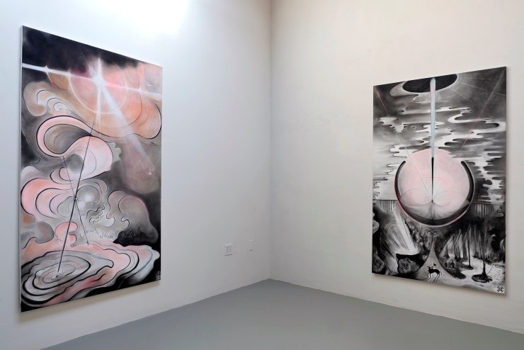
Mahsa Merci, Silent Stars, Mayten’s Projects. 2021. Image courtesy of Amir Sohrabpour / Mayten’s.
Interview by Adi Berardini
Mahsa Merci is interested in challenging society’s traditional concepts of beauty. Through her paintings, sculptures, and mixed media work she expands notions of the gender binary by depicting queer, trans and gender non-conforming individuals using viscous oil paint and building up layered textures. Born in Tehran, Iran, Merci holds a Bachelor’s degree in Graphic Design from Tehran University of Art and a Master of Painting from Azad University. Currently based in Toronto, ON, she has recently completed her Master of Fine Arts at the University of Manitoba, Canada.
In her latest exhibition Silent Stars at Mayten’s Projects, Merci displays two years of work examining the restrictiveness of social norms that affect the LGBTQIA+ community. Merci explains how “painting is one of the best ways to challenge strict binaries.” Through bending the binaries between man and woman, and beauty and the grotesque, she invites the viewer in closer to her work to experience the textures and relate to her subjects.
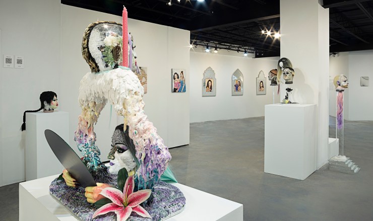
Along with her queer portraiture, in Silent Stars Merci explores the terrain of sculpture, often referencing Islamic architecture and broader queer culture. For example, her sculpture Find Yourself Through Myself consists of a figure with light teal hair peering into a mirror of another among a shrine of sequins and pastel pink candles, evoking both oral sex and self-reflection. Also referencing Islamic architecture and miniature painting, Merci includes portraits as an homage to the Iranian LGBTQ+ community. Merci’s depiction of identity is not edited or airbrushed, but displays imperfections and flaws, challenging society’s restricting binaries and expectations.
You depict the queer community, particularly drag queens, gender non-conforming, and transgender people in your work. How did you first decide on depicting the queer community as your subject matter?
I always worked on gender identity, beauty, and sexuality as a subject in my country [for] more than 10 years. In 2017, I was watching a documentary about a transgender [individual] in Iran who had to leave for Turkey since they could not live in our country. That documentary was like a hammer on my mind. I could see beauty, grotesque, sadness, all of these things. I started to work on this subject in 2018 and one year later, I understood my sexuality when I was 28 years old. After that, I understood why I decided to work on this subject in my art career. My subconscious knew about it, but my conscious mind didn’t know about it at all. We don’t have any education or educational materials, living in a religious country. When the educational materials don’t exist, how can you understand your sexuality soon and in a good way? In 2018, I understood my sexuality, but it was so hard for me until now.
I can relate in a way. I felt like I was late coming into my sexuality as well. It took me until my early 20s to clue in that this is who I am, and this is who I’ve always been. But because of religion or compulsory heterosexuality, you lose that.
Exactly. It’s hard to know that you are part of this community when you don’t see anyone, or you don’t hear anything, it takes so much time to find it. It is not easy.

Can you talk further about how you use painting to challenge binaries such as masculinity/femininity, beauty/ugliness, etc.? In what ways are interested in redefining societal beauty standards through painting?
I can say I am multidisciplinary [since] I’m working with so many materials—I’m working with painting, sculpture, animation, collage, so many things. But with painting I [can] find something so special. I never had an academic background with painting, I never had an apple on a table that I had to paint. When I’m painting, it’s like I print the portrait—I start to build up the materials and textures. I find painting as a material that I can show myself [through]. I’ve always really liked to share the spectrum of everything: softness and harshness, beauty and grotesque, femininity and masculinity and I find that painting can help me to do it. Every stroke with my brush that I do I feel myself in it.
I want to make an atmosphere that the audience wants to come closer to the portrait. Heterosexual [people] may not want to come closer to our community. I don’t want to have two categories, heterosexual and homosexual, I want to see more friendship together.
Your work uses a great amount of texture through the building up of paint. Can you explain more about your use of texture and its significance?
I work with oil colours which help me get the textures that I use. I like working with oil on small portraits that invite the audience in closer to see the portraits. When paintings are larger, physically the viewers need to go far to view it. I want to make an atmosphere that the audience wants to come closer to the portrait. Heterosexual [people] may not want to come closer to our community. I don’t want to have two categories, heterosexual and homosexual, I want to see more friendship together. I want them to come and see the portrait and see the details, the textures, the beauty, and the grotesque of the characters. Some parts come out of the canvas, like nose, lips, hairs, and jewellery—they are 3D works and not flat works. It’s kind of a metaphor for me to show that these are real people. I want to show the feeling that they are coming out of the canvas.

Can you explain your inspiration for your latest show, Silent Stars at Maytens?
The main inspiration is myself and the challenges and concerns that I am facing as a queer person. I always look at the other LGBTQIA+ people all over the world. I feel all of us have the same problems living in a patriarchal society, but the level is just a bit higher or lower. Sometimes when I see my friends and some portraits on social media or the website, they are an inspiration to me—their clothes and the queer culture. Then, I reach out to them and paint them. I am inspired by two books, Gender Trouble by Judith Butler and Women with Mustaches and Men without Beards written by Afsaneh Najmabadi, an Iranian writer.

Your work featured in Silent Stars also plays upon sculptural and Islamic architectural elements. Can you speak further about these elements in your work?
The inspiration is from the book I mentioned, Women with Mustaches and Men without Beards written by Afsaneh Najmabadi. She is an Iranian professor from Harvard working on gender, sexual identity, and beauty in ancient Iran. Through reading this book, I found that there was no heterosexuality or homosexuality in ancient Iran. It was surprising to me that two men or two women could have love or a relationship together without judging or explaining it to anyone. You can see in the paintings that the male and female clothing was the same. But when the Europeans came, they changed the culture little by little. They enforced the idea that men and women should be together. Now, if you are part of the LGBTQ+ community in Iran, you [may wish to] escape from the country or not say it too loudly since your life can be threatened by your family or your government. Although it is not us, it was brought to us.
The portraits inside the mirror frame are all Iranian LGBTQ+ [people]: one of them is queer, one is bisexual, and in the middle two portraits; one of them is lesbian, and one is non-binary. I wanted to [display] Iranian LGBTQ+ people as monumental. I get the shape of the mirrors from a very old and traditional Iranian art called miniature. Miniatures are very old paintings that Iranians and Persians painted of a building, spaces, or narratives with very, very small brushes. It is very special.
Do you have any upcoming projects that you would like to speak further about or things you’re working on?
I just moved from Winnipeg to Toronto. I still don’t have a studio, so I don’t have any big project or exhibition planned. Although, a project I’d really like to start is to make more sculptures. I found that sculpture can show very different things than painting can, so I’d like to continue that. I also want to take more photography from the background of drag shows. I have so many ideas from quarantine that I’d like to do.
You can view more of Mahsa Merci’s work on her website and social media. The Silent Stars exhibition is on display at Mayten’s Projects until January 15, 2022.